Version 2025-07 is the last API version to support React-based UI components. Later versions use Polaris web components, native UI elements with built-in accessibility, better performance, and consistent styling with Shopify's design system. Check out the upgrade guide to upgrade your extension and avoid being blocked from updating your extension after October 1st 2026.
Footer
The footer appears at the bottom of the checkout page, below the policy links and copyright text. Use this area to extend or replace the default footer with supplemental content such as custom policy links and branded layouts. Interactive elements like discount code inputs and consent toggles belong in the main checkout experience instead.
Anchor to Use casesUse cases
- Custom policy links: Add links to store policies beyond the defaults, such as shipping, returns, accessibility, or region-specific policies.
- Trust signals: Display security badges, certifications, or compliance marks to reinforce buyer confidence.
- Legal disclaimers and disclosures: Surface region-specific legal text, regulatory notices, or accessibility statements.
- Support and contact information: Display customer service details, business hours, or support links for buyers who need help.
- Custom branding: Replace the default footer with branded content, custom layouts, and store-specific information.
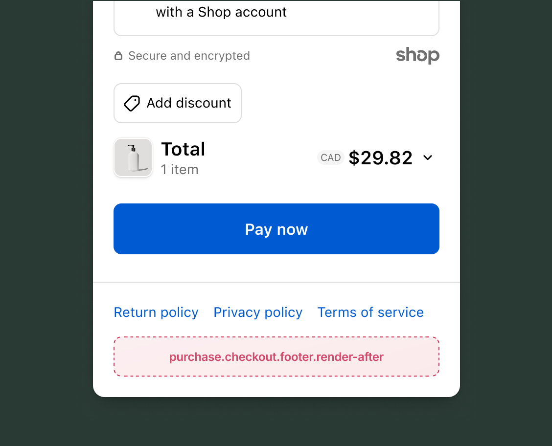
Use this static extension target to extend the area below the checkout footer. This target supports the full checkout component set, including form fields, banners, images, and interactive elements. The example demonstrates rendering custom policy links with the Shop API.
purchase.checkout.footer.render-after
Adds persistent content after the default checkout footer. Like all checkout targets, this target has write access through API methods for cart lines, discount codes, gift cards, notes, attributes, metafields, and shipping address changes.
Extensions also have read access through API properties to checkout state, including shop information, buyer identity, cost breakdowns, and cart lines.
Supported components
- Badge
- Banner
- Block
Layout - Block
Spacer - Block
Stack - Button
- Chat
- Checkbox
- Choice
- Choice
List - Clipboard
Item - Consent
Checkbox - Consent
Phone Field - Date
Field - Date
Picker - Disclosure
- Divider
- Drop
Zone - Form
- Grid
- Grid
Item - Heading
- Heading
Group - Icon
- Image
- Inline
Layout - Inline
Spacer - Inline
Stack - Link
- List
- List
Item - Map
- Map
Marker - Map
Popover - Modal
- Payment
Icon - Phone
Field - Popover
- Pressable
- Product
Thumbnail - Progress
- QR code
- Scroll
View - Select
- Sheet
- Skeleton
Image - Skeleton
Text - Skeleton
Text Block - Spinner
- Stepper
- Switch
- Tag
- Text
- Text
Block - Text
Field - Toggle
Button - Toggle
Button Group - Tooltip
- View
Available APIs
- Addresses API
- Analytics API
- Attributes API
- Buyer Identity API
- Buyer Journey API
- Cart Instructions API
- Cart Lines API
- Checkout Token API
- Cost API
- Customer Privacy API
- Delivery API
- Discounts API
- Extension API
- Gift Cards API
- Localization API
- Localized Fields API
- Metafields API
- Note API
- Payments API
- Session Token API
- Settings API
- Shop API
- Storage API
- Storefront API
- UI API
Supported components
- Badge
- Banner
- Block
Layout - Block
Spacer - Block
Stack - Button
- Chat
- Checkbox
- Choice
- Choice
List - Clipboard
Item - Consent
Checkbox - Consent
Phone Field - Date
Field - Date
Picker - Disclosure
- Divider
- Drop
Zone - Form
- Grid
- Grid
Item - Heading
- Heading
Group - Icon
- Image
- Inline
Layout - Inline
Spacer - Inline
Stack - Link
- List
- List
Item - Map
- Map
Marker - Map
Popover - Modal
- Payment
Icon - Phone
Field - Popover
- Pressable
- Product
Thumbnail - Progress
- QR code
- Scroll
View - Select
- Sheet
- Skeleton
Image - Skeleton
Text - Skeleton
Text Block - Spinner
- Stepper
- Switch
- Tag
- Text
- Text
Block - Text
Field - Toggle
Button - Toggle
Button Group - Tooltip
- View
Available APIs
- Addresses API
- Analytics API
- Attributes API
- Buyer Identity API
- Buyer Journey API
- Cart Instructions API
- Cart Lines API
- Checkout Token API
- Cost API
- Customer Privacy API
- Delivery API
- Discounts API
- Extension API
- Gift Cards API
- Localization API
- Localized Fields API
- Metafields API
- Note API
- Payments API
- Session Token API
- Settings API
- Shop API
- Storage API
- Storefront API
- UI API
Examples
Display custom policy links
Description
Render a row of additional policy links below the default footer. This example uses the Shop API to build storefront URLs for accessibility, shipping, and contact pages.
React
import {
  reactExtension,
  BlockStack,
  InlineStack,
  Link,
  useShop,
} from '@shopify/ui-extensions-react/checkout';

export default reactExtension(
  'purchase.checkout.footer.render-after',
  () => <Extension />,
);

function Extension() {
  const shop = useShop();
  const storefront = shop.storefrontUrl;

  if (!storefront) return null;

  return (
    <BlockStack spacing="base">
      <InlineStack spacing="base">
        <Link to={`${storefront}/policies/accessibility-statement`}>
          Accessibility
        </Link>
        <Link to={`${storefront}/pages/shipping-and-delivery`}>
          Shipping details
        </Link>
        <Link to={`${storefront}/pages/contact`}>
          Contact us
        </Link>
      </InlineStack>
    </BlockStack>
  );
}
TS
import {
  extension,
  BlockStack,
  InlineStack,
  Link,
} from '@shopify/ui-extensions/checkout';

export default extension(
  'purchase.checkout.footer.render-after',
  (root, api) => {
    const storefront = api.shop.storefrontUrl;

    if (!storefront) return;

    const outer = root.createComponent(
      BlockStack,
      {spacing: 'base'},
    );

    const inline = root.createComponent(
      InlineStack,
      {spacing: 'base'},
    );

    inline.appendChild(
      root.createComponent(
        Link,
        {to: `${storefront}/policies/accessibility-statement`},
        'Accessibility',
      ),
    );

    inline.appendChild(
      root.createComponent(
        Link,
        {to: `${storefront}/pages/shipping-and-delivery`},
        'Shipping details',
      ),
    );

    inline.appendChild(
      root.createComponent(
        Link,
        {to: `${storefront}/pages/contact`},
        'Contact us',
      ),
    );

    outer.appendChild(inline);
    root.appendChild(outer);
  },
);
Anchor to Best practicesBest practices
- Reserve space for dynamic content: Layout shifts in the footer are still noticeable during scrolling. If you load data asynchronously, use a skeleton paragraph or spinner to hold space while content loads.
- Use full-width layouts: A full-width layout gives your extension more space for content like multi-column layouts. Configure this through your store's checkout branding settings.
- Hide the default footer: When replacing the default footer with custom content, hide the default footer through your store's checkout branding settings first. This prevents duplicate footer content.
- Avoid placing critical actions in the footer: This target renders after the policy links and copyright text at the bottom of the page. Buyers might not scroll this far, so place essential checkout actions in higher-visibility targets like the header or a block placement.
Anchor to LimitationsLimitations
- Footer hidden in some contexts: The footer area might not be visible in embedded checkout contexts, mobile SDK integrations, or when the footer is suppressed through checkout branding settings.