Version 2025-07 is the last API version to support React-based UI components. Later versions use Polaris web components, native UI elements with built-in accessibility, better performance, and consistent styling with Shopify's design system. Check out the upgrade guide to upgrade your extension and avoid being blocked from updating your extension after October 1st 2026.
Sheet
The Sheet component displays essential information for customers at the bottom of the screen, appearing above other elements. Use it sparingly to avoid distracting customers during checkout. This component requires access to Customer Privacy API to be rendered.
The library automatically applies the WAI-ARIA Dialog pattern to both the activator and the sheet content.
Supported targets
- Checkout::Actions::Render
Before - Checkout::Cart
Line Details::Render After - Checkout::Cart
Lines::Render After - Checkout::Contact::Render
After - Checkout::Customer
Information::Render After - Checkout::Delivery
Address::Render Before - Checkout::Dynamic::Render
- Checkout::Pickup
Locations::Render After - Checkout::Pickup
Locations::Render Before - Checkout::Pickup
Points::Render After - Checkout::Pickup
Points::Render Before - Checkout::Reductions::Render
After - Checkout::Reductions::Render
Before - Checkout::Shipping
Method Details::Render After - Checkout::Shipping
Method Details::Render Expanded - Checkout::Shipping
Methods::Render After - Checkout::Shipping
Methods::Render Before - Checkout::Thank
You::Cart Line Details::Render After - Checkout::Thank
You::Cart Lines::Render After - Checkout::Thank
You::Customer Information::Render After - Checkout::Thank
You::Dynamic::Render - purchase.
checkout. actions. render-before - purchase.
checkout. block. render - purchase.
checkout. cart-line-item. render-after - purchase.
checkout. cart-line-list. render-after - purchase.
checkout. contact. render-after - purchase.
checkout. delivery-address. render-after - purchase.
checkout. delivery-address. render-before - purchase.
checkout. footer. render-after - purchase.
checkout. header. render-after - purchase.
checkout. payment-method-list. render-after - purchase.
checkout. payment-method-list. render-before - purchase.
checkout. pickup-location-list. render-after - purchase.
checkout. pickup-location-list. render-before - purchase.
checkout. pickup-location-option-item. render-after - purchase.
checkout. pickup-point-list. render-after - purchase.
checkout. pickup-point-list. render-before - purchase.
checkout. reductions. render-after - purchase.
checkout. reductions. render-before - purchase.
checkout. shipping-option-item. details. render - purchase.
checkout. shipping-option-item. render-after - purchase.
checkout. shipping-option-list. render-after - purchase.
checkout. shipping-option-list. render-before - purchase.
thank-you. announcement. render - purchase.
thank-you. block. render - purchase.
thank-you. cart-line-item. render-after - purchase.
thank-you. cart-line-list. render-after - purchase.
thank-you. customer-information. render-after - purchase.
thank-you. footer. render-after - purchase.
thank-you. header. render-after
Supported targets
- Checkout::Actions::Render
Before - Checkout::Cart
Line Details::Render After - Checkout::Cart
Lines::Render After - Checkout::Contact::Render
After - Checkout::Customer
Information::Render After - Checkout::Delivery
Address::Render Before - Checkout::Dynamic::Render
- Checkout::Pickup
Locations::Render After - Checkout::Pickup
Locations::Render Before - Checkout::Pickup
Points::Render After - Checkout::Pickup
Points::Render Before - Checkout::Reductions::Render
After - Checkout::Reductions::Render
Before - Checkout::Shipping
Method Details::Render After - Checkout::Shipping
Method Details::Render Expanded - Checkout::Shipping
Methods::Render After - Checkout::Shipping
Methods::Render Before - Checkout::Thank
You::Cart Line Details::Render After - Checkout::Thank
You::Cart Lines::Render After - Checkout::Thank
You::Customer Information::Render After - Checkout::Thank
You::Dynamic::Render - purchase.
checkout. actions. render-before - purchase.
checkout. block. render - purchase.
checkout. cart-line-item. render-after - purchase.
checkout. cart-line-list. render-after - purchase.
checkout. contact. render-after - purchase.
checkout. delivery-address. render-after - purchase.
checkout. delivery-address. render-before - purchase.
checkout. footer. render-after - purchase.
checkout. header. render-after - purchase.
checkout. payment-method-list. render-after - purchase.
checkout. payment-method-list. render-before - purchase.
checkout. pickup-location-list. render-after - purchase.
checkout. pickup-location-list. render-before - purchase.
checkout. pickup-location-option-item. render-after - purchase.
checkout. pickup-point-list. render-after - purchase.
checkout. pickup-point-list. render-before - purchase.
checkout. reductions. render-after - purchase.
checkout. reductions. render-before - purchase.
checkout. shipping-option-item. details. render - purchase.
checkout. shipping-option-item. render-after - purchase.
checkout. shipping-option-list. render-after - purchase.
checkout. shipping-option-list. render-before - purchase.
thank-you. announcement. render - purchase.
thank-you. block. render - purchase.
thank-you. cart-line-item. render-after - purchase.
thank-you. cart-line-list. render-after - purchase.
thank-you. customer-information. render-after - purchase.
thank-you. footer. render-after - purchase.
thank-you. header. render-after
Anchor to SheetPropsSheet
The Sheet component displays essential information for customers at the bottom of the screen, appearing above other elements. Use it sparingly to avoid distracting customers during checkout. This component requires access to Customer Privacy API to be rendered.
The library automatically applies the WAI-ARIA Dialog pattern to both the activator and the sheet content.
- Anchor to accessibilityLabelaccessibility
Labelaccessibility Label stringstring A label that describes the purpose of the sheet, announced by screen readers. If not set, it will use the value of
heading.- Anchor to defaultOpendefault
Opendefault Open booleanboolean Whether the sheet should be open when it first renders. Use sparingly — only when the user must interact with the sheet before proceeding (for example, a privacy consent prompt). Only takes effect on the initial render.
- Anchor to headingheadingheadingstringstring
A heading rendered at the top of the sheet.
- Anchor to idididstringstring
A unique identifier for the component.
- Anchor to onHideon
Hideon Hide () => void() => void A callback fired when the sheet is closed.
- Anchor to onShowon
Showon Show () => void() => void A callback fired when the sheet is opened.
- Anchor to primaryActionprimary
Actionprimary Action RemoteFragmentRemoteFragment The primary action to perform, provided as a Button component. Up to two buttons can be rendered.
- Anchor to secondaryActionsecondary
Actionsecondary Action RemoteFragmentRemoteFragment The secondary action to perform, provided as a Button component. Only one button can be rendered.
Anchor to ExamplesExamples
Anchor to Basic SheetBasic Sheet
Basic Sheet
Basic Sheet
React
import {
  reactExtension,
  Link,
  Sheet,
  TextBlock,
} from '@shopify/ui-extensions-react/checkout';

// This component requires access to Customer Privacy API to be rendered.

export default reactExtension(
  'purchase.checkout.block.render',
  () => <Extension />,
);

function Extension() {
  return (
    <Link
      overlay={
        <Sheet
          id="basic-sheet"
          heading="Basic Sheet"
          accessibilityLabel="A sheet with text content"
        >
          <TextBlock>
            Basic Sheet Content
          </TextBlock>
        </Sheet>
      }
    >
      Open sheet
    </Link>
  );
}
JS
import {
  extension,
  Link,
  Sheet,
  TextBlock,
} from '@shopify/ui-extensions/checkout';

// This component requires access to Customer Privacy API to be rendered.

export default extension('purchase.checkout.block.render', (root) => {
  const sheetFragment = root.createFragment();
  const sheet = root.createComponent(
    Sheet,
    {
      id: 'basic-sheet',
      heading: 'Basic Sheet',
      accessibilityLabel: 'A sheet with text content',
    },
    [root.createComponent(TextBlock, undefined, 'Basic Sheet Content')],
  );
  sheetFragment.appendChild(sheet);
  const link = root.createComponent(
    Link,
    {overlay: sheetFragment},
    'Open sheet',
  );

  root.appendChild(link);
});
Anchor to Using Sheet to display consent preferencesUsing Sheet to display consent preferences
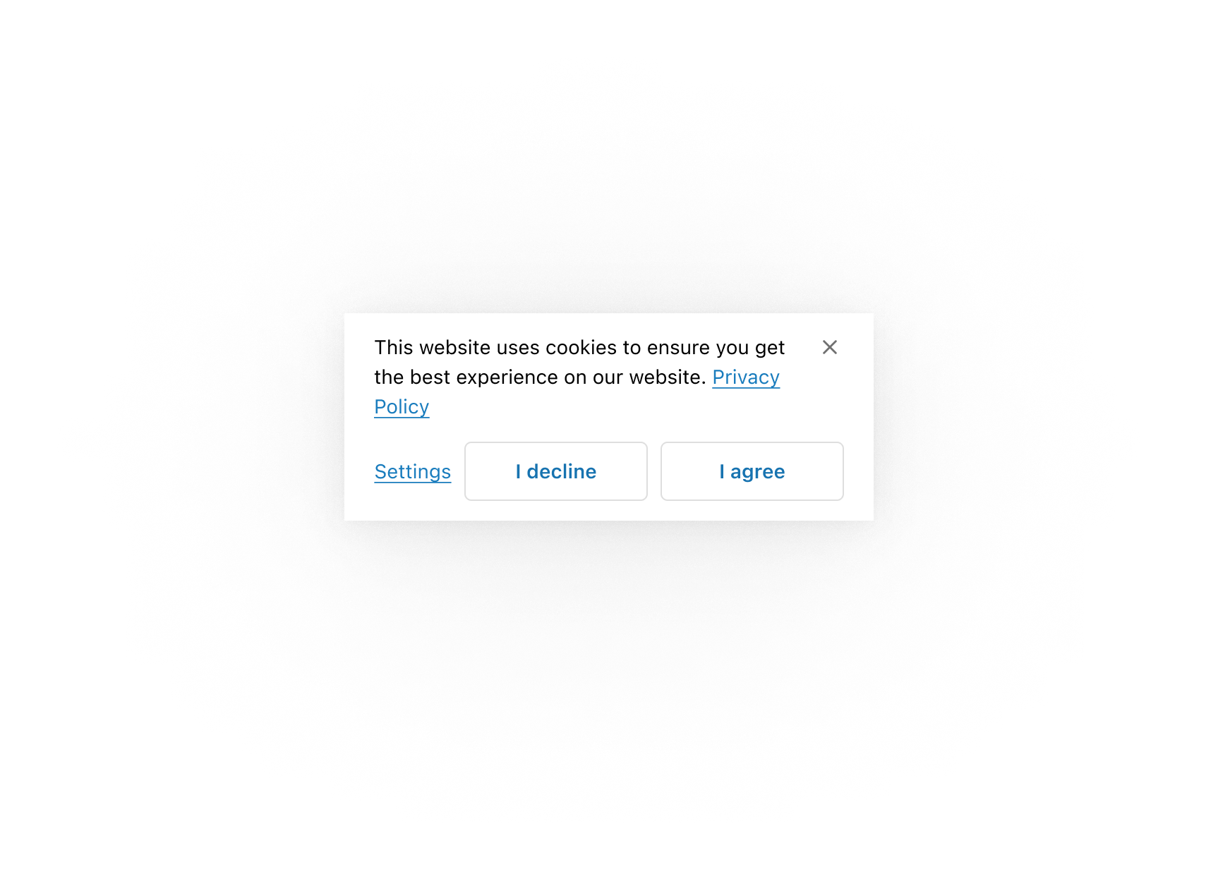
The Sheet component can be used to display privacy consent preferences in the checkout interface. Sheet can be defaulted to open for this use case.
This component requires access to Customer Privacy API to be rendered.
Using Sheet to display consent preferences
React
import {
  reactExtension,
  Button,
  Link,
  Sheet,
  TextBlock,
  useApi,
  useCustomerPrivacy,
} from '@shopify/ui-extensions-react/checkout';

export default reactExtension(
  'purchase.checkout.footer.render-after',
  () => <Extension />,
);

function Extension() {
  const {applyTrackingConsentChange, ui} =
    useApi();

  const {shouldShowBanner} = useCustomerPrivacy();

  const sheetId = 'sheet-consent';

  const handleConsentChange = async ({
    analytics,
    marketing,
    preferences,
    saleOfData,
  }) => {
    try {
      const result =
        await applyTrackingConsentChange({
          type: 'changeVisitorConsent',
          analytics,
          marketing,
          preferences,
          saleOfData,
        });

      // Check if operation was successful
      if (result.type === 'success') {
        ui.overlay.close(sheetId);
      } else {
        // Handle failure case here
      }
    } catch (error) {
      // Handle error case here
    }
  };

  return (
    <Sheet
      id={sheetId}
      heading="We value your privacy"
      accessibilityLabel="A sheet that collects privacy consent preferences"
      defaultOpen={shouldShowBanner}
      primaryAction={
        <>
          <Button
            kind="secondary"
            onPress={() =>
              handleConsentChange({
                // values derived from local form state
                analytics: false,
                marketing: false,
                preferences: false,
                saleOfData: false,
              })
            }
          >
            I decline
          </Button>
          <Button
            kind="secondary"
            onPress={() =>
              handleConsentChange({
                analytics: true,
                marketing: true,
                preferences: true,
                saleOfData: true,
              })
            }
          >
            I agree
          </Button>
        </>
      }
      secondaryAction={
        <Button
          kind="plain"
          overlay={
            // Open a settings modal
          }
        >
          Settings
        </Button>
      }
    >
      <TextBlock>
        This website uses cookies to ensure you
        get the best experience on our website.
        <Link>Privacy Policy</Link>
      </TextBlock>
    </Sheet>
  );
}
JavaScript
import {
  extension,
  Sheet,
  Button,
  Link,
  TextBlock,
} from '@shopify/ui-extensions/checkout';

export default extension(
  'purchase.checkout.footer.render-after',
  (
    root,
    {
      applyTrackingConsentChange,
      customerPrivacy,
      ui,
    },
  ) => {
    customerPrivacy.subscribe(
      ({shouldShowBanner}) => {
        const primaryFragment =
          root.createFragment();
        const secondaryFragment =
          root.createFragment();
        const handleConsentChange = async ({
          analytics,
          marketing,
          preferences,
          saleOfData,
        }) => {
          try {
            const result =
              await applyTrackingConsentChange({
                type: 'changeVisitorConsent',
                analytics,
                marketing,
                preferences,
                saleOfData,
              });

            // Check if operation was successful
            if (result) {
              ui.overlay.close(sheetId);
            } else {
              // Handle failure case here
            }
          } catch (error) {
            // Handle error case here
          }
        };

        const declineButton =
          root.createComponent(
            Button,
            {
              kind: 'secondary',
              onPress: () =>
                handleConsentChange({
                  analytics: false,
                  marketing: false,
                  preferences: false,
                  saleOfData: false,
                }),
            },
            'I decline',
          );

        const agreeButton = root.createComponent(
          Button,
          {
            kind: 'secondary',
            onPress: () =>
              handleConsentChange({
                analytics: true,
                marketing: true,
                preferences: true,
                saleOfData: true,
              }),
          },
          'I agree',
        );

        const settingsButton =
          root.createComponent(
            Button,
            {
              kind: 'secondary',
            },
            'Settings',
          );

        primaryFragment.appendChild(
          declineButton,
        );
        primaryFragment.appendChild(agreeButton);
        secondaryFragment.appendChild(
          settingsButton,
        );

        const sheetId = 'sheet-consent';
        const sheet = root.createComponent(
          Sheet,
          {
            id: sheetId,
            heading: 'We value your privacy',
            accessibilityLabel:
              'A sheet that collects privacy consent preferences',
            defaultOpen: shouldShowBanner,
            primaryAction: primaryFragment,
            secondaryAction: secondaryFragment,
          },
        );

        const textBlock = root.createComponent(
          TextBlock,
          null,
          [
            'We and our partners use cookies and other technologies to improve your experience, measure performance, and tailor marketing. Details in our ',
            root.createComponent(
              Link,
              null,
              'Privacy Policy',
            ),
          ],
        );

        sheet.appendChild(textBlock);
        root.appendChild(sheet);
      },
    );
  },
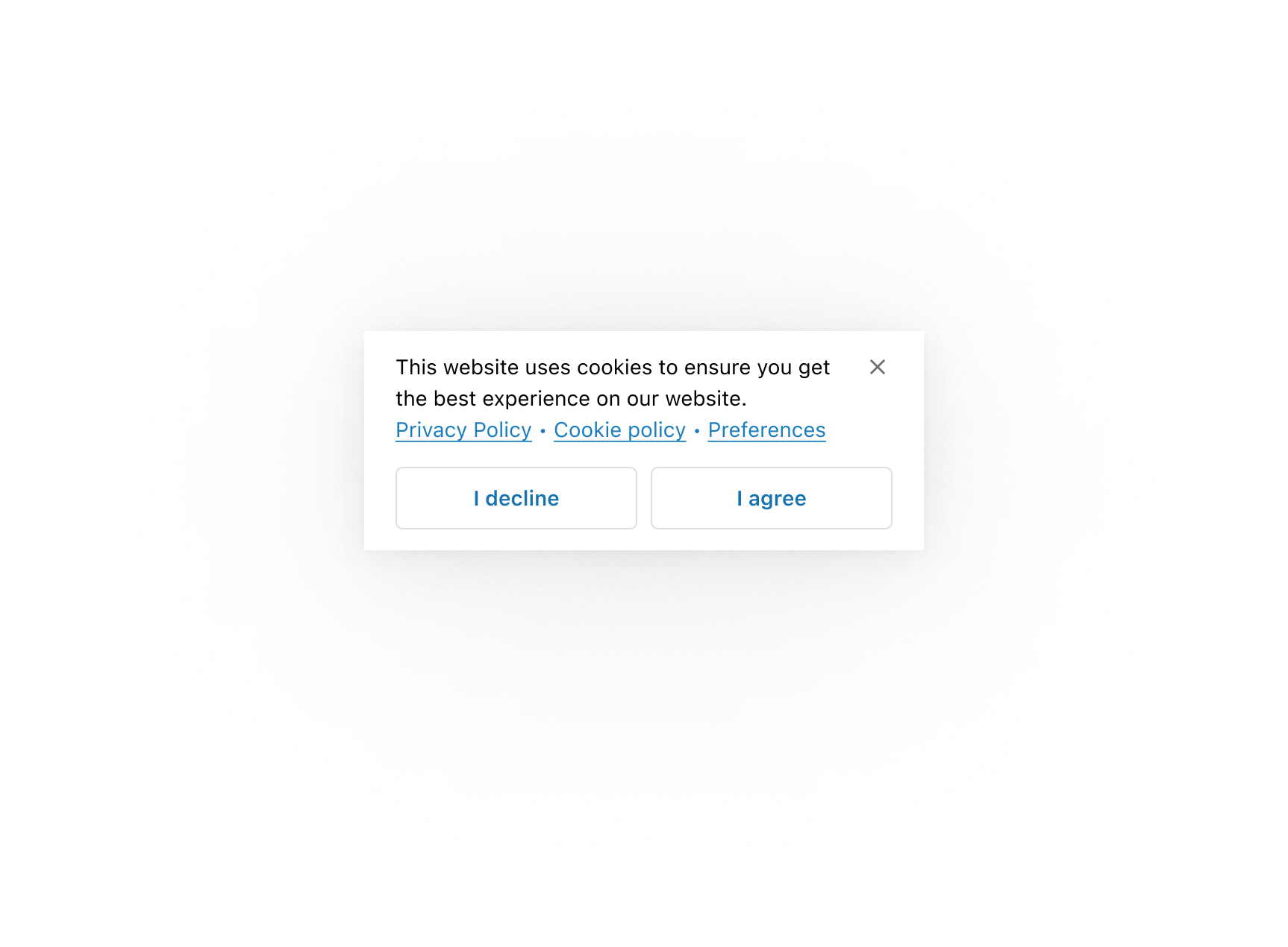
);In order to save space in the action slot, secondary actions can be placed in the content area.
Preferences button is in the description as a link
Preferences button is in the description as a link
React
import {
  reactExtension,
  Button,
  BlockStack,
  Link,
  Sheet,
  TextBlock,
  useCustomerPrivacy,
} from '@shopify/ui-extensions-react/checkout';

export default reactExtension(
  'purchase.checkout.footer.render-after',
  () => <Extension />,
);

function Extension() {
  const {shouldShowBanner} = useCustomerPrivacy();

  const sheetId = 'sheet-consent';

  return (
    <Sheet
      id={sheetId}
      accessibilityLabel="A sheet that collects privacy consent preferences"
      defaultOpen={shouldShowBanner}
      primaryAction={
        <>
          <Button
            kind="secondary"
            onPress={() => {}}
          >
            I decline
          </Button>
          <Button
            kind="secondary"
            onPress={() => {}}
          >
            I agree
          </Button>
        </>
      }
    >
      <BlockStack spacing="none">
        <TextBlock>
          This website uses cookies to ensure you
          get the best experience on our website.
        </TextBlock>
        <TextBlock>
          <Link>Privacy Policy</Link> ‧{' '}
          <Link>Cookie Policy</Link> ‧{' '}
          <Link
          // overlay: <Modal>Preferences modal...</Modal>,
          >
            Preferences
          </Link>
        </TextBlock>
      </BlockStack>
    </Sheet>
  );
}
JavaScript
import {
  extension,
  Sheet,
  Button,
  Link,
  TextBlock,
  BlockStack,
} from '@shopify/ui-extensions/checkout';

export default extension(
  'purchase.checkout.footer.render-after',
  (root, {customerPrivacy}) => {
    const primaryFragment = root.createFragment();

    const declineButton = root.createComponent(
      Button,
      {
        kind: 'secondary',
        onPress: () => {},
      },
      'I decline',
    );

    const agreeButton = root.createComponent(
      Button,
      {
        kind: 'secondary',
        onPress: () => {},
      },
      'I agree',
    );

    primaryFragment.appendChild(declineButton);
    primaryFragment.appendChild(agreeButton);

    const sheetId = 'sheet-consent';
    const sheet = root.createComponent(Sheet, {
      id: sheetId,
      accessibilityLabel:
        'A sheet that collects privacy consent preferences',
      defaultOpen:
        customerPrivacy.current.shouldShowBanner,
      primaryAction: primaryFragment,
    });

    const textBlock = root.createComponent(
      TextBlock,
      null,
      'This website uses cookies to ensure you get the best experience on our website.',
    );

    const linkBlock = root.createComponent(
      TextBlock,
      null,
      [
        root.createComponent(
          Link,
          null,
          'Privacy Policy',
        ),
        ' ‧ ',
        root.createComponent(
          Link,
          null,
          'Cookie Policy',
        ),
        ' ‧ ',
        root.createComponent(
          Link,
          {
            // overlay: <Modal>Preferences modal...</Modal>,,
          },
          'Preferences',
        ),
      ],
    );

    const blockStack = root.createComponent(
      BlockStack,
      {spacing: 'none'},
      [textBlock, linkBlock],
    );
    sheet.appendChild(blockStack);
    root.appendChild(sheet);
  },
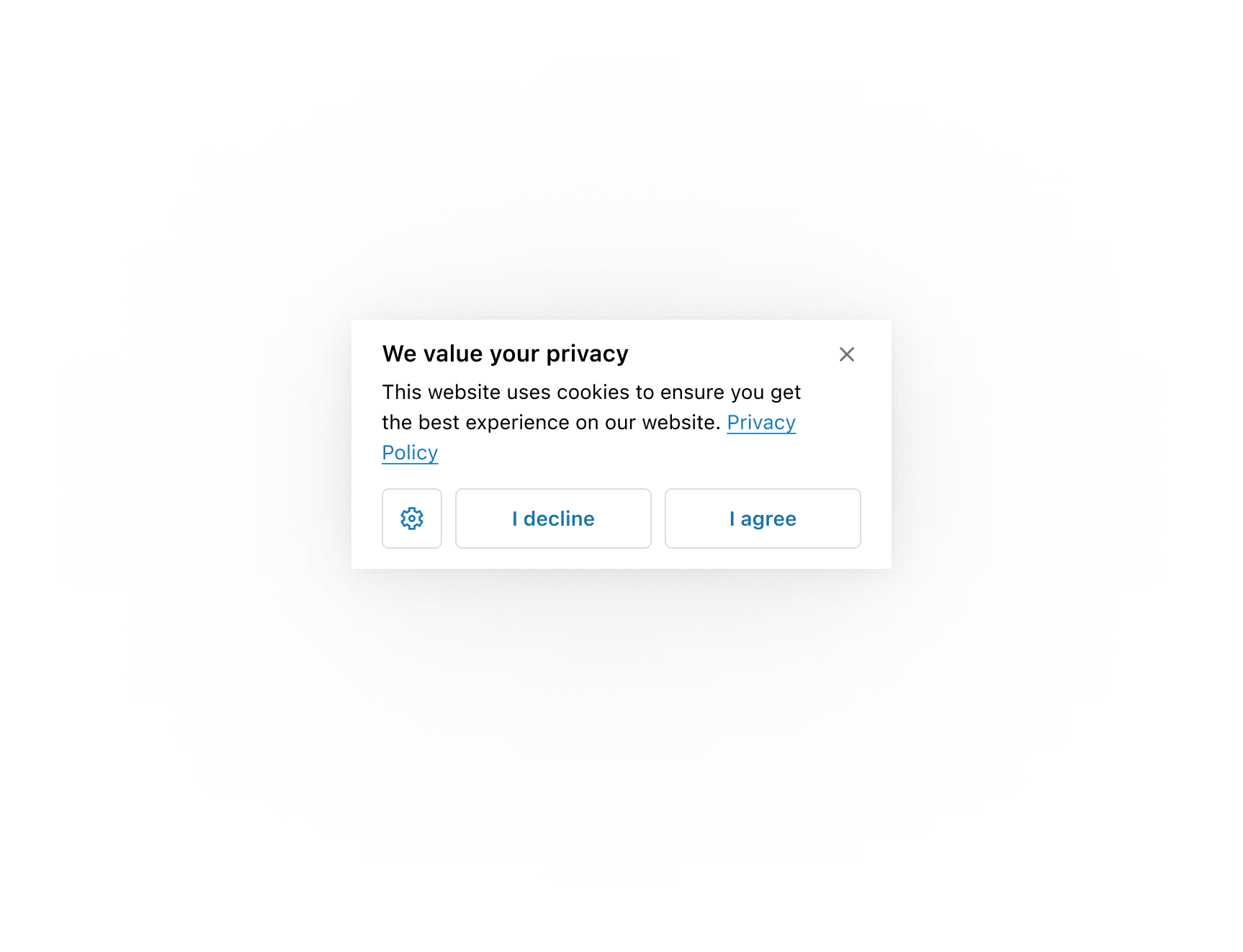
);An icon button can be used in the secondary actions area to allow for more space for the primary actions.
Icon button used for preferences
Icon button used for preferences
React
import {
  reactExtension,
  Button,
  Link,
  Icon,
  Sheet,
  TextBlock,
  useCustomerPrivacy,
} from '@shopify/ui-extensions-react/checkout';

export default reactExtension(
  'purchase.checkout.footer.render-after',
  () => <Extension />,
);

function Extension() {
  const {shouldShowBanner} = useCustomerPrivacy();

  return (
    <Sheet
      accessibilityLabel="A sheet that collects privacy consent preferences"
      heading="We value your privacy"
      defaultOpen={shouldShowBanner}
      primaryAction={
        <>
          <Button
            kind="secondary"
            onPress={() => {}}
          >
            I decline
          </Button>
          <Button
            kind="secondary"
            onPress={() => {}}
          >
            I agree
          </Button>
        </>
      }
      secondaryAction={
        <Button
          kind="secondary"
          onPress={() => {}}
        >
          <Icon source="settings" />
        </Button>
      }
    >
      <TextBlock>
        This website uses cookies to ensure you
        get the best experience on our website.{' '}
        <Link>Privacy Policy</Link>.
      </TextBlock>
    </Sheet>
  );
}
JavaScript
import {
  extension,
  Sheet,
  Button,
  Link,
  TextBlock,
  Icon,
} from '@shopify/ui-extensions/checkout';

export default extension(
  'purchase.checkout.footer.render-after',
  (root, {customerPrivacy}) => {
    const primaryFragment = root.createFragment();
    const secondaryFragment =
      root.createFragment();

    const declineButton = root.createComponent(
      Button,
      {
        kind: 'secondary',
        onPress: () => {},
      },
      'I decline',
    );

    const agreeButton = root.createComponent(
      Button,
      {
        kind: 'secondary',
        onPress: () => {},
      },
      'I agree',
    );

    const preferencesButton =
      root.createComponent(
        Button,
        {
          kind: 'secondary',
        },
        root.createComponent(Icon, {
          source: 'settings',
        }),
      );

    primaryFragment.appendChild(declineButton);
    primaryFragment.appendChild(agreeButton);
    secondaryFragment.appendChild(
      preferencesButton,
    );

    const sheet = root.createComponent(Sheet, {
      accessibilityLabel:
        'A sheet that collects privacy consent preferences',
      defaultOpen:
        customerPrivacy.current.shouldShowBanner,
      primaryAction: primaryFragment,
      secondaryAction: secondaryFragment,
    });

    const textBlock = root.createComponent(
      TextBlock,
      null,
      [
        'This website uses cookies to ensure you get the best experience on our website. ',
        root.createComponent(
          Link,
          null,
          'Privacy Policy',
        ),
      ],
    );

    sheet.appendChild(textBlock);
    root.appendChild(sheet);
  },
);
Anchor to Using layout component in the description Using layout component in the description
The description can take in layout components to allow for different types of content to be structured in specific ways.
Using layout component in the description
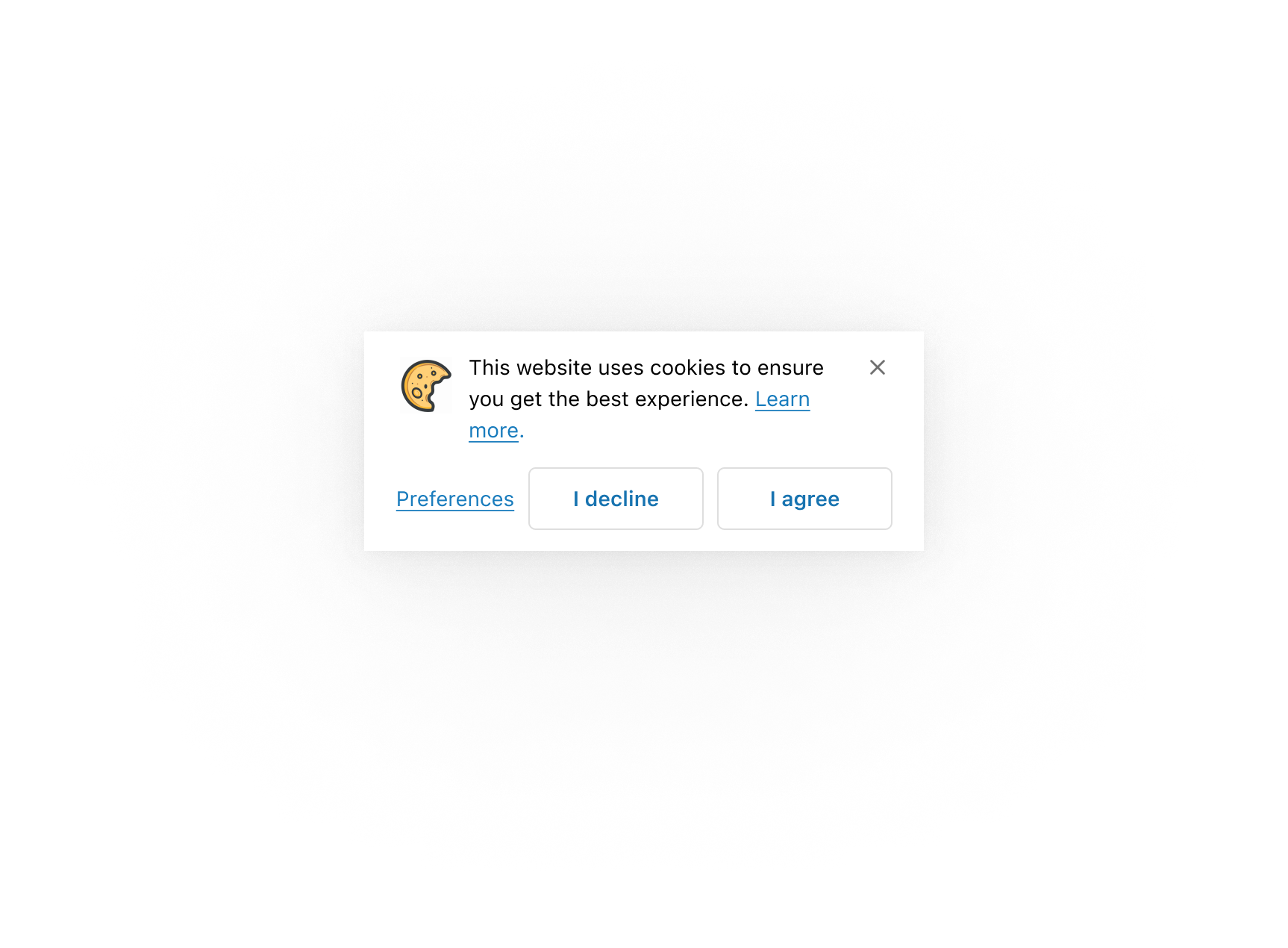
Using layout component in the description
React
import {
  reactExtension,
  Button,
  Link,
  Image,
  InlineLayout,
  Sheet,
  TextBlock,
  useCustomerPrivacy,
} from '@shopify/ui-extensions-react/checkout';

export default reactExtension(
  'purchase.checkout.footer.render-after',
  () => <Extension />,
);

function Extension() {
  const {shouldShowBanner} = useCustomerPrivacy();

  return (
    <Sheet
      accessibilityLabel="A sheet that collects privacy consent preferences"
      defaultOpen={shouldShowBanner}
      primaryAction={
        <>
          <Button
            kind="secondary"
            onPress={() => {}}
          >
            I decline
          </Button>
          <Button
            kind="secondary"
            onPress={() => {}}
          >
            I agree
          </Button>
        </>
      }
      secondaryAction={
        <Button kind="plain" onPress={() => {}}>
          Preferences
        </Button>
      }
    >
      <InlineLayout
        padding="none"
        spacing="small100"
        columns={[38, 'fill']}
      >
        <Image source="https://yourawesomeimage.com" />
        <TextBlock>
          This website uses cookies to ensure you
          get the best experience on our website.{' '}
          <Link>Learn more</Link>.
        </TextBlock>
      </InlineLayout>
    </Sheet>
  );
}
JavaScript
import {
  extension,
  Sheet,
  Button,
  Link,
  TextBlock,
  Image,
  InlineLayout,
} from '@shopify/ui-extensions/checkout';

export default extension(
  'purchase.checkout.footer.render-after',
  (root, {customerPrivacy}) => {
    const primaryFragment = root.createFragment();
    const secondaryFragment =
      root.createFragment();

    const declineButton = root.createComponent(
      Button,
      {
        kind: 'secondary',
        onPress: () => {},
      },
      'I decline',
    );

    const agreeButton = root.createComponent(
      Button,
      {
        kind: 'secondary',
        onPress: () => {},
      },
      'I agree',
    );

    const preferencesButton =
      root.createComponent(
        Button,
        {
          kind: 'plain',
        },
        'Preferences',
      );

    primaryFragment.appendChild(declineButton);
    primaryFragment.appendChild(agreeButton);
    secondaryFragment.appendChild(
      preferencesButton,
    );

    const sheet = root.createComponent(Sheet, {
      accessibilityLabel:
        'A sheet that collects privacy consent preferences',
      defaultOpen:
        customerPrivacy.current.shouldShowBanner,
      primaryAction: primaryFragment,
      secondaryAction: secondaryFragment,
    });

    const textBlock = root.createComponent(
      TextBlock,
      null,
      [
        'This website uses cookies to ensure you get the best experience on our website.',
        root.createComponent(
          Link,
          null,
          'Learn more',
        ),
      ],
    );

    const inlineLayout = root.createComponent(
      InlineLayout,
      {
        padding: 'none',
        spacing: 'small100',
        columns: [38, 'fill'],
      },
      [
        root.createComponent(Image, {
          source: 'https://yourawesomeimage.com',
        }),
        textBlock,
      ],
    );

    sheet.appendChild(inlineLayout);
    root.appendChild(sheet);
  },
);
Anchor to Shopify-controlled surfacesShopify-controlled surfaces
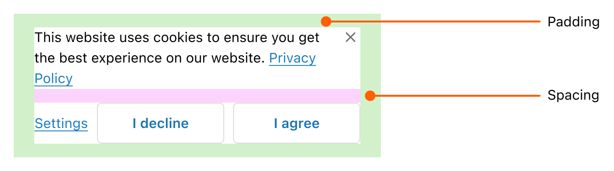
To prevent disruptions during checkout, we maintain strict design control over key areas of the Sheet component. These Shopify-controlled elements include the following.
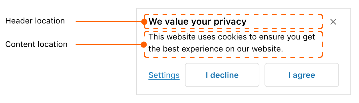
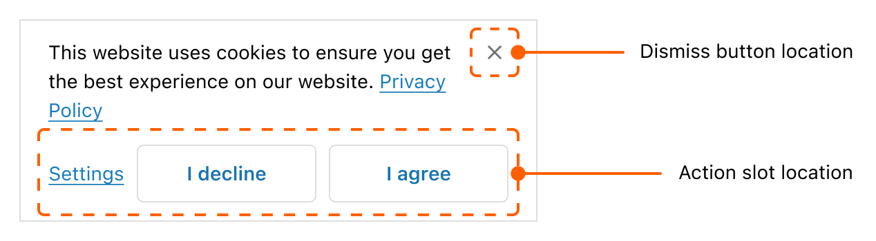
Locations of elements
The Sheet elements (header, content, action buttons, and dismiss button) are strategically positioned and sized to present vital information upfront.
Padding and spacing
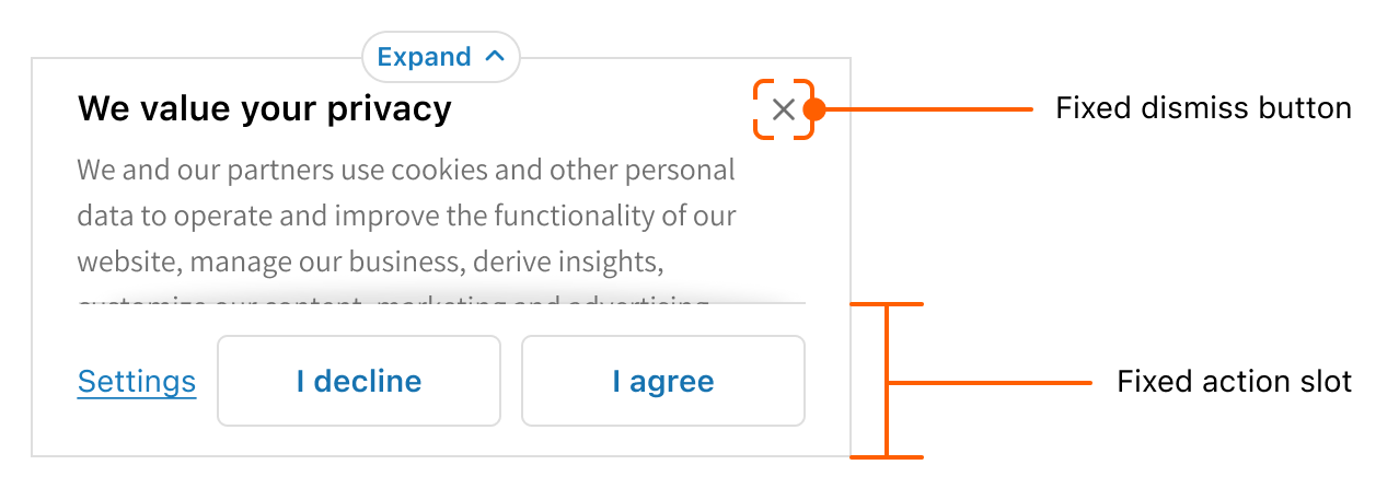
Maximum height
To balance buyer attention and task completion, a maximum height is set for the Sheet component.
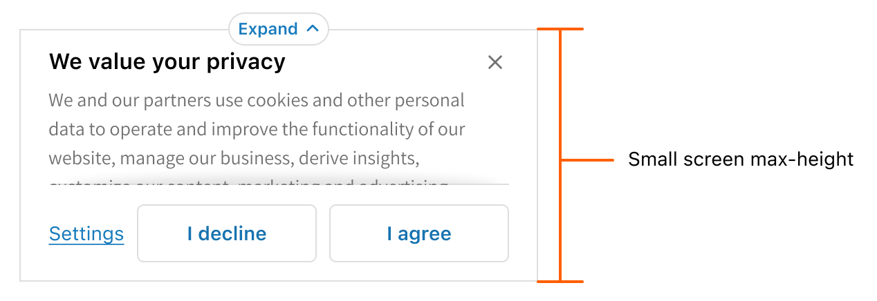
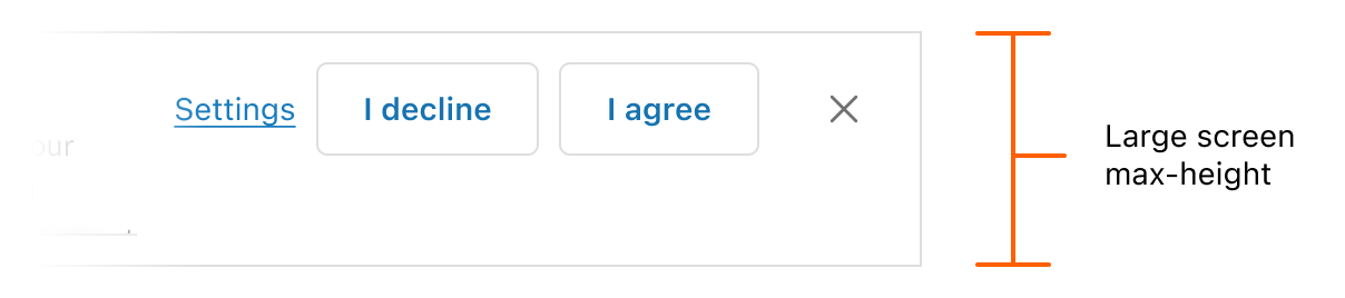
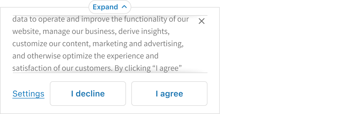
When content pushes the sheet to exceed this limit, the following UI behaviors are triggered:
Heading and content are scrollable
Expand pill appears to allow buyers to view the entire content
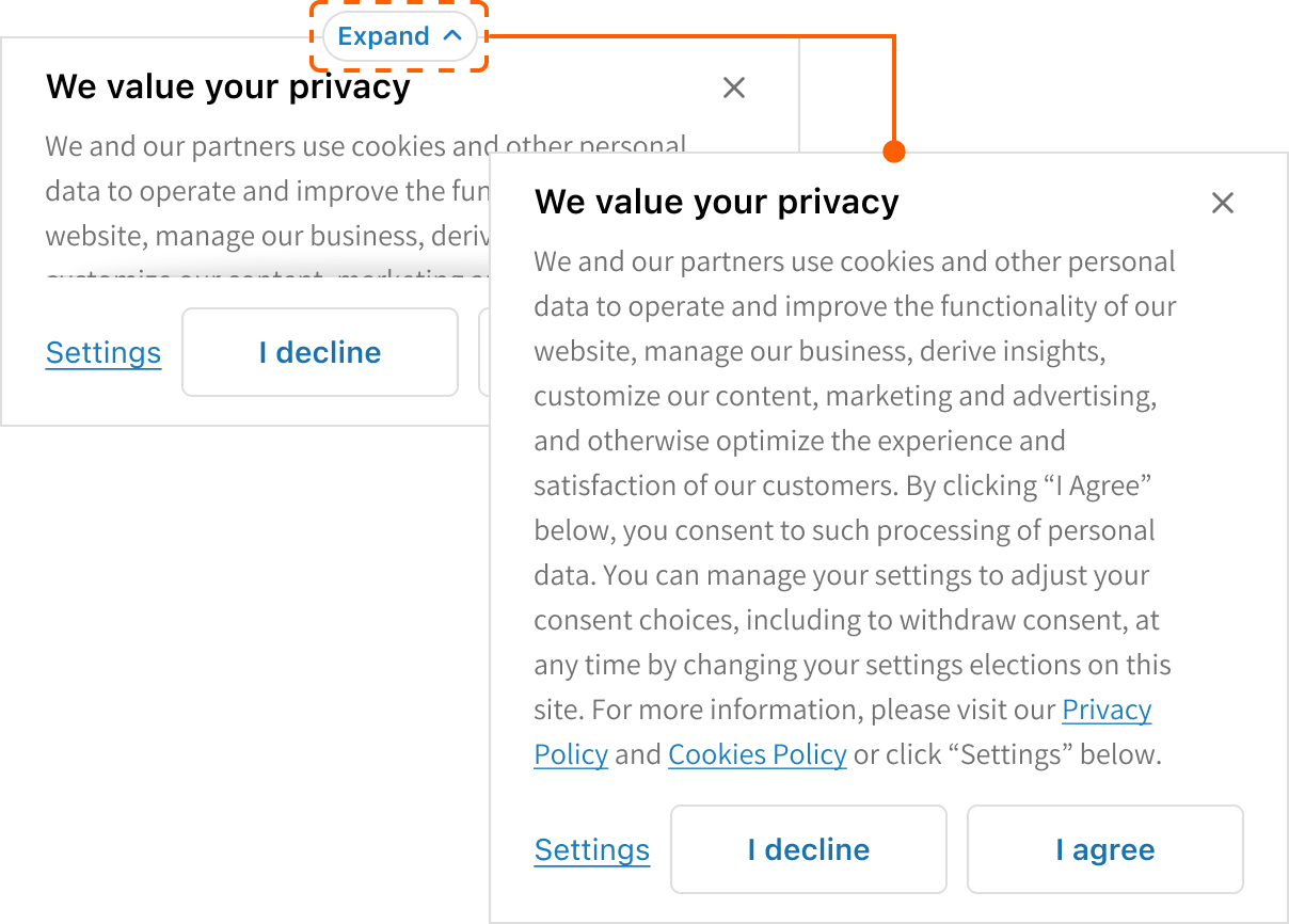
Actions slot and dismiss button remain fixed
Anchor to Privacy consent requirementsPrivacy consent requirements
Content
For the best buyer experience, ensure content is brief and to the point.
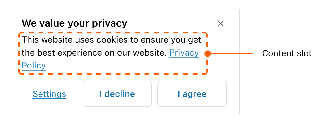
Various strategies can be employed to avoid content scrolling.
Use short content

Use small text size
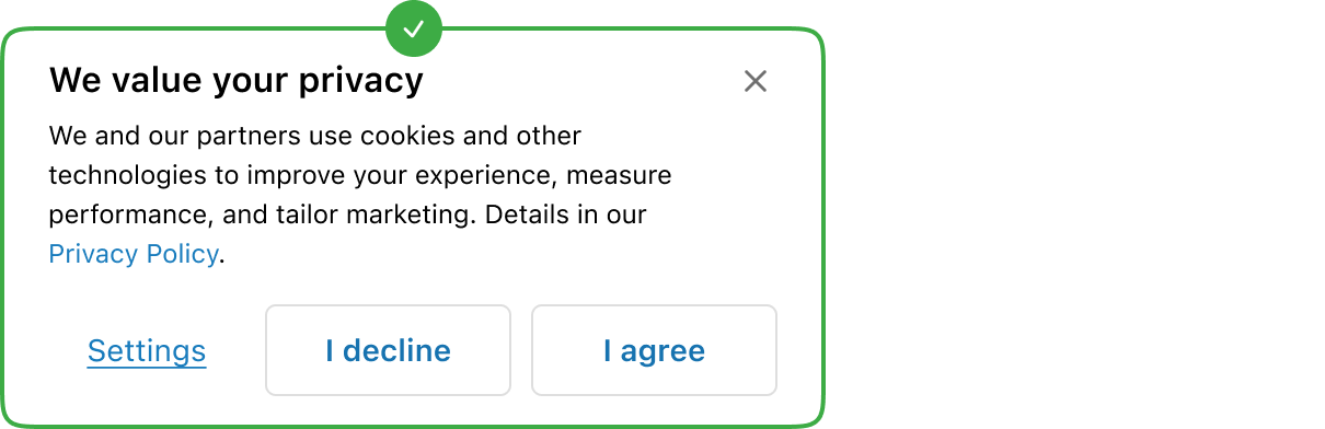
Remove the header

Actions slot
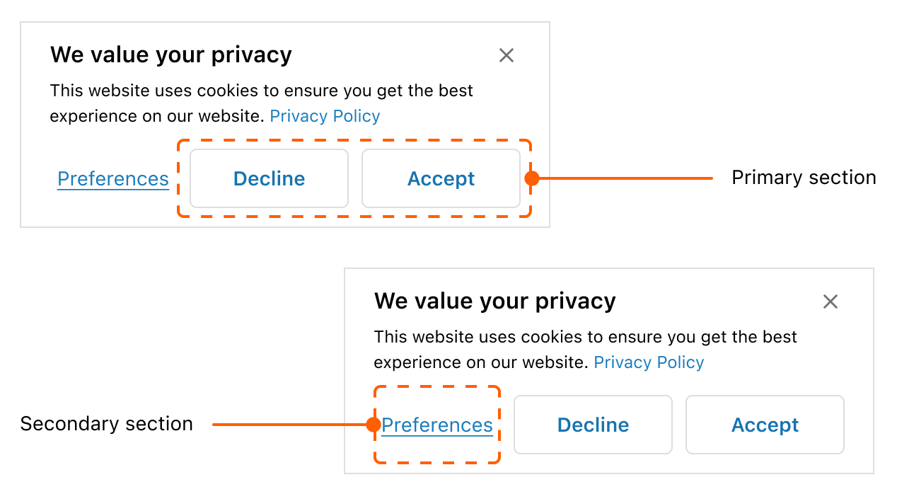
The actions slot allows buyers to make decisions and is split into primary and secondary sections.
Primary section
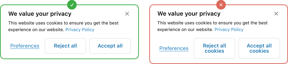
Contains primary actions for buyer decisions on the sheet’s prompt. Up to two buttons are allowed. Keep the button’s content brief so that it doesn’t wrap to more than one line.
Secondary section
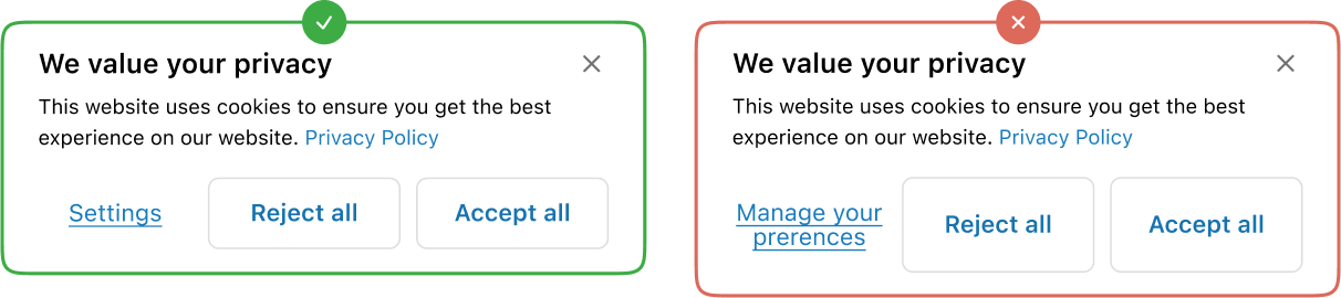
Contains action that is unrelated to the sheet’s prompt. Only one button is allowed. A modal can be activated when engaging with the secondary action. Keep the button’s content brief so that it doesn’t wrap to more than one line.
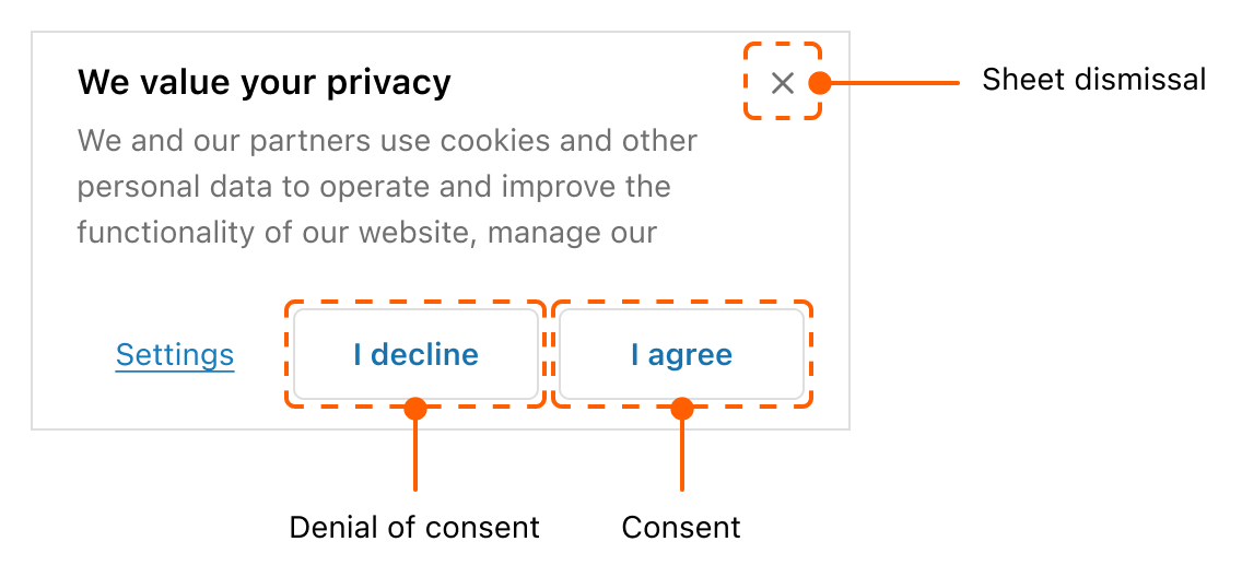
Consent, denial of consent, and sheet dismissal
Consent
When a buyer expresses consent by pressing the acceptance button, cookies load and the sheet doesn't re-appear on refresh.
Denial of consent
When a buyer expresses denial of consent by pressing the rejection button, cookies don't load and the sheet doesn't re-appear on refresh.
Sheet dismissal
When a buyer neither grants nor denies consent by pressing the dismiss button, cookies don't load and the sheet re-appears on refresh.