Version 2025-07 is the last API version to support React-based UI components. Later versions use Polaris web components, native UI elements with built-in accessibility, better performance, and consistent styling with Shopify's design system. Check out the upgrade guide to upgrade your extension and avoid being blocked from updating your extension after October 1st 2026.
Badge
Use badges to highlight contextual information, like a label or a status, about an object. An object can be anything that has a status or label attributed to it, like an order or subscription.
Supported targets
- Checkout::Actions::Render
Before - Checkout::Cart
Line Details::Render After - Checkout::Cart
Lines::Render After - Checkout::Contact::Render
After - Checkout::Customer
Information::Render After - Checkout::Delivery
Address::Render Before - Checkout::Dynamic::Render
- Checkout::Pickup
Locations::Render After - Checkout::Pickup
Locations::Render Before - Checkout::Pickup
Points::Render After - Checkout::Pickup
Points::Render Before - Checkout::Reductions::Render
After - Checkout::Reductions::Render
Before - Checkout::Shipping
Method Details::Render After - Checkout::Shipping
Method Details::Render Expanded - Checkout::Shipping
Methods::Render After - Checkout::Shipping
Methods::Render Before - Checkout::Thank
You::Cart Line Details::Render After - Checkout::Thank
You::Cart Lines::Render After - Checkout::Thank
You::Customer Information::Render After - Checkout::Thank
You::Dynamic::Render - purchase.
checkout. actions. render-before - purchase.
checkout. block. render - purchase.
checkout. cart-line-item. render-after - purchase.
checkout. cart-line-list. render-after - purchase.
checkout. contact. render-after - purchase.
checkout. delivery-address. render-after - purchase.
checkout. delivery-address. render-before - purchase.
checkout. footer. render-after - purchase.
checkout. header. render-after - purchase.
checkout. payment-method-list. render-after - purchase.
checkout. payment-method-list. render-before - purchase.
checkout. pickup-location-list. render-after - purchase.
checkout. pickup-location-list. render-before - purchase.
checkout. pickup-location-option-item. render-after - purchase.
checkout. pickup-point-list. render-after - purchase.
checkout. pickup-point-list. render-before - purchase.
checkout. reductions. render-after - purchase.
checkout. reductions. render-before - purchase.
checkout. shipping-option-item. details. render - purchase.
checkout. shipping-option-item. render-after - purchase.
checkout. shipping-option-list. render-after - purchase.
checkout. shipping-option-list. render-before - purchase.
thank-you. announcement. render - purchase.
thank-you. block. render - purchase.
thank-you. cart-line-item. render-after - purchase.
thank-you. cart-line-list. render-after - purchase.
thank-you. customer-information. render-after - purchase.
thank-you. footer. render-after - purchase.
thank-you. header. render-after
Supported targets
- Checkout::Actions::Render
Before - Checkout::Cart
Line Details::Render After - Checkout::Cart
Lines::Render After - Checkout::Contact::Render
After - Checkout::Customer
Information::Render After - Checkout::Delivery
Address::Render Before - Checkout::Dynamic::Render
- Checkout::Pickup
Locations::Render After - Checkout::Pickup
Locations::Render Before - Checkout::Pickup
Points::Render After - Checkout::Pickup
Points::Render Before - Checkout::Reductions::Render
After - Checkout::Reductions::Render
Before - Checkout::Shipping
Method Details::Render After - Checkout::Shipping
Method Details::Render Expanded - Checkout::Shipping
Methods::Render After - Checkout::Shipping
Methods::Render Before - Checkout::Thank
You::Cart Line Details::Render After - Checkout::Thank
You::Cart Lines::Render After - Checkout::Thank
You::Customer Information::Render After - Checkout::Thank
You::Dynamic::Render - purchase.
checkout. actions. render-before - purchase.
checkout. block. render - purchase.
checkout. cart-line-item. render-after - purchase.
checkout. cart-line-list. render-after - purchase.
checkout. contact. render-after - purchase.
checkout. delivery-address. render-after - purchase.
checkout. delivery-address. render-before - purchase.
checkout. footer. render-after - purchase.
checkout. header. render-after - purchase.
checkout. payment-method-list. render-after - purchase.
checkout. payment-method-list. render-before - purchase.
checkout. pickup-location-list. render-after - purchase.
checkout. pickup-location-list. render-before - purchase.
checkout. pickup-location-option-item. render-after - purchase.
checkout. pickup-point-list. render-after - purchase.
checkout. pickup-point-list. render-before - purchase.
checkout. reductions. render-after - purchase.
checkout. reductions. render-before - purchase.
checkout. shipping-option-item. details. render - purchase.
checkout. shipping-option-item. render-after - purchase.
checkout. shipping-option-list. render-after - purchase.
checkout. shipping-option-list. render-before - purchase.
thank-you. announcement. render - purchase.
thank-you. block. render - purchase.
thank-you. cart-line-item. render-after - purchase.
thank-you. cart-line-list. render-after - purchase.
thank-you. customer-information. render-after - purchase.
thank-you. footer. render-after - purchase.
thank-you. header. render-after
Anchor to BadgePropsBadge
Use badges to highlight contextual information, like a label or a status, about an object. An object can be anything that has a status or label attributed to it, like an order or subscription.
- Anchor to accessibilityLabelaccessibility
Labelaccessibility Label stringstring A label that describes the purpose or contents of the element. When set, it will announced to buyers using assistive technologies.
- Anchor to accessibilityVisibilityaccessibility
Visibilityaccessibility Visibility AccessibilityVisibilityAccessibilityVisibility Changes the visibility of the element to assistive technologies.
hiddenhides the component from assistive technology (for example, a screen reader) but remains visually visible.- Anchor to iconiconiconIconSourceIconSource
The name of the icon to be displayed in the badge.
- Anchor to iconPositionicon
Positionicon Position 'start' | 'end''start' | 'end'Default: 'start'Default: 'start' The position of the icon in relation to the text.
- Anchor to sizesizesize'small' | 'base''small' | 'base'Default: 'base'Default: 'base'
The size of the badge being rendered.
- Anchor to tonetonetoneToneToneDefault: 'default'Default: 'default'
The tone of the badge being rendered. Indicates its level of importance, where subdued provides the least emphasis, while critical indicates the highest level of urgency.
- Anchor to visibilityvisibilityvisibilityVisibilityVisibility
Changes the visibility of the element.
hiddenvisually hides the component while keeping it accessible to assistive technology, such as screen readers. Hidden elements don't take any visual space contrary to CSS visibility: hidden;
AccessibilityVisibility
'hidden'IconSource
The name of the icon to display. Each value maps to a specific pictogram from the icon set.
'arrowLeft' | 'arrowRight' | 'arrowUp' | 'arrowUpRight' | 'arrowDown' | 'bag' | 'bullet' | 'calendar' | 'camera' | 'caretDown' | 'cart' | 'cashDollar' | 'categories' | 'checkmark' | 'chevronLeft' | 'chevronRight' | 'chevronUp' | 'chevronDown' | 'clipboard' | 'clock' | 'close' | 'creditCard' | 'critical' | 'delete' | 'delivered' | 'delivery' | 'disabled' | 'discount' | 'email' | 'error' | 'errorFill' | 'external' | 'filter' | 'geolocation' | 'gift' | 'giftFill' | 'grid' | 'hamburger' | 'hollowCircle' | 'horizontalDots' | 'image' | 'info' | 'infoFill' | 'list' | 'lock' | 'magnify' | 'map' | 'marker' | 'minus' | 'mobile' | 'note' | 'orderBox' | 'pen' | 'plus' | 'profile' | 'question' | 'questionFill' | 'reorder' | 'reset' | 'return' | 'savings' | 'settings' | 'star' | 'starFill' | 'starHalf' | 'store' | 'success' | 'truck' | 'upload' | 'verticalDots' | 'warning' | 'warningFill'Tone
'default' | 'critical' | 'subdued'Visibility
'hidden'Anchor to ExamplesExamples
Anchor to Basic BadgeBasic Badge
Basic Badge

Basic Badge
React
import {
  reactExtension,
  Badge,
} from '@shopify/ui-extensions-react/checkout';

export default reactExtension(
  'purchase.checkout.block.render',
  () => <Extension />,
);

function Extension() {
  return <Badge>Available</Badge>;
}
JS
import {extension, Badge} from '@shopify/ui-extensions/checkout';

export default extension('purchase.checkout.block.render', (root) => {
  const badge = root.createComponent(Badge, undefined, 'Available');

  root.appendChild(badge);
});
Anchor to Using the Badge component as a status indicatorUsing the Badge component as a status indicator
Using the Badge component as a status indicator
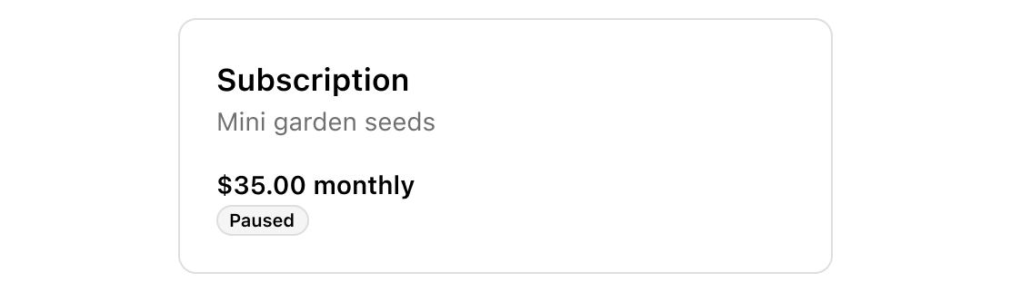
Using the Badge component as a status indicator
React
import {
  reactExtension,
  Badge,
  BlockStack,
  Text,
} from '@shopify/ui-extensions-react/checkout';

export default reactExtension(
  'purchase.checkout.block.render',
  () => <Extension />,
);

function Extension() {
  return (
    <BlockStack
      border="base"
      padding="large200"
      spacing="base"
      borderRadius="large"
    >
      <BlockStack spacing="none">
        <Text size="large" emphasis="bold">
          Subscription
        </Text>
        <Text>Mini garden seeds</Text>
      </BlockStack>
      <BlockStack
        spacing="none"
        inlineAlignment="start"
      >
        <Text emphasis="bold">
          $35.00 monthly
        </Text>
        <Badge tone="subdued">Paused</Badge>
      </BlockStack>
    </BlockStack>
  );
}
JS
import {
  extension,
  Badge,
  BlockStack,
  Text,
} from '@shopify/ui-extensions/checkout';

export default extension('purchase.checkout.block.render', (root) => {
  const container = root.createComponent(
    BlockStack,
    {
      border: 'base',
      padding: 'large200',
      spacing: 'base',
      borderRadius: 'large',
    },
    [
      root.createComponent(BlockStack, {spacing: 'none'}, [
        root.createComponent(
          Text,
          {size: 'large', emphasis: 'bold'},
          'Subscription',
        ),
        root.createComponent(Text, undefined, 'Mini garden seeds'),
      ]),

      root.createComponent(
        BlockStack,
        {spacing: 'none', inlineAlignment: 'start'},
        [
          root.createComponent(Text, {emphasis: 'bold'}, '$35.00 monthly'),
          root.createComponent(Badge, {tone: 'subdued'}, 'Paused'),
        ],
      ),
    ],
  );

  root.appendChild(container);
});
Anchor to Best practicesBest practices
-
Keep badge labels short: Aim for one word per badge. For complex states that require two words, use sentence case.
-
Use descriptive adjectives or past-tense verbs: Labels like "Paid", "Free", "Expired", or "Processing" communicate status clearly.
-
Match tone to urgency:
subduedprovides the least emphasis, whilecriticalindicates the highest level of urgency. Reservecriticalfor statuses that require immediate attention. -
Provide an accessibility label for context: Write a useful
accessibilityLabelso that buyers using assistive technology can access the full meaning of the badge. Forcriticalbadges, include urgency information like "Warning" or "Alert". -
Always attribute badges to an object: A badge should appear alongside the item it describes, such as an order, subscription, or product.