Version 2025-07 is the last API version to support React-based UI components. Later versions use Polaris web components, native UI elements with built-in accessibility, better performance, and consistent styling with Shopify's design system. Check out the upgrade guide to upgrade your extension and avoid being blocked from updating your extension after October 1st 2026.
Map marker
The MapMarker component represents a specific location or point of interest on a map.
Supported targets
- Checkout::Actions::Render
Before - Checkout::Cart
Line Details::Render After - Checkout::Cart
Lines::Render After - Checkout::Contact::Render
After - Checkout::Customer
Information::Render After - Checkout::Delivery
Address::Render Before - Checkout::Dynamic::Render
- Checkout::Pickup
Locations::Render After - Checkout::Pickup
Locations::Render Before - Checkout::Pickup
Points::Render After - Checkout::Pickup
Points::Render Before - Checkout::Reductions::Render
After - Checkout::Reductions::Render
Before - Checkout::Shipping
Method Details::Render After - Checkout::Shipping
Method Details::Render Expanded - Checkout::Shipping
Methods::Render After - Checkout::Shipping
Methods::Render Before - Checkout::Thank
You::Cart Line Details::Render After - Checkout::Thank
You::Cart Lines::Render After - Checkout::Thank
You::Customer Information::Render After - Checkout::Thank
You::Dynamic::Render - purchase.
checkout. actions. render-before - purchase.
checkout. block. render - purchase.
checkout. cart-line-item. render-after - purchase.
checkout. cart-line-list. render-after - purchase.
checkout. contact. render-after - purchase.
checkout. delivery-address. render-after - purchase.
checkout. delivery-address. render-before - purchase.
checkout. footer. render-after - purchase.
checkout. header. render-after - purchase.
checkout. payment-method-list. render-after - purchase.
checkout. payment-method-list. render-before - purchase.
checkout. pickup-location-list. render-after - purchase.
checkout. pickup-location-list. render-before - purchase.
checkout. pickup-location-option-item. render-after - purchase.
checkout. pickup-point-list. render-after - purchase.
checkout. pickup-point-list. render-before - purchase.
checkout. reductions. render-after - purchase.
checkout. reductions. render-before - purchase.
checkout. shipping-option-item. details. render - purchase.
checkout. shipping-option-item. render-after - purchase.
checkout. shipping-option-list. render-after - purchase.
checkout. shipping-option-list. render-before - purchase.
thank-you. announcement. render - purchase.
thank-you. block. render - purchase.
thank-you. cart-line-item. render-after - purchase.
thank-you. cart-line-list. render-after - purchase.
thank-you. customer-information. render-after - purchase.
thank-you. footer. render-after - purchase.
thank-you. header. render-after
Supported targets
- Checkout::Actions::Render
Before - Checkout::Cart
Line Details::Render After - Checkout::Cart
Lines::Render After - Checkout::Contact::Render
After - Checkout::Customer
Information::Render After - Checkout::Delivery
Address::Render Before - Checkout::Dynamic::Render
- Checkout::Pickup
Locations::Render After - Checkout::Pickup
Locations::Render Before - Checkout::Pickup
Points::Render After - Checkout::Pickup
Points::Render Before - Checkout::Reductions::Render
After - Checkout::Reductions::Render
Before - Checkout::Shipping
Method Details::Render After - Checkout::Shipping
Method Details::Render Expanded - Checkout::Shipping
Methods::Render After - Checkout::Shipping
Methods::Render Before - Checkout::Thank
You::Cart Line Details::Render After - Checkout::Thank
You::Cart Lines::Render After - Checkout::Thank
You::Customer Information::Render After - Checkout::Thank
You::Dynamic::Render - purchase.
checkout. actions. render-before - purchase.
checkout. block. render - purchase.
checkout. cart-line-item. render-after - purchase.
checkout. cart-line-list. render-after - purchase.
checkout. contact. render-after - purchase.
checkout. delivery-address. render-after - purchase.
checkout. delivery-address. render-before - purchase.
checkout. footer. render-after - purchase.
checkout. header. render-after - purchase.
checkout. payment-method-list. render-after - purchase.
checkout. payment-method-list. render-before - purchase.
checkout. pickup-location-list. render-after - purchase.
checkout. pickup-location-list. render-before - purchase.
checkout. pickup-location-option-item. render-after - purchase.
checkout. pickup-point-list. render-after - purchase.
checkout. pickup-point-list. render-before - purchase.
checkout. reductions. render-after - purchase.
checkout. reductions. render-before - purchase.
checkout. shipping-option-item. details. render - purchase.
checkout. shipping-option-item. render-after - purchase.
checkout. shipping-option-list. render-after - purchase.
checkout. shipping-option-list. render-before - purchase.
thank-you. announcement. render - purchase.
thank-you. block. render - purchase.
thank-you. cart-line-item. render-after - purchase.
thank-you. cart-line-list. render-after - purchase.
thank-you. customer-information. render-after - purchase.
thank-you. footer. render-after - purchase.
thank-you. header. render-after
MapMarker represents a specific location or point of interest on a map.
- Anchor to accessibilityLabelaccessibility
Labelaccessibility Label stringstringrequiredrequired A label that describes the purpose or contents of the marker. It will be announced to users using assistive technologies and will provide them with more context.
- Anchor to latitudelatitudelatitudenumbernumberrequiredrequired
The latitude of the marker, in degrees. Valid values range from -90 (south pole) to 90 (north pole).
- Anchor to longitudelongitudelongitudenumbernumberrequiredrequired
The longitude of the marker, in degrees. Valid values range from -180 (west) to 180 (east).
- Anchor to blockSizeblock
Sizeblock Size numbernumber The block size (height in horizontal writing modes) of the custom icon, in pixels. Only used when the
iconproperty is set.- Anchor to clusterableclusterableclusterablebooleanboolean
A flag that indicates whether the marker can be grouped into clusters when the map is zoomed out. When
true, nearby markers are visually combined into a single cluster icon to reduce visual clutter at lower zoom levels.- Anchor to iconiconiconstringstring
The URL of a custom icon image to display for the marker. When set, the default marker pin is replaced with the provided image. Use
andto control the icon's dimensions.- Anchor to inlineSizeinline
Sizeinline Size numbernumber The inline size (width in horizontal writing modes) of the custom icon, in pixels. Only used when the
iconproperty is set.- Anchor to onPresson
Presson Press () => void() => void A callback that fires when the user presses (clicks or taps) the marker. The event does not propagate to the parent map's
handler.- Anchor to overlayoverlayoverlayRemoteFragmentRemoteFragment
An overlay component to render when the user interacts with the component.
Anchor to ExamplesExamples
Anchor to Basic MapMarkerBasic Map
Basic MapMarker
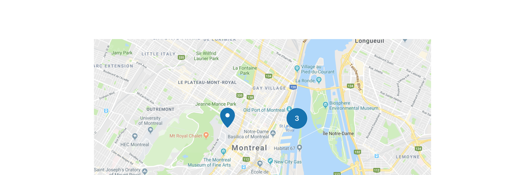
Basic MapMarker
React
import {
  reactExtension,
  Map,
  MapMarker,
} from '@shopify/ui-extensions-react/checkout';

export default reactExtension(
  'purchase.checkout.block.render',
  () => <Extension />,
);

function Extension() {
  return (
    <Map
      apiKey="YOUR_GOOGLE_MAPS_API_KEY"
      latitude={-28.024}
      longitude={140.887}
      zoom={4}
      accessibilityLabel="Map"
    >
      <MapMarker
        latitude={-28.024}
        longitude={140.887}
        accessibilityLabel="Map marker for Innamincka, Australia"
      />
    </Map>
  );
}
JS
import {extension, Map, MapMarker} from '@shopify/ui-extensions/checkout';

export default extension('purchase.checkout.block.render', (root) => {
  const map = root.createComponent(
    Map,
    {
      apiKey: 'YOUR_API_KEY',
      accessibilityLabel: 'Map',
      latitude: -28.024,
      longitude: 140.887,
      zoom: 4,
    },
    [
      root.createComponent(MapMarker, {
        latitude: -28.024,
        longitude: 140.887,
        accessibilityLabel: 'Map marker for Innamincka, Australia',
      }),
    ],
  );

  root.appendChild(map);
});
Anchor to Best PracticesBest Practices
-
If your MapMarker components are interactive, make sure that the selected marker's icon is different from the rest of the non-selected markers.
-
If there are a large number of MapMarker components obscuring important features of the map, set them to clusterable to help increase the readability of the map.

