Version 2025-07 is the last API version to support React-based UI components. Later versions use Polaris web components, native UI elements with built-in accessibility, better performance, and consistent styling with Shopify's design system. Check out the upgrade guide to upgrade your extension and avoid being blocked from updating your extension after October 1st 2026.
Banner
Use banners to communicate important messages to buyers in a prominent way.
Supported targets
- Checkout::Actions::Render
Before - Checkout::Cart
Line Details::Render After - Checkout::Cart
Lines::Render After - Checkout::Contact::Render
After - Checkout::Customer
Information::Render After - Checkout::Delivery
Address::Render Before - Checkout::Dynamic::Render
- Checkout::Pickup
Locations::Render After - Checkout::Pickup
Locations::Render Before - Checkout::Pickup
Points::Render After - Checkout::Pickup
Points::Render Before - Checkout::Reductions::Render
After - Checkout::Reductions::Render
Before - Checkout::Shipping
Method Details::Render After - Checkout::Shipping
Method Details::Render Expanded - Checkout::Shipping
Methods::Render After - Checkout::Shipping
Methods::Render Before - Checkout::Thank
You::Cart Line Details::Render After - Checkout::Thank
You::Cart Lines::Render After - Checkout::Thank
You::Customer Information::Render After - Checkout::Thank
You::Dynamic::Render - purchase.
checkout. actions. render-before - purchase.
checkout. block. render - purchase.
checkout. cart-line-item. render-after - purchase.
checkout. cart-line-list. render-after - purchase.
checkout. contact. render-after - purchase.
checkout. delivery-address. render-after - purchase.
checkout. delivery-address. render-before - purchase.
checkout. footer. render-after - purchase.
checkout. header. render-after - purchase.
checkout. payment-method-list. render-after - purchase.
checkout. payment-method-list. render-before - purchase.
checkout. pickup-location-list. render-after - purchase.
checkout. pickup-location-list. render-before - purchase.
checkout. pickup-location-option-item. render-after - purchase.
checkout. pickup-point-list. render-after - purchase.
checkout. pickup-point-list. render-before - purchase.
checkout. reductions. render-after - purchase.
checkout. reductions. render-before - purchase.
checkout. shipping-option-item. details. render - purchase.
checkout. shipping-option-item. render-after - purchase.
checkout. shipping-option-list. render-after - purchase.
checkout. shipping-option-list. render-before - purchase.
thank-you. announcement. render - purchase.
thank-you. block. render - purchase.
thank-you. cart-line-item. render-after - purchase.
thank-you. cart-line-list. render-after - purchase.
thank-you. customer-information. render-after - purchase.
thank-you. footer. render-after - purchase.
thank-you. header. render-after
Supported targets
- Checkout::Actions::Render
Before - Checkout::Cart
Line Details::Render After - Checkout::Cart
Lines::Render After - Checkout::Contact::Render
After - Checkout::Customer
Information::Render After - Checkout::Delivery
Address::Render Before - Checkout::Dynamic::Render
- Checkout::Pickup
Locations::Render After - Checkout::Pickup
Locations::Render Before - Checkout::Pickup
Points::Render After - Checkout::Pickup
Points::Render Before - Checkout::Reductions::Render
After - Checkout::Reductions::Render
Before - Checkout::Shipping
Method Details::Render After - Checkout::Shipping
Method Details::Render Expanded - Checkout::Shipping
Methods::Render After - Checkout::Shipping
Methods::Render Before - Checkout::Thank
You::Cart Line Details::Render After - Checkout::Thank
You::Cart Lines::Render After - Checkout::Thank
You::Customer Information::Render After - Checkout::Thank
You::Dynamic::Render - purchase.
checkout. actions. render-before - purchase.
checkout. block. render - purchase.
checkout. cart-line-item. render-after - purchase.
checkout. cart-line-list. render-after - purchase.
checkout. contact. render-after - purchase.
checkout. delivery-address. render-after - purchase.
checkout. delivery-address. render-before - purchase.
checkout. footer. render-after - purchase.
checkout. header. render-after - purchase.
checkout. payment-method-list. render-after - purchase.
checkout. payment-method-list. render-before - purchase.
checkout. pickup-location-list. render-after - purchase.
checkout. pickup-location-list. render-before - purchase.
checkout. pickup-location-option-item. render-after - purchase.
checkout. pickup-point-list. render-after - purchase.
checkout. pickup-point-list. render-before - purchase.
checkout. reductions. render-after - purchase.
checkout. reductions. render-before - purchase.
checkout. shipping-option-item. details. render - purchase.
checkout. shipping-option-item. render-after - purchase.
checkout. shipping-option-list. render-after - purchase.
checkout. shipping-option-list. render-before - purchase.
thank-you. announcement. render - purchase.
thank-you. block. render - purchase.
thank-you. cart-line-item. render-after - purchase.
thank-you. cart-line-list. render-after - purchase.
thank-you. customer-information. render-after - purchase.
thank-you. footer. render-after - purchase.
thank-you. header. render-after
Use banners to communicate important messages to customers in a prominent way.
- booleanbooleanDefault: falseDefault: false
Makes the content collapsible. A collapsible banner will conceal child elements initially, but allow the user to expand the banner to see them.
- stringstring
A unique identifier for the component.
- () => void() => void
Callback when banner is dismissed. This component is controlled, so you must manage the visibility of the banner in state by using the onDismiss callback.
- StatusStatusDefault: 'info'Default: 'info'
Sets the status of the banner.
- stringstring
Banners have an optional title. Use a title to grab the buyer’s attention with a short, concise message. Banners with no title should have child elements to convey the banner’s purpose to the buyer.
Status
The status communicates the intent or urgency of a message to the user. - `info`: Neutral informational content with no implied urgency. - `success`: Indicates a successful action or positive state. - `warning`: Indicates something that requires attention but isn’t blocking. - `critical`: Indicates a serious problem or error that needs immediate action.
'info' | 'success' | 'warning' | 'critical'Anchor to ExamplesExamples
Basic Banner
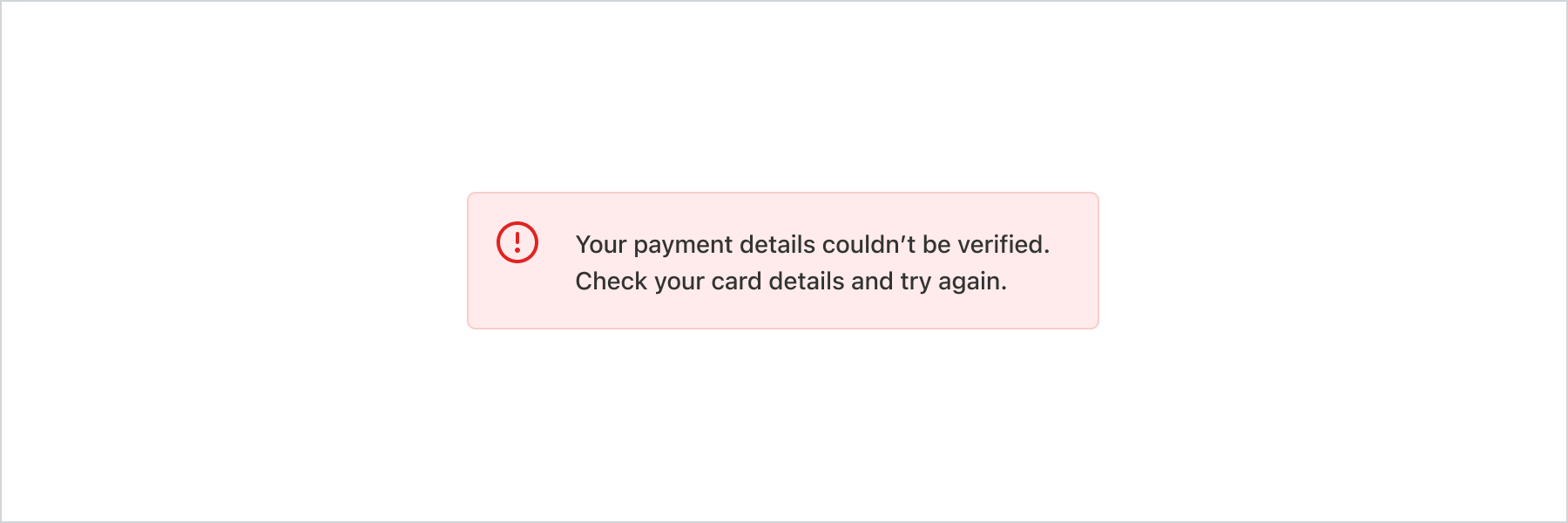
Basic Banner
React
import {
  reactExtension,
  Banner,
} from '@shopify/ui-extensions-react/checkout';

export default reactExtension(
  'purchase.checkout.block.render',
  () => <Extension />,
);

function Extension() {
  return (
    <Banner
      status="critical"
      title="Your payment details couldn’t be verified. Check your card details and try again."
    />
  );
}
JS
import {extension, Banner} from '@shopify/ui-extensions/checkout';

export default extension('purchase.checkout.block.render', (root) => {
  const banner = root.createComponent(Banner, {
    status: 'critical',
    title:
      'Your payment details couldn’t be verified. Check your card details and try again.',
  });

  root.appendChild(banner);
});
Anchor to Best practicesBest practices
-
Use banners sparingly: Too many banners distract buyers from completing checkout. Reserve them for the most important information.
-
Place banners contextually: Display banners at the top of a page or section, below the relevant header. If a banner relates to specific content, place it near that content.
-
Include a next step when possible: Add a Button component with a clear action so buyers know what to do after reading the message.
-
Make banners dismissible unless critical: Buyers should be able to dismiss informational banners. Keep
criticalbanners persistent until the issue is resolved. -
Match status to urgency: Use
infofor general updates,warningfor issues needing attention,successfor confirmations, andcriticalfor problems that block progress.
Anchor to StatusStatus
| Value | Description |
|---|---|
"info" | Convey general information or actions that aren’t critical or tied to a particular action.. |
"success" | Use rarely, only if you need additional visual confirmation that a non-standard action has been completed successfully, for example adding an item to an order as an upsell. |
"warning" | Display information that needs attention or that buyers should take action on. Seeing these banners can be stressful for buyers so be cautious about using them. Should not block progress to next step. |
"critical" | Communicate problems that have to be resolved immediately for buyers to complete a task. For example, using a different payment method if card details couldn’t be processed. Seeing these banners can be stressful for buyers so be cautious about using them. |