Version 2025-07 is the last API version to support React-based UI components. Later versions use Polaris web components, native UI elements with built-in accessibility, better performance, and consistent styling with Shopify's design system. Check out the upgrade guide to upgrade your extension and avoid being blocked from updating your extension after October 1st 2026.
Drop
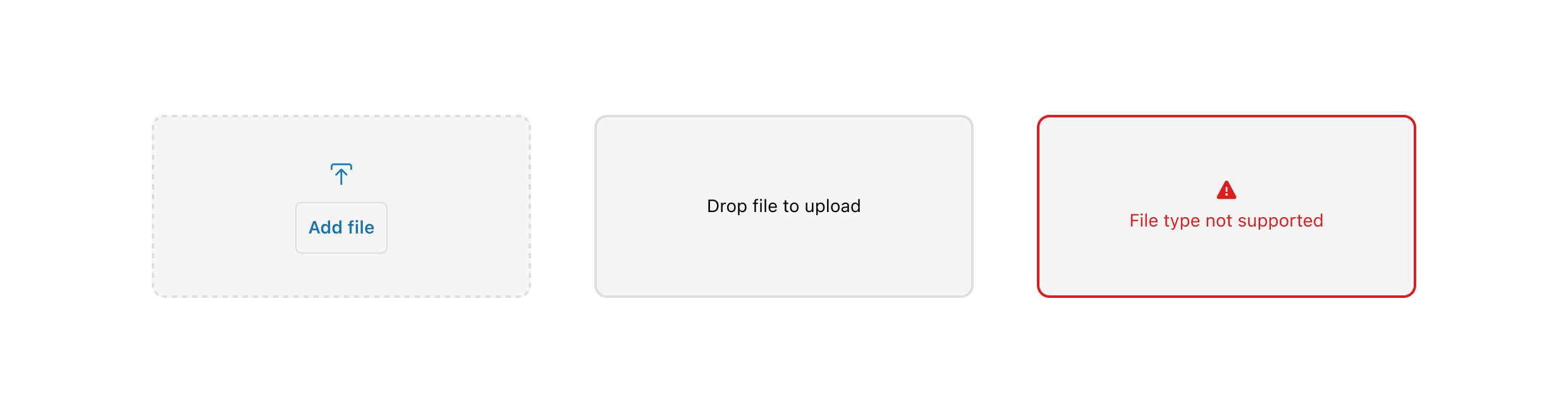
The DropZone component allows file uploads through drag-and-drop functionality into a designated area on a page, or by activating a button. At present, the DropZone component does not offer image upload preview capabilities. The use of object URLs directly in an image component is not possible due to the extension and host operating on separate domains.
Any element focused within the DropZone component, including child elements such as the 'Add file' button, will initiate the file selector when the Enter or Spacebar key is pressed.
Supported targets
- Checkout::Actions::Render
Before - Checkout::Cart
Line Details::Render After - Checkout::Cart
Lines::Render After - Checkout::Contact::Render
After - Checkout::Customer
Information::Render After - Checkout::Delivery
Address::Render Before - Checkout::Dynamic::Render
- Checkout::Pickup
Locations::Render After - Checkout::Pickup
Locations::Render Before - Checkout::Pickup
Points::Render After - Checkout::Pickup
Points::Render Before - Checkout::Reductions::Render
After - Checkout::Reductions::Render
Before - Checkout::Shipping
Method Details::Render After - Checkout::Shipping
Method Details::Render Expanded - Checkout::Shipping
Methods::Render After - Checkout::Shipping
Methods::Render Before - Checkout::Thank
You::Cart Line Details::Render After - Checkout::Thank
You::Cart Lines::Render After - Checkout::Thank
You::Customer Information::Render After - Checkout::Thank
You::Dynamic::Render - purchase.
checkout. actions. render-before - purchase.
checkout. block. render - purchase.
checkout. cart-line-item. render-after - purchase.
checkout. cart-line-list. render-after - purchase.
checkout. contact. render-after - purchase.
checkout. delivery-address. render-after - purchase.
checkout. delivery-address. render-before - purchase.
checkout. footer. render-after - purchase.
checkout. header. render-after - purchase.
checkout. payment-method-list. render-after - purchase.
checkout. payment-method-list. render-before - purchase.
checkout. pickup-location-list. render-after - purchase.
checkout. pickup-location-list. render-before - purchase.
checkout. pickup-location-option-item. render-after - purchase.
checkout. pickup-point-list. render-after - purchase.
checkout. pickup-point-list. render-before - purchase.
checkout. reductions. render-after - purchase.
checkout. reductions. render-before - purchase.
checkout. shipping-option-item. details. render - purchase.
checkout. shipping-option-item. render-after - purchase.
checkout. shipping-option-list. render-after - purchase.
checkout. shipping-option-list. render-before - purchase.
thank-you. announcement. render - purchase.
thank-you. block. render - purchase.
thank-you. cart-line-item. render-after - purchase.
thank-you. cart-line-list. render-after - purchase.
thank-you. customer-information. render-after - purchase.
thank-you. footer. render-after - purchase.
thank-you. header. render-after
Supported targets
- Checkout::Actions::Render
Before - Checkout::Cart
Line Details::Render After - Checkout::Cart
Lines::Render After - Checkout::Contact::Render
After - Checkout::Customer
Information::Render After - Checkout::Delivery
Address::Render Before - Checkout::Dynamic::Render
- Checkout::Pickup
Locations::Render After - Checkout::Pickup
Locations::Render Before - Checkout::Pickup
Points::Render After - Checkout::Pickup
Points::Render Before - Checkout::Reductions::Render
After - Checkout::Reductions::Render
Before - Checkout::Shipping
Method Details::Render After - Checkout::Shipping
Method Details::Render Expanded - Checkout::Shipping
Methods::Render After - Checkout::Shipping
Methods::Render Before - Checkout::Thank
You::Cart Line Details::Render After - Checkout::Thank
You::Cart Lines::Render After - Checkout::Thank
You::Customer Information::Render After - Checkout::Thank
You::Dynamic::Render - purchase.
checkout. actions. render-before - purchase.
checkout. block. render - purchase.
checkout. cart-line-item. render-after - purchase.
checkout. cart-line-list. render-after - purchase.
checkout. contact. render-after - purchase.
checkout. delivery-address. render-after - purchase.
checkout. delivery-address. render-before - purchase.
checkout. footer. render-after - purchase.
checkout. header. render-after - purchase.
checkout. payment-method-list. render-after - purchase.
checkout. payment-method-list. render-before - purchase.
checkout. pickup-location-list. render-after - purchase.
checkout. pickup-location-list. render-before - purchase.
checkout. pickup-location-option-item. render-after - purchase.
checkout. pickup-point-list. render-after - purchase.
checkout. pickup-point-list. render-before - purchase.
checkout. reductions. render-after - purchase.
checkout. reductions. render-before - purchase.
checkout. shipping-option-item. details. render - purchase.
checkout. shipping-option-item. render-after - purchase.
checkout. shipping-option-list. render-after - purchase.
checkout. shipping-option-list. render-before - purchase.
thank-you. announcement. render - purchase.
thank-you. block. render - purchase.
thank-you. cart-line-item. render-after - purchase.
thank-you. cart-line-list. render-after - purchase.
thank-you. customer-information. render-after - purchase.
thank-you. footer. render-after - purchase.
thank-you. header. render-after
DropZone allows file uploads through drag-and-drop functionality into a designated area on a page, or by activating a button. At present, DropZone does not offer image upload preview capabilities. The use of object URLs directly in an image component is not possible due to the extension and host operating on separate domains. Any element focused within the Dropzone component, including child elements such as the 'Add file' button, will initiate the file selector when the Enter or Spacebar key is pressed.
- Anchor to acceptacceptacceptstringstring
A string representing the types of files that are accepted by the dropzone. This string is a comma-separated list of unique file type specifiers which can be one of the following:
- A file extension starting with a period (".") character (e.g. .jpg, .pdf, .doc)
- A valid MIME type string with no extensions
If left empty, the dropzone will accept all files.
- Anchor to accessibilityLabelaccessibility
Labelaccessibility Label stringstring A label that describes the purpose or contents of the item. When set, it will be announced to buyers using assistive technologies and will provide them with more context.
- Anchor to disableddisableddisabledbooleanboolean
Whether the field can be modified.
- Anchor to errorerrorerrorstringstring
Indicate an error to the user. The field will be given a specific stylistic treatment to communicate problems that have to be resolved immediately.
- Anchor to idididstringstring
A unique identifier for the component.
- Anchor to labellabellabelstringstring
Content to use as the field label.
- Anchor to multiplemultiplemultiplebooleanbooleanDefault: falseDefault: false
Defines if the user can select or drop multiple files at once.
- Anchor to namenamenamestringstring
An identifier for the field that is unique within the nearest containing
Formcomponent.- Anchor to onDropRejectedon
Drop Rejectedon Drop Rejected (files: File[]) => void(files: File[]) => void Callback when rejected files are dropped. Files are rejected based on the
acceptprop.- Anchor to onInputon
Inputon Input (files: File[]) => void(files: File[]) => void Callback when files are dropped or selected.
- Anchor to requiredrequiredrequiredbooleanboolean
Whether the field needs a value. This requirement adds semantic value to the field, but it will not cause an error to appear automatically. If you want to present an error when this field is empty, you can do so with the
errorprop.
Anchor to ExamplesExamples
Anchor to DropZoneDrop
DropZone
DropZone
React
import {
  reactExtension,
  DropZone,
} from '@shopify/ui-extensions-react/checkout';

export default reactExtension(
  'purchase.checkout.block.render',
  () => <Extension />,
);

function Extension() {
  return <DropZone accept="image/*" />;
}
JS
import {DropZone, extension} from '@shopify/ui-extensions/checkout';

export default extension('purchase.checkout.block.render', (root) => {
  const dropZone = root.createComponent(DropZone, {
    accept: 'image/*',
  });

  root.appendChild(dropZone);
});
Anchor to Best practicesBest practices
- Restrict accepted file types: Use the
acceptproperty to limit file uploads to valid formats likeimage/*orapplication/pdf. - Set a minimum size: Keep the drop zone to at least 100px by 100px to prevent truncated text and spacing issues.
- Handle rejected files: Use the
onDropRejectedcallback to display clear error messages when files don't match the accepted type. - Include a click-to-browse option: Drag and drop doesn't work on mobile devices. Include an option to select files manually.
Anchor to LimitationsLimitations
- File storage must be implemented separately. Use metafields through the Metafields API to store references to uploaded files.