Version 2025-07 is the last API version to support React-based UI components. Later versions use Polaris web components, native UI elements with built-in accessibility, better performance, and consistent styling with Shopify's design system. Check out the upgrade guide to upgrade your extension and avoid being blocked from updating your extension after October 1st 2026.
Progress
Use to visually represent the completion of a task or process.
Supported targets
- Checkout::Actions::Render
Before - Checkout::Cart
Line Details::Render After - Checkout::Cart
Lines::Render After - Checkout::Contact::Render
After - Checkout::Customer
Information::Render After - Checkout::Delivery
Address::Render Before - Checkout::Dynamic::Render
- Checkout::Pickup
Locations::Render After - Checkout::Pickup
Locations::Render Before - Checkout::Pickup
Points::Render After - Checkout::Pickup
Points::Render Before - Checkout::Reductions::Render
After - Checkout::Reductions::Render
Before - Checkout::Shipping
Method Details::Render After - Checkout::Shipping
Method Details::Render Expanded - Checkout::Shipping
Methods::Render After - Checkout::Shipping
Methods::Render Before - Checkout::Thank
You::Cart Line Details::Render After - Checkout::Thank
You::Cart Lines::Render After - Checkout::Thank
You::Customer Information::Render After - Checkout::Thank
You::Dynamic::Render - purchase.
checkout. actions. render-before - purchase.
checkout. block. render - purchase.
checkout. cart-line-item. render-after - purchase.
checkout. cart-line-list. render-after - purchase.
checkout. contact. render-after - purchase.
checkout. delivery-address. render-after - purchase.
checkout. delivery-address. render-before - purchase.
checkout. footer. render-after - purchase.
checkout. header. render-after - purchase.
checkout. payment-method-list. render-after - purchase.
checkout. payment-method-list. render-before - purchase.
checkout. pickup-location-list. render-after - purchase.
checkout. pickup-location-list. render-before - purchase.
checkout. pickup-location-option-item. render-after - purchase.
checkout. pickup-point-list. render-after - purchase.
checkout. pickup-point-list. render-before - purchase.
checkout. reductions. render-after - purchase.
checkout. reductions. render-before - purchase.
checkout. shipping-option-item. details. render - purchase.
checkout. shipping-option-item. render-after - purchase.
checkout. shipping-option-list. render-after - purchase.
checkout. shipping-option-list. render-before - purchase.
thank-you. announcement. render - purchase.
thank-you. block. render - purchase.
thank-you. cart-line-item. render-after - purchase.
thank-you. cart-line-list. render-after - purchase.
thank-you. customer-information. render-after - purchase.
thank-you. footer. render-after - purchase.
thank-you. header. render-after
Supported targets
- Checkout::Actions::Render
Before - Checkout::Cart
Line Details::Render After - Checkout::Cart
Lines::Render After - Checkout::Contact::Render
After - Checkout::Customer
Information::Render After - Checkout::Delivery
Address::Render Before - Checkout::Dynamic::Render
- Checkout::Pickup
Locations::Render After - Checkout::Pickup
Locations::Render Before - Checkout::Pickup
Points::Render After - Checkout::Pickup
Points::Render Before - Checkout::Reductions::Render
After - Checkout::Reductions::Render
Before - Checkout::Shipping
Method Details::Render After - Checkout::Shipping
Method Details::Render Expanded - Checkout::Shipping
Methods::Render After - Checkout::Shipping
Methods::Render Before - Checkout::Thank
You::Cart Line Details::Render After - Checkout::Thank
You::Cart Lines::Render After - Checkout::Thank
You::Customer Information::Render After - Checkout::Thank
You::Dynamic::Render - purchase.
checkout. actions. render-before - purchase.
checkout. block. render - purchase.
checkout. cart-line-item. render-after - purchase.
checkout. cart-line-list. render-after - purchase.
checkout. contact. render-after - purchase.
checkout. delivery-address. render-after - purchase.
checkout. delivery-address. render-before - purchase.
checkout. footer. render-after - purchase.
checkout. header. render-after - purchase.
checkout. payment-method-list. render-after - purchase.
checkout. payment-method-list. render-before - purchase.
checkout. pickup-location-list. render-after - purchase.
checkout. pickup-location-list. render-before - purchase.
checkout. pickup-location-option-item. render-after - purchase.
checkout. pickup-point-list. render-after - purchase.
checkout. pickup-point-list. render-before - purchase.
checkout. reductions. render-after - purchase.
checkout. reductions. render-before - purchase.
checkout. shipping-option-item. details. render - purchase.
checkout. shipping-option-item. render-after - purchase.
checkout. shipping-option-list. render-after - purchase.
checkout. shipping-option-list. render-before - purchase.
thank-you. announcement. render - purchase.
thank-you. block. render - purchase.
thank-you. cart-line-item. render-after - purchase.
thank-you. cart-line-list. render-after - purchase.
thank-you. customer-information. render-after - purchase.
thank-you. footer. render-after - purchase.
thank-you. header. render-after
Anchor to ProgressPropsProgress
Use to visually represent the completion of a task or process.
- Anchor to accessibilityLabelaccessibility
Labelaccessibility Label stringstring A label to use for the Progress that will be used for buyers using assistive technologies like screen readers. It will also be used to replace the animated loading indicator when buyers prefer reduced motion.
- Anchor to idididstringstring
A unique identifier for the component.
- Anchor to maxmaxmaxnumbernumberDefault: 1Default: 1
Define the maximum limit of the progress element. It must have a value greater than 0 and be a valid floating point number.
- Anchor to tonetonetoneToneToneDefault: 'auto'Default: 'auto'
Set the color of the progress bar.
- Anchor to valuevaluevaluenumbernumber
Specify how much of the task that has been completed. It must be a valid floating point number between 0 and max, or between 0 and 1 if max is omitted. When undefined, the progress bar is indeterminate; this indicates that an activity is ongoing with no indication of how long it is expected to take.
Tone
'default' | 'critical' | 'subdued'Anchor to ExamplesExamples
Anchor to Indeterminate stateIndeterminate state
Indeterminate state
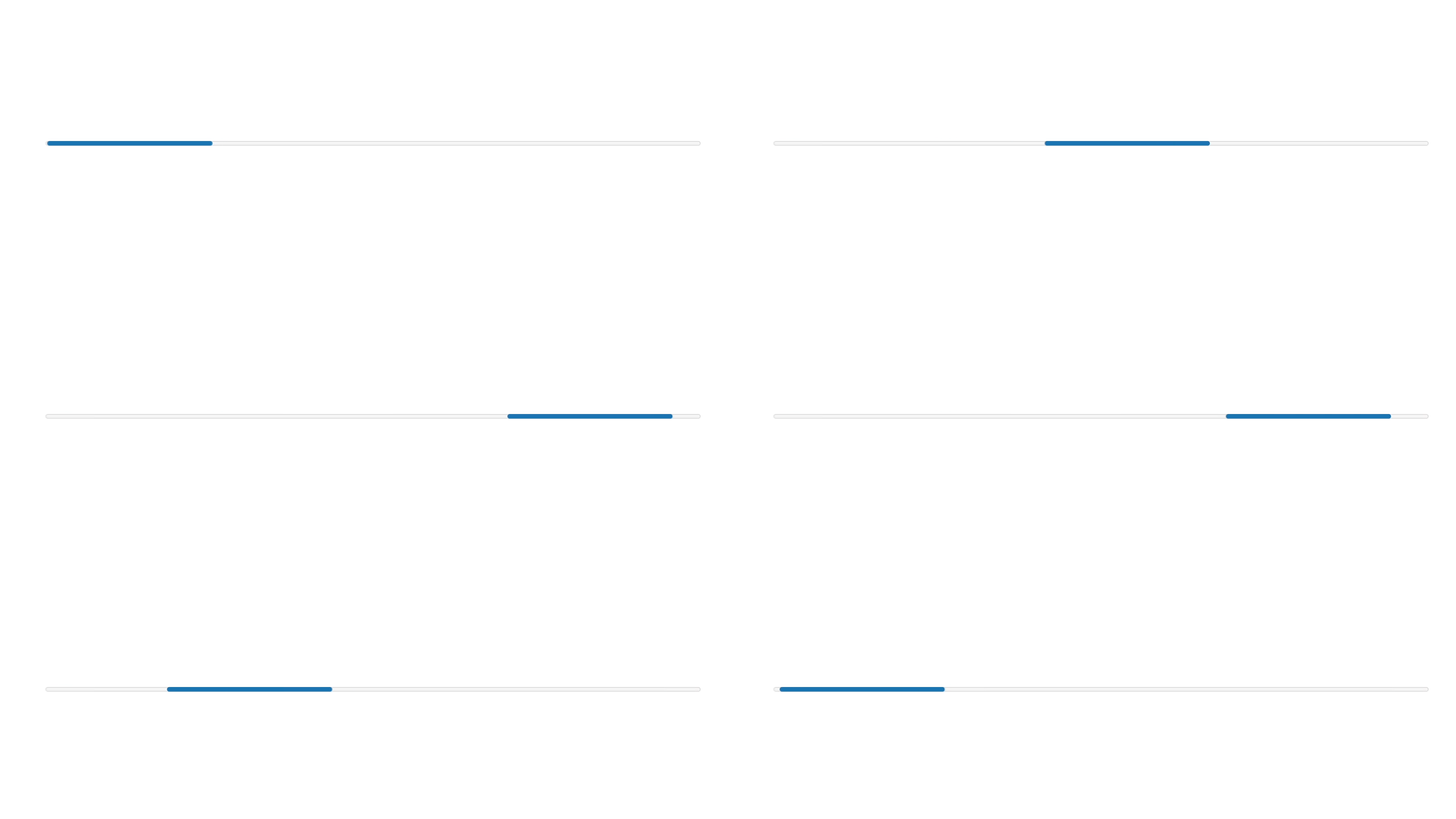
Indeterminate state
React
import {
  reactExtension,
  Progress,
} from '@shopify/ui-extensions-react/checkout';

export default reactExtension(
  'purchase.checkout.block.render',
  () => <Extension />,
);

function Extension() {
  return (
    <Progress accessibilityLabel="Loading" />
  );
}
JS
import {extension, Progress} from '@shopify/ui-extensions/checkout';

export default extension('purchase.checkout.block.render', (root) => {
  const baseProgress = root.createComponent(Progress, {
    accessibilityLabel: 'Loading',
  });

  root.appendChild(baseProgress);
});
Anchor to Determinate stateDeterminate state
In a determinate state, TextBlock or Text components can be used to communicate what the progress bar is tracking, and to set clear expectations about the current progress.
Determinate state
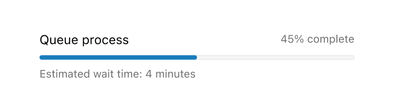
Determinate state
React
import {
  reactExtension,
  BlockStack,
  Grid,
  Progress,
  Text,
  TextBlock,
} from '@shopify/ui-extensions-react/checkout';

export default reactExtension(
  'purchase.checkout.footer.render-after',
  () => <Extension />,
);

function Extension() {
  const label = 'Queue process';
  return (
    <BlockStack>
      <Grid columns={['fill', 'auto']}>
        <Text>{label}</Text>
        <Text appearance="subdued">
          45% completed
        </Text>
      </Grid>
      <Progress
        value={45}
        max={100}
        accessibilityLabel={label}
      />
      <TextBlock appearance="subdued">
        Estimated wait time: 4 minutes
      </TextBlock>
    </BlockStack>
  );
}
JavaScript
import {
  extension,
  BlockStack,
  Grid,
  Progress,
  Text,
  TextBlock,
} from '@shopify/ui-extensions/checkout';

export default extension(
  'purchase.checkout.block.render',
  (root) => {
    const label = 'Queue process';

    const progress = root.createComponent(
      BlockStack,
      null,
      [
        root.createComponent(
          Grid,
          {
            columns: ['fill', 'auto'],
          },
          [
            root.createComponent(
              Text,
              null,
              label,
            ),
            root.createComponent(
              Text,
              {
                appearance: 'subdued',
              },
              '45% completed',
            ),
          ],
        ),
        root.createComponent(Progress, {
          value: 45,
          max: 100,
          accessibilityLabel: label,
        }),
        root.createComponent(
          TextBlock,
          {
            appearance: 'subdued',
          },
          'Estimated wait time: 4 minutes',
        ),
      ],
    );

    root.appendChild(progress);
  },
);
Anchor to Best practicesBest practices
Use components like TextBlock or Text, along with the Progress component, to display text indicating the status of the progress bar.
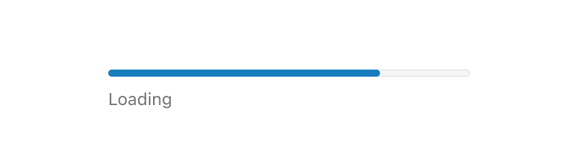
Anchor to Loading statesLoading states
For loading states, add text to reassure the buyer that the progress bar is not frozen.
Anchor to Error statesError states
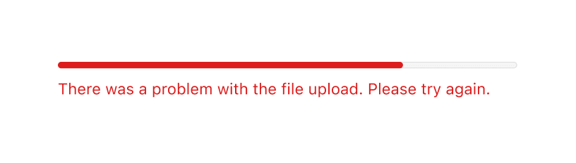
For error states, add text or a Banner to describe the error and next steps. Use the critical tone property to convey urgency.
Anchor to Visualize a goalVisualize a goal
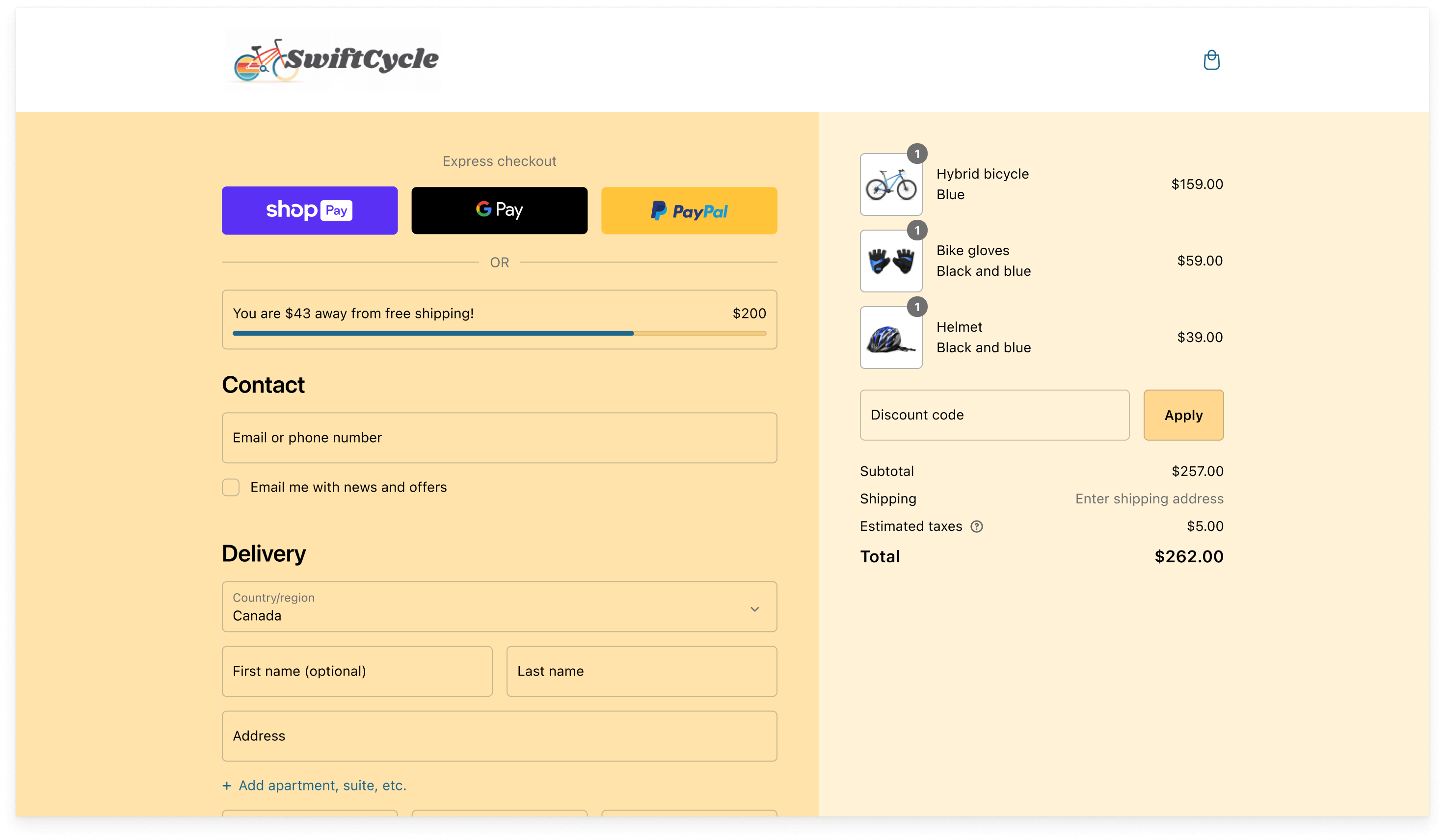
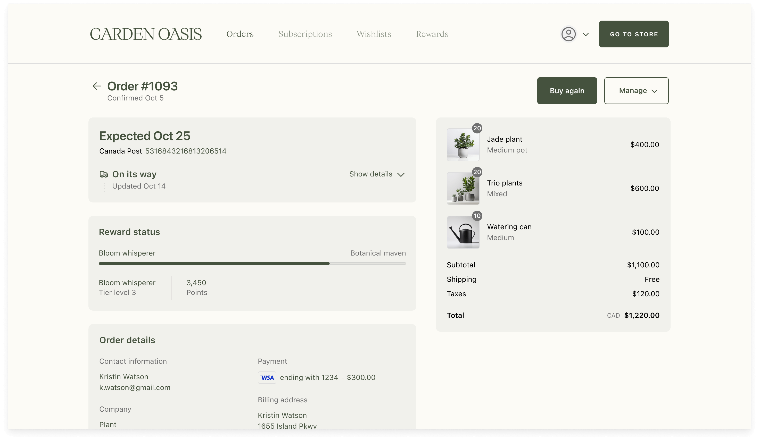
Use the Progress component to visualize a goal that's valuable to the buyer.
Here's an example of using a progress bar to show a buyer's progress toward the next rewards tier:
Here's an example of using a progress bar to show how much more a buyer needs to spend to get free shipping: