Version 2025-07 is the last API version to support React-based UI components. Later versions use Polaris web components, native UI elements with built-in accessibility, better performance, and consistent styling with Shopify's design system. Check out the upgrade guide to upgrade your extension and avoid being blocked from updating your extension after October 1st 2026.
Disclosure
Disclosure is an optionally controlled component used to put long sections of information under content blocks that buyers can expand or collapse by pressing an activator. The activator can be specified as children using an action component (Button, Link or Pressable) or a form control (Checkbox or Switch) component. The content blocks can be specified as children inside a structure component (View, InlineLayout, BlockStack, Grid, etc.).
The library automatically applies the WAI-ARIA Accordion pattern to both the activator and the toggled content.
Supported targets
- Checkout::Actions::Render
Before - Checkout::Cart
Line Details::Render After - Checkout::Cart
Lines::Render After - Checkout::Contact::Render
After - Checkout::Customer
Information::Render After - Checkout::Delivery
Address::Render Before - Checkout::Dynamic::Render
- Checkout::Pickup
Locations::Render After - Checkout::Pickup
Locations::Render Before - Checkout::Pickup
Points::Render After - Checkout::Pickup
Points::Render Before - Checkout::Reductions::Render
After - Checkout::Reductions::Render
Before - Checkout::Shipping
Method Details::Render After - Checkout::Shipping
Method Details::Render Expanded - Checkout::Shipping
Methods::Render After - Checkout::Shipping
Methods::Render Before - Checkout::Thank
You::Cart Line Details::Render After - Checkout::Thank
You::Cart Lines::Render After - Checkout::Thank
You::Customer Information::Render After - Checkout::Thank
You::Dynamic::Render - purchase.
checkout. actions. render-before - purchase.
checkout. block. render - purchase.
checkout. cart-line-item. render-after - purchase.
checkout. cart-line-list. render-after - purchase.
checkout. contact. render-after - purchase.
checkout. delivery-address. render-after - purchase.
checkout. delivery-address. render-before - purchase.
checkout. footer. render-after - purchase.
checkout. header. render-after - purchase.
checkout. payment-method-list. render-after - purchase.
checkout. payment-method-list. render-before - purchase.
checkout. pickup-location-list. render-after - purchase.
checkout. pickup-location-list. render-before - purchase.
checkout. pickup-location-option-item. render-after - purchase.
checkout. pickup-point-list. render-after - purchase.
checkout. pickup-point-list. render-before - purchase.
checkout. reductions. render-after - purchase.
checkout. reductions. render-before - purchase.
checkout. shipping-option-item. details. render - purchase.
checkout. shipping-option-item. render-after - purchase.
checkout. shipping-option-list. render-after - purchase.
checkout. shipping-option-list. render-before - purchase.
thank-you. announcement. render - purchase.
thank-you. block. render - purchase.
thank-you. cart-line-item. render-after - purchase.
thank-you. cart-line-list. render-after - purchase.
thank-you. customer-information. render-after - purchase.
thank-you. footer. render-after - purchase.
thank-you. header. render-after
Supported targets
- Checkout::Actions::Render
Before - Checkout::Cart
Line Details::Render After - Checkout::Cart
Lines::Render After - Checkout::Contact::Render
After - Checkout::Customer
Information::Render After - Checkout::Delivery
Address::Render Before - Checkout::Dynamic::Render
- Checkout::Pickup
Locations::Render After - Checkout::Pickup
Locations::Render Before - Checkout::Pickup
Points::Render After - Checkout::Pickup
Points::Render Before - Checkout::Reductions::Render
After - Checkout::Reductions::Render
Before - Checkout::Shipping
Method Details::Render After - Checkout::Shipping
Method Details::Render Expanded - Checkout::Shipping
Methods::Render After - Checkout::Shipping
Methods::Render Before - Checkout::Thank
You::Cart Line Details::Render After - Checkout::Thank
You::Cart Lines::Render After - Checkout::Thank
You::Customer Information::Render After - Checkout::Thank
You::Dynamic::Render - purchase.
checkout. actions. render-before - purchase.
checkout. block. render - purchase.
checkout. cart-line-item. render-after - purchase.
checkout. cart-line-list. render-after - purchase.
checkout. contact. render-after - purchase.
checkout. delivery-address. render-after - purchase.
checkout. delivery-address. render-before - purchase.
checkout. footer. render-after - purchase.
checkout. header. render-after - purchase.
checkout. payment-method-list. render-after - purchase.
checkout. payment-method-list. render-before - purchase.
checkout. pickup-location-list. render-after - purchase.
checkout. pickup-location-list. render-before - purchase.
checkout. pickup-location-option-item. render-after - purchase.
checkout. pickup-point-list. render-after - purchase.
checkout. pickup-point-list. render-before - purchase.
checkout. reductions. render-after - purchase.
checkout. reductions. render-before - purchase.
checkout. shipping-option-item. details. render - purchase.
checkout. shipping-option-item. render-after - purchase.
checkout. shipping-option-list. render-after - purchase.
checkout. shipping-option-list. render-before - purchase.
thank-you. announcement. render - purchase.
thank-you. block. render - purchase.
thank-you. cart-line-item. render-after - purchase.
thank-you. cart-line-list. render-after - purchase.
thank-you. customer-information. render-after - purchase.
thank-you. footer. render-after - purchase.
thank-you. header. render-after
Anchor to DisclosurePropsDisclosure
Disclosure is an optionally controlled component used to put long sections of information under content blocks that users can expand or collapse by pressing an activator. The activator can be specified as children using an action component (Button, Link or Pressable) or a form control (Checkbox or Switch) component. The content blocks can be specified as children inside a structure component (View, , , Grid, etc.).
The library automatically applies the WAI-ARIA Accordion pattern to both the activator and the toggled content.
- Anchor to defaultOpendefault
Opendefault Open MaybeResponsiveConditionalStyle<DisclosureOpen | undefined>MaybeResponsiveConditionalStyle<DisclosureOpen | undefined> For uncontrolled disclosure components, the default
openstate on the initial render.It's possible to specify a boolean value, a string value, or an array of string values:
truewill expand all contentfalsewill collapse all contentstringwill expand the content with the matchingidstring[]will expand the content with the matchingids
- Anchor to onToggleon
Toggleon Toggle (open: string[]) => void(open: string[]) => void Callback fired when the open state of the disclosure changes.
- Anchor to openopenopenDisclosureOpenDisclosureOpen
For controlled disclosure components, the open state. The
openprop should be used along withto create a controlled disclosure component.- Anchor to transitiontransitiontransition'none''none'
Set to 'none' to disable the default transition animation.
MaybeResponsiveConditionalStyle
A type that represents a value that can be a conditional style. The conditions are based on the viewport size. We highly recommend using the `Style` helper which simplifies the creation of conditional styles.
T | ConditionalStyle<T, ViewportSizeCondition>ConditionalStyle
A conditional style definition that maps one or more conditions to different values. The `default` value is used as a fallback when none of the conditions in `conditionals` are satisfied.
- conditionals
An array of conditional values.
ConditionalValue<T, AcceptedConditions>[] - default
The default value applied when none of the conditional values specified in `conditionals` are met.
T
ConditionalValue
A single conditional branch that pairs a set of conditions with the value to apply when those conditions are met.
- conditions
The conditions that must be met for the value to be applied. At least one condition must be specified.
AcceptedConditions - value
The value that will be applied if the conditions are met.
T
ViewportSizeCondition
A condition that targets layouts based on the inline size (width in horizontal writing modes) of the viewport.
- viewportInlineSize
The minimum viewport inline size that the condition must match.
{ min: T; }
DisclosureOpen
boolean | string | string[]Anchor to ExamplesExamples
Anchor to Basic DisclosureBasic Disclosure
Basic Disclosure
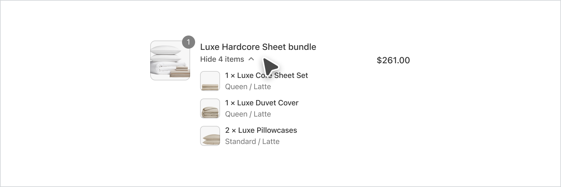
Basic Disclosure
React
import {
  reactExtension,
  Disclosure,
  Button,
  View,
} from '@shopify/ui-extensions-react/checkout';

export default reactExtension(
  'purchase.checkout.block.render',
  () => <Extension />,
);

function Extension() {
  return (
    <Disclosure>
      <Button toggles="one">Toggle</Button>
      <View id="one">Content</View>
    </Disclosure>
  );
}
JS
import {
  extension,
  Button,
  View,
  Disclosure,
} from '@shopify/ui-extensions/checkout';

export default extension('purchase.checkout.block.render', (root) => {
  const disclosure = root.createComponent(Disclosure, {}, [
    root.createComponent(Button, {toggles: 'one'}, 'Toggle'),
    root.createComponent(
      View,
      {border: 'base', padding: 'base', id: 'one'},
      'Content',
    ),
  ]);

  root.appendChild(disclosure);
});
Anchor to Strategies for simplifying layout and aligning content using Disclosure and Inline/Block Layout components.Strategies for simplifying layout and aligning content using Disclosure and Inline/Block Layout components.
Use the Disclosure component to simplify the user experience and reveal interfaces only when the buyer requests it. It also demonstrates how a combination of inline and block layout components can improve the readability of information. By employing these strategies, buyers can easily scan and comprehend the content, making for a better user experience overall.
Strategies for simplifying layout and aligning content using Disclosure and Inline/Block Layout components.
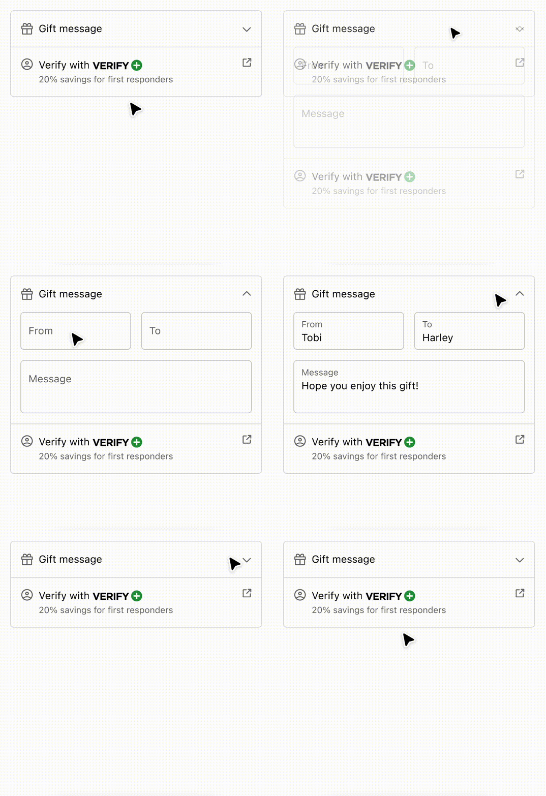
Strategies for simplifying layout and aligning content using Disclosure and Inline/Block Layout components.
React
import {
  reactExtension,
  View,
  Image,
  Icon,
  Pressable,
  Disclosure,
  InlineLayout,
  BlockStack,
  Text,
  Form,
  TextField,
  Button,
  Divider,
  InlineStack,
} from '@shopify/ui-extensions-react/checkout';

export default reactExtension(
  'purchase.checkout.block.render',
  () => <DisclosureAndAlignment />,
);

export const DisclosureAndAlignment = () => {
  const openIds = ['one'];
  return (
    <View
      maxInlineSize={400}
      cornerRadius="large"
      border="base"
    >
      <BlockStack spacing="none">
        <Disclosure
          defaultOpen="one"
          onToggle={(open) =>
            console.log('onToggle event', open)
          }
        >
          <Pressable toggles="one" padding="base">
            <InlineLayout
              blockAlignment="center"
              spacing="base"
              columns={['auto', 'fill', 'auto']}
            >
              <Icon
                source="gift"
                appearance="subdued"
              />
              Gift message
              <Icon
                source={
                  openIds.includes('one')
                    ? 'chevronUp'
                    : 'chevronDown'
                }
                appearance="subdued"
              />
            </InlineLayout>
          </Pressable>
          <View
            id="one"
            padding={[
              'none',
              'base',
              'base',
              'base',
            ]}
          >
            <Form
              onSubmit={() =>
                console.log('onSubmit event')
              }
            >
              <BlockStack>
                <InlineLayout
                  columns={['fill', 'fill']}
                  spacing="base"
                >
                  <TextField
                    label="From"
                    name="from0"
                    id="from0"
                  />
                  <TextField
                    label="To"
                    name="to0"
                    id="to0"
                  />
                </InlineLayout>
                <TextField
                  label="Message"
                  name="message0"
                  id="message0"
                />
                <View>
                  <Button
                    accessibilityRole="submit"
                    kind="secondary"
                  >
                    Save
                  </Button>
                </View>
              </BlockStack>
            </Form>
          </View>
        </Disclosure>
        <Divider />
        <InlineLayout
          blockAlignment="baseline"
          spacing="base"
          columns={['auto', 'fill', 'auto']}
          padding="base"
        >
          <Icon
            source="profile"
            appearance="subdued"
          />
          <BlockStack spacing="none">
            <InlineStack blockAlignment="center">
              <Text>Verify with</Text>
              <Image source="https://via.placeholder.com/50x15" />
            </InlineStack>
            <Text
              appearance="subdued"
              size="small"
            >
              15% savings for students and
              military
            </Text>
          </BlockStack>
          <Pressable to="https://www.shopify.com">
            <Icon
              source="external"
              appearance="subdued"
            />
          </Pressable>
        </InlineLayout>
      </BlockStack>
    </View>
  );
};
JavaScript
import {
  extension,
  BlockStack,
  View,
  InlineLayout,
  InlineStack,
  Image,
  Pressable,
  Icon,
  Text,
  TextField,
  Form,
  Button,
  Disclosure,
  Divider,
} from '@shopify/ui-extensions/checkout';

export default extension(
  'purchase.checkout.block.render',
  (root) => {
    const openIds = ['one'];

    const pressable = root.createComponent(
      Pressable,
      {
        toggles: 'one',
        padding: 'base',
      },
      [
        root.createComponent(
          InlineLayout,
          {
            blockAlignment: 'center',
            spacing: 'base',
            columns: ['auto', 'fill', 'auto'],
          },
          [
            root.createComponent(Icon, {
              source: 'gift',
              appearance: 'subdued',
            }),
            'Gift message',
            root.createComponent(Icon, {
              source: openIds.includes('one')
                ? 'chevronUp'
                : 'chevronDown',
              size: 'small',
            }),
          ],
        ),
      ],
    );

    const disclosureView = root.createComponent(
      View,
      {
        id: 'one',
        padding: ['none', 'base', 'base', 'base'],
      },
      [
        root.createComponent(
          Form,
          {
            onSubmit: () =>
              console.log('onSubmit event'),
          },
          [
            root.createComponent(BlockStack, {}, [
              root.createComponent(
                InlineLayout,
                {
                  columns: ['fill', 'fill'],
                  spacing: 'base',
                },
                [
                  root.createComponent(
                    TextField,
                    {
                      label: 'From',
                      name: 'from0',
                      id: 'from0',
                    },
                  ),
                  root.createComponent(
                    TextField,
                    {
                      label: 'To',
                      name: 'to0',
                      id: 'to0',
                    },
                  ),
                ],
              ),
              root.createComponent(TextField, {
                label: 'Message',
                name: 'message0',
                id: 'message0',
              }),
              root.createComponent(View, {}, [
                root.createComponent(
                  Button,
                  {
                    accessibilityRole: 'submit',
                    kind: 'secondary',
                  },
                  'Save',
                ),
              ]),
            ]),
          ],
        ),
      ],
    );

    const disclosure = root.createComponent(
      Disclosure,
      {
        defaultOpen: 'one',
        onToggle: (open) =>
          console.log('onToggle event', open),
      },
      [pressable, disclosureView],
    );

    const inlineLayout = root.createComponent(
      InlineLayout,
      {
        blockAlignment: 'baseline',
        spacing: 'base',
        columns: ['auto', 'fill', 'auto'],
        padding: 'base',
      },
      [
        root.createComponent(Icon, {
          source: 'profile',
          appearance: 'subdued',
        }),
        root.createComponent(
          BlockStack,
          {
            spacing: 'none',
          },
          [
            root.createComponent(
              InlineStack,
              {
                blockAlignment: 'center',
              },
              [
                root.createComponent(
                  Text,
                  {},
                  'Verify with',
                ),
                root.createComponent(Image, {
                  source:
                    'https://via.placeholder.com/50x15',
                }),
              ],
            ),
            root.createComponent(
              Text,
              {
                appearance: 'subdued',
                size: 'small',
              },
              '15% savings for students and military',
            ),
          ],
        ),
        root.createComponent(
          Pressable,
          {
            to: 'https://www.shopify.com',
          },
          [
            root.createComponent(Icon, {
              source: 'external',
              appearance: 'subdued',
            }),
          ],
        ),
      ],
    );
    const view = root.createComponent(
      View,
      {
        maxInlineSize: 400,
        cornerRadius: 'large',
        border: 'base',
      },
      [
        root.createComponent(
          BlockStack,
          {
            spacing: 'none',
          },
          [
            disclosure,
            root.createComponent(Divider),
            inlineLayout,
          ],
        ),
      ],
    );

    root.appendChild(view);
  },
);
Anchor to Best practicesBest practices
-
Disclosures should be initiated by the buyer.
-
Use disclosures to hide content until they are relevant to the buyer.
-
Avoid hiding critical information that buyers need to complete their checkout.
-
Keep content inside disclosures concise.
-
Avoid nesting of disclosures.
-
Keep the activator and the content it toggles in close proximity to each other.