Version 2025-07 is the last API version to support React-based UI components. Later versions use Polaris web components, native UI elements with built-in accessibility, better performance, and consistent styling with Shopify's design system. Check out the upgrade guide to upgrade your extension and avoid being blocked from updating your extension after October 1st 2026.
Skeleton image
The SkeletonImage component is used to provide a low fidelity representation of an image before it appears on the page.
Supported targets
- Checkout::Actions::Render
Before - Checkout::Cart
Line Details::Render After - Checkout::Cart
Lines::Render After - Checkout::Contact::Render
After - Checkout::Customer
Information::Render After - Checkout::Delivery
Address::Render Before - Checkout::Dynamic::Render
- Checkout::Pickup
Locations::Render After - Checkout::Pickup
Locations::Render Before - Checkout::Pickup
Points::Render After - Checkout::Pickup
Points::Render Before - Checkout::Reductions::Render
After - Checkout::Reductions::Render
Before - Checkout::Shipping
Method Details::Render After - Checkout::Shipping
Method Details::Render Expanded - Checkout::Shipping
Methods::Render After - Checkout::Shipping
Methods::Render Before - Checkout::Thank
You::Cart Line Details::Render After - Checkout::Thank
You::Cart Lines::Render After - Checkout::Thank
You::Customer Information::Render After - Checkout::Thank
You::Dynamic::Render - purchase.
checkout. actions. render-before - purchase.
checkout. block. render - purchase.
checkout. cart-line-item. render-after - purchase.
checkout. cart-line-list. render-after - purchase.
checkout. contact. render-after - purchase.
checkout. delivery-address. render-after - purchase.
checkout. delivery-address. render-before - purchase.
checkout. footer. render-after - purchase.
checkout. header. render-after - purchase.
checkout. payment-method-list. render-after - purchase.
checkout. payment-method-list. render-before - purchase.
checkout. pickup-location-list. render-after - purchase.
checkout. pickup-location-list. render-before - purchase.
checkout. pickup-location-option-item. render-after - purchase.
checkout. pickup-point-list. render-after - purchase.
checkout. pickup-point-list. render-before - purchase.
checkout. reductions. render-after - purchase.
checkout. reductions. render-before - purchase.
checkout. shipping-option-item. details. render - purchase.
checkout. shipping-option-item. render-after - purchase.
checkout. shipping-option-list. render-after - purchase.
checkout. shipping-option-list. render-before - purchase.
thank-you. announcement. render - purchase.
thank-you. block. render - purchase.
thank-you. cart-line-item. render-after - purchase.
thank-you. cart-line-list. render-after - purchase.
thank-you. customer-information. render-after - purchase.
thank-you. footer. render-after - purchase.
thank-you. header. render-after
Supported targets
- Checkout::Actions::Render
Before - Checkout::Cart
Line Details::Render After - Checkout::Cart
Lines::Render After - Checkout::Contact::Render
After - Checkout::Customer
Information::Render After - Checkout::Delivery
Address::Render Before - Checkout::Dynamic::Render
- Checkout::Pickup
Locations::Render After - Checkout::Pickup
Locations::Render Before - Checkout::Pickup
Points::Render After - Checkout::Pickup
Points::Render Before - Checkout::Reductions::Render
After - Checkout::Reductions::Render
Before - Checkout::Shipping
Method Details::Render After - Checkout::Shipping
Method Details::Render Expanded - Checkout::Shipping
Methods::Render After - Checkout::Shipping
Methods::Render Before - Checkout::Thank
You::Cart Line Details::Render After - Checkout::Thank
You::Cart Lines::Render After - Checkout::Thank
You::Customer Information::Render After - Checkout::Thank
You::Dynamic::Render - purchase.
checkout. actions. render-before - purchase.
checkout. block. render - purchase.
checkout. cart-line-item. render-after - purchase.
checkout. cart-line-list. render-after - purchase.
checkout. contact. render-after - purchase.
checkout. delivery-address. render-after - purchase.
checkout. delivery-address. render-before - purchase.
checkout. footer. render-after - purchase.
checkout. header. render-after - purchase.
checkout. payment-method-list. render-after - purchase.
checkout. payment-method-list. render-before - purchase.
checkout. pickup-location-list. render-after - purchase.
checkout. pickup-location-list. render-before - purchase.
checkout. pickup-location-option-item. render-after - purchase.
checkout. pickup-point-list. render-after - purchase.
checkout. pickup-point-list. render-before - purchase.
checkout. reductions. render-after - purchase.
checkout. reductions. render-before - purchase.
checkout. shipping-option-item. details. render - purchase.
checkout. shipping-option-item. render-after - purchase.
checkout. shipping-option-list. render-after - purchase.
checkout. shipping-option-list. render-before - purchase.
thank-you. announcement. render - purchase.
thank-you. block. render - purchase.
thank-you. cart-line-item. render-after - purchase.
thank-you. cart-line-list. render-after - purchase.
thank-you. customer-information. render-after - purchase.
thank-you. footer. render-after - purchase.
thank-you. header. render-after
SkeletonImage is used to provide a low fidelity representation of an image before it appears on the page.
- Anchor to aspectRatioaspect
Ratioaspect Ratio numbernumber The aspect ratio to display the skeleton at (fills the width of the parent container and sets the height accordingly). Use this to reserve the correct space for an image before it loads, preventing content jumping.
- Anchor to blockSizeblock
Sizeblock Size MaybeResponsiveConditionalStyle<number | `${number}%` | 'fill'>MaybeResponsiveConditionalStyle<number | `${number}%` | 'fill'> The block size (height in horizontal writing modes) of the skeleton placeholder.
number: The size in pixels.`${number}%`: The size as a percentage of the parent container's block size.fill: Takes all the available space.
Learn more about the block-size property.
- Anchor to idididstringstring
A unique identifier for the component.
- Anchor to inlineSizeinline
Sizeinline Size MaybeResponsiveConditionalStyle<number | `${number}%` | 'fill'>MaybeResponsiveConditionalStyle<number | `${number}%` | 'fill'> The inline size (width in horizontal writing modes) of the skeleton placeholder.
number: The size in pixels.`${number}%`: The size as a percentage of the parent container's inline size.fill: Takes all the available space.
Learn more about the inline-size property.
MaybeResponsiveConditionalStyle
A type that represents a value that can be a conditional style. The conditions are based on the viewport size. We highly recommend using the `Style` helper which simplifies the creation of conditional styles.
T | ConditionalStyle<T, ViewportSizeCondition>ConditionalStyle
A conditional style definition that maps one or more conditions to different values. The `default` value is used as a fallback when none of the conditions in `conditionals` are satisfied.
- conditionals
An array of conditional values.
ConditionalValue<T, AcceptedConditions>[] - default
The default value applied when none of the conditional values specified in `conditionals` are met.
T
ConditionalValue
A single conditional branch that pairs a set of conditions with the value to apply when those conditions are met.
- conditions
The conditions that must be met for the value to be applied. At least one condition must be specified.
AcceptedConditions - value
The value that will be applied if the conditions are met.
T
ViewportSizeCondition
A condition that targets layouts based on the inline size (width in horizontal writing modes) of the viewport.
- viewportInlineSize
The minimum viewport inline size that the condition must match.
{ min: T; }
Anchor to ExamplesExamples
Anchor to Basic SkeletonImageBasic Skeleton
Basic SkeletonImage

Basic SkeletonImage
React
import {
  reactExtension,
  SkeletonImage,
} from '@shopify/ui-extensions-react/checkout';

export default reactExtension(
  'purchase.checkout.block.render',
  () => <Extension />,
);

function Extension() {
  return (
    <SkeletonImage
      inlineSize={300}
      blockSize={300}
    />
  );
}
JS
import {extension, SkeletonImage} from '@shopify/ui-extensions/checkout';

export default extension('purchase.checkout.block.render', (root) => {
  const skeletonImage = root.createComponent(SkeletonImage, {
    inlineSize: 300,
    blockSize: 300,
  });

  root.appendChild(skeletonImage);
});
Anchor to Using skeleton loaders to prevent layout shifts on content load.Using skeleton loaders to prevent layout shifts on content load.
When adding content to a layout, incorporate the SkeletonImage component so it renders the approximate size and position of the content during loading. This will provide a seamless transition from skeleton loaders to the content, and prevent any layout shift when the resulting content loads.
Using skeleton loaders to prevent layout shifts on content load.
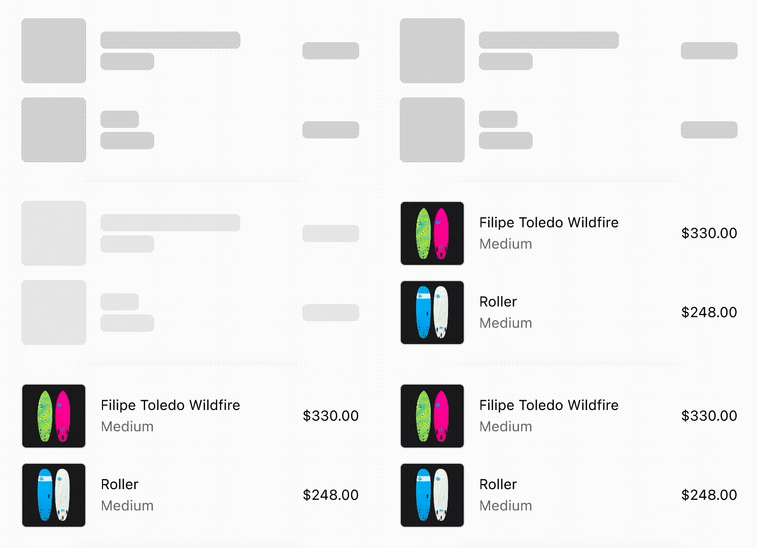
Using skeleton loaders to prevent layout shifts on content load.
React
import {
  reactExtension,
  View,
  BlockStack,
  InlineLayout,
  SkeletonImage,
  Image,
  Icon,
  SkeletonText,
  Text,
} from '@shopify/ui-extensions-react/checkout';

export default reactExtension(
  'purchase.checkout.block.render',
  () => <LoadingStateSkeletons />,
);

export const ProductThumbnail = ({
  source = 'https://yourawesomeimage.com',
}) => (
  <View
    minBlockSize={64}
    cornerRadius="large"
    maxInlineSize={64}
    minInlineSize={64}
    border="base"
  >
    {source ? (
      <Image
        fit="cover"
        aspectRatio={1}
        source={source}
        cornerRadius="large"
      />
    ) : (
      <View maxInlineSize={33}>
        <Icon source="camera" size="fill" />
      </View>
    )}
  </View>
);
export const LoadingStateSkeletons = () => {
  const loading = true;
  const [item1, item2] = [
    {
      title: 'Felipe Toledo WildFire',
      variantTitle: 'Medium',
      price: '$330.00',
    },
    {
      title: 'Roller',
      variantTitle: 'Medium',
      price: '$248.00',
    },
  ];
  const itemInfo = ({title, variantTitle}) =>
    loading ? (
      <>
        <SkeletonText>{title}</SkeletonText>
        <SkeletonText>
          {variantTitle}
        </SkeletonText>
      </>
    ) : (
      <>
        <Text emphasis="bold">{title}</Text>
        <Text appearance="subdued">
          {variantTitle}
        </Text>
      </>
    );
  const order = (item) => (
    <InlineLayout
      columns={['auto', 'fill', 'auto']}
      spacing="base"
      blockAlignment="center"
    >
      {loading ? (
        <SkeletonImage
          blockSize={64}
          inlineSize={64}
        />
      ) : (
        <ProductThumbnail />
      )}
      <BlockStack spacing="extraTight">
        {itemInfo(item)}
      </BlockStack>
      {loading ? (
        <SkeletonText>{item.price}</SkeletonText>
      ) : (
        <Text emphasis="bold">{item.price}</Text>
      )}
    </InlineLayout>
  );
  return (
    <View maxInlineSize={400}>
      <BlockStack>
        {order(item1)}
        {order(item2)}
      </BlockStack>
    </View>
  );
};
JavaScript
import {
  extension,
  BlockStack,
  View,
  InlineLayout,
  Image,
  Icon,
  Text,
  SkeletonImage,
  SkeletonText,
} from '@shopify/ui-extensions/checkout';

export default extension(
  'purchase.checkout.block.render',
  (root) => {
    const source = 'https://yourawesomeimage.com';
    const loading = true;
    const [item1, item2] = [
      {
        title: 'Felipe Toledo WildFire',
        variantTitle: 'Medium',
        price: '$330.00',
      },
      {
        title: 'Roller',
        variantTitle: 'Medium',
        price: '$248.00',
      },
    ];
    const thumbnail = root.createComponent(
      View,
      {
        minBlockSize: 64,
        cornerRadius: 'large',
        maxInlineSize: 64,
        minInlineSize: 64,
        border: 'base',
      },
      [
        source
          ? root.createComponent(Image, {
              fit: 'cover',
              aspectRatio: 1,
              source,
              cornerRadius: 'large',
            })
          : root.createComponent(
              View,
              {maxInlineSize: 33},
              [
                root.createComponent(Icon, {
                  source: 'camera',
                  size: 'fill',
                }),
              ],
            ),
      ],
    );
    const itemInfo = ({title, variantTitle}) =>
      root.createComponent(
        BlockStack,
        {
          spacing: 'extraTight',
        },
        [
          loading
            ? (root.createComponent(
                SkeletonText,
                {},
                title,
              ),
              root.createComponent(
                SkeletonText,
                {},
                variantTitle,
              ))
            : (root.createComponent(
                Text,
                {},
                title,
              ),
              root.createComponent(
                Text,
                {},
                variantTitle,
              )),
        ],
      );
    const order = (item) =>
      root.createComponent(
        InlineLayout,
        {
          columns: ['auto', 'fill', 'auto'],
          spacing: 'base',
          blockAlignment: 'center',
        },
        [
          loading
            ? root.createComponent(
                SkeletonImage,
                {
                  blockSize: 64,
                  inlineSize: 64,
                },
              )
            : thumbnail,
          itemInfo(item),
          loading
            ? root.createComponent(
                SkeletonText,
                {},
                item.price,
              )
            : root.createComponent(
                Text,
                {},
                item.price,
              ),
        ],
      );
    const view = root.createComponent(
      View,
      {
        maxInlineSize: 400,
      },
      [
        root.createComponent(BlockStack, {}, [
          order(item1),
          order(item2),
        ]),
      ],
    );
    root.appendChild(view);
  },
);