Version 2025-07 is the last API version to support React-based UI components. Later versions use Polaris web components, native UI elements with built-in accessibility, better performance, and consistent styling with Shopify's design system. Check out the upgrade guide to upgrade your extension and avoid being blocked from updating your extension after October 1st 2026.
Form
The Form component should be used to wrap one or more form controls. The Form component provides an "implicit submit" behavior, where buyers can submit the form from any input by pressing "Enter" on their keyboards. This behavior is widely expected, and should be respected as often as possible.
Unlike an HTML form element, the Form component does not support configuring the descendant fields to be submitted via HTTP automatically. Instead, you must provide an onSubmit callback that will perform the necessary HTTP requests in JavaScript.
Supported targets
- Checkout::Actions::Render
Before - Checkout::Cart
Line Details::Render After - Checkout::Cart
Lines::Render After - Checkout::Contact::Render
After - Checkout::Customer
Information::Render After - Checkout::Delivery
Address::Render Before - Checkout::Dynamic::Render
- Checkout::Pickup
Locations::Render After - Checkout::Pickup
Locations::Render Before - Checkout::Pickup
Points::Render After - Checkout::Pickup
Points::Render Before - Checkout::Reductions::Render
After - Checkout::Reductions::Render
Before - Checkout::Shipping
Method Details::Render After - Checkout::Shipping
Method Details::Render Expanded - Checkout::Shipping
Methods::Render After - Checkout::Shipping
Methods::Render Before - Checkout::Thank
You::Cart Line Details::Render After - Checkout::Thank
You::Cart Lines::Render After - Checkout::Thank
You::Customer Information::Render After - Checkout::Thank
You::Dynamic::Render - purchase.
checkout. actions. render-before - purchase.
checkout. block. render - purchase.
checkout. cart-line-item. render-after - purchase.
checkout. cart-line-list. render-after - purchase.
checkout. contact. render-after - purchase.
checkout. delivery-address. render-after - purchase.
checkout. delivery-address. render-before - purchase.
checkout. footer. render-after - purchase.
checkout. header. render-after - purchase.
checkout. payment-method-list. render-after - purchase.
checkout. payment-method-list. render-before - purchase.
checkout. pickup-location-list. render-after - purchase.
checkout. pickup-location-list. render-before - purchase.
checkout. pickup-location-option-item. render-after - purchase.
checkout. pickup-point-list. render-after - purchase.
checkout. pickup-point-list. render-before - purchase.
checkout. reductions. render-after - purchase.
checkout. reductions. render-before - purchase.
checkout. shipping-option-item. details. render - purchase.
checkout. shipping-option-item. render-after - purchase.
checkout. shipping-option-list. render-after - purchase.
checkout. shipping-option-list. render-before - purchase.
thank-you. announcement. render - purchase.
thank-you. block. render - purchase.
thank-you. cart-line-item. render-after - purchase.
thank-you. cart-line-list. render-after - purchase.
thank-you. customer-information. render-after - purchase.
thank-you. footer. render-after - purchase.
thank-you. header. render-after
Supported targets
- Checkout::Actions::Render
Before - Checkout::Cart
Line Details::Render After - Checkout::Cart
Lines::Render After - Checkout::Contact::Render
After - Checkout::Customer
Information::Render After - Checkout::Delivery
Address::Render Before - Checkout::Dynamic::Render
- Checkout::Pickup
Locations::Render After - Checkout::Pickup
Locations::Render Before - Checkout::Pickup
Points::Render After - Checkout::Pickup
Points::Render Before - Checkout::Reductions::Render
After - Checkout::Reductions::Render
Before - Checkout::Shipping
Method Details::Render After - Checkout::Shipping
Method Details::Render Expanded - Checkout::Shipping
Methods::Render After - Checkout::Shipping
Methods::Render Before - Checkout::Thank
You::Cart Line Details::Render After - Checkout::Thank
You::Cart Lines::Render After - Checkout::Thank
You::Customer Information::Render After - Checkout::Thank
You::Dynamic::Render - purchase.
checkout. actions. render-before - purchase.
checkout. block. render - purchase.
checkout. cart-line-item. render-after - purchase.
checkout. cart-line-list. render-after - purchase.
checkout. contact. render-after - purchase.
checkout. delivery-address. render-after - purchase.
checkout. delivery-address. render-before - purchase.
checkout. footer. render-after - purchase.
checkout. header. render-after - purchase.
checkout. payment-method-list. render-after - purchase.
checkout. payment-method-list. render-before - purchase.
checkout. pickup-location-list. render-after - purchase.
checkout. pickup-location-list. render-before - purchase.
checkout. pickup-location-option-item. render-after - purchase.
checkout. pickup-point-list. render-after - purchase.
checkout. pickup-point-list. render-before - purchase.
checkout. reductions. render-after - purchase.
checkout. reductions. render-before - purchase.
checkout. shipping-option-item. details. render - purchase.
checkout. shipping-option-item. render-after - purchase.
checkout. shipping-option-list. render-after - purchase.
checkout. shipping-option-list. render-before - purchase.
thank-you. announcement. render - purchase.
thank-you. block. render - purchase.
thank-you. cart-line-item. render-after - purchase.
thank-you. cart-line-list. render-after - purchase.
thank-you. customer-information. render-after - purchase.
thank-you. footer. render-after - purchase.
thank-you. header. render-after
Anchor to FormPropsForm
The form component should be used to wrap one or more form controls. This component provides an "implicit submit" behavior, where customers can submit the form from any input by pressing "Enter" on their keyboards. This behavior is widely expected, and should be respected as often as possible.
Unlike an HTML form element, this component does not support configuring the descendant fields to be submitted via HTTP automatically. Instead, you must provide an callback that will perform the necessary HTTP requests in JavaScript.
- Anchor to onSubmiton
Submiton Submit () => void() => voidrequiredrequired A callback that is run when the form is submitted.
- Anchor to disableddisableddisabledbooleanboolean
Whether the form is able to be submitted. When set to
true, this will disable the implicit submit behavior of the form.- Anchor to idididstringstring
An optional override for the autogenerated form ID.
Anchor to ExamplesExamples
Anchor to Basic FormBasic Form
Basic Form
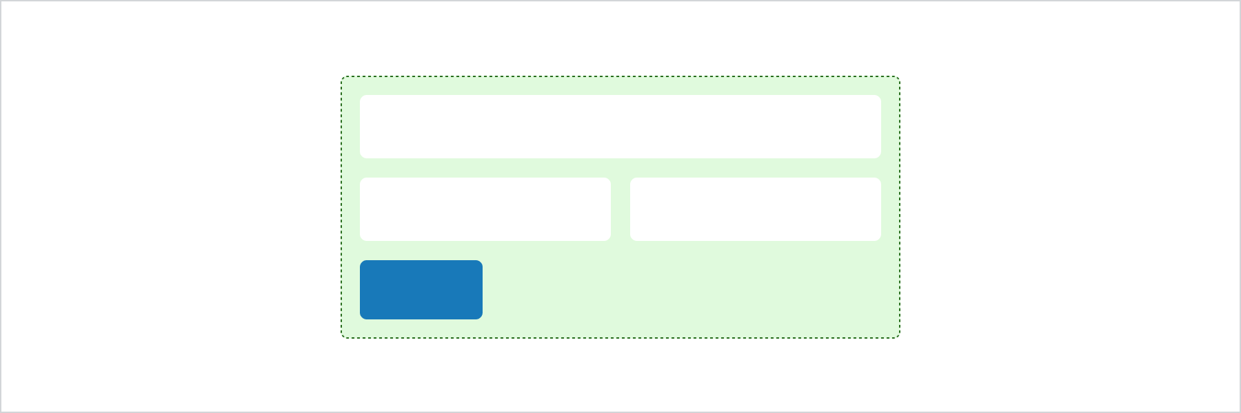
Basic Form
React
import {
  reactExtension,
  BlockSpacer,
  Button,
  Form,
  Grid,
  GridItem,
  TextField,
  View,
} from '@shopify/ui-extensions-react/checkout';

export default reactExtension(
  'purchase.checkout.block.render',
  () => <Extension />,
);

function Extension() {
  return (
    <Form
      onSubmit={() =>
        console.log('onSubmit event')
      }
    >
      <Grid
        columns={['50%', '50%']}
        spacing="base"
      >
        <View>
          <TextField label="First name" />
        </View>
        <View>
          <TextField label="Last name" />
        </View>
        <GridItem columnSpan={2}>
          <TextField label="Company" />
        </GridItem>
      </Grid>
      <BlockSpacer spacing="base" />
      <Button accessibilityRole="submit">
        Submit
      </Button>
    </Form>
  );
}
JS
import {
  extension,
  BlockSpacer,
  Button,
  Form,
  Grid,
  GridItem,
  TextField,
  View,
} from '@shopify/ui-extensions/checkout';

export default extension('purchase.checkout.block.render', (root) => {
  const fields = root.createComponent(
    Grid,
    {columns: ['50%', '50%'], spacing: 'base'},
    [
      root.createComponent(
        View,
        undefined,
        root.createComponent(TextField, {label: 'First name'}),
      ),
      root.createComponent(
        View,
        undefined,
        root.createComponent(TextField, {label: 'Last name'}),
      ),
      root.createComponent(
        GridItem,
        {columnSpan: 2},
        root.createComponent(TextField, {label: 'Company'}),
      ),
    ],
  );
  const spacer = root.createComponent(BlockSpacer, {spacing: 'base'});
  const button = root.createComponent(
    Button,
    {accessibilityRole: 'submit'},
    'Submit',
  );

  const form = root.createComponent(
    Form,
    {onSubmit: () => console.log('onSubmit event')},
    [fields, spacer, button],
  );

  root.appendChild(form);
});
Anchor to Best practicesBest practices
- Place one submit button per form: Include a single submit button at the end of the Form component to keep the submission flow clear.
- Register an
onSubmithandler: The Form component doesn't submit data over HTTP. Provide anonSubmitcallback to process form data programmatically. - Group related fields: Wrap only related inputs in a single Form component. Use separate Form components for independent data collection tasks.
Anchor to LimitationsLimitations
- The Form component doesn't automatically submit data using HTTP. You must implement
onSubmitto process form data. - Each form supports only one submit button.