Version 2025-07 is the last API version to support React-based UI components. Later versions use Polaris web components, native UI elements with built-in accessibility, better performance, and consistent styling with Shopify's design system. Check out the upgrade guide to upgrade your extension and avoid being blocked from updating your extension after October 1st 2026.
Announcement
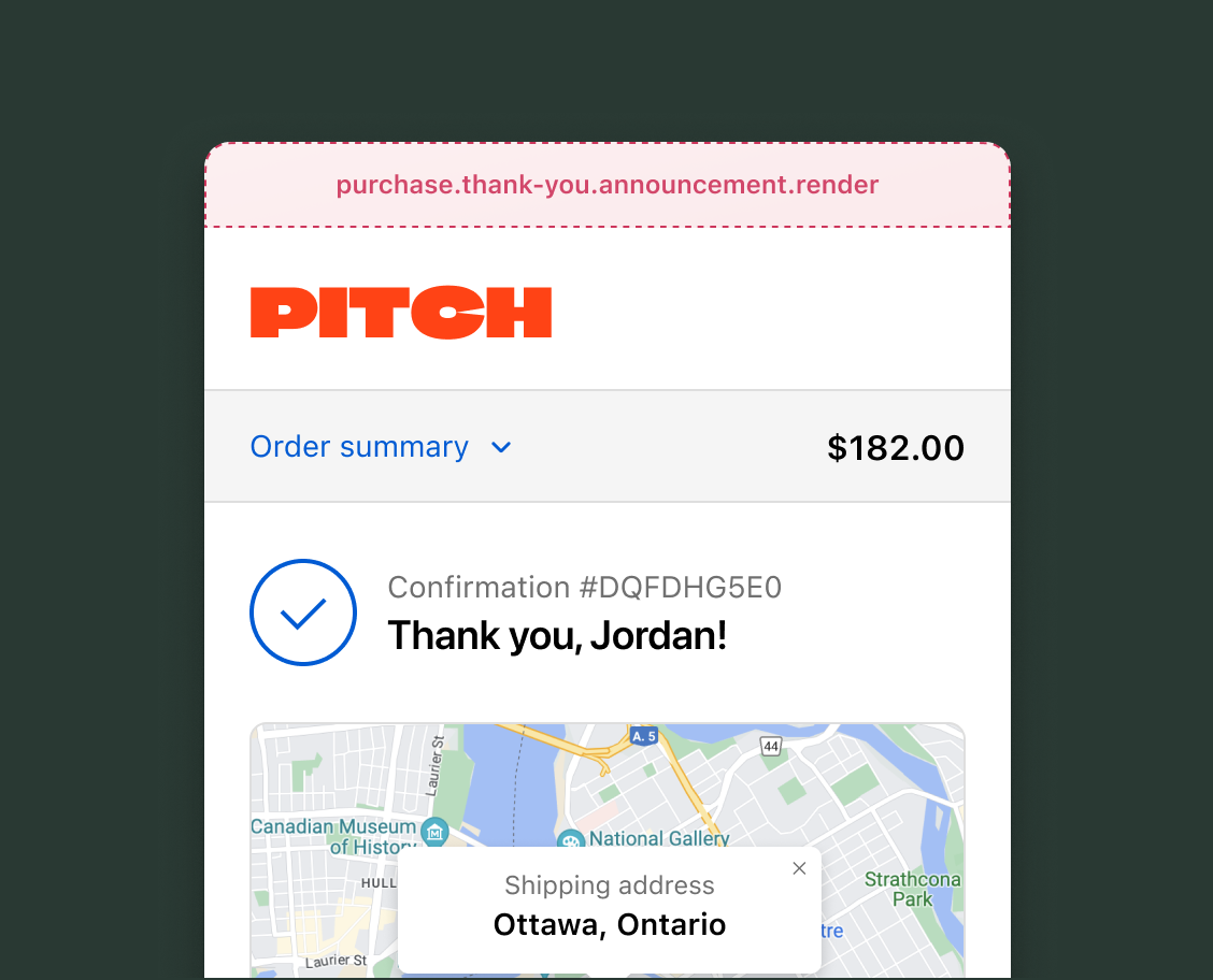
The announcement target renders a dismissable banner at the top of the Thank you page. Extensions here communicate high-priority content you want buyers to act on, such as surveys, promotions, and referral programs.
Anchor to Use casesUse cases
- Exclusive offers and promotions: Display special offers, discount codes, or loyalty program enrollment opportunities to returning buyers.
- Buyer surveys and feedback: Prompt buyers to complete a survey or provide feedback about their shopping experience.
- Referral programs: Promote referral programs and provide a direct link for buyer participation.
- Localized messaging: Show market-specific announcements based on the buyer's country, language, or currency, such as customs information for international orders or region-specific promotions.
Anchor to Announcement targetAnnouncement target
Use this static target to display time-sensitive announcements to buyers immediately after their purchase.
Extensions must wrap all content inside the announcement component. The examples demonstrate using the OrderConfirmationApi for order data and API properties for authenticated backend calls, Storefront API queries, and merchant settings.
Anchor to Thank you announcement ,[object Object]Thank you announcement target
purchase.thank-you.announcement.render
Renders a dismissable announcement banner above all other content on the Thank you page. Use this target to capture the buyer's attention with time-sensitive content that links to a modal for longer interactions.
Extensions at this target can access order information through the OrderConfirmationApi, including whether it's the buyer's first order. The Announcement API provides methods to programmatically close the announcement and listen for close events. The announcement renders as a banner with built-in expand and collapse behavior.
Supported components
- Badge
- Banner
- Block
Layout - Block
Spacer - Block
Stack - Button
- Chat
- Checkbox
- Choice
- Choice
List - Clipboard
Item - Consent
Checkbox - Consent
Phone Field - Date
Field - Date
Picker - Disclosure
- Divider
- Drop
Zone - Form
- Grid
- Grid
Item - Heading
- Heading
Group - Icon
- Image
- Inline
Layout - Inline
Spacer - Inline
Stack - Link
- List
- List
Item - Map
- Map
Marker - Map
Popover - Modal
- Payment
Icon - Phone
Field - Popover
- Pressable
- Product
Thumbnail - Progress
- QR code
- Scroll
View - Select
- Sheet
- Skeleton
Image - Skeleton
Text - Skeleton
Text Block - Spinner
- Stepper
- Switch
- Tag
- Text
- Text
Block - Text
Field - Toggle
Button - Toggle
Button Group - Tooltip
- View
Supported components
- Badge
- Banner
- Block
Layout - Block
Spacer - Block
Stack - Button
- Chat
- Checkbox
- Choice
- Choice
List - Clipboard
Item - Consent
Checkbox - Consent
Phone Field - Date
Field - Date
Picker - Disclosure
- Divider
- Drop
Zone - Form
- Grid
- Grid
Item - Heading
- Heading
Group - Icon
- Image
- Inline
Layout - Inline
Spacer - Inline
Stack - Link
- List
- List
Item - Map
- Map
Marker - Map
Popover - Modal
- Payment
Icon - Phone
Field - Popover
- Pressable
- Product
Thumbnail - Progress
- QR code
- Scroll
View - Select
- Sheet
- Skeleton
Image - Skeleton
Text - Skeleton
Text Block - Spinner
- Stepper
- Switch
- Tag
- Text
- Text
Block - Text
Field - Toggle
Button - Toggle
Button Group - Tooltip
- View
Examples
Create a post-purchase survey announcement
Description
Add a dismissable announcement to the Thank you page that prompts buyers to fill out a survey. This example uses the announcement component with a modal to collect feedback about the shopping experience.
React
import {
  reactExtension,
  InlineStack,
  Text,
  Link,
  Modal,
  TextField,
  Button,
} from '@shopify/ui-extensions-react/checkout';

export default reactExtension(
  'purchase.thank-you.announcement.render',
  () => <Extension />,
);

function Extension() {
  return (
    <InlineStack spacing="base">
      <Text>
        How was your shopping experience?
      </Text>
      <Link
        overlay={
          <Modal
            title="Quick survey"
            padding
          >
            <TextField
              label="How can we improve your experience?"
            />
            <Button kind="primary">
              Submit
            </Button>
          </Modal>
        }
      >
        Take a quick survey
      </Link>
    </InlineStack>
  );
}
TS
import {
  extension,
  InlineStack,
  Text,
  Link,
  Modal,
  TextField,
  Button,
} from '@shopify/ui-extensions/checkout';

export default extension(
  'purchase.thank-you.announcement.render',
  (root) => {
    const modal = root.createComponent(
      Modal,
      {title: 'Quick survey', padding: true},
    );

    modal.appendChild(
      root.createComponent(
        TextField,
        {
          label:
            'How can we improve your experience?',
        },
      ),
    );

    modal.appendChild(
      root.createComponent(
        Button,
        {kind: 'primary'},
        'Submit',
      ),
    );

    const stack = root.createComponent(
      InlineStack,
      {spacing: 'base'},
    );

    stack.appendChild(
      root.createComponent(
        Text,
        {},
        'How was your shopping experience?',
      ),
    );

    stack.appendChild(
      root.createComponent(
        Link,
        {overlay: modal},
        'Take a quick survey',
      ),
    );

    root.appendChild(stack);
  },
);
Anchor to Best practicesBest practices
- Prioritize the default state: The announcement is most effective when content is short enough to display entirely in its default state, with no need for expansion. Keep text concise and scannable, because buyers are focused on their order confirmation.
- Handle content truncation: The announcement component has a strict maximum height. Content that exceeds the expanded state's height is cut off with no scrolling capability. Make sure your extension handles long content gracefully to prevent truncation.
- Provide a modal alternative: If your extension needs to display more than a few lines of content, don't cram it into the announcement bar. Instead, use the bar as a teaser that links to a modal. This is the recommended pattern for displaying surveys, detailed offers, or other longer-form content.
Anchor to LimitationsLimitations
- Single extension slot: Only one extension renders at this target. If multiple apps target this location, only one is displayed. Design your extension with the expectation that it may not render if another app occupies this slot.
- Read-only order data: Order data through the
OrderConfirmationApiis limited to the order ID, order number, and whether it's the buyer's first order. The order number might not be present for orders created before 2024. To access additional order details, use the GraphQL Admin API'sorderquery through your app backend.