Stackcomponent
A container for other components that allows them to be stacked horizontally or vertically. When building complex UIs, this will be your primary building block. Stacks always wrap the content to the next column or row.
Anchor to stackStack
- Anchor to alignContentalignContent'stretch' | ContentPosition | ContentDistributionDefault: 'start'
Aligns the Stack along the cross axis.
- Anchor to alignItemsalignItems'stretch' | 'baseline' | ContentPositionDefault: 'stretch'
Aligns the Stack's children along the cross axis.
- Anchor to blockSizeblockSizeSizeUnitsOrAutoDefault: 'auto'
Adjust the block size.
Auto takes the block size of the box's children.
- Anchor to columnGapcolumnGapSpacingKeyword | ''Default: '' - meaning no override
Adjust spacing between elements in the inline axis.
This overrides the column value of
gap.- Anchor to directiondirection'inline' | 'block' | DeprecatedStackDirectionDefault: 'inline'
Sets how the Stack's children are placed within the Stack. 'vertical' and 'horizontal' are deprecated. Using these values will use the Stack implementation from 2024-10.
- Anchor to flexflexnumber
The flex value for the stack. Flex 1 will stretch the stack to fill the parent.
- Anchor to flexChildrenflexChildrenboolean
Whether the children should be stretched to fill the cross axis.
- SpacingKeywordDefault: '0'
The size of the gap between each child in the stack.
- Anchor to inlineSizeinlineSizeSizeUnitsOrAutoDefault: 'auto'
Adjust the inline size.
Auto takes the inline size of the box's children.
- Anchor to justifyContentjustifyContentContentPosition | ContentDistributionDefault: 'start'
Aligns the Stack along the main axis.
- Anchor to maxBlockSizemaxBlockSizeSizeUnitsOrNoneDefault: 'none'
Adjust the maximum block size.
- Anchor to maxInlineSizemaxInlineSizeSizeUnitsOrNoneDefault: 'none'
Adjust the maximum inline size.
- Anchor to minBlockSizeminBlockSizeSizeUnitsDefault: '0'
Adjust the minimum block size.
- Anchor to minInlineSizeminInlineSizeSizeUnitsDefault: '0'
Adjust the minimum inline size.
- Anchor to paddingpaddingPaddingKeysDefault: '0'
Adjust the padding of all edges in pixels.
- Anchor to paddingBlockpaddingBlockPaddingKeysDefault: '0'
Adjust the block-padding.
This overrides the block value of
padding.- Anchor to paddingBlockEndpaddingBlockEndPaddingKeysDefault: '0'
Adjust the block-end padding.
This overrides the block-end value of
.- Anchor to paddingBlockStartpaddingBlockStartPaddingKeysDefault: '0'
Adjust the block-start padding.
This overrides the block-start value of
.- Anchor to paddingInlinepaddingInlinePaddingKeysDefault: '0'
Adjust the inline padding.
This overrides the inline value of
padding.- Anchor to paddingInlineEndpaddingInlineEndPaddingKeysDefault: '0'
Adjust the inline-end padding.
This overrides the inline-end value of
.- Anchor to paddingInlineStartpaddingInlineStartPaddingKeysDefault: '0'
Adjust the inline-start padding.
This overrides the inline-start value of
.- Anchor to rowGaprowGapSpacingKeyword | ''Default: '' - meaning no override
Adjust spacing between elements in the block axis.
This overrides the row value of
gap.- Anchor to alignmentalignmentContentPosition | ContentDistributionDefault: 'flex-start'deprecated
The alignment of the children along the main axis.
DeprecatedUse the
prop instead.- Anchor to flexWrapflexWrap'wrap' | 'nowrap' | 'wrap-reverse'deprecated
Wrap behavior for the children of the stack.
DeprecatedHas no effect, content will always wrap.
- Anchor to paddingHorizontalpaddingHorizontalHorizontalSpacingdeprecated
The horizontal padding around the stack.
DeprecatedUse the
prop instead.- Anchor to paddingVerticalpaddingVerticalVerticalSpacingdeprecated
The vertical padding around the stack.
DeprecatedUse the
prop instead.- Anchor to spacingspacingSpacingDefault: 1deprecated
The spacing between each child in the stack.
DeprecatedUse the
gapprop instead.
ContentPosition
'center' | 'start' | 'end'ContentDistribution
'space-around' | 'space-between' | 'space-evenly'SizeUnitsOrAuto
SizeUnits | 'auto'SizeUnits
`${number}px` | `${number}%` | `0`SpacingKeyword
SizeKeyword | 'none'SizeKeyword
SizeKeyword maps to predetermined values in POS.
'0' | '025' | '050' | '100' | '200' | '250' | '300' | '350' | '400' | '450' | '500' | '600' | '700' | '800' | '900' | '1000' | '1100' | '1200' | '1400' | '1800' | '2000'DeprecatedStackDirection
'vertical' | 'horizontal'SizeUnitsOrNone
SizeUnits | 'none'PaddingKeys
SizeKeyword | 'none'HorizontalSpacing
'HalfPoint' | 'ExtraSmall' | 'Small' | 'Medium' | 'Large' | 'ExtraLarge' | 'ExtraExtraLarge'VerticalSpacing
'HalfPoint' | 'ExtraSmall' | 'Small' | 'Medium' | 'Large' | 'ExtraLarge'Spacing
0.5 | 1 | 2 | 3 | 4 | 5 | 6 | 7 | 8 | 9 | 10 | 11 | 13 | 16Stack
Examples
Stack
React
import {
  reactExtension,
  Button,
  Stack,
  Screen,
} from '@shopify/ui-extensions-react/point-of-sale';
import React from 'react';

export default reactExtension('pos.home.modal.render', () => (
  <Screen name="Stack" title="Stack">
    <Stack direction="inline" gap="200">
      <Button title="Hello" />
      <Button title="Hello" />
    </Stack>
  </Screen>
));
TS
import {
  extension,
  Button,
  Screen,
  Stack,
} from '@shopify/ui-extensions/point-of-sale';

export default extension('pos.home.modal.render', (root) => {
  const button1 = root.createComponent(Button, {
    title: 'Hello',
  });

  const button2 = root.createComponent(Button, {
    title: 'Hello',
  });

  const stack = root.createComponent(Stack, {
    direction: 'inline',
    gap: '200',
  });
  stack.append(button1, button2);

  const screen = root.createComponent(Screen, {
    name: 'Stack',
    title: 'Stack',
  });
  screen.append(stack);
  root.append(screen);

  root.mount();
});
Preview
Anchor to examplesExamples
The following examples will demonstrate some, but not all of the abilities of the Stack component. For simplicity, these examples use the React version of the Stack component, but the same results will be achieved by using the same properties with the regular JS library.
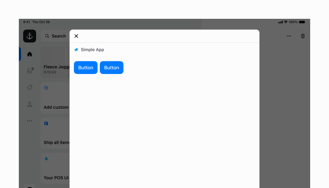
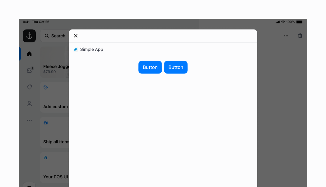
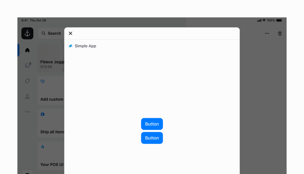
Anchor to inline-defaultInline Stack with default values
In this example, we specify inline for the direction. As you can see, we have two small buttons occupying just the amount of space that they need, at the left side of the Stack. This is because is set to start by default. We also include a gap of "200".
Inline Stack with default values
Examples
Inline Stack with default values
React
import {
  reactExtension,
  Button,
  Stack,
  Screen,
} from '@shopify/ui-extensions-react/point-of-sale';
import React from 'react';

export default reactExtension('pos.home.modal.render', () => (
  <Screen name="Stack" title="Stack">
    <Stack direction="inline" gap="200">
      <Button title="Hello" />
      <Button title="Hello" />
    </Stack>
  </Screen>
));
TS
import {
  extension,
  Button,
  Screen,
  Stack,
} from '@shopify/ui-extensions/point-of-sale';

export default extension('pos.home.modal.render', (root) => {
  const button1 = root.createComponent(Button, {
    title: 'Hello',
  });

  const button2 = root.createComponent(Button, {
    title: 'Hello',
  });

  const stack = root.createComponent(Stack, {
    direction: 'inline',
    gap: '200',
  });
  stack.append(button1, button2);

  const screen = root.createComponent(Screen, {
    name: 'Stack',
    title: 'Stack',
  });
  screen.append(stack);
  root.append(screen);

  root.mount();
});
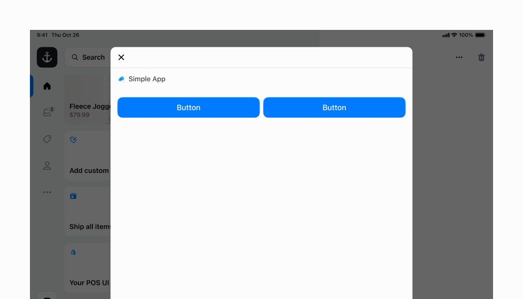
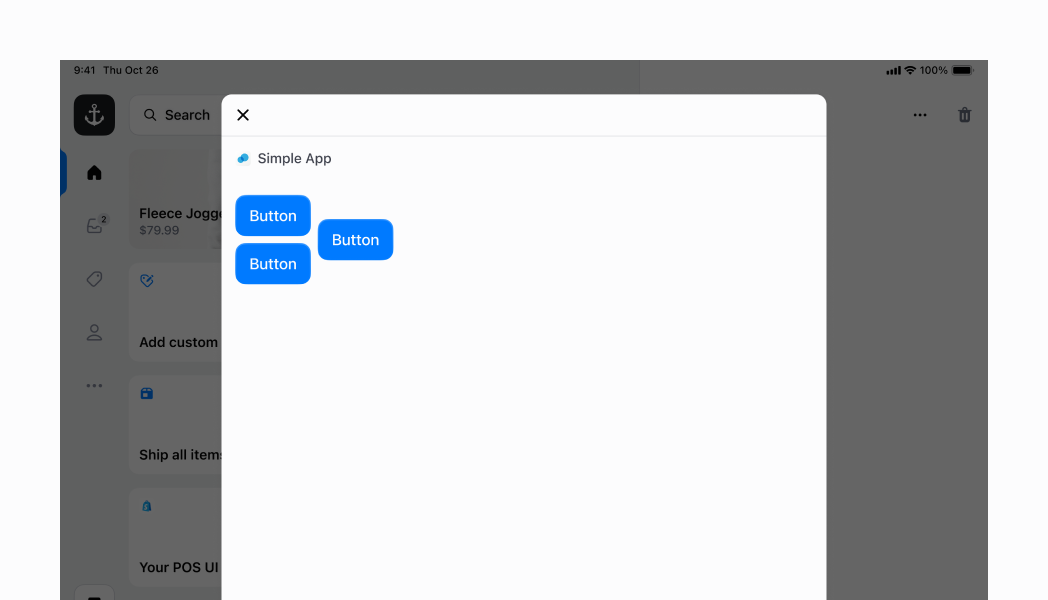
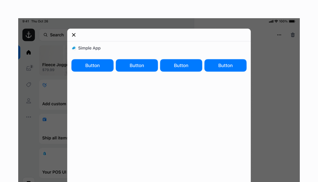
Anchor to inline-flex-childrenInline Stack with flexChildren
Similar to the example above, but this time we are specifying to be true. This means that the two buttons will take up the max amount of space that they can within the inline stack.
Inline Stack with flexChildren
Examples
Inline Stack with flexChildren
React
import {
  reactExtension,
  Button,
  Stack,
  Screen,
} from '@shopify/ui-extensions-react/point-of-sale';
import React from 'react';

export default reactExtension('pos.home.modal.render', () => (
  <Screen name="Stack" title="Stack">
    <Stack direction="inline" gap="200" flexChildren>
      <Button title="Hello" />
      <Button title="Hello" />
    </Stack>
  </Screen>
));
TS
import {
  extension,
  Button,
  Screen,
  Stack,
} from '@shopify/ui-extensions/point-of-sale';

export default extension('pos.home.modal.render', (root) => {
  const button1 = root.createComponent(Button, {
    title: 'Hello',
  });

  const button2 = root.createComponent(Button, {
    title: 'Hello',
  });

  const stack = root.createComponent(Stack, {
    direction: 'inline',
    gap: '200',
    flexChildren: true,
  });
  stack.append(button1, button2);

  const screen = root.createComponent(Screen, {
    name: 'Stack',
    title: 'Stack',
  });
  screen.append(stack);
  root.append(screen);

  root.mount();
});
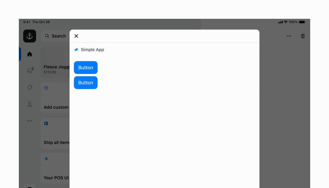
Anchor to inline-center-childrenInline Stack with centered children
You can also center elements in your inline stack. For this, you can specify the to be center. However, in this case you also want to be false (which is the default), so that the children can take up the minimal amount of space that they need, and be centered.
Inline Stack with centered children
Examples
Inline Stack with centered children
React
import {
  reactExtension,
  Button,
  Stack,
  Screen,
} from '@shopify/ui-extensions-react/point-of-sale';
import React from 'react';

export default reactExtension('pos.home.modal.render', () => (
  <Screen name="Stack" title="Stack">
    <Stack direction="inline" gap="200" justifyContent="center">
      <Button title="Hello" />
      <Button title="Hello" />
    </Stack>
  </Screen>
));
TS
import {
  extension,
  Button,
  Screen,
  Stack,
} from '@shopify/ui-extensions/point-of-sale';

export default extension('pos.home.modal.render', (root) => {
  const button1 = root.createComponent(Button, {
    title: 'Hello',
  });

  const button2 = root.createComponent(Button, {
    title: 'Hello',
  });

  const stack = root.createComponent(Stack, {
    direction: 'inline',
    gap: '200',
    justifyContent: 'center',
  });
  stack.append(button1, button2);

  const screen = root.createComponent(Screen, {
    name: 'Stack',
    title: 'Stack',
  });
  screen.append(stack);
  root.append(screen);

  root.mount();
});
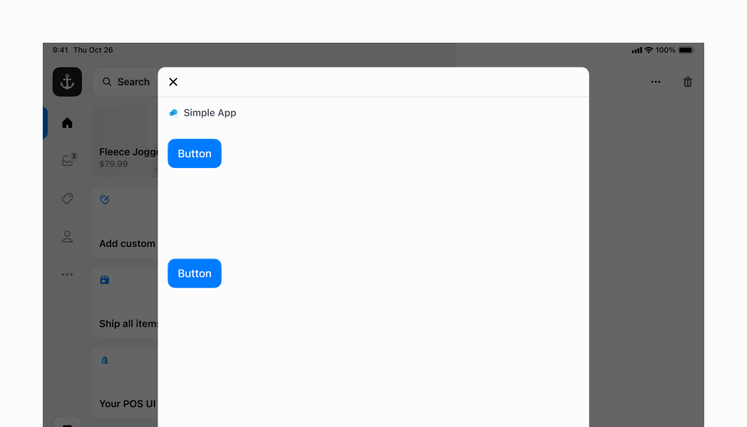
Anchor to inline-align-items-centerInline Stack with vertical axis centering
Here we have an inline stack with two children. The first is a block stack with two buttons, and the second is a single button. Since the first element has a greater intrinsic height, our main inline stack's intrinsic height is also increased. We can center both children component along the main axis (x-axis) by setting the property to center.
Inline Stack with vertical axis centering
Examples
Inline Stack with vertical axis centering
React
import {
  reactExtension,
  Button,
  Stack,
  Screen,
  ScrollView,
} from '@shopify/ui-extensions-react/point-of-sale';
import React from 'react';

export default reactExtension('pos.home.modal.render', () => (
  <Screen name="Stack" title="Stack">
    <ScrollView>
      <Stack
        direction="inline"
        gap="200"
        alignItems="center"
        alignContent="center"
      >
        <Stack direction="block" gap="200">
          <Button title="Hello" />
          <Button title="Hello" />
        </Stack>
        <Button title="Hello" />
      </Stack>
    </ScrollView>
  </Screen>
));
TS
import {
  extension,
  Button,
  Screen,
  Stack,
  ScrollView,
} from '@shopify/ui-extensions/point-of-sale';

export default extension('pos.home.modal.render', (root) => {
  const button1 = root.createComponent(Button, {
    title: 'Hello',
  });

  const button2 = root.createComponent(Button, {
    title: 'Hello',
  });

  const button3 = root.createComponent(Button, {
    title: 'Hello',
  });

  const innerStack = root.createComponent(Stack, {
    direction: 'block',
    gap: '200',
  });
  innerStack.append(button1, button2);

  const mainStack = root.createComponent(Stack, {
    direction: 'inline',
    gap: '200',
    alignItems: 'center',
    alignContent: 'center',
  });
  mainStack.append(innerStack, button3);

  const scrollView = root.createComponent(ScrollView);
  scrollView.append(mainStack);

  const screen = root.createComponent(Screen, {
    name: 'Stack',
    title: 'Stack',
  });
  screen.append(scrollView);
  root.append(screen);

  root.mount();
});
Anchor to blockBlock Stack
You can specify your Stack to layout its children vertically by setting the direction property to block.
Block Stack
Examples
Block Stack
React
import {
  reactExtension,
  Button,
  Stack,
  Screen,
} from '@shopify/ui-extensions-react/point-of-sale';
import React from 'react';

export default reactExtension('pos.home.modal.render', () => (
  <Screen name="Stack" title="Stack">
    <Stack direction="block" gap="200" paddingInline="450">
      <Button title="Hello" />
      <Button title="Hello" />
      <Button title="Hello" />
    </Stack>
  </Screen>
));
TS
import {
  extension,
  Button,
  Screen,
  Stack,
} from '@shopify/ui-extensions/point-of-sale';

export default extension('pos.home.modal.render', (root) => {
  const button1 = root.createComponent(Button, {
    title: 'Hello',
  });

  const button2 = root.createComponent(Button, {
    title: 'Hello',
  });

  const button3 = root.createComponent(Button, {
    title: 'Hello',
  });

  const stack = root.createComponent(Stack, {
    direction: 'block',
    gap: '200',
    paddingInline: '450',
  });
  stack.append(button1, button2, button3);

  const screen = root.createComponent(Screen, {
    name: 'Stack',
    title: 'Stack',
  });
  screen.append(stack);
  root.append(screen);

  root.mount();
});
Anchor to extension-stack-block-space-betweenBlock Stack with space between children
Here we are spacing out the children of our block stack by setting to space-between in order to space the children out as much as possible along the vertical axis. Note that in this example, we removed the wrapping in order to introduce a custom height by setting the to 50%. We are also adding of 450 in order to mimic the padding applied to the UI Extension screen header.
Block Stack with space between children
Examples
Block Stack with space between children
React
import {
  reactExtension,
  Button,
  Stack,
  Screen,
} from '@shopify/ui-extensions-react/point-of-sale';
import React from 'react';

export default reactExtension('pos.home.modal.render', () => (
  <Screen name="Stack" title="Stack">
    <Stack
      direction="block"
      gap="200"
      justifyContent="space-between"
      blockSize="50%"
      paddingInline="450"
    >
      <Button title="Hello" />
      <Button title="Hello" />
      <Button title="Hello" />
    </Stack>
  </Screen>
));
TS
import {
  extension,
  Button,
  Screen,
  Stack,
} from '@shopify/ui-extensions/point-of-sale';

export default extension('pos.home.modal.render', (root) => {
  const button1 = root.createComponent(Button, {
    title: 'Hello',
  });

  const button2 = root.createComponent(Button, {
    title: 'Hello',
  });

  const button3 = root.createComponent(Button, {
    title: 'Hello',
  });

  const stack = root.createComponent(Stack, {
    direction: 'block',
    gap: '200',
    justifyContent: 'space-between',
    blockSize: '50%',
    paddingInline: '450',
  });
  stack.append(button1, button2, button3);

  const screen = root.createComponent(Screen, {
    name: 'Stack',
    title: 'Stack',
  });
  screen.append(stack);
  root.append(screen);

  root.mount();
});
Anchor to block-center-allBlock Stack centered on both axes
You can center your block stack on the vertical axis by setting to center. Next, you can set a custom size on your block stack by setting the and . In this example we set them to 50% and 100% respectively. We can then center our elements along both axis of the stack by setting justifyContent to center to center the children vertically, and setting both and to center.
Block Stack centered on both axes
Examples
Block Stack centered on both axes
React
import {
  reactExtension,
  Button,
  Stack,
  Screen,
} from '@shopify/ui-extensions-react/point-of-sale';
import React from 'react';

export default reactExtension('pos.home.modal.render', () => (
  <Screen name="Stack" title="Stack">
    <Stack
      direction="block"
      gap="200"
      justifyContent="center"
      alignContent="center"
      alignItems="center"
      inlineSize="100%"
      paddingInline="450"
      blockSize="50%"
    >
      <Button title="Hello" />
      <Button title="Hello" />
    </Stack>
  </Screen>
));
TS
import {
  extension,
  Button,
  Screen,
  Stack,
} from '@shopify/ui-extensions/point-of-sale';

export default extension('pos.home.modal.render', (root) => {
  const button1 = root.createComponent(Button, {
    title: 'Hello',
  });

  const button2 = root.createComponent(Button, {
    title: 'Hello',
  });

  const stack = root.createComponent(Stack, {
    direction: 'block',
    justifyContent: 'center',
    alignContent: 'center',
    alignItems: 'center',
    inlineSize: '100%',
    paddingInline: '450',
    blockSize: '50%',
    gap: '200',
  });
  stack.append(button1, button2);

  const screen = root.createComponent(Screen, {
    name: 'Stack',
    title: 'Stack',
  });
  screen.append(stack);
  root.append(screen);

  root.mount();
});
Anchor to block-align-content-stretchBlock Stack with horizontal stretching
This example demonstrates a block stack with elements stretched to fill the width of the container. By setting to 'stretch', the children will expand to fill the available horizontal space. This is useful when you want all elements to have consistent width, regardless of their content.
Block Stack with horizontally stretched contents
Examples
Block Stack with horizontally stretched contents
React
import {
  reactExtension,
  SegmentedControl,
  Stack,
  Screen,
} from '@shopify/ui-extensions-react/point-of-sale';
import React from 'react';

export default reactExtension('pos.home.modal.render', () => (
  <Screen name="Stack" title="Stack">
    <Stack direction="block" gap="400" alignContent="stretch" padding="400">
      <SegmentedControl
        selected="1"
        segments={[
          {id: '1', label: 'Segment 1', disabled: false},
          {id: '2', label: 'Segment 2', disabled: false},
          {id: '3', label: 'Segment 3', disabled: false},
          {id: '4', label: 'Segment 4', disabled: false},
          {id: '5', label: 'Segment 5', disabled: false},
          {id: '6', label: 'Segment 6', disabled: false},
          {id: '7', label: 'Segment 7', disabled: false},
        ]}
        onSelect={(id) => console.log(`Selected segment with id: ${id}`)}
      />
    </Stack>
  </Screen>
));
TS
import {
  extension,
  SegmentedControl,
  Screen,
  Stack,
} from '@shopify/ui-extensions/point-of-sale';

export default extension('pos.home.modal.render', (root) => {
  const segmentedControl = root.createComponent(SegmentedControl, {
    segments: [
      {id: '1', label: 'Segment 1', disabled: false},
      {id: '2', label: 'Segment 2', disabled: false},
      {id: '3', label: 'Segment 3', disabled: false},
      {id: '4', label: 'Segment 4', disabled: false},
      {id: '5', label: 'Segment 5', disabled: false},
      {id: '6', label: 'Segment 6', disabled: false},
      {id: '7', label: 'Segment 7', disabled: false},
    ],
    selected: '1',
    onSelect: (id: string) => {
      console.log(`Selected segment with id: ${id}`);
    },
  });
  const stack = root.createComponent(Stack);
  stack.append(segmentedControl);
  const screen = root.createComponent(Screen, {
    name: 'Stack',
    title: 'Stack',
  });
  screen.append(stack);
  root.append(screen);

  root.mount();
});
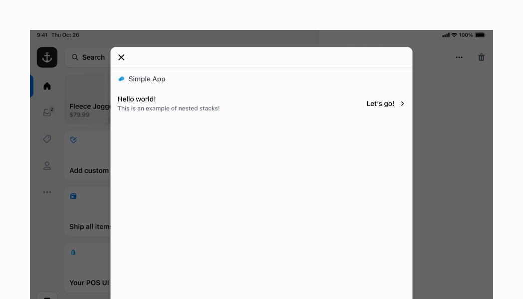
Anchor to nestedNested Stack
Now that we've run through a few examples of what a stack can do, let's move on to something more complex. You can nest multiple stacks of different configurations to achieve a more complex UI. In this example, we will create a row that displays several labels and an icon. This will mimic some of the basic rows that you can find across different POS screens.
Let's put the Selectable aside for now; we'll get to that later. The first stack is which we can refer to as the parent stack, is set to inline. It has two main children, a block stack on the left, and an inline stack on the right. To space them out completely along the horizontal axis, we set our parent inline stack's to space-between. We also specify the to be 100% to take up the full width of the screen.
The first child stack (the block stack) simply has a gap of 100 to space out the two Text components.
The second child stack (the inline stack) has a gap of 600 to space out the Text and the Icon. We also set the and properties to center to center the Text and Icon within their stack.
However, we also need to the and properties to center on the parent inline stack to center the two children stacks along the vertical axis.
Finally, we can return to the Selectable. You'll notice that we've wrapped the entire stack in a Selectable. This makes the entire stack within the Selectable become a tappable surface, with an handler, which is part of the Selectable component. It also gives a nice highlight effect when you tap, as you can see in the screenshot.
Nested Stack
Examples
Nested Stack
React
import {
  reactExtension,
  Text,
  Icon,
  Stack,
  Screen,
  Selectable,
} from '@shopify/ui-extensions-react/point-of-sale';
import React from 'react';

export default reactExtension('pos.home.modal.render', () => (
  <Screen name="Stack" title="Stack">
    <Selectable onPress={() => console.log('Pressed')}>
      <Stack
        direction="inline"
        gap="400"
        justifyContent="space-between"
        alignItems="center"
        alignContent="center"
        paddingInline="450"
        paddingBlock="600"
        inlineSize="100%"
      >
        <Stack direction="block" gap="100">
          <Text>Hello world!</Text>
          <Text variant="captionRegular">
            This is an example of a nested stack!
          </Text>
        </Stack>
        <Stack
          direction="inline"
          gap="600"
          alignItems="center"
          alignContent="center"
        >
          <Text>Let's go!</Text>
          <Icon name="chevron-right" />
        </Stack>
      </Stack>
    </Selectable>
  </Screen>
));
TS
import {
  extension,
  Text,
  Icon,
  Screen,
  Stack,
  Selectable,
} from '@shopify/ui-extensions/point-of-sale';

export default extension('pos.home.modal.render', (root) => {
  const label1 = root.createComponent(Text);
  label1.append('Hello world!');

  const label2 = root.createComponent(Text, {variant: 'captionRegular'});
  label2.append('This is an example of a nested stack!');

  const price = root.createComponent(Text);
  price.append("Let's go!");

  const icon = root.createComponent(Icon, {
    name: 'chevron-right',
  });

  const leftStack = root.createComponent(Stack, {
    direction: 'block',
    gap: '100',
  });
  leftStack.append(label1, label2);

  const rightStack = root.createComponent(Stack, {
    direction: 'inline',
    gap: '600',
    alignItems: 'center',
    alignContent: 'center',
  });
  rightStack.append(price, icon);

  const mainStack = root.createComponent(Stack, {
    direction: 'inline',
    gap: '400',
    justifyContent: 'space-between',
    alignItems: 'center',
    alignContent: 'center',
    paddingInline: '450',
    paddingBlock: '600',
    inlineSize: '100%',
  });
  mainStack.append(leftStack, rightStack);

  const selectable = root.createComponent(Selectable, {
    onPress: () => console.log('Pressed'),
  });
  selectable.append(mainStack);

  const screen = root.createComponent(Screen, {
    name: 'Stack',
    title: 'Stack',
  });
  screen.append(selectable);
  root.append(screen);

  root.mount();
});