Badgecomponent
component
Badges are used to inform merchants of the status of an item or action that’s been taken.
Anchor to badgeBadge
- Anchor to texttextstringrequired
The text displayed inside the badge.
- Anchor to variantvariantBadgeVariantrequired
The appearance and function of the badge.
- Anchor to statusstatusBadgeStatusdeprecated
A circle icon displaying the status of the badge.
DeprecatedNo longer supported as of POS 10.0.0.
BadgeStatus
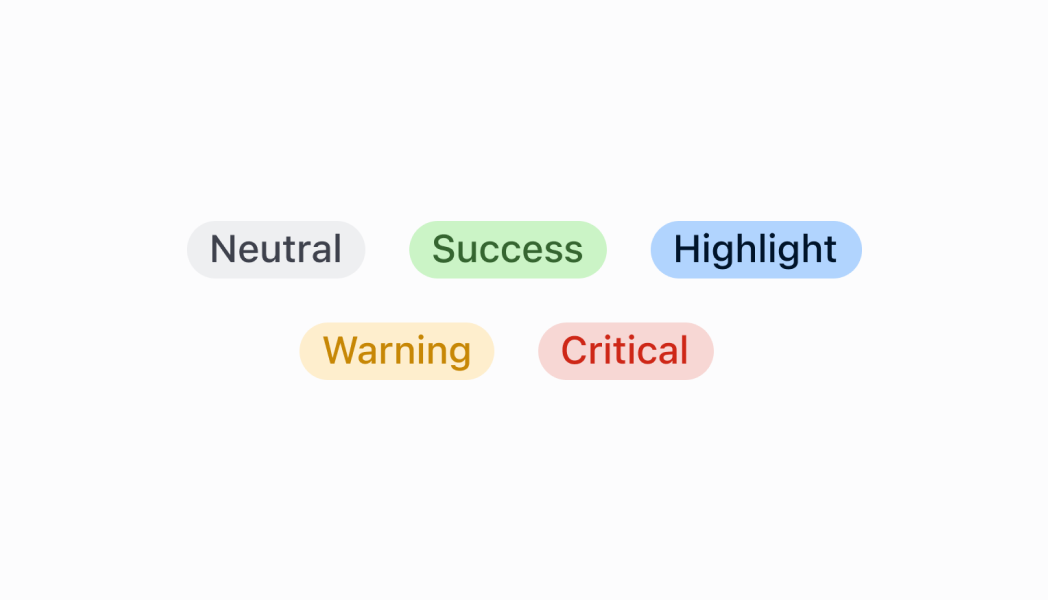
'empty' | 'partial' | 'complete'BadgeVariant
'neutral' | 'critical' | 'warning' | 'success' | 'highlight'Was this section helpful?
Badge
import React from 'react';
import {
  Badge,
  Screen,
  reactExtension,
} from '@shopify/ui-extensions-react/point-of-sale';

const SmartGridModal = () => {
  return (
    <Screen title="Home" name="Home">
      <Badge
        text="Badge"
        variant="success"
        status="complete"
      />
    </Screen>
  );
};

export default reactExtension(
  'pos.home.modal.render',
  () => <SmartGridModal />,
);
Examples
Badge
React
import React from 'react'; import { Badge, Screen, reactExtension, } from '@shopify/ui-extensions-react/point-of-sale'; const SmartGridModal = () => { return ( <Screen title="Home" name="Home"> <Badge text="Badge" variant="success" status="complete" /> </Screen> ); }; export default reactExtension( 'pos.home.modal.render', () => <SmartGridModal />, );TS
import {
  Badge,
  Screen,
  extension,
} from '@shopify/ui-extensions/point-of-sale';

export default extension(
  'pos.home.modal.render',
  (root) => {
    const mainScreen = root.createComponent(
      Screen,
      {
        name: 'Home',
        title: 'Home',
      },
    );

    const badge = root.createComponent(Badge, {
      text: 'Badge',
      variant: 'success',
      status: 'complete',
    });

    mainScreen.append(badge);
    root.append(mainScreen);
  },
);
Preview
Anchor to guidelinesGuidelines
- Badges should be positioned as close as possible to the item they’re related to.
Was this section helpful?
Anchor to content-guidelinesContent guidelines
- Be concise. Use a single word to describe the status of an item.
- Only use two or three words if you need to describe a complex state, for example "partially fulfilled".
✅ fulfilled ❌ order fulfilled
Statuses should ideally be written as adjectives:
✅ unpaid ❌ payment not received
Was this section helpful?