Date
component
A component used to select a date through a dialog.
Anchor to datepickerDatePicker
- Anchor to visibleStatevisibleState[boolean, (visible: boolean) => void]required
Control the visible state, and a callback to set the visible state as false when the dialog closes.
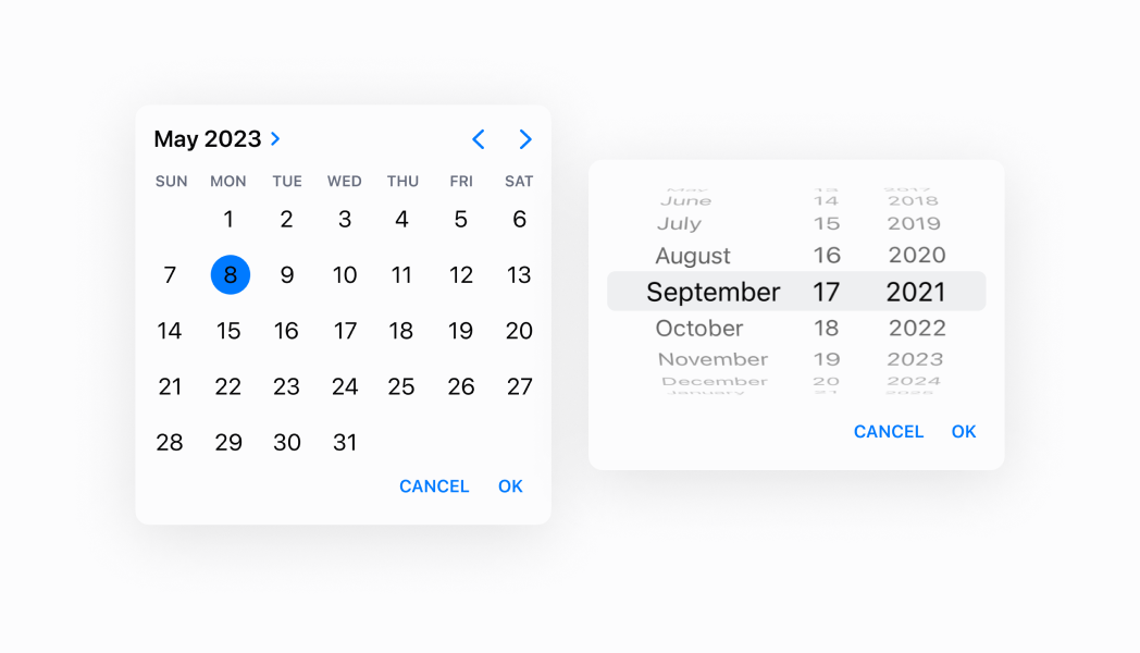
- Anchor to inputModeinputMode'inline' | 'spinner'Default: 'inline'
Whether to display the picker in inline (calendar) mode or spinner mode.
- Anchor to onChangeonChange(selected: string) => void
A callback for changes.
- Anchor to selectedselectedstringDefault: The current time
The selected time.
Was this section helpful?
DatePicker
import React, {useState} from 'react';
import {
  Button,
  DatePicker,
  Screen,
  Text,
  reactExtension,
} from '@shopify/ui-extensions-react/point-of-sale';

const SmartGridModal = () => {
  const [date, setDate] = useState(
    new Date().toDateString(),
  );
  const visibleState = useState(false);

  return (
    <Screen name="Home" title="Home">
      <Text>Selected date: {date}</Text>
      <Button
        title="Show"
        onPress={() => {
          visibleState[1](true);
        }}
      />
      <DatePicker
        visibleState={visibleState}
        onChange={(selected) => {
          setDate(
            new Date(selected).toDateString(),
          );
        }}
        selected={date}
        inputMode={'spinner'}
      />
    </Screen>
  );
};

export default reactExtension(
  'pos.home.modal.render',
  () => <SmartGridModal />,
);
Examples
DatePicker
React
import React, {useState} from 'react'; import { Button, DatePicker, Screen, Text, reactExtension, } from '@shopify/ui-extensions-react/point-of-sale'; const SmartGridModal = () => { const [date, setDate] = useState( new Date().toDateString(), ); const visibleState = useState(false); return ( <Screen name="Home" title="Home"> <Text>Selected date: {date}</Text> <Button title="Show" onPress={() => { visibleState[1](true); }} /> <DatePicker visibleState={visibleState} onChange={(selected) => { setDate( new Date(selected).toDateString(), ); }} selected={date} inputMode={'spinner'} /> </Screen> ); }; export default reactExtension( 'pos.home.modal.render', () => <SmartGridModal />, );TS
import {
  Button,
  DatePicker,
  Screen,
  extension,
} from '@shopify/ui-extensions/point-of-sale';

export default extension(
  'pos.home.modal.render',
  (root) => {
    const mainScreen = root.createComponent(
      Screen,
      {
        name: 'Home',
        title: 'Home',
      },
    );

    const button = root.createComponent(Button, {
      title: 'Show',
      onPress: () => {
        datePicker.updateProps({
          visibleState: [true, () => {}],
        });
      },
    });

    const handleOnChange = (selected) => {
      datePicker.updateProps({
        selected: new Date(
          selected,
        ).toDateString(),
      });
    };

    const datePicker = root.createComponent(
      DatePicker,
      {
        visibleState: [false, () => {}],
        onChange: handleOnChange,
        selected: new Date().toDateString(),
        inputMode: 'spinner',
      },
    );

    mainScreen.append(button);
    mainScreen.append(datePicker);
    root.append(mainScreen);
  },
);
Preview