Buttoncomponent
component
Buttons enable the merchant to initiate actions, like "add", "save", or "next".
Note
The plain is no longer supported as of POS 10.0.0 and defaults to basic.
- boolean
Sets whether the
Buttoncan be tapped.- boolean
Sets whether the
Buttonis displaying an animated loading state.- () => void
The callback that is executed when the user taps the button.
- string
The text set on the
Button.Note: When using a Button for menu-item targets, the title will be ignored. The text on the menu-item will be the extension's description.
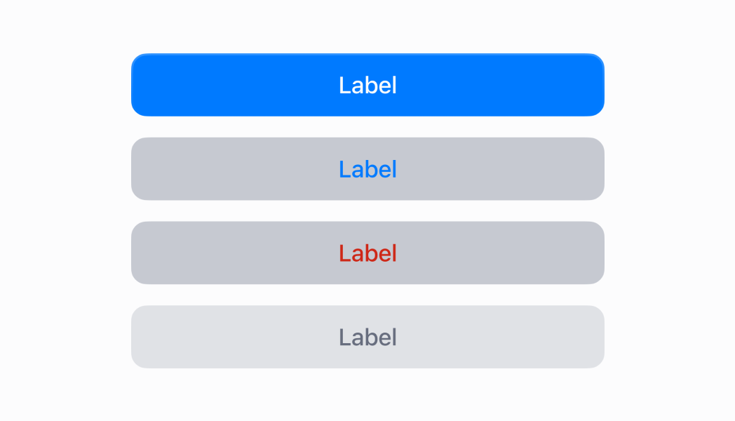
- ButtonType
The type of
Buttonto render. Determines the appearance of the button. Note: The 'plain' type is no longer supported as of POS 10.0.0. Using it will default to 'basic'.
ButtonType
'primary' | 'basic' | 'destructive' | 'plain'Was this section helpful?
Determines the appearance of the button.
'primary' | 'basic' | 'destructive' | 'plain'Was this section helpful?
Render a button that presents a toast
import React from 'react'
import { Button, Navigator, Screen, reactExtension, useApi } from '@shopify/ui-extensions-react/point-of-sale'

const ModalComponent = () => {
  const api = useApi()
  return (
    <Navigator>
      <Screen title="Home" name="Home">
        <Button title="Press me!" onPress={() => api.toast.show('Button tapped!')} />
      </Screen>
    </Navigator>
  )
}

export default reactExtension('pos.home.modal.render', () => {
  return <ModalComponent />
})
Examples
Render a button that presents a toast
React
import React from 'react' import { Button, Navigator, Screen, reactExtension, useApi } from '@shopify/ui-extensions-react/point-of-sale' const ModalComponent = () => { const api = useApi() return ( <Navigator> <Screen title="Home" name="Home"> <Button title="Press me!" onPress={() => api.toast.show('Button tapped!')} /> </Screen> </Navigator> ) } export default reactExtension('pos.home.modal.render', () => { return <ModalComponent /> })TS
import {
  Button,
  Navigator,
  Screen,
  extension,
} from '@shopify/ui-extensions/point-of-sale';

export default extension(
  'pos.home.modal.render',
  (root, api) => {
    const button = root.createComponent(Button, {
      title: 'Press me!',
      onPress: () => {
        api.toast.show('Button tapped!');
      },
    });

    const screen = root.createComponent(Screen, {
      name: 'Home',
      title: 'Home',
    });
    screen.append(button);

    const navigator =
      root.createComponent(Navigator);

    navigator.append(screen);

    root.append(navigator);
  },
);
Preview