Iconcomponent
component
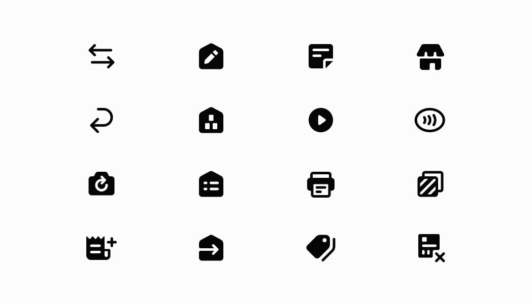
A component that renders an icon from the POS asset catalog.
Anchor to iconIcon
- Anchor to namenameIconName | DeprecatedIconNamerequired
A name used to render the icon.
- Anchor to sizesizeIconSize | DeprecatedIconSizeDefault: 'l'
Size of the icon.
- Anchor to tonetoneIconToneDefault: 'icon-primary'
Color of the icon.
IconName
'add-customer' | 'activity' | 'analytics' | 'apps' | 'arrow-down' | 'arrow-left' | 'arrow-right' | 'arrow-up' | 'backspace' | 'call' | 'cancel-fulfillment' | 'cancel' | 'card-reader' | 'caret-down' | 'caret-up' | 'cart-filled' | 'cart-outlined' | 'cash' | 'checklist' | 'checkmark' | 'checkmark-active' | 'checkmark-inactive' | 'chevron-down' | 'chevron-left' | 'chevron-right' | 'chevron-up' | 'circle-alert' | 'circle-cancel' | 'circle-checkmark' | 'circle-disconnected' | 'circle-info' | 'circle-outline' | 'clock' | 'collection' | 'connectivity' | 'connectivity-issue' | 'connectivity-critical-issue' | 'copy' | 'credit-card' | 'custom-payment' | 'custom-sale' | 'customer-filled' | 'customer-outlined' | 'delete' | 'desktop' | 'discount' | 'discount-automatic' | 'discount-code' | 'discount-custom' | 'discount-remove' | 'dockside' | 'draft-orders' | 'drawer' | 'exchange' | 'external-link' | 'fees' | 'flag' | 'flip-camera' | 'fulfillment-delivery' | 'fulfillment-shipment' | 'gallery-view' | 'gift-card' | 'help' | 'hide' | 'hide-keyboard' | 'home-filled' | 'home-outlined' | 'horizontal-dots' | 'image' | 'images' | 'inventory-adjustments' | 'inventory-counts' | 'inventory-po' | 'inventory-transfer' | 'keypad' | 'learn' | 'lightning' | 'link' | 'list' | 'list-view' | 'location' | 'lock' | 'low-battery' | 'mail' | 'maximize' | 'minimize' | 'minus' | 'mobile' | 'more-filled' | 'more-outlined' | 'no-internet' | 'note-report' | 'not-stocked' | 'orders-filled' | 'orders-outlined' | 'pencil' | 'play-button' | 'plus' | 'point-of-sale' | 'print' | 'pro' | 'products-filled' | 'products-outlined' | 'radio-active' | 'radio-inactive' | 'reassign-fulfillment' | 'rearrange' | 'receipt' | 'refresh' | 'register' | 'return' | 'retrieve-cart' | 'save-cart' | 'scan-barcode' | 'scan-qr-code' | 'search' | 'send' | 'send-cart' | 'settings' | 'shop-app' | 'shop-pay' | 'shopify-payments' | 'sort' | 'split-payment' | 'staff' | 'star' | 'store' | 'tablet-l' | 'tablet-s' | 'tap-to-pay' | 'unlock' | 'unordered-list' | 'variant' | 'view' | 'void-shipping-label'DeprecatedIconName
'add-customer' | 'analytics' | 'apps' | 'arrow' | 'arrow-left' | 'backspace' | 'card-reader' | 'call' | 'cancel' | 'not-stocked' | 'cash' | 'checkmark' | 'caret-down' | 'checkmark-active' | 'checkmark-inactive' | 'chevron-up' | 'chevron-right' | 'chevron-down' | 'circle-alert' | 'circle-cancel' | 'circle-checkmark' | 'circle-disconnected' | 'circle-info' | 'circle-outline' | 'clock' | 'collections' | 'copy' | 'credit-card' | 'custom-payment' | 'custom-sale' | 'discount' | 'external-link' | 'flag' | 'flip-camera' | 'gallery-view' | 'gift-card' | 'help' | 'hide-keyboard' | 'home' | 'horizontal-dots' | 'keypad' | 'lightning' | 'link' | 'list' | 'list-view' | 'lock' | 'mail' | 'available-at-other-locations' | 'menu' | 'minus' | 'mobile' | 'note-report' | 'drawer' | 'orders' | 'shopify-payments' | 'play-button' | 'plus' | 'products' | 'radio-active' | 'radio-inactive' | 'rearrange' | 'receipt' | 'refresh' | 'register' | 'retrieve-cart' | 'image-placeholder' | 'save-cart' | 'scan-barcode' | 'search' | 'send' | 'settings' | 'shipment' | 'split-payment' | 'sort' | 'staff' | 'star' | 'unordered-list' | 'connectivity-warning' | 'internet' | 'delivery' | 'shop-pay'IconSize
's' | 'm' | 'l' | 'xl'DeprecatedIconSize
'minor' | 'major' | 'spot' | 'caption' | 'badge'IconTone
'icon-primary' | 'icon-inverse' | 'icon-subdued' | 'icon-disabled' | 'icon-warning' | 'icon-critical' | 'icon-success' | 'icon-interactive' | 'icon-highlight' | 'icon-shoppay' | 'icon-static-light' | 'icon-static-dark' | 'icon-inactive' | 'icon-badge-neutral' | 'icon-search' | 'icon-tile-default' | 'icon-tile-stack' | 'icon-tile-disabled' | 'icon-tile-pink' | 'icon-tile-purple' | 'icon-tile-orange' | 'icon-subnavigation-inactive' | 'icon-primary-pressed'Was this section helpful?
Example icons
import React from 'react';

import {
  Icon,
  Screen,
  ScrollView,
  Navigator,
  reactExtension,
} from '@shopify/ui-extensions-react/point-of-sale';

const SmartGridModal = () => {
  return (
    <Navigator>
      <Screen name="Image" title="Image Example">
        <ScrollView>
          <Icon name="call" size="s" tone="icon-success" />
          <Icon name="card-reader" size="l" />
          <Icon name="circle-cancel" size="xl" tone="icon-critical" />
          <Icon name="orders-filled" size="s" />
          <Icon name="star" size="m" />
        </ScrollView>
      </Screen>
    </Navigator>
  );
};

export default reactExtension('pos.home.modal.render', () => (
  <SmartGridModal />
));
Examples
Example icons
React
import React from 'react'; import { Icon, Screen, ScrollView, Navigator, reactExtension, } from '@shopify/ui-extensions-react/point-of-sale'; const SmartGridModal = () => { return ( <Navigator> <Screen name="Image" title="Image Example"> <ScrollView> <Icon name="call" size="s" tone="icon-success" /> <Icon name="card-reader" size="l" /> <Icon name="circle-cancel" size="xl" tone="icon-critical" /> <Icon name="orders-filled" size="s" /> <Icon name="star" size="m" /> </ScrollView> </Screen> </Navigator> ); }; export default reactExtension('pos.home.modal.render', () => ( <SmartGridModal /> ));TS
import {
  Navigator,
  Screen,
  ScrollView,
  Icon,
  IconName,
  IconSize,
  extension,
} from '@shopify/ui-extensions/point-of-sale';

export default extension('pos.home.modal.render', (root, api) => {
  const iconsData: {name: IconName; size: IconSize}[] = [
    {name: 'call', size: 's', tone: 'icon-success'},
    {name: 'card-reader', size: 'l'},
    {name: 'circle-cancel', size: 'xl', tone: 'icon-critical'},
    {name: 'orders-filled', size: 's'},
    {name: 'star', size: 'm'},
  ];
  const scrollView = root.createComponent(ScrollView);

  iconsData.forEach((iconData) => {
    const icon = root.createComponent(Icon, {
      name: iconData.name,
      size: iconData.size,
    });
    scrollView.append(icon);
  });

  const screen = root.createComponent(Screen, {
    name: 'Icon',
    title: 'Icon Example',
  });
  screen.append(scrollView);

  const navigator = root.createComponent(Navigator);
  navigator.append(screen);

  root.append(navigator);
});
Preview
Anchor to guidelinesGuidelines
- Icons in POS are used in areas where they specifically add clarity and structure to the UI, aiding in creating a deeper understanding of the product and common interaction points nested throughout the experience.
Was this section helpful?