Listcomponent
The list is a scrollable component in which the list rows are rendered.
List items no longer have dividers as of POS 10.0.0.
Anchor to listList
- Anchor to datadataListRow[]required
The array of
which will be converted into rows for this list.- Anchor to imageDisplayStrategyimageDisplayStrategy'automatic' | 'always' | 'never'Default: `automatic`
The logic behind displaying an image or placeholder.
automaticwill display an image or placeholder if it detects that aindatahas anvalue.neverwill never display images or placeholders.alwayswill always display images or placeholders ifis undefined or empty.- Anchor to isLoadingMoreisLoadingMoreboolean
Whether or not more data is being loaded. Set this to
truewhen paginating and fetching more data for the list.- Anchor to listHeaderComponentlistHeaderComponentRemoteFragment
A header component for the list.
- Anchor to onEndReachedonEndReached() => void
Callback for when the user reaches the end of the
List. This can be used to fire a request to load more data.- Anchor to titletitlestring
A large display title at the top of the
List.
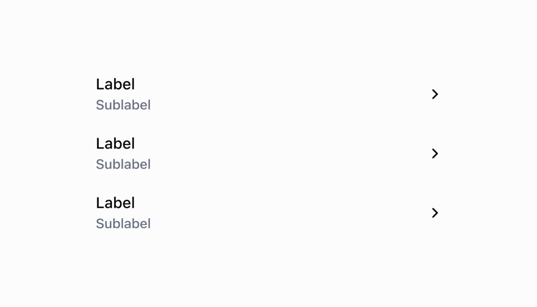
ListRow
- id
The unique identifier for this list item.
string - leftSide
The user interface of the left side of the row.
ListRowLeftSide - onPress
Callback for when the user taps the row.
() => void - rightSide
The user interface of the right side of the row.
ListRowRightSide
export interface ListRow {
  /**
   * The unique identifier for this list item.
   */
  id: string;
  /**
   * The user interface of the left side of the row.
   */
  leftSide: ListRowLeftSide;
  /**
   * The user interface of the right side of the row.
   */
  rightSide?: ListRowRightSide;
  /**
   * Callback for when the user taps the row.
   */
  onPress?: () => void;
}
ListRowLeftSide
- badges
Colored badges that are displayed underneath the `title` and `subtitles`.
BadgeProps[] - image
{ source?: string; badge?: number; } - label
The main label that will be displayed on the left side of the row.
string - subtitle
The subtitles to display beneath the main label. Up to 3 subtitles can be displayed. Subtitles can optionally be configured with colors by passing an object with a `content` and `color` properties.
[ListRowSubtitle, ListRowSubtitle?, ListRowSubtitle?]
export interface ListRowLeftSide {
  /**
   * The main label that will be displayed on the left side of the row.
   */
  label: string;
  /**
   * The subtitles to display beneath the main label. Up to 3 subtitles can be displayed.
   * Subtitles can optionally be configured with colors by passing an object with a `content` and `color` properties.
   */
  subtitle?: [ListRowSubtitle, ListRowSubtitle?, ListRowSubtitle?];
  /**
   * Colored badges that are displayed underneath the `title` and `subtitles`.
   */
  badges?: BadgeProps[];
  image?: {
    /**
     * A link to an image to be displayed on the far left side of the row.
     */
    source?: string;
    /**
     * A number that is displayed on the top right of the image.
     */
    badge?: number;
  };
}
BadgeProps
- status
A circle icon displaying the status of the badge.
BadgeStatus - text
The text displayed inside the badge.
string - variant
The appearance and function of the badge.
BadgeVariant
export interface BadgeProps {
  /**
   * The text displayed inside the badge.
   */
  text: string;

  /**
   * The appearance and function of the badge.
   */
  variant: BadgeVariant;

  /**
   * A circle icon displaying the status of the badge.
   * @deprecated No longer supported as of POS 10.0.0.
   */
  status?: BadgeStatus;
}
BadgeStatus
'empty' | 'partial' | 'complete'BadgeVariant
'neutral' | 'critical' | 'warning' | 'success' | 'highlight'ListRowSubtitle
string | SubtitleTypeSubtitleType
- color
Property used to modify the subtitle appearance.
ColorType - content
The subtitles to display beneath the main label.
string
export interface SubtitleType {
  /**
   * The subtitles to display beneath the main label.
   */
  content: string;

  /**
   * Property used to modify the subtitle appearance.
   */
  color?: ColorType;
}
ColorType
'TextNeutral' | 'TextSubdued' | 'TextDisabled' | 'TextWarning' | 'TextCritical' | 'TextSuccess' | 'TextInteractive' | 'TextHighlight'ListRowRightSide
- label
The main label that will be displayed on the right side of the row.
string - showChevron
Show a chevron. Set this to true if pressing on the row navigates to another screen.
boolean - toggleSwitch
A toggle switch that is be displayed on the right side of the row.
ToggleSwitch
export interface ListRowRightSide {
  /**
   * The main label that will be displayed on the right side of the row.
   */
  label?: string;
  /**
   * Show a chevron. Set this to true if pressing on the row navigates to another screen.
   * @defaultValue `false`
   */
  showChevron?: boolean;
  /**
   * A toggle switch that is be displayed on the right side of the row.
   */
  toggleSwitch?: ToggleSwitch;
}
ToggleSwitch
- disabled
Whether or not the toggle switch is disabled.
boolean - value
Whether or not the toggle switch is on or off.
boolean
export interface ToggleSwitch {
  /**
   * Whether or not the toggle switch is on or off.
   */
  value?: boolean;

  /**
   * Whether or not the toggle switch is disabled.
   */
  disabled?: boolean;
}Product List
Examples
Product List
React
import React, {useState} from 'react';
import {
  Navigator,
  Screen,
  List,
  Text,
  ScrollView,
  Section,
  ListRowSubtitle,
  reactExtension,
} from '@shopify/ui-extensions-react/point-of-sale';

const SmartGridModal = () => {
  const [seeDetails, setSeeDetails] = useState(false);
  const listData = [
    {
      id: 'graphicTees',
      leftSide: {
        label: 'Graphic Tees',
        subtitle: [{content: 'Summer Collection'}, {content: 'Unisex'}] as [
          ListRowSubtitle,
          ListRowSubtitle?,
        ],
      },
      rightSide: {
        label: 'Product details',
        showChevron: true,
      },
      onPress: () => setSeeDetails(!seeDetails),
    },
    {
      id: 'denimShorts',
      leftSide: {
        label: 'Denim Shorts',
        subtitle: [{content: 'Summer Collection'}, {content: 'Denim'}] as [
          ListRowSubtitle,
          ListRowSubtitle?,
        ],
      },
    },
  ];
  return (
    <Navigator>
      <Screen name="ProductList" title="Product List">
        <List title="Products" data={listData} />
        {seeDetails && (
          <ScrollView>
            <Section title="Our T-shirts">
              <Text>Our shirts are made with 100% organic cotton!</Text>
            </Section>
          </ScrollView>
        )}
      </Screen>
    </Navigator>
  );
};

export default reactExtension('pos.home.modal.render', () => (
  <SmartGridModal />
));
TS
import {
  Navigator,
  Screen,
  List,
  Text,
  ScrollView,
  Section,
  ListRowSubtitle,
  extension,
} from '@shopify/ui-extensions/point-of-sale';

export default extension('pos.home.modal.render', (root, api) => {
  let showDetails = false;
  const section = root.createComponent(Section, {
    title: 'Our T-shirts',
  });

  const scrollView = root.createComponent(ScrollView);

  const triggerShowDetails = () => {
    showDetails = !showDetails;
    if (showDetails) {
      scrollView.append(section);
    } else {
      scrollView.removeChild(section);
    }
  };

  const listData = [
    {
      id: 'graphicTees',
      leftSide: {
        label: 'Graphic Tees',
        subtitle: [{content: 'Summer Collection'}, {content: 'Unisex'}] as [
          ListRowSubtitle,
          ListRowSubtitle?,
        ],
      },
      rightSide: {
        label: 'Product details',
        showChevron: true,
      },
      onPress: () => triggerShowDetails(),
    },
    {
      id: 'denimShorts',
      leftSide: {
        label: 'Denim Shorts',
        subtitle: [{content: 'Summer Collection'}, {content: 'Denim'}] as [
          ListRowSubtitle,
          ListRowSubtitle?,
        ],
      },
    },
  ];

  const list = root.createComponent(List, {
    title: 'Products',
    data: listData,
  });

  const textBlock = root.createComponent(
    Text,
    null,
    'Our shirts are made with 100% organic cotton!',
  );

  section.append(textBlock);

  const screen = root.createComponent(Screen, {
    name: 'ProductList',
    title: 'Product List',
  });

  screen.append(list);

  if (showDetails) {
    scrollView.append(section);
  }

  screen.append(scrollView);

  const navigator = root.createComponent(Navigator);
  navigator.append(screen);

  root.append(navigator);
});
Preview
Anchor to guidelinesGuidelines
List items have a wide variety of use cases:
- To display and link to an object | Examples: an item in the cart, a customer in the customer list
- To display information | Examples: the payment breakdown in an order, staff contact information
- To display a menu item | Examples: an item on the first page of settings, an item in “More actions”
- To display a setting
- To display an action related to other items in the section
- To show a selectable option | Example: one filter option
- To display an external link
Anchor to content-guidelinesContent Guidelines
Subtitles:
- Each subtitle should have a different piece of information. Don't use dashes to display more than one type of information on the same line.
- Subtitles should be shown in order of relevance.
- If you're showing the results of the form, the label should be the form field title and the subtitle should be the information the merchant entered.