Bannercomponent
component
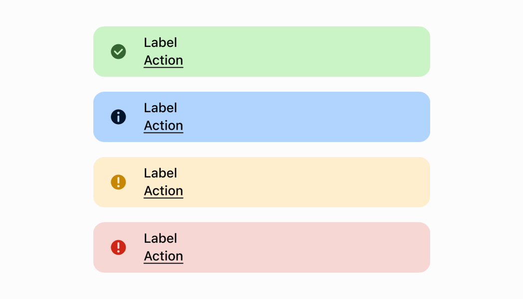
A banner informs merchants about important changes or persistent conditions. Use if you need to communicate to merchants in a prominent way, without blocking other actions.
- stringrequired
The title text displayed on the banner.
- BannerVariantrequired
The variant type of the banner.
- booleanrequired
The visibility state of the banner.
- stringDefault: 'Dismiss'
The text for the action button.
- booleanDefault: true
Whether to hide the action button.
- () => voidDefault: Callback which dismisses the banner
The callback function executed when the banner is pressed.
BannerVariant
'confirmation' | 'alert' | 'error' | 'information'Was this section helpful?
Banner
import React from 'react';
import {
  Banner,
  ScrollView,
  Screen,
  reactExtension,
} from '@shopify/ui-extensions-react/point-of-sale';

const SmartGridModal = () => {
  return (
    <Screen title="Home" name="Home">
      <ScrollView>
        <Banner
          title="Information Banner"
          variant="information"
          action="Ok"
          visible
        />
        <Banner
          title="Confirmation Banner"
          variant="confirmation"
          visible
        />
        <Banner
          title="Alert Banner"
          variant="alert"
          visible
        />
        <Banner
          title="Error Banner"
          variant="error"
          visible
        />
      </ScrollView>
    </Screen>
  );
};

export default reactExtension(
  'pos.home.modal.render',
  () => <SmartGridModal />,
);
Examples
Banner
React
import React from 'react'; import { Banner, ScrollView, Screen, reactExtension, } from '@shopify/ui-extensions-react/point-of-sale'; const SmartGridModal = () => { return ( <Screen title="Home" name="Home"> <ScrollView> <Banner title="Information Banner" variant="information" action="Ok" visible /> <Banner title="Confirmation Banner" variant="confirmation" visible /> <Banner title="Alert Banner" variant="alert" visible /> <Banner title="Error Banner" variant="error" visible /> </ScrollView> </Screen> ); }; export default reactExtension( 'pos.home.modal.render', () => <SmartGridModal />, );TS
import {
  Banner,
  ScrollView,
  Screen,
  extension,
} from '@shopify/ui-extensions/point-of-sale';

export default extension(
  'pos.home.modal.render',
  (root) => {
    const screen = root.createComponent(Screen, {
      title: 'Home',
      name: 'Home',
    });
    const scrollView =
      root.createComponent(ScrollView);

    scrollView.appendChild(
      root.createComponent(Banner, {
        title: 'Information Banner',
        variant: 'information',
        action: 'Ok',
        visible: true,
      }),
    );

    scrollView.appendChild(
      root.createComponent(Banner, {
        title: 'Confirmation Banner',
        variant: 'confirmation',
        visible: true,
      }),
    );

    scrollView.appendChild(
      root.createComponent(Banner, {
        title: 'Alert Banner',
        variant: 'alert',
        visible: true,
      }),
    );

    scrollView.appendChild(
      root.createComponent(Banner, {
        title: 'Error Banner',
        variant: 'error',
        visible: true,
      }),
    );

    screen.appendChild(scrollView);
    root.appendChild(screen);
  },
);
Preview
Anchor to guidelinesGuidelines
- Use when needing to communicate to merchants in a way that is persistent but non-interruptive.
- Only one banner should be visible at a time.
Was this section helpful?