Search
component
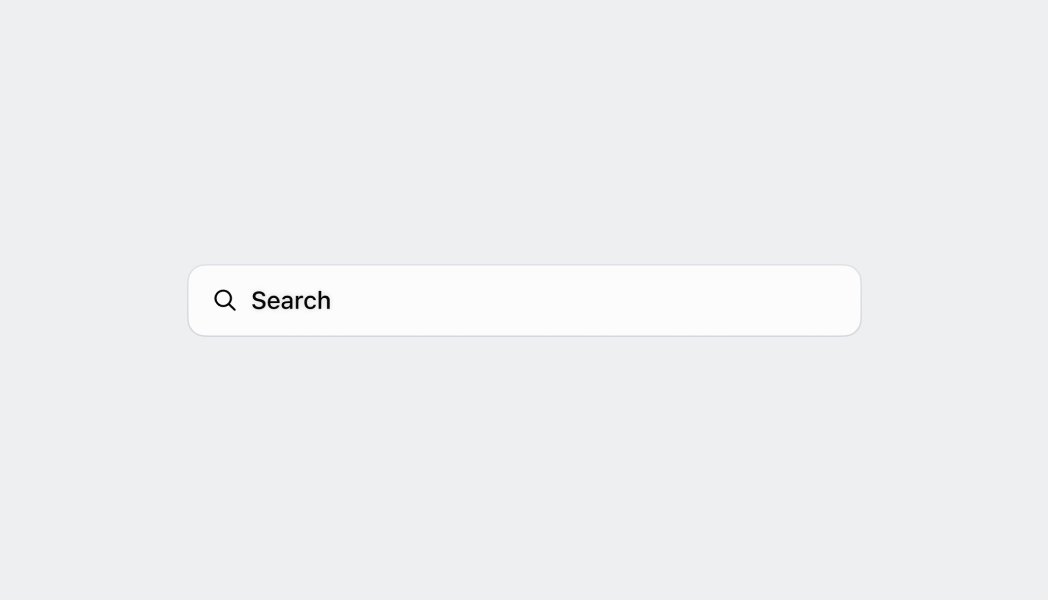
The search bar lets merchants enter search queries for objects throughout the app.
Anchor to searchbarSearchBar
- Anchor to onSearchonSearch(value: string) => voidrequired
A callback when the search button is tapped.
- Anchor to editableeditableboolean
Whether the text can be changed.
- Anchor to initialValueinitialValuestring
The initial text value in the search bar. This is different from
, which is displayed in the search bar when the search bar doesn't have a populated string.- Anchor to onBluronBlur() => void
A callback when focus is removed.
- Anchor to onFocusonFocus() => void
A callback when the input is focused.
- Anchor to onTextChangeonTextChange(value: string) => void
A callback containing the new text value of the search bar.
- Anchor to placeholderplaceholderstring
The placeholder value to display in the search bar when no text is entered.
Was this section helpful?
SearchBar
import React from 'react';
import {
  reactExtension,
  Text,
  Screen,
  SearchBar,
  ScrollView,
} from '@shopify/ui-extensions-react/point-of-sale';

const SmartGridModal = () => {
  const [searched, setSearched] =
    React.useState('');

  return (
    <Screen name="SearchBar" title="SearchBar">
      <ScrollView>
        <SearchBar
          onSearch={setSearched}
          editable
          initialValue="initial value"
          placeholder="placeholder"
        />
        <Text>Searched: {searched}</Text>
      </ScrollView>
    </Screen>
  );
};

export default reactExtension(
  'pos.home.modal.render',
  () => {
    return <SmartGridModal />;
  },
);
Examples
SearchBar
React
import React from 'react'; import { reactExtension, Text, Screen, SearchBar, ScrollView, } from '@shopify/ui-extensions-react/point-of-sale'; const SmartGridModal = () => { const [searched, setSearched] = React.useState(''); return ( <Screen name="SearchBar" title="SearchBar"> <ScrollView> <SearchBar onSearch={setSearched} editable initialValue="initial value" placeholder="placeholder" /> <Text>Searched: {searched}</Text> </ScrollView> </Screen> ); }; export default reactExtension( 'pos.home.modal.render', () => { return <SmartGridModal />; }, );TS
import {
  extension,
  Screen,
  ScrollView,
  SearchBar,
  Text,
} from '@shopify/ui-extensions/point-of-sale';

export default extension(
  'pos.home.modal.render',
  (root) => {
    const mainScreen = root.createComponent(
      Screen,
      {name: 'SearchBar', title: 'SearchBar'},
    );
    const scrollView =
      root.createComponent(ScrollView);
    const text = root.createComponent(Text, null);

    const onSearch = (value: string) => {
      text.replaceChildren(`Searched: ${value}`);
    };

    const searchBar = root.createComponent(
      SearchBar,
      {
        onSearch,
        editable: true,
        initialValue: 'initial value',
        placeholder: 'placeholder',
      },
    );

    scrollView.append(searchBar);
    scrollView.append(text);

    mainScreen.append(scrollView);
    root.append(mainScreen);
  },
);
Preview
Anchor to guidelinesGuidelines
- The global search bar should appear at the very top of a view, above the header. This is because it searches for things beyond the scope of that page.
- The inline search bar should appear at the top of a list, but under the header.
- The search bar should be sticky and remain at the top of the page when the merchant scrolls.
- When a merchant selects the search bar, the bar enters the focused state.
- When entering the focused state, the border turns blue and the search icon changes to a back arrow icon. Selecting the back arrow lets merchants return to the default state.
- If it's an inline search bar, entering focused state should also move the search bar to the top of the screen.
- When a merchant starts entering a search query, the bar enters the filled state.
- Selecting the X deletes the merchant's search query, but keeps them in the focused state so that they can immediately enter a new search query.
Was this section helpful?
Anchor to content-guidelinesContent guidelines
For the placeholder text, use the pattern: "Search {items}"
✅ Search staff ❌ Search
Was this section helpful?