Section
component
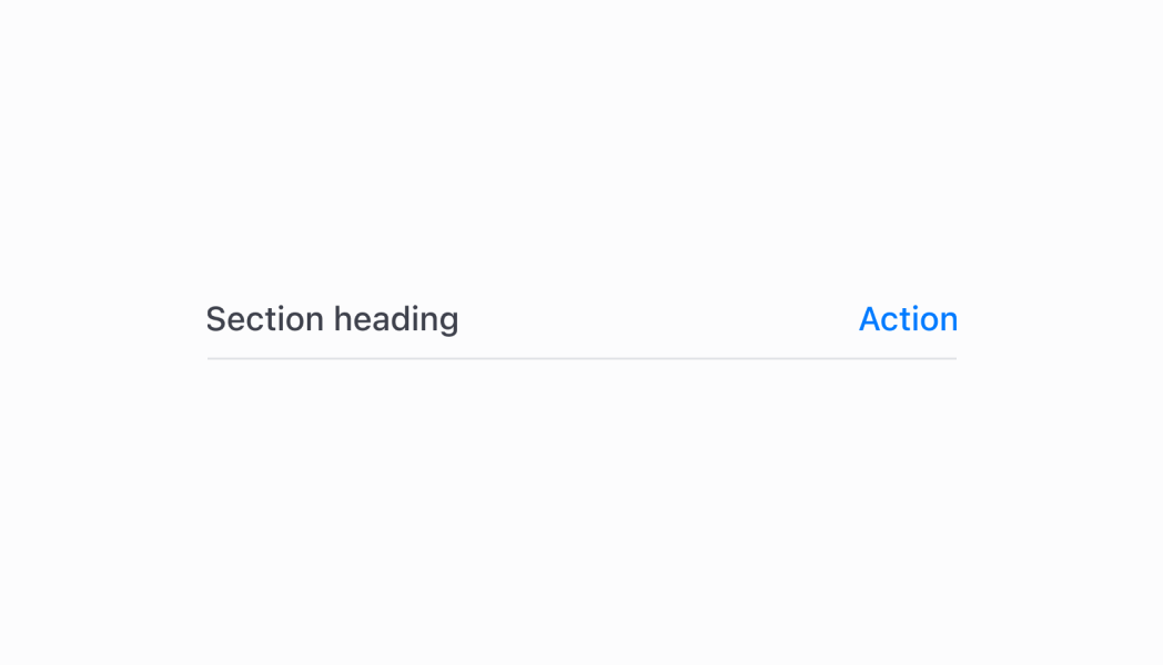
A heading style text component with an optional divider line to structure content.
Anchor to sectionheaderSectionHeader
- Anchor to titletitlestringrequired
Title to be displayed.
- Anchor to actionaction{ label: string; onPress: () => void; disabled?: boolean; }
Action button to be displayed. The SectionHeader must have a
titleforactionto work.- Anchor to hideDividerhideDividerboolean
Whether or not the divider line under the SectionHeader should be hidden.
Was this section helpful?
SectionHeader
import React from 'react'
import { Navigator, Screen, ScrollView, Stack, reactExtension, useApi, SectionHeader } from '@shopify/ui-extensions-react/point-of-sale'

const ModalComponent = () => {
  const api = useApi<'pos.home.modal.render'>();

  return (
    <Navigator>
      <Screen title="SectionHeader" name="SectionHeader">
        <ScrollView>
          <Stack direction="vertical" paddingHorizontal="HalfPoint">
            <SectionHeader title='Default' />
            <SectionHeader title='With action' action={{label: 'Action', onPress: () => { }}} />
            <SectionHeader title='Without divider' hideDivider />
          </Stack>
        </ScrollView>
      </Screen>
    </Navigator>
  )
}

export default reactExtension('pos.home.modal.render', () => {
  return <ModalComponent />
})
Examples
SectionHeader
React
import React from 'react' import { Navigator, Screen, ScrollView, Stack, reactExtension, useApi, SectionHeader } from '@shopify/ui-extensions-react/point-of-sale' const ModalComponent = () => { const api = useApi<'pos.home.modal.render'>(); return ( <Navigator> <Screen title="SectionHeader" name="SectionHeader"> <ScrollView> <Stack direction="vertical" paddingHorizontal="HalfPoint"> <SectionHeader title='Default' /> <SectionHeader title='With action' action={{label: 'Action', onPress: () => { }}} /> <SectionHeader title='Without divider' hideDivider /> </Stack> </ScrollView> </Screen> </Navigator> ) } export default reactExtension('pos.home.modal.render', () => { return <ModalComponent /> })TS
import {
  extension,
  Screen,
  ScrollView,
  Stack,
  Navigator,
  SectionHeader,
} from '@shopify/ui-extensions/point-of-sale';

export default extension(
  'pos.home.modal.render',
  (root, api) => {
    const screen = root.createComponent(Screen, {
      name: 'SectionHeader',
      title: 'SectionHeader',
    });

    const scrollView =
      root.createComponent(ScrollView);

    const defaultSectionHeader = root.createComponent(
      SectionHeader,
      {
        title: 'Default',
      },
    );

    const actionSectionHeader =
      root.createComponent(SectionHeader, {
        title: 'With action',
        action: {
          label: 'Show toast',
          onPress: () =>
            api.toast.show('Hello world!'),
        },
      });

    const noDividerSectionHeader =
      root.createComponent(SectionHeader, {
        title: 'Without divider',
        hideDivider: true,
      });

    const rootStack = root.createComponent(
      Stack,
      {
        paddingHorizontal: 'HalfPoint',
        direction: 'vertical',
      },
    );
    rootStack.append(defaultSectionHeader);
    rootStack.append(actionSectionHeader);
    rootStack.append(noDividerSectionHeader);

    scrollView.append(rootStack);
    screen.append(scrollView);
    const navigator =
      root.createComponent(Navigator);
    navigator.append(screen);
    root.append(navigator);
  },
);
Preview