Text
Use a text field to allow merchants to enter or edit text. If you want to specify the kind of input, then use a formatted text field.
Anchor to textfieldTextField
Use a text field to allow merchants to input or modify multiline text.
- Anchor to labellabelstringrequired
The content to use as the field label.
- Anchor to actionactionInputAction
A button under the text field to provide extra functionality.
- Anchor to disableddisabledboolean
Whether the field can be modified.
- Anchor to errorerrorstring
Indicates an error to the user. The field is given specific stylistic treatment to communicate problems that have to be resolved immediately.
- Anchor to helpTexthelpTextstring
The label under the text field which provides guidance or instructions that assist users.
- Anchor to maxLengthmaxLengthnumber
The maximum number of characters allowed in the input field.
- Anchor to onBluronBlur() => void
The callback when focus is removed.
- Anchor to onChangeonChange(value: string) => void
The callback when the user has finished editing a field.
- Anchor to onFocusonFocus() => void
The callback when input is focused.
- Anchor to onInputonInput(value: string) => void
Callback when the user makes any changes in the field. As noted in the documentation for
, you must not use this to updatevalue— use thecallback for that purpose. Use theprop when you need to do something as soon as the user makes a change, like clearing validation errors that apply to the field as soon as the user begins making the necessary adjustments.- Anchor to placeholderplaceholderstring
A short hint that describes the expected value of the field.
- Anchor to requiredrequiredboolean
Whether the field needs a value.
- Anchor to valuevaluestring
The current value for the field. Defaults to now. You should update this value in response to the
callback.
InputAction
- disabled
Whether the button can be pressed.
boolean - label
The text displayed in the button.
string - onPress
A callback to be performed.
() => void
export interface InputAction {
  /**
   * The text displayed in the button.
   */
  label: string;
  /**
   * A callback to be performed.
   */
  onPress: () => void;
  /**
   * Whether the button can be pressed.
   */
  disabled?: boolean;
}Name Input
Examples
Name Input
React
import React, {useState} from 'react';
import {
  TextField,
  Screen,
  ScrollView,
  Navigator,
  reactExtension,
  Text,
} from '@shopify/ui-extensions-react/point-of-sale';

const SmartGridModal = () => {
  const [name, setName] = useState('');
  return (
    <Navigator>
      <Screen name="TextField" title="Text Field Example">
        <ScrollView>
          <TextField
            label="Name"
            placeholder="Input your name here"
            required={true}
            value={name}
            onChange={setName}
          />
          <Text>{name ? `Hello ${name}!` : ''}</Text>
        </ScrollView>
      </Screen>
    </Navigator>
  );
};

export default reactExtension('pos.home.modal.render', () => (
  <SmartGridModal />
));
TS
import {
  Navigator,
  Screen,
  ScrollView,
  Text,
  TextField,
  extension,
} from '@shopify/ui-extensions/point-of-sale';

export default extension('pos.home.modal.render', (root, api) => {
  const textField = root.createComponent(TextField, {
    label: 'Name',
    placeholder: 'Input your name here',
    required: true,
    value: '',
  });

  const textBox = root.createComponent(Text);

  const onChangeHandler = (newValue: string) => {
    textField.updateProps({value: newValue});

    const greeting = newValue ? `Hello ${newValue}!` : '';
    textBox.replaceChildren(greeting);
  };

  textField.updateProps({onChange: onChangeHandler});

  const scrollView = root.createComponent(ScrollView);
  scrollView.append(textField);
  scrollView.append(textBox);

  const screen = root.createComponent(Screen, {
    name: 'TextField',
    title: 'Text Field Example',
  });
  screen.append(scrollView);

  const navigator = root.createComponent(Navigator);
  navigator.append(screen);

  root.append(navigator);
});
Preview
Anchor to guidelinesGuidelines
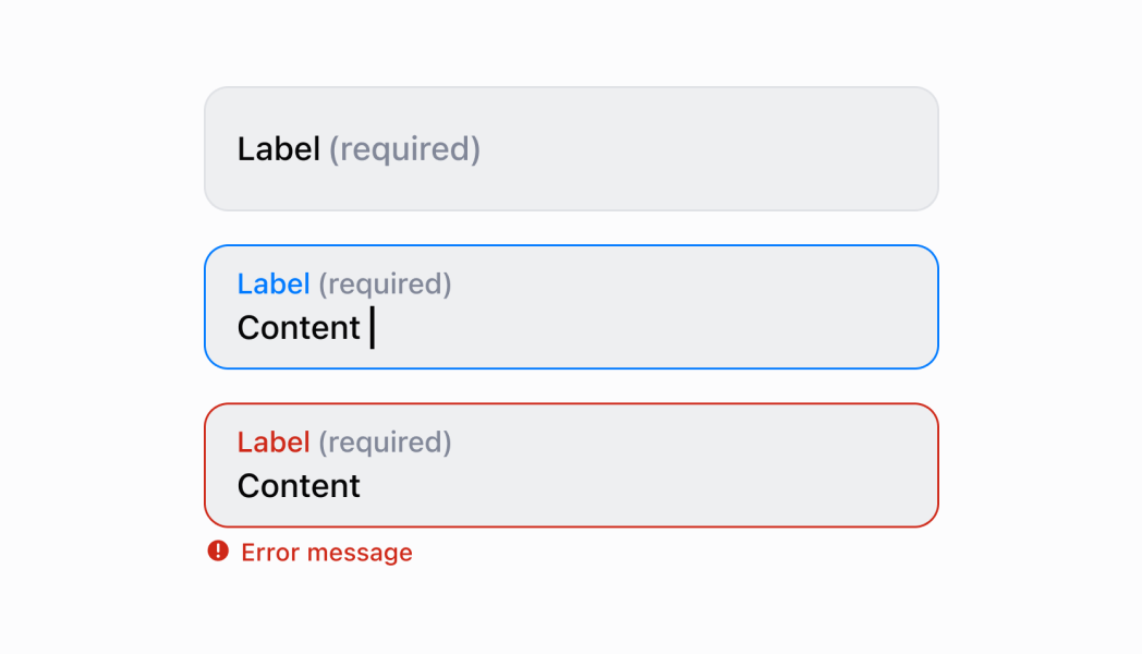
- When a merchant opens a new form, the first text field should be in a focused state.
- If the merchant is actively focused in a text field, then the keyboard should come up and the label should move to the top of the field.
- If focus goes away from the text field, then the keyboard should hide.
- Text fields always take up the full screen width.
- Text fields don’t change height. If text entered is longer than the width of the text field, then the oldest text on the left should be hidden to make room.
- When it makes sense, provide autocomplete options (for example, entering an address).
Anchor to content-guidelinesContent Guidelines
- If a text field is required, then it should indicate
Required. - Label titles should be brief and written in sentence case.
- Use the same terms for similar label titles throughout the app.