Textcomponent
component
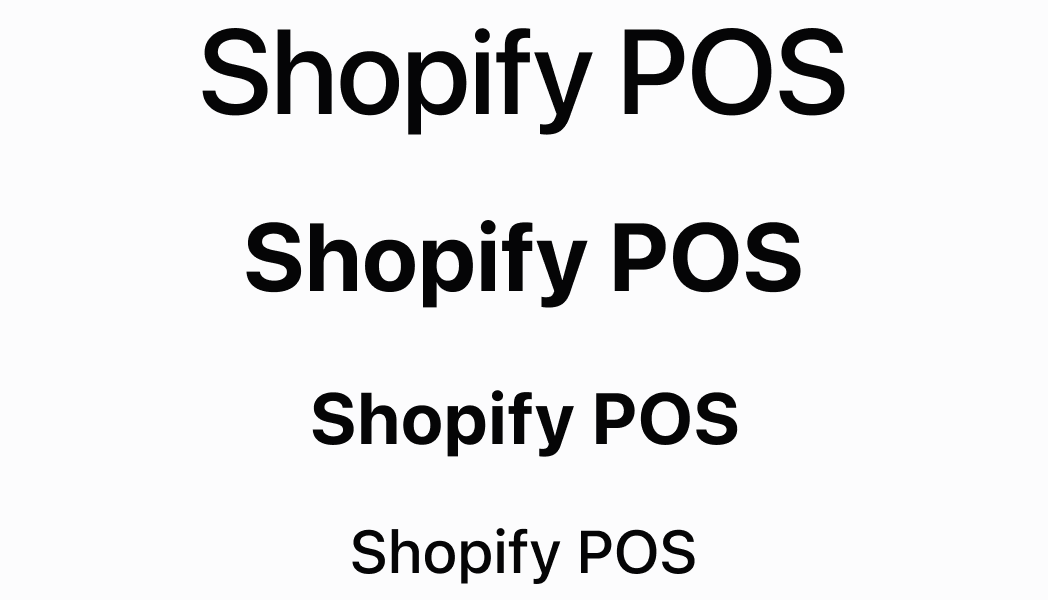
Text can be rendered in different sizes and colors in order to structure content. By default, Text will always stretch to fill the width of the container, but it can be wrapped in a Box to limit its width to what it needs. When the width of Text reaches its limit, the string will automatically wrap to the next line.
Anchor to textText
- Anchor to colorcolorColorType
The text color.
- Anchor to variantvariantTextVariant
The text variant.
ColorType
'TextNeutral' | 'TextSubdued' | 'TextDisabled' | 'TextWarning' | 'TextCritical' | 'TextSuccess' | 'TextInteractive' | 'TextHighlight'TextVariant
'sectionHeader' | 'captionRegular' | 'captionRegularTall' | 'captionMedium' | 'body' | 'headingSmall' | 'headingLarge' | 'display'Was this section helpful?
Anchor to textvariantTextVariant
'sectionHeader' | 'captionRegular' | 'captionRegularTall' | 'captionMedium' | 'body' | 'headingSmall' | 'headingLarge' | 'display'Was this section helpful?
Anchor to colortypeColorType
'TextNeutral' | 'TextSubdued' | 'TextDisabled' | 'TextWarning' | 'TextCritical' | 'TextSuccess' | 'TextInteractive' | 'TextHighlight'Was this section helpful?
Text
import React from 'react';

import { Screen, reactExtension, Text, ScrollView } from '@shopify/ui-extensions-react/point-of-sale';

const SmartGridModal = () => {
  return (
    <Screen name='text' title='Text'>
      <ScrollView>
        <Text variant="body">body</Text>
        <Text variant="captionMedium">captionMedium</Text>
        <Text variant="captionRegular">captionRegular</Text>
        <Text variant="captionRegularTall">captionRegularTall</Text>
        <Text variant="display">display</Text>
        <Text variant="headingLarge">headingLarge</Text>
        <Text variant="headingSmall">headingSmall</Text>
        <Text variant="sectionHeader">sectionHeader</Text>
        <Text variant="headingSmall" color="TextCritical">
          TextCritical
        </Text>
        <Text variant="headingSmall" color="TextDisabled">
          TextDisabled
        </Text>
        <Text variant="headingSmall" color="TextHighlight">
          TextHighlight
        </Text>
        <Text variant="headingSmall" color="TextInteractive">
          TextInteractive
        </Text>
        <Text variant="headingSmall" color="TextNeutral">
          TextNeutral
        </Text>
        <Text variant="headingSmall" color="TextSubdued">
          TextSubdued
        </Text>
        <Text variant="headingSmall" color="TextSuccess">
          TextSuccess
        </Text>
        <Text variant="headingSmall" color="TextWarning">
          TextWarning
        </Text>
      </ScrollView>
    </Screen>
  );
}

export default reactExtension('pos.home.modal.render', () => {
  return <SmartGridModal />
})
Examples
Text
React
import React from 'react'; import { Screen, reactExtension, Text, ScrollView } from '@shopify/ui-extensions-react/point-of-sale'; const SmartGridModal = () => { return ( <Screen name='text' title='Text'> <ScrollView> <Text variant="body">body</Text> <Text variant="captionMedium">captionMedium</Text> <Text variant="captionRegular">captionRegular</Text> <Text variant="captionRegularTall">captionRegularTall</Text> <Text variant="display">display</Text> <Text variant="headingLarge">headingLarge</Text> <Text variant="headingSmall">headingSmall</Text> <Text variant="sectionHeader">sectionHeader</Text> <Text variant="headingSmall" color="TextCritical"> TextCritical </Text> <Text variant="headingSmall" color="TextDisabled"> TextDisabled </Text> <Text variant="headingSmall" color="TextHighlight"> TextHighlight </Text> <Text variant="headingSmall" color="TextInteractive"> TextInteractive </Text> <Text variant="headingSmall" color="TextNeutral"> TextNeutral </Text> <Text variant="headingSmall" color="TextSubdued"> TextSubdued </Text> <Text variant="headingSmall" color="TextSuccess"> TextSuccess </Text> <Text variant="headingSmall" color="TextWarning"> TextWarning </Text> </ScrollView> </Screen> ); } export default reactExtension('pos.home.modal.render', () => { return <SmartGridModal /> })TS
import {
  extension,
  Screen,
  ScrollView,
  Text,
} from '@shopify/ui-extensions/point-of-sale';

export default extension(
  'pos.home.modal.render',
  (root) => {
    const mainScreen = root.createComponent(
      Screen,
      {name: 'text', title: 'Text'},
    );
    const scrollView =
      root.createComponent(ScrollView);

    scrollView.append(
      root.createComponent(
        Text,
        {variant: 'body'},
        'body',
      ),
    );
    scrollView.append(
      root.createComponent(
        Text,
        {variant: 'captionMedium'},
        'captionMedium',
      ),
    );
    scrollView.append(
      root.createComponent(
        Text,
        {variant: 'captionRegular'},
        'captionRegular',
      ),
    );
    scrollView.append(
      root.createComponent(
        Text,
        {variant: 'captionRegularTall'},
        'captionRegularTall',
      ),
    );
    scrollView.append(
      root.createComponent(
        Text,
        {variant: 'display'},
        'display',
      ),
    );
    scrollView.append(
      root.createComponent(
        Text,
        {variant: 'headingLarge'},
        'headingLarge',
      ),
    );
    scrollView.append(
      root.createComponent(
        Text,
        {variant: 'headingSmall'},
        'headingSmall',
      ),
    );
    scrollView.append(
      root.createComponent(
        Text,
        {variant: 'sectionHeader'},
        'sectionHeader',
      ),
    );
    scrollView.append(
      root.createComponent(
        Text,
        {
          variant: 'headingSmall',
          color: 'TextCritical',
        },
        'TextCritical',
      ),
    );
    scrollView.append(
      root.createComponent(
        Text,
        {
          variant: 'headingSmall',
          color: 'TextHighlight',
        },
        'TextHighlight',
      ),
    );
    scrollView.append(
      root.createComponent(
        Text,
        {
          variant: 'headingSmall',
          color: 'TextInteractive',
        },
        'TextInteractive',
      ),
    );
    scrollView.append(
      root.createComponent(
        Text,
        {
          variant: 'headingSmall',
          color: 'TextNeutral',
        },
        'TextNeutral',
      ),
    );
    scrollView.append(
      root.createComponent(
        Text,
        {
          variant: 'headingSmall',
          color: 'TextSubdued',
        },
        'TextSubdued',
      ),
    );
    scrollView.append(
      root.createComponent(
        Text,
        {
          variant: 'headingSmall',
          color: 'TextSuccess',
        },
        'TextSuccess',
      ),
    );
    scrollView.append(
      root.createComponent(
        Text,
        {
          variant: 'headingSmall',
          color: 'TextWarning',
        },
        'TextWarning',
      ),
    );

    mainScreen.append(scrollView);
    root.append(mainScreen);
  },
);
Preview