Components
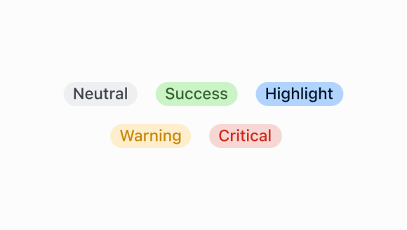
Badge
Badges are used to inform merchants of the status of an item or action that’s been taken.
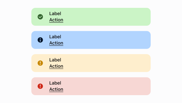
Banner
A banner informs merchants about important changes or persistent conditions. Use if you need to communicate to merchants in a prominent way, without blocking other actions.
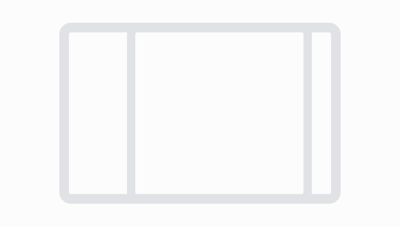
Box
A box component is a container that can be used to group and display content in a consistent manner.
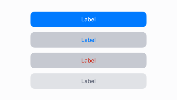
Button
Buttons enable the merchant to initiate actions, like "add", "save", or "next".
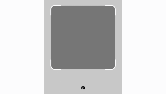
Camera
The camera scanner uses the devices camera to scan and decode barcodes or QR codes. It displays a live feed with guidance markers for alignment and triggers actions within the app upon successful recognition.
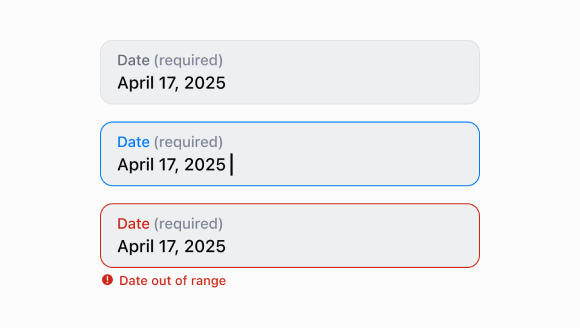
Date
A component that enables users to open a dialog and select a date through a text input.
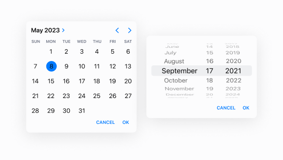
Date
A component used to select a date through a dialog.
Dialog
A dialog is a high-priority, intentionally disruptive message that requires action from the merchant before they can continue using POS.
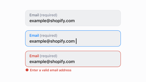
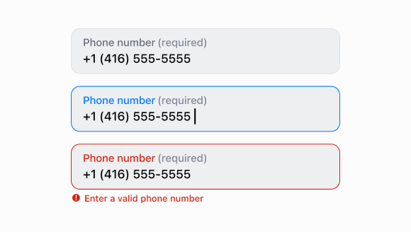
Email
Use an email field to conveniently and accurately capture merchant email addresses.
Icon
A component that renders an icon from the POS asset catalog.
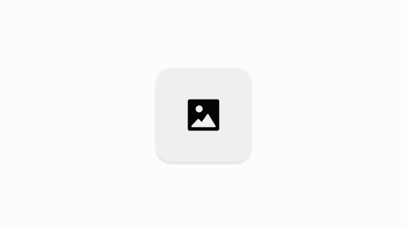
Image
The image component displays an image to a merchant in Shopify POS.
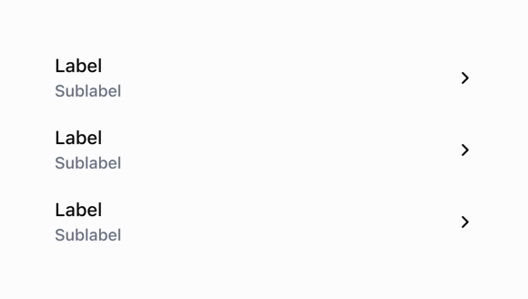
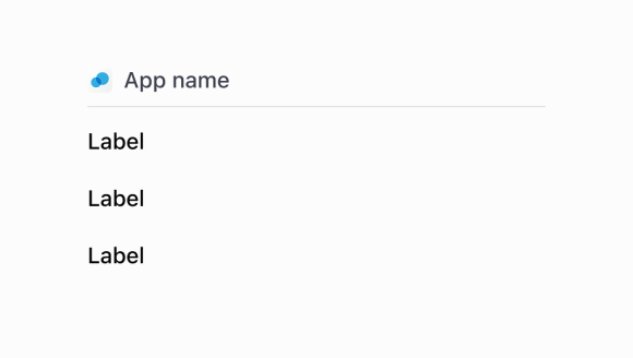
List
The list is a scrollable component in which the list rows are rendered.
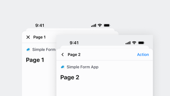
Navigator
A component used to navigate between different screens.
Number
Use a number field to conveniently and accurately capture numerical values.
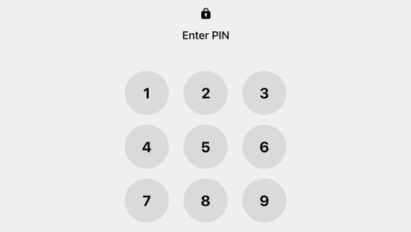
Pin
A component used to authenticate or identify individuals through a standarized number pad.
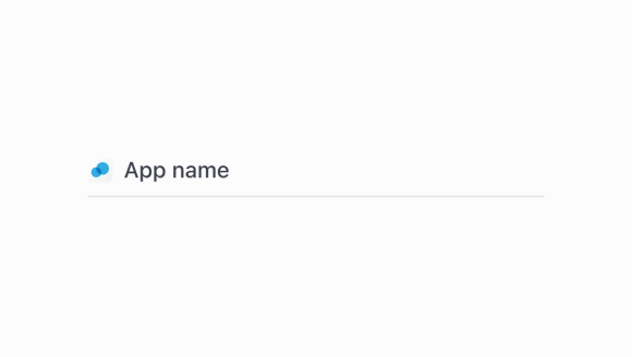
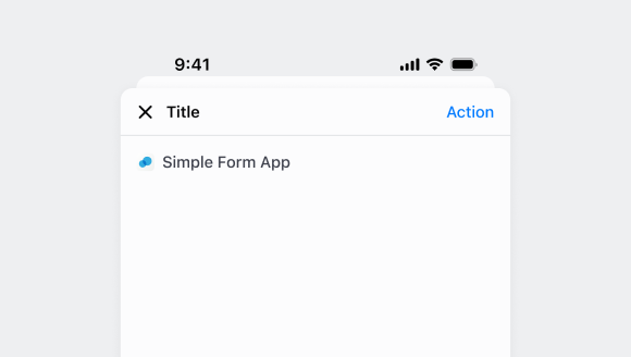
POS
The provides a surface on the specified extension target as an entry point to an extension. Note that the title displayed on this is dependent on the description of the extension.
POS
Renders a in a .
POS
A component used to group other components together for display on POS receipts.
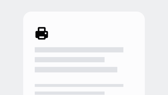
Print
A component that displays a preview of a printable document.

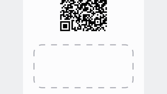
QR
A component that renders a QR code in Shopify POS.
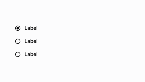
Radio
A radio button list lets merchants select from a given set of options.
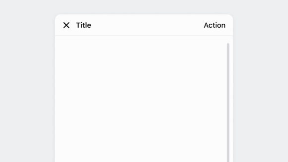
Screen
A component used in the root of a modal extension to define a screen.
Scroll
The ScrollView component allows content that doesn’t fully fit on screen to scroll. Typically, the ScrollView component serves as the root component of a Screen.
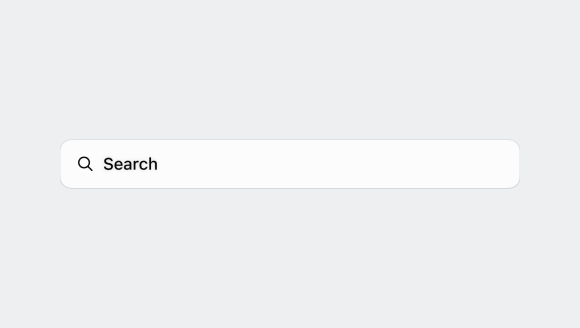
Search
The search bar lets merchants enter search queries for objects throughout the app.
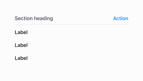
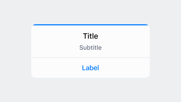
Section
A component used to group other components together in a card-like UI. Usually, sections will be used inside a ScrollView.
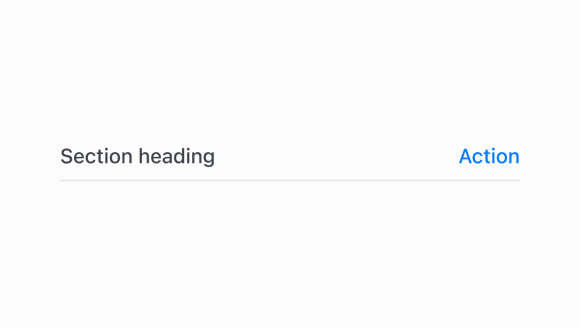
Section
A heading style text component with an optional divider line to structure content.
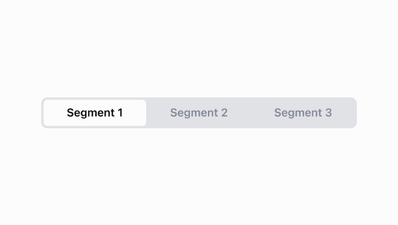
Segmented
The segmented control lets the merchant easily switch between different lists or views on the same page.
Selectable
The selectable component allows you to wrap any non-interactive UI component to make it selectable.
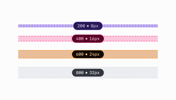
Spacing
Set of spacing constants to be used in the UI Extensions components library.
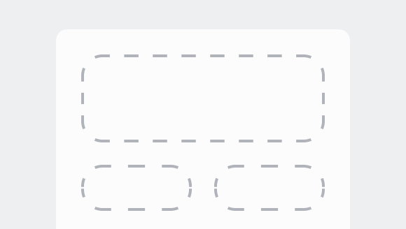
Stack
A container for other components that allows them to be stacked horizontally or vertically. When building complex UIs, this will be your primary building block. Stacks always wrap the content to the next column or row.
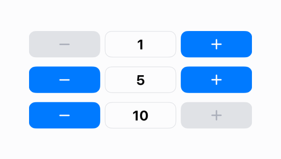
Stepper
A component used for increasing or decreasing quantities.
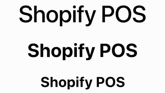
Text
Text can be rendered in different sizes and colors in order to structure content. By default, Text will always stretch to fill the width of the container, but it can be wrapped in a Box to limit its width to what it needs. When the width of Text reaches its limit, the string will automatically wrap to the next line.
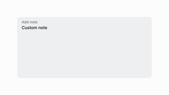
Text
Use a text input to allow merchants to input or modify multiline text.
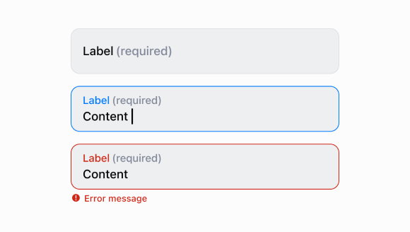
Text
Use a text field to allow merchants to enter or edit text. If you want to specify the kind of input, then use a formatted text field.
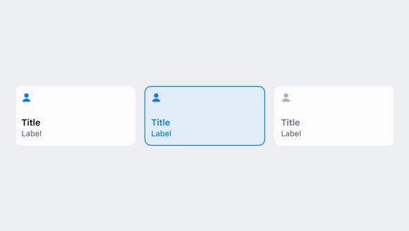
Tile
Tiles are customizable buttons that allow staff to complete actions quickly. Think of them as shortcuts--adding a 10% discount to an order, for example. Tiles provide contextual information and let merchants quickly access workflows, actions, and information from the smart grid and the top of detail pages. They’re dynamic and can change based on surrounding context, such as what’s in the cart.
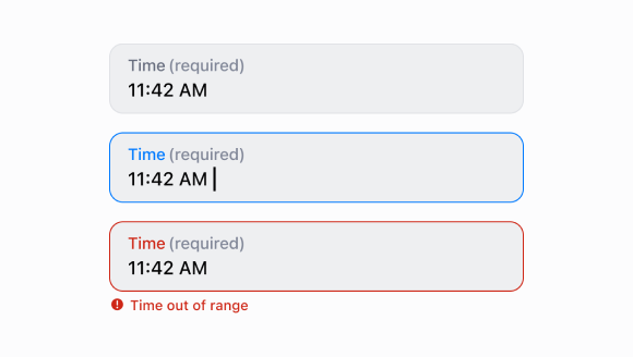
Time
A component that enables users to open a dialog and select a time through a text input.
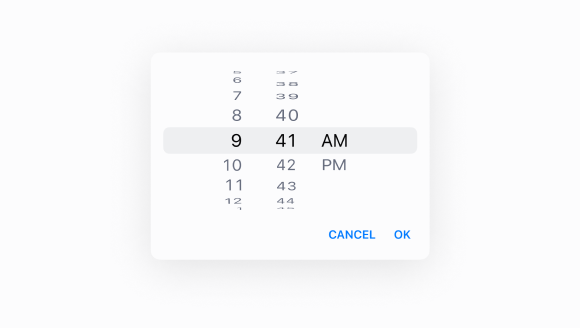
Time
A component used to select a time through a dialog.