Web components
Web components are the UI building blocks that you use to display data and trigger API functions. These components are native UI elements that follow Shopify's design system and render optimized interfaces for workflows in checkout.
Your target determines which components you can use because different locations in checkout have different interface requirements and constraints.
You can't override the CSS for UI components. The checkout UI will always render the merchant's own branding. Checkout UI extensions don't have access to the real checkout DOM and can't render arbitrary HTML. They can only render custom HTML elements provided by Shopify.
You can't override the CSS for UI components. The checkout UI will always render the merchant's own branding. Checkout UI extensions don't have access to the real checkout DOM and can't render arbitrary HTML. They can only render custom HTML elements provided by Shopify.
Anchor to ActionsActions
Actions enable users to perform tasks and navigate through the checkout interface with interactive elements like buttons and links.

Button
Trigger actions or events, such as submitting forms, opening dialogs, or navigating to other pages.

Clickable
Wrap content to make it interactive when you need more styling control than Button or Link provide.

Clickable chip
Display interactive labels or categories that users can click or remove.

Clipboard item
Copy text or data to the clipboard when activated.

Link
Make text interactive, allowing users to navigate to other pages or perform specific actions.

Press button
Enable users to toggle between active and inactive states to represent a persistent on/off or selected/unselected status.
Anchor to Feedback and status indicatorsFeedback and status indicators
Feedback and status indicators communicate system states, progress, and important information to users.

Announcement
Provide a less disruptive alternative to modals for capturing user attention.

Badge
Display status information or indicate completed actions through compact visual indicators.

Banner
Highlight important information or required actions prominently within the interface.

Progress
Visually represent the completion of a task or process.

Spinner
Display an animated indicator to show that content or actions are loading.
Anchor to FormsForms
Forms capture and validate user input with specialized field types optimized for different data collection needs in checkout.

Checkbox
Enable users to make selections, such as agreeing to terms, enabling settings, or choosing multiple items from a list.

Choice list
Present multiple options for single or multiple selections.

Consent checkbox
Collect the buyer's approval for a given policy.

Consent phone field
Capture phone numbers for text message marketing sign-up, with the value automatically saved during checkout.

Date field
Capture date input with a consistent interface for date selection and proper validation.

Date picker
Enable merchants to select dates using a calendar interface.

Drop zone
Accept file uploads through drag-and-drop or button activation.

Email field
Capture email address input.

Form
Wrap form controls and enable implicit submission when users press Enter.

Money field
Capture monetary values with built-in currency formatting and validation.

Number field
Capture numeric input with built-in validation.

Password field
Securely capture sensitive information.

Phone field
Capture phone number input with built-in formatting and validation.

Select
Enable users to pick one option from a dropdown menu.

Switch
Toggle options on or off.

Text area
Capture longer text content with a multi-line, resizable text input area.

Text field
Capture single-line text input.

URL field
Capture URLs with built-in formatting and validation.
Anchor to Layout and structureLayout and structure
Layout and structure components organize content hierarchically and spatially, creating clear visual relationships in checkout interfaces.

Box
Provide a generic, flexible container for custom designs and layouts.

Divider
Create visual separation between content sections.

Grid
Organize content in a matrix of rows and columns to build responsive layouts.

Query container
Establish a container query context so child components can adapt based on the container's size rather than viewport width.

Scroll box
Create a scrollable container for overflowing content.

Section
Group related content into clearly-defined thematic areas.

Stack
Organize elements horizontally or vertically along the block or inline axis.
Anchor to Media and visualsMedia and visuals
Media and visuals display images, icons, and graphical elements that enhance comprehension and visual communication in checkout.

Icon
Display standardized visual symbols to represent actions, statuses, or categories consistently.

Image
Embed images within the interface with control over presentation and loading behavior.
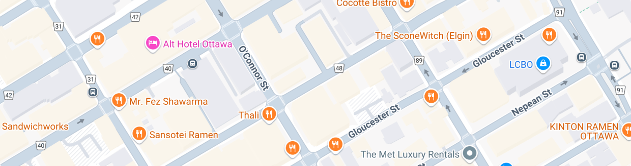
Map
Display an interactive map with location markers.
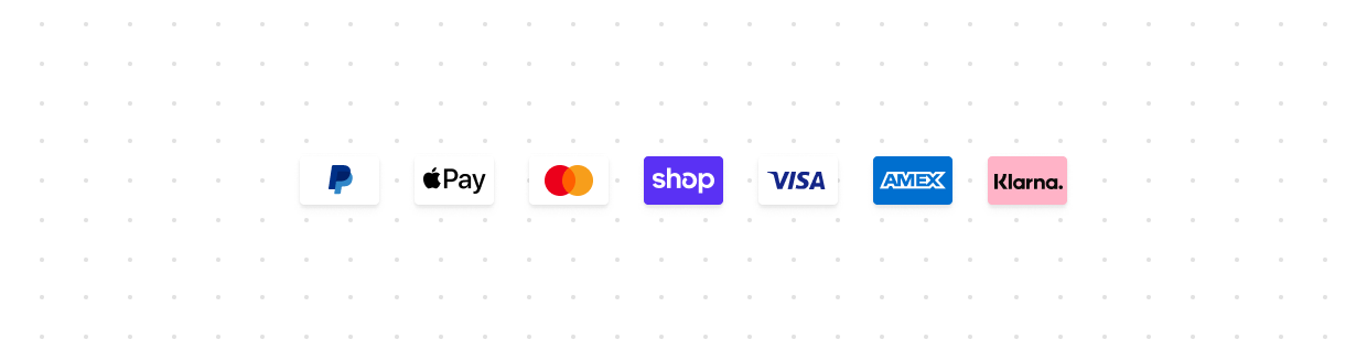
Payment icon
Display standardized icons for payment methods.

Product thumbnail
Display small preview images representing products.

QR code
Generate and display QR codes for sharing links or data.
Anchor to OverlaysOverlays
Overlays present content in floating or layered surfaces that appear above the main interface, useful for focused tasks, contextual information, and supplementary content.

Modal
Display content in a focused layer for tasks such as confirmation dialogs or settings panels.

Popover
Display contextual content in a floating container anchored to a trigger element.

Sheet
Display essential information at the bottom of the screen, appearing above other elements.

Tooltip
Display additional information on hover or focus.

Chat
Embeds a real-time chat experience in checkout, letting buyers get live support without leaving the page.
Anchor to Typography and contentTypography and content
Typography and content components present textual information with appropriate hierarchy, emphasis, and styling for clear communication.

Abbreviation
Display abbreviated text with a tooltip showing the full term on hover.

Chip
Display static labels, categories, or attributes that help classify and organize content.

Details
Display a collapsible section that users can expand to reveal additional content.

Heading
Render hierarchical titles to communicate the structure and organization of page content.

Ordered list
Display a numbered list of items.

Paragraph
Display blocks of text that can contain inline elements such as buttons, links, or emphasized text.

Skeleton paragraph
Display a placeholder for paragraph content while data is loading.

Text
Display text with specific visual styles or tones.

Time
Display dates and times in a localized format.

Unordered list
Display a bulleted list of items.