Chip
The chip component displays static labels, categories, or attributes that help classify and organize content. Use chip to show product tags, categories, or metadata near the items they describe, helping buyers identify items with similar properties.
Chips can include icons to provide additional visual context. For system-generated status indicators, use badge. For interactive or removable chips, use clickable chip.
Supported targets
- purchase.
checkout. actions. render-before - purchase.
checkout. block. render - purchase.
checkout. cart-line-item. render-after - purchase.
checkout. cart-line-list. render-after - purchase.
checkout. contact. render-after - purchase.
checkout. delivery-address. render-after - purchase.
checkout. delivery-address. render-before - purchase.
checkout. footer. render-after - purchase.
checkout. header. render-after - purchase.
checkout. payment-method-list. render-after - purchase.
checkout. payment-method-list. render-before - purchase.
checkout. pickup-location-list. render-after - purchase.
checkout. pickup-location-list. render-before - purchase.
checkout. pickup-location-option-item. render-after - purchase.
checkout. pickup-point-list. render-after - purchase.
checkout. pickup-point-list. render-before - purchase.
checkout. reductions. render-after - purchase.
checkout. reductions. render-before - purchase.
checkout. shipping-option-item. details. render - purchase.
checkout. shipping-option-item. render-after - purchase.
checkout. shipping-option-list. render-after - purchase.
checkout. shipping-option-list. render-before - purchase.
thank-you. announcement. render - purchase.
thank-you. block. render - purchase.
thank-you. cart-line-item. render-after - purchase.
thank-you. cart-line-list. render-after - purchase.
thank-you. customer-information. render-after - purchase.
thank-you. footer. render-after - purchase.
thank-you. header. render-after
Supported targets
- purchase.
checkout. actions. render-before - purchase.
checkout. block. render - purchase.
checkout. cart-line-item. render-after - purchase.
checkout. cart-line-list. render-after - purchase.
checkout. contact. render-after - purchase.
checkout. delivery-address. render-after - purchase.
checkout. delivery-address. render-before - purchase.
checkout. footer. render-after - purchase.
checkout. header. render-after - purchase.
checkout. payment-method-list. render-after - purchase.
checkout. payment-method-list. render-before - purchase.
checkout. pickup-location-list. render-after - purchase.
checkout. pickup-location-list. render-before - purchase.
checkout. pickup-location-option-item. render-after - purchase.
checkout. pickup-point-list. render-after - purchase.
checkout. pickup-point-list. render-before - purchase.
checkout. reductions. render-after - purchase.
checkout. reductions. render-before - purchase.
checkout. shipping-option-item. details. render - purchase.
checkout. shipping-option-item. render-after - purchase.
checkout. shipping-option-list. render-after - purchase.
checkout. shipping-option-list. render-before - purchase.
thank-you. announcement. render - purchase.
thank-you. block. render - purchase.
thank-you. cart-line-item. render-after - purchase.
thank-you. cart-line-list. render-after - purchase.
thank-you. customer-information. render-after - purchase.
thank-you. footer. render-after - purchase.
thank-you. header. render-after
Anchor to Use casesUse cases
- Product tags: Label items with attributes like "Organic," "Best Seller," or "Limited Edition" for quick scanning.
- Active filters: Display currently applied filters so buyers can see and manage their selections.
Anchor to PropertiesProperties
Configure the following properties on the chip component.
- Anchor to accessibilityLabelaccessibility
Labelaccessibility Label stringstring A label that describes the purpose or contents of the chip. It will be read to users using assistive technologies such as screen readers.
- Anchor to idididstringstring
A unique identifier for the element. Use this to reference the element in JavaScript, link labels to form controls, or target specific elements for styling or scripting.
Anchor to SlotsSlots
The chip component supports slots for additional content placement within the component. Learn more about using slots.
- Anchor to graphicgraphicgraphicHTMLElementHTMLElement
An optional graphic displayed at the start of the chip, such as an icon to visually reinforce the chip's label. Only the
s-iconelement and itstypeattribute are supported.
Anchor to ExamplesExamples
Anchor to Display a basic chipDisplay a basic chip
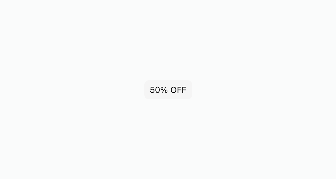
Highlight a short piece of information with a styled tag. This example renders an s-chip containing a "50% OFF" promotional label.
Display a basic chip
html
Anchor to Pair an icon with a screen reader labelPair an icon with a screen reader label
Add an icon when the chip text alone doesn't convey the full meaning. This example pairs the graphic slot with s-icon and sets accessibilityLabel for clearer context.
html
Display multiple product attributes as a row of chips. This example uses s-stack with direction="inline" to arrange three s-chip elements side by side.
html
Anchor to Best practicesBest practices
- Keep labels concise: Use one to three words per chip so the label remains scannable at a glance.
- Pair icons with labels: When adding an icon via the
graphicslot, also setaccessibilityLabelso screen readers convey the full meaning. - Reserve chips for classification: Use chips for static labels and categories. For interactive or removable chips, use
s-clickable-chipinstead. - Avoid crowding the layout: Use chips only for high-signal labels so checkout stays easy to scan.