Badge
The badge component displays status information or indicates completed actions through compact visual indicators. Use badges to communicate object states, order statuses, or system-generated classifications that help buyers quickly understand item conditions.
Badges support multiple tones and sizes, with optional icons to reinforce status meaning and improve scannability in lists and tables. For user-created labels, categories, or tags, use chip instead.
Badges are read-only indicators. They can't contain links, buttons, or other interactive elements.
Supported targets
- purchase.
checkout. actions. render-before - purchase.
checkout. block. render - purchase.
checkout. cart-line-item. render-after - purchase.
checkout. cart-line-list. render-after - purchase.
checkout. contact. render-after - purchase.
checkout. delivery-address. render-after - purchase.
checkout. delivery-address. render-before - purchase.
checkout. footer. render-after - purchase.
checkout. header. render-after - purchase.
checkout. payment-method-list. render-after - purchase.
checkout. payment-method-list. render-before - purchase.
checkout. pickup-location-list. render-after - purchase.
checkout. pickup-location-list. render-before - purchase.
checkout. pickup-location-option-item. render-after - purchase.
checkout. pickup-point-list. render-after - purchase.
checkout. pickup-point-list. render-before - purchase.
checkout. reductions. render-after - purchase.
checkout. reductions. render-before - purchase.
checkout. shipping-option-item. details. render - purchase.
checkout. shipping-option-item. render-after - purchase.
checkout. shipping-option-list. render-after - purchase.
checkout. shipping-option-list. render-before - purchase.
thank-you. announcement. render - purchase.
thank-you. block. render - purchase.
thank-you. cart-line-item. render-after - purchase.
thank-you. cart-line-list. render-after - purchase.
thank-you. customer-information. render-after - purchase.
thank-you. footer. render-after - purchase.
thank-you. header. render-after
Supported targets
- purchase.
checkout. actions. render-before - purchase.
checkout. block. render - purchase.
checkout. cart-line-item. render-after - purchase.
checkout. cart-line-list. render-after - purchase.
checkout. contact. render-after - purchase.
checkout. delivery-address. render-after - purchase.
checkout. delivery-address. render-before - purchase.
checkout. footer. render-after - purchase.
checkout. header. render-after - purchase.
checkout. payment-method-list. render-after - purchase.
checkout. payment-method-list. render-before - purchase.
checkout. pickup-location-list. render-after - purchase.
checkout. pickup-location-list. render-before - purchase.
checkout. pickup-location-option-item. render-after - purchase.
checkout. pickup-point-list. render-after - purchase.
checkout. pickup-point-list. render-before - purchase.
checkout. reductions. render-after - purchase.
checkout. reductions. render-before - purchase.
checkout. shipping-option-item. details. render - purchase.
checkout. shipping-option-item. render-after - purchase.
checkout. shipping-option-list. render-after - purchase.
checkout. shipping-option-list. render-before - purchase.
thank-you. announcement. render - purchase.
thank-you. block. render - purchase.
thank-you. cart-line-item. render-after - purchase.
thank-you. cart-line-list. render-after - purchase.
thank-you. customer-information. render-after - purchase.
thank-you. footer. render-after - purchase.
thank-you. header. render-after
Anchor to Use casesUse cases
- Discount and promotion status: Label applied discounts or promotions with badges like "Applied", "Eligible", or "Limited" so buyers can quickly see what's active.
- Delivery estimates: Display estimated delivery windows alongside line items to set buyer expectations.
- Payment method indicators: Communicate payment method states such as "Saved" or "Preferred" next to stored payment options.
- Product availability: Surface stock or availability labels like "Available", "Low stock", or "Pre-order" alongside line items.
Anchor to PropertiesProperties
Configure the following properties on the badge component.
- Anchor to colorcolorcolor'base' | 'subdued''base' | 'subdued'Default: 'base'Default: 'base'
Controls the visual weight and emphasis of the badge.
base: Standard weight with moderate emphasis, suitable for most use cases.subdued: Reduced visual weight for less prominent or secondary badges.
- Anchor to iconiconicon'' | ReducedIconTypes'' | ReducedIconTypesDefault: ''Default: ''
An icon displayed inside the badge to provide additional visual context or reinforce the badge's meaning. Set to an empty string to display no icon.
- Anchor to iconPositionicon
Positionicon Position 'start' | 'end''start' | 'end' The position of the icon relative to the badge text.
start: Places the icon before the text.end: Places the icon after the text.
- Anchor to idididstringstring
A unique identifier for the element. Use this to reference the element in JavaScript, link labels to form controls, or target specific elements for styling or scripting.
- Anchor to sizesizesize'small' | 'base' | 'small-100''small' | 'base' | 'small-100'Default: 'base'Default: 'base'
The size of the badge.
base: The default size, suitable for most use cases.small: A smaller badge for compact layouts.small-100: The smallest badge for tight spaces or dense lists.
- Anchor to tonetonetone'auto' | 'neutral' | 'critical''auto' | 'neutral' | 'critical'Default: 'auto'Default: 'auto'
The semantic meaning and color treatment of the badge.
auto: Automatically determined based on context.neutral: General information without specific intent.critical: Urgent problems or destructive actions.
ReducedIconTypes
The subset of icon types available in checkout and customer account surfaces. This is a narrowed set from the full Shopify icon library, containing only the icons supported in these contexts.
'cart' | 'note' | 'settings' | 'reset' | 'map' | 'menu' | 'search' | 'circle' | 'filter' | 'image' | 'alert-circle' | 'alert-triangle-filled' | 'alert-triangle' | 'arrow-down' | 'arrow-left' | 'arrow-right' | 'arrow-up-right' | 'arrow-up' | 'bag' | 'bullet' | 'calendar' | 'camera' | 'caret-down' | 'cash-dollar' | 'categories' | 'check-circle' | 'check-circle-filled' | 'check' | 'chevron-down' | 'chevron-left' | 'chevron-right' | 'chevron-up' | 'clipboard' | 'clock' | 'credit-card' | 'delete' | 'delivered' | 'delivery' | 'disabled' | 'discount' | 'edit' | 'email' | 'empty' | 'external' | 'geolocation' | 'gift-card' | 'globe' | 'grid' | 'info-filled' | 'info' | 'list-bulleted' | 'location' | 'lock' | 'menu-horizontal' | 'menu-vertical' | 'minus' | 'mobile' | 'order' | 'organization' | 'plus' | 'profile' | 'question-circle-filled' | 'question-circle' | 'reorder' | 'return' | 'savings' | 'star-filled' | 'star-half' | 'star' | 'store' | 'truck' | 'upload' | 'x-circle-filled' | 'x-circle' | 'x'Anchor to ExamplesExamples
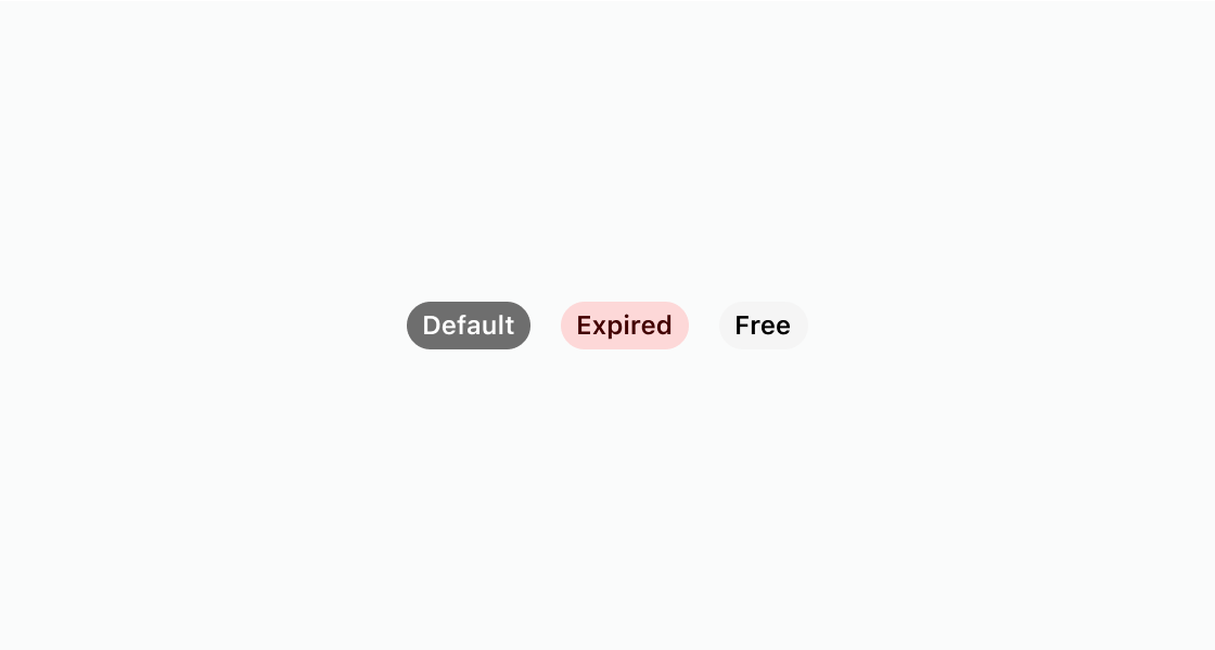
Anchor to Show badges with different tonesShow badges with different tones
Render badges with different visual treatments. This example shows three s-badge elements: one with the default appearance, one with tone="critical", and one with color="subdued".
Show badges with different tones
html
Anchor to Add an icon to a badgeAdd an icon to a badge
Add an icon beside a badge label to reinforce its meaning. This example sets icon, iconPosition, and size on s-badge.
html
Anchor to Group multiple status badgesGroup multiple status badges
Lay out several badges in one horizontal row. This example nests three s-badge elements with default, neutral, and critical tones inside an s-stack.
html
Anchor to Best practicesBest practices
- Keep badge labels short: Aim for one word per badge. For complex states that require two words, use sentence case.
- Use descriptive adjectives or past-tense verbs: Labels like "Paid", "Free", "Expired", or "Processing" communicate status clearly.
- Match tone to urgency: Use
neutralfor standard indicators andcriticalfor urgent statuses. Adjust visual intensity with thecolorproperty.subduedreduces emphasis whilebasekeeps the default appearance. - Always attribute badges to an object: A badge should appear alongside the item it describes, such as an order, subscription, or product.