Select
The select component allows users to choose one option from a dropdown menu. Use select when presenting four or more choices to keep interfaces uncluttered and scannable, or when space is limited.
Select components support option grouping, placeholder text, help text, and validation states to create clear selection interfaces. For more visual selection layouts with radio buttons or checkboxes, use choice list.
Select supports single-value selection only and presents all options in a flat list. For multi-select behavior, use choice list with multiple.
Supported targets
- purchase.
checkout. actions. render-before - purchase.
checkout. block. render - purchase.
checkout. cart-line-item. render-after - purchase.
checkout. cart-line-list. render-after - purchase.
checkout. contact. render-after - purchase.
checkout. delivery-address. render-after - purchase.
checkout. delivery-address. render-before - purchase.
checkout. footer. render-after - purchase.
checkout. header. render-after - purchase.
checkout. payment-method-list. render-after - purchase.
checkout. payment-method-list. render-before - purchase.
checkout. pickup-location-list. render-after - purchase.
checkout. pickup-location-list. render-before - purchase.
checkout. pickup-location-option-item. render-after - purchase.
checkout. pickup-point-list. render-after - purchase.
checkout. pickup-point-list. render-before - purchase.
checkout. reductions. render-after - purchase.
checkout. reductions. render-before - purchase.
checkout. shipping-option-item. details. render - purchase.
checkout. shipping-option-item. render-after - purchase.
checkout. shipping-option-list. render-after - purchase.
checkout. shipping-option-list. render-before - purchase.
thank-you. announcement. render - purchase.
thank-you. block. render - purchase.
thank-you. cart-line-item. render-after - purchase.
thank-you. cart-line-list. render-after - purchase.
thank-you. customer-information. render-after - purchase.
thank-you. footer. render-after - purchase.
thank-you. header. render-after
Supported targets
- purchase.
checkout. actions. render-before - purchase.
checkout. block. render - purchase.
checkout. cart-line-item. render-after - purchase.
checkout. cart-line-list. render-after - purchase.
checkout. contact. render-after - purchase.
checkout. delivery-address. render-after - purchase.
checkout. delivery-address. render-before - purchase.
checkout. footer. render-after - purchase.
checkout. header. render-after - purchase.
checkout. payment-method-list. render-after - purchase.
checkout. payment-method-list. render-before - purchase.
checkout. pickup-location-list. render-after - purchase.
checkout. pickup-location-list. render-before - purchase.
checkout. pickup-location-option-item. render-after - purchase.
checkout. pickup-point-list. render-after - purchase.
checkout. pickup-point-list. render-before - purchase.
checkout. reductions. render-after - purchase.
checkout. reductions. render-before - purchase.
checkout. shipping-option-item. details. render - purchase.
checkout. shipping-option-item. render-after - purchase.
checkout. shipping-option-list. render-after - purchase.
checkout. shipping-option-list. render-before - purchase.
thank-you. announcement. render - purchase.
thank-you. block. render - purchase.
thank-you. cart-line-item. render-after - purchase.
thank-you. cart-line-list. render-after - purchase.
thank-you. customer-information. render-after - purchase.
thank-you. footer. render-after - purchase.
thank-you. header. render-after
Anchor to Use casesUse cases
- Country or region selection: Let buyers choose their country from a dropdown with a pre-selected default.
- Placeholder prompts: Display hint text like "Choose a language" when no option is selected yet.
- Disabled dropdowns: Show a non-interactive dropdown when the selection is locked or determined by another field.
- Compact option lists: Replace long radio button lists with a dropdown to save space.
Anchor to PropertiesProperties
Configure the following properties on the select component.
- Anchor to autocompleteautocompleteautocompleteAutocompleteField | `${AutocompleteSection} ${AutocompleteField}` | `${AutocompleteGroup} ${AutocompleteField}` | `${AutocompleteSection} ${AutocompleteGroup} ${AutocompleteField}` | "on" | "off"AutocompleteField | `${AutocompleteSection} ${AutocompleteField}` | `${AutocompleteGroup} ${AutocompleteField}` | `${AutocompleteSection} ${AutocompleteGroup} ${AutocompleteField}` | "on" | "off"Default: 'on'Default: 'on'
A hint about the intended content of the field for browser autofill.
When set to
on(the default), this property indicates that the field should support autofill, but you do not have any more semantic information on the intended contents.When set to
off, you are indicating that this field contains sensitive information, or contents that are never saved, like one-time codes.Alternatively, you can provide value which describes the specific data you would like to be entered into this field during autofill.
Learn more about the set of autocomplete values supported in browsers.
- Anchor to disableddisableddisabledbooleanbooleanDefault: falseDefault: false
Whether the field is disabled, preventing any user interaction.
- Anchor to errorerrorerrorstringstring
An error message displayed below the field to indicate validation problems. When set, the field is styled with error indicators and the message is announced to screen readers.
- Anchor to idididstringstring
A unique identifier for the element. Use this to reference the element in JavaScript, link labels to form controls, or target specific elements for styling or scripting.
- Anchor to labellabellabelstringstring
The text displayed as the field label, which identifies the purpose of the field to users. This label is associated with the field for accessibility and helps users understand what information to provide.
- Anchor to namenamenamestringstring
The name attribute for the field, used to identify the field's value when the form is submitted. Must be unique within the nearest containing form.
- Anchor to placeholderplaceholderplaceholderstringstring
The placeholder text displayed in the field when it's empty, providing a hint about the expected input format or value.
- Anchor to requiredrequiredrequiredbooleanbooleanDefault: falseDefault: false
Whether the field needs a value. This requirement adds semantic value to the field, but it will not cause an error to appear automatically. If you want to present an error when this field is empty, you can do so with the
errorproperty.- Anchor to valuevaluevaluestringstring
The current value for the field. If omitted, the field will be empty.
AutocompleteSection
The “section” scopes the autocomplete data that should be inserted to a specific area of the page. Commonly used when there are multiple fields with the same autocomplete needs in the same page. For example: 2 shipping address forms in the same page.
`section-${string}`AutocompleteGroup
The contact information group the autocomplete data should be sourced from.
"shipping" | "billing"Anchor to EventsEvents
The select component provides event callbacks for handling user interactions. Learn more about handling events.
- Anchor to blurblurblurCallbackEventListener<typeof tagName>CallbackEventListener<typeof tagName>
A callback fired when the select loses focus.
Learn more about the blur event.
- Anchor to changechangechangeCallbackEventListener<typeof tagName>CallbackEventListener<typeof tagName>
A callback fired when the select value changes.
Learn more about the change event.
- Anchor to focusfocusfocusCallbackEventListener<typeof tagName>CallbackEventListener<typeof tagName>
A callback fired when the select receives focus.
Learn more about the focus event.
CallbackEventListener
A typed event listener for custom element events. The listener receives a `CallbackEvent` with the correct `currentTarget` type for the associated custom element tag.
(EventListener & {
    (event: CallbackEvent<TTagName, Event> & TData): void;
}) | null
CallbackEvent
An event type that narrows the `currentTarget` to the specific HTML element associated with the custom element tag. This provides type-safe event handling in callback listeners.
TEvent & {
    currentTarget: HTMLElementTagNameMap[TTagName];
}
Anchor to OptionOption
Represents a single option within a select component. Use only as a child of s-select components.
- Anchor to accessibilityLabelaccessibility
Labelaccessibility Label stringstring A label used for users using assistive technologies like screen readers. When set, any children or
labelsupplied will not be announced. This can also be used to display a control without a visual label, while still providing context to users using screen readers.- Anchor to defaultSelecteddefault
Selecteddefault Selected booleanbooleanDefault: falseDefault: false Whether the control is selected by default.
- Anchor to disableddisableddisabledbooleanbooleanDefault: falseDefault: false
Whether the control is disabled, preventing any user interaction.
- Anchor to idididstringstring
A unique identifier for the element. Use this to reference the element in JavaScript, link labels to form controls, or target specific elements for styling or scripting.
- Anchor to selectedselectedselectedbooleanbooleanDefault: falseDefault: false
Whether the control is currently selected.
- Anchor to valuevaluevaluestringstring
The value used in form data when the control is checked.
Anchor to ExamplesExamples
Anchor to Select a countrySelect a country
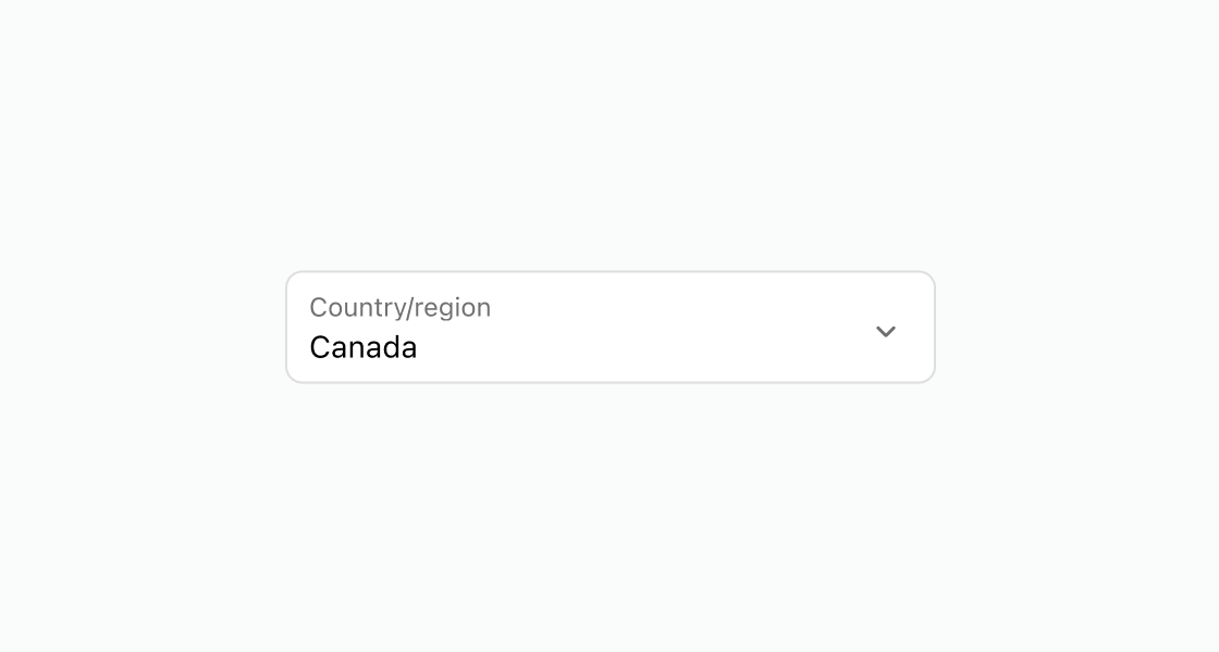
Display a dropdown with pre-defined options and a default selection. This example uses an s-select for country selection with one option pre-selected using defaultSelected.Select a country
html
Anchor to Add placeholder textAdd placeholder text
Display hint text that prompts the buyer to make a selection. This example displays an s-select with a placeholder for language selection.html
Anchor to Disable a locked selectionDisable a locked selection
Show a non-interactive dropdown when the selection is determined by another field. This example shows an s-select with the disabled attribute for a locked currency choice.html
Anchor to Best practicesBest practices
- Use for four or more options: For fewer choices, use choice list with radio buttons for better visibility.
- Add placeholder text: Set
placeholderto guide buyers when no option is selected, such as "Choose a country." - Pre-select common choices: Use
defaultSelectedon the most common option to reduce the number of interactions for most buyers.