Announcement
The announcement component surfaces short, high-visibility messages at checkout without blocking the flow. Use announcement for promotions, shipping updates, and lightweight prompts that keep buyers moving.
Announcements support links, optional dismissal, and can trigger a modal for longer-form content. For persistent status messages or error alerts, use banner instead.
The announcement bar enforces a strict maximum height. Content beyond that height is truncated and can't scroll. Layout and content are controlled entirely through child elements.
Supported targets
Supported targets
Anchor to Use casesUse cases
- Promotional offers: Highlight limited-time discounts, coupon codes, or free shipping thresholds to drive conversions.
- Loyalty program nudges: Inform returning buyers about membership perks or points available during checkout.
- Feedback collection: Prompt buyers to complete a quick survey using a teaser that links to a modal form.
Anchor to EventsEvents
The announcement component provides event callbacks for handling user interactions. Learn more about handling events.
- Anchor to aftertoggleaftertoggleaftertoggleCallbackEventListener<typeof tagName, ToggleArgumentsEvent>CallbackEventListener<typeof tagName, ToggleArgumentsEvent>
A callback that fires when the element state changes, after any toggle animations have finished.
- If the element transitioned from hidden to showing, the
property will be set toclosedand theproperty will be set toopen. - If the element transitioned from showing to hidden, the
property will be set toopenand thewill beclosed.
- If the element transitioned from hidden to showing, the
- Anchor to dismissdismissdismissCallbackEventListener<typeof tagName>CallbackEventListener<typeof tagName>
A callback that fires when the announcement is dismissed by the user clicking the close button or by calling the
dismiss()method programmatically.- Anchor to toggletoggletoggleCallbackEventListener<typeof tagName, ToggleArgumentsEvent>CallbackEventListener<typeof tagName, ToggleArgumentsEvent>
A callback that fires immediately when the element state changes, before any animations.
- If the element is transitioning from hidden to showing, the
property will be set toclosedand theproperty will be set toopen. - If the element is transitioning from showing to hidden, then the
property will be set toopenand thewill beclosed.
Learn more about the
toggleevent,property, andproperty.- If the element is transitioning from hidden to showing, the
CallbackEventListener
A typed event listener for custom element events. The listener receives a `CallbackEvent` with the correct `currentTarget` type for the associated custom element tag.
(EventListener & {
    (event: CallbackEvent<TTagName, Event> & TData): void;
}) | null
CallbackEvent
An event type that narrows the `currentTarget` to the specific HTML element associated with the custom element tag. This provides type-safe event handling in callback listeners.
TEvent & {
    currentTarget: HTMLElementTagNameMap[TTagName];
}
ToggleArgumentsEvent
The event data provided to toggle-related callbacks. Contains the previous and next visibility states of the element.
- newState
The visibility state of the element after the toggle occurred.
ToggleState - oldState
The visibility state of the element before the toggle occurred.
ToggleState
ToggleState
The visibility state of a toggleable element. - `open`: The element is visible and showing its content. - `closed`: The element is hidden and its content is not visible.
'open' | 'closed'Anchor to MethodsMethods
The announcement component exposes methods for programmatic control. Learn more about using methods.
- Anchor to dismissdismissdismiss() => void() => voidrequiredrequired
Programmatically dismisses the announcement. This triggers the
dismissevent callback.
Anchor to ExamplesExamples
Anchor to Display a promotional announcementDisplay a promotional announcement
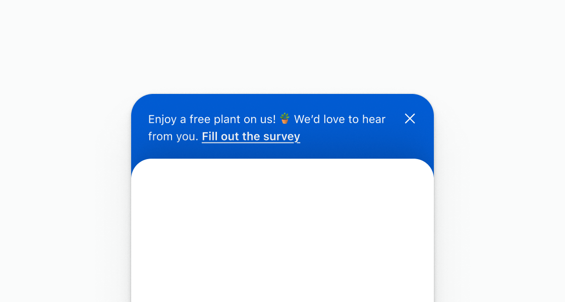
Display a promotional announcement with a survey link. This example shows an s-announcement with inline text and a link inviting buyers to fill out a survey.
Display a promotional announcement
html
Anchor to Display a message with a link to open a modalDisplay a message with a link to open a modal
Use an announcement as a teaser that opens a modal for longer-form content. This example displays a short prompt with an s-link that triggers a survey modal.
html
Anchor to Display an announcement with plain textDisplay an announcement with plain text
Keep the body to a single s-text element. This example places one s-text inside s-announcement without stacks or other layout wrappers.
html
Anchor to Best practicesBest practices
- Keep copy short: Fit the message in a single short line whenever possible so buyers see it at a glance without needing to expand.
- Plan for truncation: The component has a strict maximum height. Content that exceeds the expanded state's height is clipped with no scrolling. Validate your copy length before shipping.
- Link to a modal for longer content: If you need to display surveys, detailed offers, or other long-form content, use the announcement bar as a teaser that opens a modal rather than overfilling the bar.