Drop zone
The drop zone component lets users upload files through drag-and-drop or by clicking to browse. Use for file uploads such as images, documents, or CSV imports.
The component provides visual feedback during drag operations and supports file type validation through the accept property. Rejected files trigger the droprejected event for custom error handling.
Drop zone handles file selection only. Implement upload and storage in your extension logic. To store file references on the cart, use the Metafields API.
Supported targets
- purchase.
checkout. actions. render-before - purchase.
checkout. block. render - purchase.
checkout. cart-line-item. render-after - purchase.
checkout. cart-line-list. render-after - purchase.
checkout. contact. render-after - purchase.
checkout. delivery-address. render-after - purchase.
checkout. delivery-address. render-before - purchase.
checkout. footer. render-after - purchase.
checkout. header. render-after - purchase.
checkout. payment-method-list. render-after - purchase.
checkout. payment-method-list. render-before - purchase.
checkout. pickup-location-list. render-after - purchase.
checkout. pickup-location-list. render-before - purchase.
checkout. pickup-location-option-item. render-after - purchase.
checkout. pickup-point-list. render-after - purchase.
checkout. pickup-point-list. render-before - purchase.
checkout. reductions. render-after - purchase.
checkout. reductions. render-before - purchase.
checkout. shipping-option-item. details. render - purchase.
checkout. shipping-option-item. render-after - purchase.
checkout. shipping-option-list. render-after - purchase.
checkout. shipping-option-list. render-before - purchase.
thank-you. announcement. render - purchase.
thank-you. block. render - purchase.
thank-you. cart-line-item. render-after - purchase.
thank-you. cart-line-list. render-after - purchase.
thank-you. customer-information. render-after - purchase.
thank-you. footer. render-after - purchase.
thank-you. header. render-after
Supported targets
- purchase.
checkout. actions. render-before - purchase.
checkout. block. render - purchase.
checkout. cart-line-item. render-after - purchase.
checkout. cart-line-list. render-after - purchase.
checkout. contact. render-after - purchase.
checkout. delivery-address. render-after - purchase.
checkout. delivery-address. render-before - purchase.
checkout. footer. render-after - purchase.
checkout. header. render-after - purchase.
checkout. payment-method-list. render-after - purchase.
checkout. payment-method-list. render-before - purchase.
checkout. pickup-location-list. render-after - purchase.
checkout. pickup-location-list. render-before - purchase.
checkout. pickup-location-option-item. render-after - purchase.
checkout. pickup-point-list. render-after - purchase.
checkout. pickup-point-list. render-before - purchase.
checkout. reductions. render-after - purchase.
checkout. reductions. render-before - purchase.
checkout. shipping-option-item. details. render - purchase.
checkout. shipping-option-item. render-after - purchase.
checkout. shipping-option-list. render-after - purchase.
checkout. shipping-option-list. render-before - purchase.
thank-you. announcement. render - purchase.
thank-you. block. render - purchase.
thank-you. cart-line-item. render-after - purchase.
thank-you. cart-line-list. render-after - purchase.
thank-you. customer-information. render-after - purchase.
thank-you. footer. render-after - purchase.
thank-you. header. render-after
Anchor to Use casesUse cases
- Image uploads: Let buyers upload product customization images, proof of purchase, or warranty photos.
- Document submissions: Accept PDF or document uploads for returns, warranties, or custom orders.
- Multi-file uploads: Allow buyers to upload multiple files at once for bulk submissions.
- Upload validation: Display error messages when files don't meet size or type requirements.
Anchor to PropertiesProperties
Configure the following properties on the drop zone component.
- Anchor to acceptacceptacceptstringstringDefault: ''Default: ''
A string representing the types of files that are accepted by the drop zone. This string is a comma-separated list of unique file type specifiers which can be one of the following:
- A file extension starting with a period (".") character (such as .jpg, .pdf, .doc)
- A valid MIME type string with no extensions
If omitted, all file types are accepted.
- Anchor to accessibilityLabelaccessibility
Labelaccessibility Label stringstring A label that describes the purpose or contents of the item. When set, it will be announced to buyers using assistive technologies and will provide them with more context.
- Anchor to disableddisableddisabledbooleanbooleanDefault: falseDefault: false
Whether the field is disabled, preventing any user interaction.
- Anchor to errorerrorerrorstringstring
An error message displayed below the field to indicate validation problems. When set, the field is styled with error indicators and the message is announced to screen readers.
- Anchor to idididstringstring
A unique identifier for the element. Use this to reference the element in JavaScript, link labels to form controls, or target specific elements for styling or scripting.
- Anchor to labellabellabelstringstring
The text displayed as the field label, which identifies the purpose of the field to users. This label is associated with the field for accessibility and helps users understand what information to provide.
- Anchor to multiplemultiplemultiplebooleanbooleanDefault: falseDefault: false
Whether multiple files can be selected or dropped at once.
- Anchor to namenamenamestringstring
The name attribute for the field, used to identify the field's value when the form is submitted. Must be unique within the nearest containing form.
- Anchor to requiredrequiredrequiredbooleanbooleanDefault: falseDefault: false
Whether the field needs a value. This requirement adds semantic value to the field, but it will not cause an error to appear automatically. If you want to present an error when this field is empty, you can do so with the
errorproperty.- Anchor to valuevaluevaluestringstringDefault: ''Default: ''
A string that represents the path to the selected file(s). If no file is selected yet, the value is an empty string (""). When the user selected multiple files, the value represents the first file in the list of files they selected. The value is always the file's name prefixed with "C:\fakepath", which isn't the real path of the file.
Anchor to EventsEvents
The drop zone component provides event callbacks for handling user interactions. Learn more about handling events.
- Anchor to changechangechangeCallbackEventListener<typeof tagName>CallbackEventListener<typeof tagName>
A callback fired when the drop zone value changes.
Learn more about the change event.
- Anchor to droprejecteddroprejecteddroprejectedCallbackEventListener<typeof tagName>CallbackEventListener<typeof tagName>
A callback fired when files are rejected based on the
acceptprop.- Anchor to inputinputinputCallbackEventListener<typeof tagName>CallbackEventListener<typeof tagName>
A callback fired when the user inputs data into the drop zone.
Learn more about the input event.
CallbackEventListener
A typed event listener for custom element events. The listener receives a `CallbackEvent` with the correct `currentTarget` type for the associated custom element tag.
(EventListener & {
    (event: CallbackEvent<TTagName, Event> & TData): void;
}) | null
CallbackEvent
An event type that narrows the `currentTarget` to the specific HTML element associated with the custom element tag. This provides type-safe event handling in callback listeners.
TEvent & {
    currentTarget: HTMLElementTagNameMap[TTagName];
}
Anchor to ExamplesExamples
Anchor to Accept file uploadsAccept file uploads
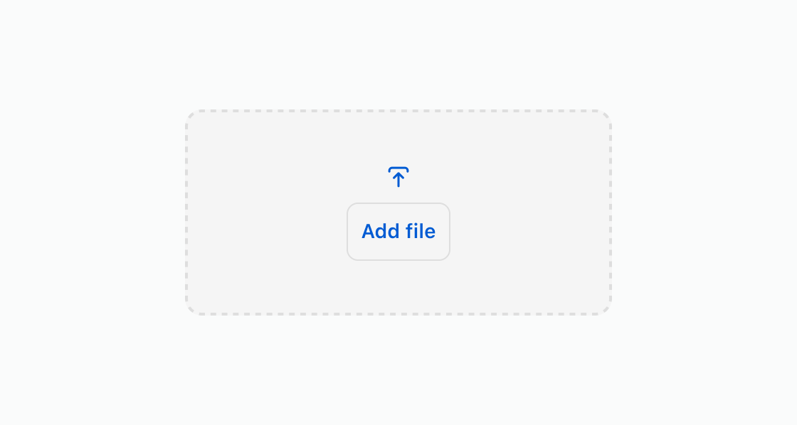
Let buyers upload files by dragging or clicking to browse. This example creates a basic upload area that accepts image files.Accept file uploads
html
Anchor to Upload return documentsUpload return documents
Restrict uploads to document formats for return or warranty submissions. This example accepts only PDF and DOC files using the accept property.html
Anchor to Require a file uploadRequire a file upload
Ensure a file is provided before the form can be submitted. This example uses the required attribute on a drop zone for proof of purchase.html
Anchor to Show an upload errorShow an upload error
Display an error message when an upload fails validation. This example shows a drop zone with an error message for oversized files.html
Anchor to Disable uploadsDisable uploads
Block uploads while files are being processed or when the upload window has closed. This example shows a drop zone with the disabled attribute.html
Anchor to Best practicesBest practices
- Specify accepted types: Use the
acceptproperty to restrict uploads to expected file types, such asimage/*orapplication/pdf. - Mobile considerations: Drag and drop functionality is limited on mobile devices. Include a button to help guide buyers to select files.
- Minimum size: Keep the drop zone at least 100px x 100px to avoid cut-off text and spacing issues.