Product thumbnail
The product thumbnail component shows a small product image alongside line items and recommendations. Use product thumbnails in carts, bundles, upsells, and compact lists.
Product thumbnails support size variants, quantity badges, and alt text. For larger illustrative images, use image.
Product thumbnails render at a fixed aspect ratio and use center cropping for non-square images. Custom placeholder graphics aren't available — a generic placeholder shows when images fail to load or no source is provided.
Supported targets
- purchase.
checkout. actions. render-before - purchase.
checkout. block. render - purchase.
checkout. cart-line-item. render-after - purchase.
checkout. cart-line-list. render-after - purchase.
checkout. contact. render-after - purchase.
checkout. delivery-address. render-after - purchase.
checkout. delivery-address. render-before - purchase.
checkout. footer. render-after - purchase.
checkout. header. render-after - purchase.
checkout. payment-method-list. render-after - purchase.
checkout. payment-method-list. render-before - purchase.
checkout. pickup-location-list. render-after - purchase.
checkout. pickup-location-list. render-before - purchase.
checkout. pickup-location-option-item. render-after - purchase.
checkout. pickup-point-list. render-after - purchase.
checkout. pickup-point-list. render-before - purchase.
checkout. reductions. render-after - purchase.
checkout. reductions. render-before - purchase.
checkout. shipping-option-item. details. render - purchase.
checkout. shipping-option-item. render-after - purchase.
checkout. shipping-option-list. render-after - purchase.
checkout. shipping-option-list. render-before - purchase.
thank-you. announcement. render - purchase.
thank-you. block. render - purchase.
thank-you. cart-line-item. render-after - purchase.
thank-you. cart-line-list. render-after - purchase.
thank-you. customer-information. render-after - purchase.
thank-you. footer. render-after - purchase.
thank-you. header. render-after
Supported targets
- purchase.
checkout. actions. render-before - purchase.
checkout. block. render - purchase.
checkout. cart-line-item. render-after - purchase.
checkout. cart-line-list. render-after - purchase.
checkout. contact. render-after - purchase.
checkout. delivery-address. render-after - purchase.
checkout. delivery-address. render-before - purchase.
checkout. footer. render-after - purchase.
checkout. header. render-after - purchase.
checkout. payment-method-list. render-after - purchase.
checkout. payment-method-list. render-before - purchase.
checkout. pickup-location-list. render-after - purchase.
checkout. pickup-location-list. render-before - purchase.
checkout. pickup-location-option-item. render-after - purchase.
checkout. pickup-point-list. render-after - purchase.
checkout. pickup-point-list. render-before - purchase.
checkout. reductions. render-after - purchase.
checkout. reductions. render-before - purchase.
checkout. shipping-option-item. details. render - purchase.
checkout. shipping-option-item. render-after - purchase.
checkout. shipping-option-list. render-after - purchase.
checkout. shipping-option-list. render-before - purchase.
thank-you. announcement. render - purchase.
thank-you. block. render - purchase.
thank-you. cart-line-item. render-after - purchase.
thank-you. cart-line-list. render-after - purchase.
thank-you. customer-information. render-after - purchase.
thank-you. footer. render-after - purchase.
thank-you. header. render-after
Anchor to Use casesUse cases
- Cart line items: Show product images in the cart summary to help buyers confirm their selections.
- Bundle indicators: Display a thumbnail with a
totalItemsbadge to indicate how many items a bundle contains. - Compact layouts: Render small thumbnails in condensed line-item lists where space is limited.
- Upsell suggestions: Present recommended products with thumbnails alongside their names and prices.
Anchor to PropertiesProperties
Configure the following properties on the product thumbnail component.
- Anchor to altaltaltstringstringDefault: ''Default: ''
Alternative text that describes the image for accessibility.
Provides a text description of the image for users with assistive technology and serves as a fallback when the image fails to load. A well-written description enables people with visual impairments to understand non-text content.
When a screen reader encounters an image, it reads this description aloud. When an image fails to load, this text displays on screen, helping all users understand what content was intended.
Learn more about writing effective alt text and the alt attribute.
- Anchor to sizesizesize'small' | 'base' | 'small-100''small' | 'base' | 'small-100'Default: 'base'Default: 'base'
The size of the product thumbnail image.
'base': Default size that works well in most contexts.'small': Small thumbnail, good for secondary contexts or tight layouts.'small-100': Extra small thumbnail for compact displays or dense lists.
- Anchor to sizessizessizesstringstring
A set of media conditions and their corresponding sizes. Learn more about the sizes attribute.
- Anchor to srcsrcsrcstringstring
The image source (either a remote URL or a local file resource).
When the image is loading or no
srcis provided, a placeholder is rendered. Learn more about the src attribute.- Anchor to srcSetsrc
Setsrc Set stringstring A set of image sources and their width or pixel density descriptors. Learn more about the srcset attribute. This overrides the
srcproperty.- Anchor to totalItemstotal
Itemstotal Items numbernumber The total number of items that the product thumbnail represents. When this value exceeds 1, the component displays a badge showing the count, useful for representing bundled products or quantities.
Anchor to ExamplesExamples
Anchor to Show a product image with a quantity badgeShow a product image with a quantity badge
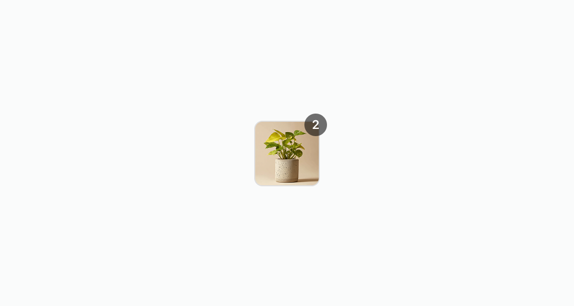
Show a small product image with a quantity badge. This example renders an s-product-thumbnail with totalItems set to 2, indicating multiple items in the bundle.Show a product image with a quantity badge
html
Anchor to Show an empty stateShow an empty state
Show a placeholder when no image is available. This example displays a product thumbnail without a source that renders a default icon.html
Anchor to Display a compact product thumbnailDisplay a compact product thumbnail
Render a small product image for compact line-item layouts. This example configures size="small" and a descriptive alt attribute for accessibility.html
Anchor to Show a compact bundle thumbnailShow a compact bundle thumbnail
Display a small product thumbnail with a quantity badge for bundled items. This example uses size="small" and totalItems="3" to show a compact bundle with an item count badge.html
Anchor to Best practicesBest practices
- Provide descriptive alt text: Write descriptive alt attributes that describe the product, including variant details like size and color. Avoid generic labels like “shirt” or “book”. See Shopify's alt text guidance to learn more about alt text best practices.
- Size thumbnails for your context: Smaller thumbnails work better in dense layouts like lists, while larger sizes suit product-focused interfaces like a recommended product block. Consider the buyer's task and the information density when selecting a size.
- Use quantity badges appropriately: Set
totalItemsonly when the thumbnail represents a bundle or multi-quantity line item. - Maintain visual consistency: Keep a consistent visual style and aspect ratio for product thumbnails throughout your extension. This consistency helps buyers recognize and associate thumbnails with product offerings.
- Optimize for visual clarity and loading time: Choose a resolution and image quality that provide visual clarity while maintaining fast load times. For fast, reliable delivery during checkout, consider hosting images from Shopify's CDN.