Date field
The date field component captures date input with a consistent interface for date selection and proper validation. Use it to collect date information in forms, scheduling interfaces, or data entry workflows.
The component supports manual text entry. For visual calendar-based selection, consider using date picker.
Supported targets
- purchase.
checkout. actions. render-before - purchase.
checkout. block. render - purchase.
checkout. cart-line-item. render-after - purchase.
checkout. cart-line-list. render-after - purchase.
checkout. contact. render-after - purchase.
checkout. delivery-address. render-after - purchase.
checkout. delivery-address. render-before - purchase.
checkout. footer. render-after - purchase.
checkout. header. render-after - purchase.
checkout. payment-method-list. render-after - purchase.
checkout. payment-method-list. render-before - purchase.
checkout. pickup-location-list. render-after - purchase.
checkout. pickup-location-list. render-before - purchase.
checkout. pickup-location-option-item. render-after - purchase.
checkout. pickup-point-list. render-after - purchase.
checkout. pickup-point-list. render-before - purchase.
checkout. reductions. render-after - purchase.
checkout. reductions. render-before - purchase.
checkout. shipping-option-item. details. render - purchase.
checkout. shipping-option-item. render-after - purchase.
checkout. shipping-option-list. render-after - purchase.
checkout. shipping-option-list. render-before - purchase.
thank-you. announcement. render - purchase.
thank-you. block. render - purchase.
thank-you. cart-line-item. render-after - purchase.
thank-you. cart-line-list. render-after - purchase.
thank-you. customer-information. render-after - purchase.
thank-you. footer. render-after - purchase.
thank-you. header. render-after
Supported targets
- purchase.
checkout. actions. render-before - purchase.
checkout. block. render - purchase.
checkout. cart-line-item. render-after - purchase.
checkout. cart-line-list. render-after - purchase.
checkout. contact. render-after - purchase.
checkout. delivery-address. render-after - purchase.
checkout. delivery-address. render-before - purchase.
checkout. footer. render-after - purchase.
checkout. header. render-after - purchase.
checkout. payment-method-list. render-after - purchase.
checkout. payment-method-list. render-before - purchase.
checkout. pickup-location-list. render-after - purchase.
checkout. pickup-location-list. render-before - purchase.
checkout. pickup-location-option-item. render-after - purchase.
checkout. pickup-point-list. render-after - purchase.
checkout. pickup-point-list. render-before - purchase.
checkout. reductions. render-after - purchase.
checkout. reductions. render-before - purchase.
checkout. shipping-option-item. details. render - purchase.
checkout. shipping-option-item. render-after - purchase.
checkout. shipping-option-list. render-after - purchase.
checkout. shipping-option-list. render-before - purchase.
thank-you. announcement. render - purchase.
thank-you. block. render - purchase.
thank-you. cart-line-item. render-after - purchase.
thank-you. cart-line-list. render-after - purchase.
thank-you. customer-information. render-after - purchase.
thank-you. footer. render-after - purchase.
thank-you. header. render-after
Anchor to Use casesUse cases
- Delivery scheduling: Let buyers choose a preferred delivery or pickup date for their order.
- Date restrictions: Exclude weekends, holidays, or dates before a cutoff to guide buyers toward valid selections.
- Pre-filled dates: Display a default date for common selections like the next available business day.
- Read-only display: Show a confirmed date in a non-editable state for order summaries or receipts.
Anchor to PropertiesProperties
Configure the following properties on the date field component.
- Anchor to allowallowallowstringstringDefault: ""Default: ""
Restricts which dates the user can select. Accepts a comma-separated list of dates and date ranges. Whitespace is allowed after commas.
The default
''allows all dates.- Dates in
YYYY-MM-DDformat allow a single date. - Dates in
YYYY-MMformat allow a whole month. - Dates in
YYYYformat allow a whole year. - Ranges are expressed as
start--end. - Ranges are inclusive.- If either
startorendis omitted, the range is unbounded in that direction. - If parts of the date are omitted for
start, they are assumed to be the minimum possible value. So2024--is equivalent to2024-01-01--. - If parts of the date are omitted for
end, they are assumed to be the maximum possible value. So--2024is equivalent to--2024-12-31. - Whitespace is allowed either side of
--.
- If either
Comma-separated list of allowed dates in
YYYY-MM-DDformat.- Dates in
- Anchor to allowDaysallow
Daysallow Days stringstringDefault: ""Default: "" Restricts which days of the week the user can select. Only dates that fall on an allowed day AND pass the
allow/disallowfilters are selectable. For example, settingto'mon, wed, fri'withallowset to'2024-06'restricts selection to Mondays, Wednesdays, and Fridays in June 2024.A comma-separated list of days. Whitespace is allowed after commas.
The default
''has no effect on the result ofallowanddisallow.Days are
sunday,monday,tuesday,wednesday,thursday,friday,saturday.- Anchor to autocompleteautocompleteautocompleteAutocompleteField | `${AutocompleteSection} ${AutocompleteField}` | `${AutocompleteGroup} ${AutocompleteField}` | `${AutocompleteSection} ${AutocompleteGroup} ${AutocompleteField}` | "on" | "off"AutocompleteField | `${AutocompleteSection} ${AutocompleteField}` | `${AutocompleteGroup} ${AutocompleteField}` | `${AutocompleteSection} ${AutocompleteGroup} ${AutocompleteField}` | "on" | "off"Default: 'on'Default: 'on'
A hint about the intended content of the field for browser autofill.
When set to
on(the default), this property indicates that the field should support autofill, but you do not have any more semantic information on the intended contents.When set to
off, you are indicating that this field contains sensitive information, or contents that are never saved, like one-time codes.Alternatively, you can provide value which describes the specific data you would like to be entered into this field during autofill.
Learn more about the set of autocomplete values supported in browsers.
- Anchor to defaultValuedefault
Valuedefault Value stringstring The initial value of the field when it first loads. Unlike
placeholder, this is a real value that the user can edit and that gets submitted with the form. Once the user starts typing, their input replaces this value.- Anchor to defaultViewdefault
Viewdefault View stringstring Default month to display in
YYYY-MMformat.This value is used until
viewis set, either directly or as a result of user interaction.Defaults to the current month in the user's locale.
- Anchor to disableddisableddisabledbooleanbooleanDefault: falseDefault: false
Whether the field is disabled, preventing any user interaction.
- Anchor to disallowdisallowdisallowstringstringDefault: ""Default: ""
Dates that cannot be selected. These subtract from
allow.A comma-separated list of dates, date ranges. Whitespace is allowed after commas.
The default
''has no effect onallow.- Dates in
YYYY-MM-DDformat disallow a single date. - Dates in
YYYY-MMformat disallow a whole month. - Dates in
YYYYformat disallow a whole year. - Ranges are expressed as
start--end. - Ranges are inclusive.- If either
startorendis omitted, the range is unbounded in that direction. - If parts of the date are omitted for
start, they are assumed to be the minimum possible value. So2024--is equivalent to2024-01-01--. - If parts of the date are omitted for
end, they are assumed to be the maximum possible value. So--2024is equivalent to--2024-12-31. - Whitespace is allowed either side of
--.
- If either
Comma-separated list of disallowed dates in
YYYY-MM-DDformat.- Dates in
- Anchor to disallowDaysdisallow
Daysdisallow Days stringstringDefault: ""Default: "" Days of the week that cannot be selected. This subtracts from
, and intersects with the result ofallowanddisallow.A comma-separated list of days. Whitespace is allowed after commas.
The default
''has no effect on.Days are
sunday,monday,tuesday,wednesday,thursday,friday,saturday.- Anchor to errorerrorerrorstringstring
An error message displayed below the field to indicate validation problems. When set, the field is styled with error indicators and the message is announced to screen readers.
- Anchor to idididstringstring
A unique identifier for the element. Use this to reference the element in JavaScript, link labels to form controls, or target specific elements for styling or scripting.
- Anchor to labellabellabelstringstring
The text displayed as the field label, which identifies the purpose of the field to users. This label is associated with the field for accessibility and helps users understand what information to provide.
- Anchor to namenamenamestringstring
The name attribute for the field, used to identify the field's value when the form is submitted. Must be unique within the nearest containing form.
- Anchor to readOnlyread
Onlyread Only booleanbooleanDefault: falseDefault: false Whether the field is read-only and can't be edited. Read-only fields remain focusable and their content is announced by screen readers.
- Anchor to requiredrequiredrequiredbooleanbooleanDefault: falseDefault: false
Whether the field needs a value. This requirement adds semantic value to the field, but it will not cause an error to appear automatically. If you want to present an error when this field is empty, you can do so with the
errorproperty.- Anchor to valuevaluevaluestringstring
The current value for the field. If omitted, the field will be empty.
- Anchor to viewviewviewstringstring
Displayed month in
YYYY-MMformat.is called when this value changes.Defaults to
.
AutocompleteSection
The “section” scopes the autocomplete data that should be inserted to a specific area of the page. Commonly used when there are multiple fields with the same autocomplete needs in the same page. For example: 2 shipping address forms in the same page.
`section-${string}`AutocompleteGroup
The contact information group the autocomplete data should be sourced from.
"shipping" | "billing"Anchor to EventsEvents
The date field component provides event callbacks for handling user interactions. Learn more about handling events.
- Anchor to blurblurblurCallbackEventListener<typeof tagName>CallbackEventListener<typeof tagName>
A callback fired when the date field loses focus.
Learn more about the blur event.
- Anchor to changechangechangeCallbackEventListener<typeof tagName>CallbackEventListener<typeof tagName>
A callback fired when the date field value changes.
Learn more about the change event.
- Anchor to focusfocusfocusCallbackEventListener<typeof tagName>CallbackEventListener<typeof tagName>
A callback fired when the date field receives focus.
Learn more about the focus event.
- Anchor to inputinputinputCallbackEventListener<typeof tagName>CallbackEventListener<typeof tagName>
A callback fired when the user inputs data into the date field.
Learn more about the input event.
- Anchor to invalidinvalidinvalidCallbackEventListener<typeof tagName>CallbackEventListener<typeof tagName>
A callback fired when the date field value is invalid.
Learn more about the invalid event.
- Anchor to viewChangeview
Changeview Change CallbackEventListener<typeof tagName>CallbackEventListener<typeof tagName> A callback fired when the calendar view changes, such as when navigating between months.
CallbackEventListener
A typed event listener for custom element events. The listener receives a `CallbackEvent` with the correct `currentTarget` type for the associated custom element tag.
(EventListener & {
    (event: CallbackEvent<TTagName, Event> & TData): void;
}) | null
CallbackEvent
An event type that narrows the `currentTarget` to the specific HTML element associated with the custom element tag. This provides type-safe event handling in callback listeners.
TEvent & {
    currentTarget: HTMLElementTagNameMap[TTagName];
}
Anchor to ExamplesExamples
Anchor to Collect a pickup dateCollect a pickup date
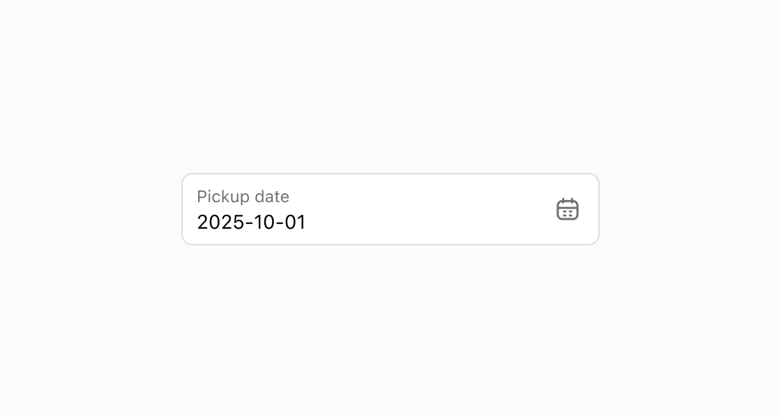
Display a date input with a pre-filled default for scheduled pickups. This example shows an s-date-field with a label and defaultValue set to a specific date.Collect a pickup date
html
Anchor to Restrict selectable delivery datesRestrict selectable delivery dates
Block a holiday date range and exclude weekends from selection. This example configures an s-date-field with disallow set to December 24-31 and disallowDays excluding Saturdays and Sundays.html
Anchor to Display a read-only order dateDisplay a read-only order date
Show a confirmed date in a non-editable state for reference. This example displays an s-date-field with the readonly attribute and a pre-filled value.html
Anchor to Best practicesBest practices
- Set meaningful defaults: Use
defaultValueto pre-fill the next available date and reduce manual input. - Restrict invalid dates: Use
disallowanddisallowDaysto prevent buyers from selecting dates that aren't available for fulfillment. - Pair with date picker: For date selection that benefits from calendar context, use date picker alongside or instead of a date field.