Tooltip
The tooltip component displays helpful information in a small overlay when buyers hover over or focus on an element. Use tooltip to provide additional context, explain functionality, or clarify terms without cluttering the interface with permanent text.
Tooltips support keyboard accessibility and activate on both hover and focus for inclusive interaction patterns. For interactive content like links or buttons, use popover instead.
Tooltips rely on :hover and :focus states, so they only appear on devices with a mouse or trackpad — they don't work on touch devices like phones and tablets. Per the WAI-ARIA tooltip pattern, tooltips can't contain interactive elements like links or buttons. Placement is automatic and can't be configured.
Supported targets
- purchase.
checkout. actions. render-before - purchase.
checkout. block. render - purchase.
checkout. cart-line-item. render-after - purchase.
checkout. cart-line-list. render-after - purchase.
checkout. contact. render-after - purchase.
checkout. delivery-address. render-after - purchase.
checkout. delivery-address. render-before - purchase.
checkout. footer. render-after - purchase.
checkout. header. render-after - purchase.
checkout. payment-method-list. render-after - purchase.
checkout. payment-method-list. render-before - purchase.
checkout. pickup-location-list. render-after - purchase.
checkout. pickup-location-list. render-before - purchase.
checkout. pickup-location-option-item. render-after - purchase.
checkout. pickup-point-list. render-after - purchase.
checkout. pickup-point-list. render-before - purchase.
checkout. reductions. render-after - purchase.
checkout. reductions. render-before - purchase.
checkout. shipping-option-item. details. render - purchase.
checkout. shipping-option-item. render-after - purchase.
checkout. shipping-option-list. render-after - purchase.
checkout. shipping-option-list. render-before - purchase.
thank-you. announcement. render - purchase.
thank-you. block. render - purchase.
thank-you. cart-line-item. render-after - purchase.
thank-you. cart-line-list. render-after - purchase.
thank-you. customer-information. render-after - purchase.
thank-you. footer. render-after - purchase.
thank-you. header. render-after
Supported targets
- purchase.
checkout. actions. render-before - purchase.
checkout. block. render - purchase.
checkout. cart-line-item. render-after - purchase.
checkout. cart-line-list. render-after - purchase.
checkout. contact. render-after - purchase.
checkout. delivery-address. render-after - purchase.
checkout. delivery-address. render-before - purchase.
checkout. footer. render-after - purchase.
checkout. header. render-after - purchase.
checkout. payment-method-list. render-after - purchase.
checkout. payment-method-list. render-before - purchase.
checkout. pickup-location-list. render-after - purchase.
checkout. pickup-location-list. render-before - purchase.
checkout. pickup-location-option-item. render-after - purchase.
checkout. pickup-point-list. render-after - purchase.
checkout. pickup-point-list. render-before - purchase.
checkout. reductions. render-after - purchase.
checkout. reductions. render-before - purchase.
checkout. shipping-option-item. details. render - purchase.
checkout. shipping-option-item. render-after - purchase.
checkout. shipping-option-list. render-after - purchase.
checkout. shipping-option-list. render-before - purchase.
thank-you. announcement. render - purchase.
thank-you. block. render - purchase.
thank-you. cart-line-item. render-after - purchase.
thank-you. cart-line-list. render-after - purchase.
thank-you. customer-information. render-after - purchase.
thank-you. footer. render-after - purchase.
thank-you. header. render-after
Anchor to Use casesUse cases
- Delivery details: Explain shipping timeframes, express options, or carrier-specific information next to delivery estimates.
- Policy clarifications: Provide brief explanations of duty, tax, or return policy terms inline with checkout totals.
- Feature guidance: Describe what a field or option does when the label alone isn't sufficient.
- Insurance details: Clarify coverage terms for optional add-ons like shipping insurance or extended warranties.
Anchor to PropertiesProperties
Configure the following properties on the tooltip component.
- Anchor to idididstringstring
A unique identifier for the element. Use this to reference the element in JavaScript, link labels to form controls, or target specific elements for styling or scripting.
Anchor to ExamplesExamples
Anchor to Show curbside pickup detailsShow curbside pickup details
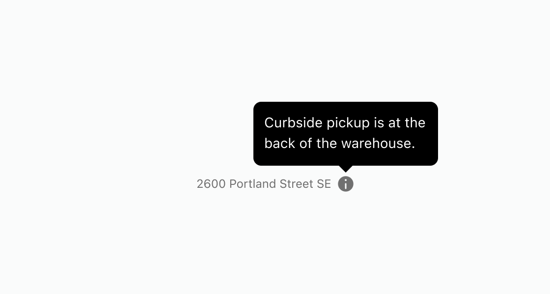
Show extra details when a buyer hovers over or focuses on an element. This example adds a tooltip to an info icon beside an address, displaying curbside pickup instructions.Show curbside pickup details
html
Anchor to Add delivery and duty detailsAdd delivery and duty details
Display delivery and duty info next to checkout line items on hover. This example renders two tooltips, each attached to a clickable text element with interestFor.html
Anchor to Show shipping insurance detailsShow shipping insurance details
Explain coverage terms for an optional add-on next to a help icon. This example uses a tooltip to show shipping insurance details alongside the add-on label.html
Anchor to Best practicesBest practices
- Reserve tooltips for non-essential information: The component works best for supplementary details that enhance understanding without being critical. Never hide essential information, errors, or required instructions in tooltips.
- Add tooltips to icon-only elements: Icon buttons need tooltips to clarify what they do. Attach tooltips to info or question icons so buyers know additional context is available without cluttering the layout.
- Keep tooltip content brief and clear: Limit tooltip content to one or two short sentences. For longer explanations, use a popover instead.
- Use
interestForfor accessible binding: Connect the trigger element to the tooltip usinginterestForand a matchingidfor proper keyboard and screen reader support. - Reconsider your design if many tooltips are needed: If you're adding many tooltips to explain your interface, the design itself might be unclear. Improve labels, layout, or information architecture instead.
- Design for touch-device fallbacks: If the information is important enough to need a tooltip, consider making it visible by default on mobile.