Date picker
The date picker component allows merchants to select dates using a calendar interface. Use it when merchants benefit from seeing dates in context of the full month, such as selecting dates relative to today or needing weekday context.
The component supports single dates, multiple dates, and date ranges. Time selection isn't supported. For text date entry, use date field.
Supported targets
- purchase.
checkout. actions. render-before - purchase.
checkout. block. render - purchase.
checkout. cart-line-item. render-after - purchase.
checkout. cart-line-list. render-after - purchase.
checkout. contact. render-after - purchase.
checkout. delivery-address. render-after - purchase.
checkout. delivery-address. render-before - purchase.
checkout. footer. render-after - purchase.
checkout. header. render-after - purchase.
checkout. payment-method-list. render-after - purchase.
checkout. payment-method-list. render-before - purchase.
checkout. pickup-location-list. render-after - purchase.
checkout. pickup-location-list. render-before - purchase.
checkout. pickup-location-option-item. render-after - purchase.
checkout. pickup-point-list. render-after - purchase.
checkout. pickup-point-list. render-before - purchase.
checkout. reductions. render-after - purchase.
checkout. reductions. render-before - purchase.
checkout. shipping-option-item. details. render - purchase.
checkout. shipping-option-item. render-after - purchase.
checkout. shipping-option-list. render-after - purchase.
checkout. shipping-option-list. render-before - purchase.
thank-you. announcement. render - purchase.
thank-you. block. render - purchase.
thank-you. cart-line-item. render-after - purchase.
thank-you. cart-line-list. render-after - purchase.
thank-you. customer-information. render-after - purchase.
thank-you. footer. render-after - purchase.
thank-you. header. render-after
Supported targets
- purchase.
checkout. actions. render-before - purchase.
checkout. block. render - purchase.
checkout. cart-line-item. render-after - purchase.
checkout. cart-line-list. render-after - purchase.
checkout. contact. render-after - purchase.
checkout. delivery-address. render-after - purchase.
checkout. delivery-address. render-before - purchase.
checkout. footer. render-after - purchase.
checkout. header. render-after - purchase.
checkout. payment-method-list. render-after - purchase.
checkout. payment-method-list. render-before - purchase.
checkout. pickup-location-list. render-after - purchase.
checkout. pickup-location-list. render-before - purchase.
checkout. pickup-location-option-item. render-after - purchase.
checkout. pickup-point-list. render-after - purchase.
checkout. pickup-point-list. render-before - purchase.
checkout. reductions. render-after - purchase.
checkout. reductions. render-before - purchase.
checkout. shipping-option-item. details. render - purchase.
checkout. shipping-option-item. render-after - purchase.
checkout. shipping-option-list. render-after - purchase.
checkout. shipping-option-list. render-before - purchase.
thank-you. announcement. render - purchase.
thank-you. block. render - purchase.
thank-you. cart-line-item. render-after - purchase.
thank-you. cart-line-list. render-after - purchase.
thank-you. customer-information. render-after - purchase.
thank-you. footer. render-after - purchase.
thank-you. header. render-after
Anchor to Use casesUse cases
- Delivery scheduling: Let buyers pick a delivery date from a visual calendar that shows the full month.
- Date range selection: Allow buyers to select a start and end date for subscriptions, rentals, or booking windows.
- Restricted calendars: Gray out unavailable days like weekends or holidays to guide buyers toward valid dates.
- Pre-selected dates: Highlight a default date on the calendar to speed up selection for common choices.
Anchor to PropertiesProperties
Configure the following properties on the date picker component.
- Anchor to allowallowallowstringstringDefault: ""Default: ""
Restricts which dates the user can select. Accepts a comma-separated list of dates and date ranges. Whitespace is allowed after commas.
The default
''allows all dates.- Dates in
YYYY-MM-DDformat allow a single date. - Dates in
YYYY-MMformat allow a whole month. - Dates in
YYYYformat allow a whole year. - Ranges are expressed as
start--end. - Ranges are inclusive.- If either
startorendis omitted, the range is unbounded in that direction. - If parts of the date are omitted for
start, they are assumed to be the minimum possible value. So2024--is equivalent to2024-01-01--. - If parts of the date are omitted for
end, they are assumed to be the maximum possible value. So--2024is equivalent to--2024-12-31. - Whitespace is allowed either side of
--.
- If either
Comma-separated list of allowed dates in
YYYY-MM-DDformat.- Dates in
- Anchor to allowDaysallow
Daysallow Days stringstringDefault: ""Default: "" Restricts which days of the week the user can select. Only dates that fall on an allowed day AND pass the
allow/disallowfilters are selectable. For example, settingto'mon, wed, fri'withallowset to'2024-06'restricts selection to Mondays, Wednesdays, and Fridays in June 2024.A comma-separated list of days. Whitespace is allowed after commas.
The default
''has no effect on the result ofallowanddisallow.Days are
sunday,monday,tuesday,wednesday,thursday,friday,saturday.- Anchor to defaultValuedefault
Valuedefault Value stringstringDefault: ""Default: "" Default selected value.
The default means no date is selected.
If the provided value is invalid, no date is selected.
- If
type="single", this is a date inYYYY-MM-DDformat. - If
type="multiple", this is a comma-separated list of dates inYYYY-MM-DDformat. - If
type="range", this is a range inYYYY-MM-DD--YYYY-MM-DDformat. The range is inclusive.
- If
- Anchor to defaultViewdefault
Viewdefault View stringstring Default month to display in
YYYY-MMformat.This value is used until
viewis set, either directly or as a result of user interaction.Defaults to the current month in the user's locale.
- Anchor to disableddisableddisabledbooleanbooleanDefault: falseDefault: false
Whether the field is disabled, preventing any user interaction.
- Anchor to disallowdisallowdisallowstringstringDefault: ""Default: ""
Dates that cannot be selected. These subtract from
allow.A comma-separated list of dates, date ranges. Whitespace is allowed after commas.
The default
''has no effect onallow.- Dates in
YYYY-MM-DDformat disallow a single date. - Dates in
YYYY-MMformat disallow a whole month. - Dates in
YYYYformat disallow a whole year. - Ranges are expressed as
start--end. - Ranges are inclusive.- If either
startorendis omitted, the range is unbounded in that direction. - If parts of the date are omitted for
start, they are assumed to be the minimum possible value. So2024--is equivalent to2024-01-01--. - If parts of the date are omitted for
end, they are assumed to be the maximum possible value. So--2024is equivalent to--2024-12-31. - Whitespace is allowed either side of
--.
- If either
Comma-separated list of disallowed dates in
YYYY-MM-DDformat.- Dates in
- Anchor to disallowDaysdisallow
Daysdisallow Days stringstringDefault: ""Default: "" Days of the week that cannot be selected. This subtracts from
, and intersects with the result ofallowanddisallow.A comma-separated list of days. Whitespace is allowed after commas.
The default
''has no effect on.Days are
sunday,monday,tuesday,wednesday,thursday,friday,saturday.- Anchor to idididstringstring
A unique identifier for the element. Use this to reference the element in JavaScript, link labels to form controls, or target specific elements for styling or scripting.
- Anchor to namenamenamestringstring
The name attribute for the field, used to identify the field's value when the form is submitted. Must be unique within the nearest containing form.
- Anchor to typetypetype'single' | 'multiple' | 'range''single' | 'multiple' | 'range'Default: "single"Default: "single"
The type of selection the date picker allows.
singleallows selecting a single date.multipleallows selecting multiple non-contiguous dates.rangeallows selecting a single range of dates.
- Anchor to valuevaluevaluestringstringDefault: ""Default: ""
Current selected value.
The default means no date is selected.
If the provided value is invalid, no date is selected.
Otherwise:
- If
type="single", this is a date inYYYY-MM-DDformat. - If
type="multiple", this is a comma-separated list of dates inYYYY-MM-DDformat. - If
type="range", this is a range inYYYY-MM-DD--YYYY-MM-DDformat. The range is inclusive.
Single dates use ISO 8601 format (
YYYY-MM-DD); ranges useYYYY-MM-DD--YYYY-MM-DD. Locale-specific formats aren't supported.- If
- Anchor to viewviewviewstringstring
Displayed month in
YYYY-MMformat.is called when this value changes.Defaults to
.
Anchor to EventsEvents
The date picker component provides event callbacks for handling user interactions. Learn more about handling events.
- Anchor to blurblurblurCallbackEventListener<typeof tagName>CallbackEventListener<typeof tagName>
A callback fired when the date picker loses focus.
Learn more about the blur event.
- Anchor to changechangechangeCallbackEventListener<typeof tagName>CallbackEventListener<typeof tagName>
A callback fired when the date picker value changes.
Learn more about the change event.
- Anchor to focusfocusfocusCallbackEventListener<typeof tagName>CallbackEventListener<typeof tagName>
A callback fired when the date picker receives focus.
Learn more about the focus event.
- Anchor to inputinputinputCallbackEventListener<typeof tagName>CallbackEventListener<typeof tagName>
A callback fired when the user inputs data into the date picker.
Learn more about the input event.
- Anchor to viewChangeview
Changeview Change CallbackEventListener<typeof tagName>CallbackEventListener<typeof tagName> A callback fired when the calendar view changes, such as when navigating between months.
CallbackEventListener
A typed event listener for custom element events. The listener receives a `CallbackEvent` with the correct `currentTarget` type for the associated custom element tag.
(EventListener & {
    (event: CallbackEvent<TTagName, Event> & TData): void;
}) | null
CallbackEvent
An event type that narrows the `currentTarget` to the specific HTML element associated with the custom element tag. This provides type-safe event handling in callback listeners.
TEvent & {
    currentTarget: HTMLElementTagNameMap[TTagName];
}
Anchor to ExamplesExamples
Anchor to Select a date from a calendarSelect a date from a calendar
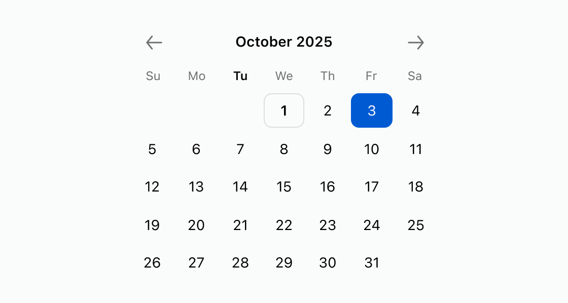
Display a visual calendar for date selection with a pre-selected date. This example configures an s-date-picker with defaultView set to a month and defaultValue highlighting a specific day.Select a date from a calendar
html
Anchor to Restrict selectable calendar datesRestrict selectable calendar dates
Block dates before a cutoff and exclude Sundays from the calendar. This example shows an s-date-picker with disallow set to dates before December 1, 2026 and disallowDays excluding Sundays.html
Anchor to Select a date rangeSelect a date range
Allow buyers to pick a start and end date for a booking or subscription window. This example uses an s-date-picker with type set to range.html
Anchor to Best practicesBest practices
- Set a default view: Use
defaultViewto open the calendar to the most relevant month, such as the current or next month. - Restrict invalid dates: Use
disallowwith date ranges anddisallowDayswith day names to prevent buyers from selecting unavailable dates. - Choose the right selection mode: Use
type="range"for booking windows and the default single mode for one-off date selections.