Version 2025-07 is the last API version to support React-based UI components. Later versions use Polaris web components, native UI elements with built-in accessibility, better performance, and consistent styling with Shopify's design system. Check out the upgrade guide to upgrade your extension and avoid being blocked from updating your extension after October 1st 2026.
Full page
Full-page extensions allow you to create entirely new pages in customer accounts. They render in the main content area, below the header, and above the footer. By default, when a merchant adds a full-page extension in the checkout and accounts editor, they're prompted to add it to the customer account header menu. Use the Page component as the main container for placing content in your full-page extension.
Anchor to Use casesUse cases
- Wishlist: Build a dedicated page where customers can view and manage their saved products.
- Loyalty program: Display loyalty points, rewards tiers, and redemption options on a custom page.
- Return requests: Create an order-specific page where customers can initiate and manage product returns.
- Subscription management: Allow customers to view and manage their product subscriptions on a dedicated page.
- Custom order views: Build order-specific pages that display supplementary information such as warranty details or installation instructions.
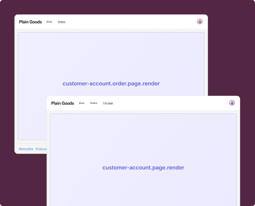
Anchor to Full page targetsFull page targets
Full-page extensions support custom protocols and the Navigation API for in-extension routing.
A full-page extension target can't coexist with any other targets in the same extension. Each full-page extension must be defined in a separate [[extensions.targeting]] entry in your TOML configuration.
A full-page extension target can't coexist with any other targets in the same extension. Each full-page extension must be defined in a separate [[extensions.targeting]] entry in your TOML configuration.
Anchor to Customer account full page ,[object Object]Customer account full page target
customer-account.page.render
Renders a full-page extension in the main content area of customer accounts. Use this target for pages that aren't tied to a specific order, such as a wishlist or loyalty program page.
Supported components
- Avatar
- Badge
- Banner
- Block
Layout - Block
Spacer - Block
Stack - Button
- Card
- Checkbox
- Choice
- Choice
List - Clipboard
Item - Customer
Account Action - Date
Field - Date
Picker - Disclosure
- Divider
- Drop
Zone - Form
- Grid
- Grid
Item - Heading
- Heading
Group - Icon
- Image
- Image
Group - Inline
Layout - Inline
Spacer - Inline
Stack - Link
- List
- List
Item - Map
- Map
Marker - Map
Popover - Menu
- Modal
- Page
- Payment
Icon - Phone
Field - Popover
- Pressable
- Product
Thumbnail - Progress
- QRCode
- Resource
Item - Scroll
View - Select
- Sheet
- Skeleton
Image - Skeleton
Text - Skeleton
Text Block - Spinner
- Stepper
- Switch
- Tag
- Text
- Text
Block - Text
Field - Toggle
Button - Toggle
Button Group - Tooltip
- View
Supported components
- Avatar
- Badge
- Banner
- Block
Layout - Block
Spacer - Block
Stack - Button
- Card
- Checkbox
- Choice
- Choice
List - Clipboard
Item - Customer
Account Action - Date
Field - Date
Picker - Disclosure
- Divider
- Drop
Zone - Form
- Grid
- Grid
Item - Heading
- Heading
Group - Icon
- Image
- Image
Group - Inline
Layout - Inline
Spacer - Inline
Stack - Link
- List
- List
Item - Map
- Map
Marker - Map
Popover - Menu
- Modal
- Page
- Payment
Icon - Phone
Field - Popover
- Pressable
- Product
Thumbnail - Progress
- QRCode
- Resource
Item - Scroll
View - Select
- Sheet
- Skeleton
Image - Skeleton
Text - Skeleton
Text Block - Spinner
- Stepper
- Switch
- Tag
- Text
- Text
Block - Text
Field - Toggle
Button - Toggle
Button Group - Tooltip
- View
Examples
Build a wishlist page
Description
Create a full-page extension that displays a wishlist. This example uses [Page](/docs/api/customer-account-ui-extensions/2025-07/components/layout-and-structure/page) as the main container with a title, subtitle, and a primary action button that navigates back to the customer account.
React
import {
  reactExtension,
  Page,
  Button,
  BlockStack,
  Banner,
  Heading,
  Text,
  useApi,
} from '@shopify/ui-extensions-react/customer-account';

export default reactExtension(
  'customer-account.page.render',
  () => <Extension />,
);

function Extension() {
  const {navigation} = useApi();

  return (
    <Page
      title="Wishlist"
      subtitle="Your saved items"
      primaryAction={
        <Button onPress={() => navigation.navigate('shopify:customer-account/')}>
          Back to account
        </Button>
      }
    >
      <BlockStack spacing="base">
        <Banner status="info">
          Save items from the store to keep track of products you love.
        </Banner>
        <BlockStack spacing="base">
          <Heading>No saved items yet</Heading>
          <Text appearance="subdued">
            Browse the store and save items to your wishlist.
          </Text>
        </BlockStack>
      </BlockStack>
    </Page>
  );
}
TS
import {
  extension,
  Page,
  Button,
  BlockStack,
  Banner,
  Heading,
  Text,
} from '@shopify/ui-extensions/customer-account';

export default extension(
  'customer-account.page.render',
  (root, {navigation}) => {
    const primaryAction = root.createFragment();
    primaryAction.appendChild(
      root.createComponent(
        Button,
        {onPress: () => navigation.navigate('shopify:customer-account/')},
        'Back to account',
      ),
    );

    const page = root.createComponent(
      Page,
      {title: 'Wishlist', subtitle: 'Your saved items', primaryAction},
      [
        root.createComponent(BlockStack, {spacing: 'base'}, [
          root.createComponent(
            Banner,
            {status: 'info'},
            'Save items from the store to keep track of products you love.',
          ),
          root.createComponent(BlockStack, {spacing: 'base'}, [
            root.createComponent(Heading, undefined, 'No saved items yet'),
            root.createComponent(
              Text,
              {appearance: 'subdued'},
              'Browse the store and save items to your wishlist.',
            ),
          ]),
        ]),
      ],
    );

    root.appendChild(page);
  },
);
Handle in-extension navigation
Description
Build a full-page extension with multiple routes using the [Navigation API](/docs/api/customer-account-ui-extensions/2025-07/target-apis/platform-apis/navigation-api). Use `navigation.navigate()` to move between routes within the extension, and `useNavigationCurrentEntry()` (React) or `navigation.currentEntry` (TS) to determine the current route.
React
import {
  reactExtension,
  Page,
  Button,
  BlockStack,
  Text,
  useApi,
  useNavigationCurrentEntry,
} from '@shopify/ui-extensions-react/customer-account';

export default reactExtension(
  'customer-account.page.render',
  () => <Extension />,
);

function Extension() {
  const {navigation} = useApi();
  const currentEntry = useNavigationCurrentEntry();
  const currentPath = new URL(currentEntry.url).pathname;

  if (currentPath.endsWith('/settings')) {
    return (
      <Page
        title="Subscription Settings"
        primaryAction={
          <Button onPress={() => navigation.navigate('extension://')}>
            Back
          </Button>
        }
      >
        <BlockStack spacing="base">
          <Text>Manage your subscription preferences here.</Text>
        </BlockStack>
      </Page>
    );
  }

  return (
    <Page title="Subscriptions">
      <BlockStack spacing="base">
        <Text>Manage your active subscriptions.</Text>
        <Button onPress={() => navigation.navigate('extension://settings')}>
          Subscription settings
        </Button>
      </BlockStack>
    </Page>
  );
}
TS
import {
  extension,
  Page,
  Button,
  BlockStack,
  Text,
} from '@shopify/ui-extensions/customer-account';

export default extension(
  'customer-account.page.render',
  (root, {navigation}) => {
    function renderPage(path: string) {
      root.replaceChildren();

      if (path.endsWith('/settings')) {
        const primaryAction = root.createFragment();
        primaryAction.appendChild(
          root.createComponent(
            Button,
            {onPress: () => navigation.navigate('extension://')},
            'Back',
          ),
        );

        root.appendChild(
          root.createComponent(
            Page,
            {title: 'Subscription Settings', primaryAction},
            [
              root.createComponent(BlockStack, {spacing: 'base'}, [
                root.createComponent(
                  Text,
                  undefined,
                  'Manage your subscription preferences here.',
                ),
              ]),
            ],
          ),
        );
        return;
      }

      root.appendChild(
        root.createComponent(Page, {title: 'Subscriptions'}, [
          root.createComponent(BlockStack, {spacing: 'base'}, [
            root.createComponent(
              Text,
              undefined,
              'Manage your active subscriptions.',
            ),
            root.createComponent(
              Button,
              {onPress: () => navigation.navigate('extension://settings')},
              'Subscription settings',
            ),
          ]),
        ]),
      );
    }

    renderPage(new URL(navigation.currentEntry.url).pathname);

    navigation.addEventListener('currententrychange', () => {
      renderPage(new URL(navigation.currentEntry.url).pathname);
    });
  },
);
Anchor to Order-specific full page ,[object Object]Order-specific full page target
customer-account.order.page.render
Renders a full-page extension tied to a specific order in the main content area of customer accounts. Use this target for pages like return requests or warranty details. This target gives you access to order details through useOrder() (React) or order (TS), as well as line items through useCartLines() (React) or lines (TS).
Supported components
- Avatar
- Badge
- Banner
- Block
Layout - Block
Spacer - Block
Stack - Button
- Card
- Checkbox
- Choice
- Choice
List - Clipboard
Item - Customer
Account Action - Date
Field - Date
Picker - Disclosure
- Divider
- Drop
Zone - Form
- Grid
- Grid
Item - Heading
- Heading
Group - Icon
- Image
- Image
Group - Inline
Layout - Inline
Spacer - Inline
Stack - Link
- List
- List
Item - Map
- Map
Marker - Map
Popover - Menu
- Modal
- Page
- Payment
Icon - Phone
Field - Popover
- Pressable
- Product
Thumbnail - Progress
- QRCode
- Resource
Item - Scroll
View - Select
- Sheet
- Skeleton
Image - Skeleton
Text - Skeleton
Text Block - Spinner
- Stepper
- Switch
- Tag
- Text
- Text
Block - Text
Field - Toggle
Button - Toggle
Button Group - Tooltip
- View
Available APIs
- Addresses API
- Analytics API
- Attributes API
- Authenticated Account API
- Authentication State API
- Buyer Identity API
- Cart Lines API
- Checkout Settings API
- Cost API
- Customer Account API
- Customer Privacy API
- Discounts API
- Extension API
- Gift Cards API
- Localization API
- Metafields API
- Navigation API
- Note API
- Order API
- Order Status Localization API
- Require Login API
- Session Token API
- Settings API
- Shop API
- Storage API
- Storefront API
- UI API
- Version API
Supported components
- Avatar
- Badge
- Banner
- Block
Layout - Block
Spacer - Block
Stack - Button
- Card
- Checkbox
- Choice
- Choice
List - Clipboard
Item - Customer
Account Action - Date
Field - Date
Picker - Disclosure
- Divider
- Drop
Zone - Form
- Grid
- Grid
Item - Heading
- Heading
Group - Icon
- Image
- Image
Group - Inline
Layout - Inline
Spacer - Inline
Stack - Link
- List
- List
Item - Map
- Map
Marker - Map
Popover - Menu
- Modal
- Page
- Payment
Icon - Phone
Field - Popover
- Pressable
- Product
Thumbnail - Progress
- QRCode
- Resource
Item - Scroll
View - Select
- Sheet
- Skeleton
Image - Skeleton
Text - Skeleton
Text Block - Spinner
- Stepper
- Switch
- Tag
- Text
- Text
Block - Text
Field - Toggle
Button - Toggle
Button Group - Tooltip
- View
Available APIs
- Addresses API
- Analytics API
- Attributes API
- Authenticated Account API
- Authentication State API
- Buyer Identity API
- Cart Lines API
- Checkout Settings API
- Cost API
- Customer Account API
- Customer Privacy API
- Discounts API
- Extension API
- Gift Cards API
- Localization API
- Metafields API
- Navigation API
- Note API
- Order API
- Order Status Localization API
- Require Login API
- Session Token API
- Settings API
- Shop API
- Storage API
- Storefront API
- UI API
- Version API
Examples
Display order information on a custom page
Description
Build an order-specific full-page extension that reads order data and displays it on a custom page. This example creates a warranty information page tied to the order.
React
import {
  reactExtension,
  Page,
  Button,
  BlockStack,
  Banner,
  Heading,
  Text,
  useApi,
  useOrder,
} from '@shopify/ui-extensions-react/customer-account';

export default reactExtension(
  'customer-account.order.page.render',
  () => <Extension />,
);

function Extension() {
  const {navigation} = useApi();
  const order = useOrder();

  if (!order) {
    return null;
  }

  return (
    <Page
      title="Warranty Details"
      subtitle={`Order ${order.name}`}
      primaryAction={
        <Button onPress={() => navigation.navigate('shopify:customer-account/orders')}>
          Back to orders
        </Button>
      }
    >
      <BlockStack spacing="base">
        <Banner status="success">
          Your warranty is active for this order.
        </Banner>
        <BlockStack spacing="base">
          <Heading>Order information</Heading>
          <Text>Order ID: {order.id}</Text>
          <Text>Order number: {order.name}</Text>
          {order.processedAt && (
            <Text>Purchase date: {order.processedAt}</Text>
          )}
        </BlockStack>
      </BlockStack>
    </Page>
  );
}
TS
import {
  extension,
  Page,
  Button,
  BlockStack,
  Banner,
  Heading,
  Text,
} from '@shopify/ui-extensions/customer-account';

export default extension(
  'customer-account.order.page.render',
  (root, {navigation, order}) => {
    function render() {
      root.replaceChildren();

      const currentOrder = order.current;

      if (!currentOrder) {
        return;
      }

      const primaryAction = root.createFragment();
      primaryAction.appendChild(
        root.createComponent(
          Button,
          {onPress: () => navigation.navigate('shopify:customer-account/orders')},
          'Back to orders',
        ),
      );

      const orderDetails = [
        root.createComponent(Text, undefined, `Order ID: ${currentOrder.id}`),
        root.createComponent(Text, undefined, `Order number: ${currentOrder.name}`),
      ];

      if (currentOrder.processedAt) {
        orderDetails.push(
          root.createComponent(Text, undefined, `Purchase date: ${currentOrder.processedAt}`),
        );
      }

      root.appendChild(
        root.createComponent(
          Page,
          {title: 'Warranty Details', subtitle: `Order ${currentOrder.name}`, primaryAction},
          [
            root.createComponent(BlockStack, {spacing: 'base'}, [
              root.createComponent(
                Banner,
                {status: 'success'},
                'Your warranty is active for this order.',
              ),
              root.createComponent(BlockStack, {spacing: 'base'}, [
                root.createComponent(Heading, undefined, 'Order information'),
                ...orderDetails,
              ]),
            ]),
          ],
        ),
      );
    }

    order.subscribe(() => render());
    render();
  },
);
Build a return request page
Description
Create an order-specific full-page extension for submitting return requests. This example demonstrates reading order line items and using [Page](/docs/api/customer-account-ui-extensions/2025-07/components/layout-and-structure/page) action props for navigation.
React
import {useState} from 'react';
import {
  reactExtension,
  Page,
  Button,
  BlockStack,
  InlineStack,
  Banner,
  Text,
  useApi,
  useOrder,
  useCartLines,
} from '@shopify/ui-extensions-react/customer-account';

export default reactExtension(
  'customer-account.order.page.render',
  () => <Extension />,
);

function Extension() {
  const {navigation} = useApi();
  const order = useOrder();
  const lines = useCartLines();
  const [submitted, setSubmitted] = useState(false);

  if (!order) {
    return null;
  }

  if (submitted) {
    return (
      <Page
        title="Return Request Submitted"
        subtitle={`Order ${order.name}`}
        primaryAction={
          <Button onPress={() => navigation.navigate('shopify:customer-account/orders')}>
            Back to orders
          </Button>
        }
      >
        <Banner status="success">
          Your return request has been submitted. We'll review it and get back to you.
        </Banner>
      </Page>
    );
  }

  return (
    <Page
      title="Request a Return"
      subtitle={`Order ${order.name}`}
      primaryAction={
        <Button onPress={() => navigation.navigate('shopify:customer-account/orders')}>
          Back to orders
        </Button>
      }
    >
      <BlockStack spacing="base">
        <Text>Select items to return from order {order.name}:</Text>
        <BlockStack spacing="base">
          {lines.map((line) => (
            <InlineStack key={line.id} spacing="base" blockAlignment="center">
              <Text>{line.merchandise.title}</Text>
              <Text appearance="subdued">Qty: {line.quantity}</Text>
            </InlineStack>
          ))}
        </BlockStack>
        <Button onPress={() => setSubmitted(true)}>
          Submit return request
        </Button>
      </BlockStack>
    </Page>
  );
}
TS
import {
  extension,
  Page,
  Button,
  BlockStack,
  InlineStack,
  Banner,
  Text,
} from '@shopify/ui-extensions/customer-account';

export default extension(
  'customer-account.order.page.render',
  (root, {navigation, order, lines}) => {
    function render(submitted = false) {
      root.replaceChildren();

      const currentOrder = order.current;
      const currentLines = lines.current;

      if (!currentOrder) {
        return;
      }

      const primaryAction = root.createFragment();
      primaryAction.appendChild(
        root.createComponent(
          Button,
          {onPress: () => navigation.navigate('shopify:customer-account/orders')},
          'Back to orders',
        ),
      );

      if (submitted) {
        root.appendChild(
          root.createComponent(
            Page,
            {title: 'Return Request Submitted', subtitle: `Order ${currentOrder.name}`, primaryAction},
            [
              root.createComponent(
                Banner,
                {status: 'success'},
                "Your return request has been submitted. We'll review it and get back to you.",
              ),
            ],
          ),
        );
        return;
      }

      const lineItems = currentLines.map((line) =>
        root.createComponent(InlineStack, {spacing: 'base', blockAlignment: 'center'}, [
          root.createComponent(Text, undefined, line.merchandise.title),
          root.createComponent(Text, {appearance: 'subdued'}, `Qty: ${line.quantity}`),
        ]),
      );

      root.appendChild(
        root.createComponent(
          Page,
          {title: 'Request a Return', subtitle: `Order ${currentOrder.name}`, primaryAction},
          [
            root.createComponent(BlockStack, {spacing: 'base'}, [
              root.createComponent(
                Text,
                undefined,
                `Select items to return from order ${currentOrder.name}:`,
              ),
              root.createComponent(BlockStack, {spacing: 'base'}, lineItems),
              root.createComponent(
                Button,
                {onPress: () => render(true)},
                'Submit return request',
              ),
            ]),
          ],
        ),
      );
    }

    order.subscribe(() => render());
    render();
  },
);
Anchor to Best practicesBest practices
- Use the Page component as the root container: Wrap your full-page extension content in a Page component. It provides a consistent layout with support for title, subtitle, and action props (
primaryAction,secondaryAction). - Choose the right target for the context: If the page needs access to order data, use
customer-account.order.page.render. Otherwise, usecustomer-account.page.render. - Handle route navigation within the extension: Use the Navigation API and
navigation.navigate()for programmatic in-extension routing. Use relative URLs or theextension:protocol with Link components for declarative navigation. - Share direct links to the page: The URL for a full-page extension is static, so merchants can link customers directly to the page using the URL.
- Guard against missing data: When using
customer-account.order.page.render, always check that order data is defined before rendering order-specific content. The order data loads asynchronously and may beundefinedon the initial render.