Version 2025-07 is the last API version to support React-based UI components. Later versions use Polaris web components, native UI elements with built-in accessibility, better performance, and consistent styling with Shopify's design system. Check out the upgrade guide to upgrade your extension and avoid being blocked from updating your extension after October 1st 2026.
Skeleton
The skeleton text component displays a placeholder representation of inline text content while it loads. Use skeleton text to improve perceived performance by reserving space where text will appear.
Optionally pass text content inside the component to use as a base for the rendered skeleton shape.
Supported targets
- Customer
Account::Kitchen Sink - customer-account.
footer. render-after - customer-account.
order-index. announcement. render - customer-account.
order-index. block. render - customer-account.
order-status. announcement. render - customer-account.
order-status. block. render - customer-account.
order-status. cart-line-item. render-after - customer-account.
order-status. cart-line-list. render-after - customer-account.
order-status. customer-information. render-after - customer-account.
order-status. fulfillment-details. render-after - customer-account.
order-status. payment-details. render-after - customer-account.
order-status. return-details. render-after - customer-account.
order-status. unfulfilled-items. render-after - customer-account.
order. action. menu-item. render - customer-account.
order. action. render - customer-account.
order. page. render - customer-account.
page. render - customer-account.
profile. addresses. render-after - customer-account.
profile. announcement. render - customer-account.
profile. block. render - customer-account.
profile. company-details. render-after - customer-account.
profile. company-location-addresses. render-after - customer-account.
profile. company-location-payment. render-after - customer-account.
profile. company-location-staff. render-after - customer-account.
profile. payment. render-after
Supported targets
- Customer
Account::Kitchen Sink - customer-account.
footer. render-after - customer-account.
order-index. announcement. render - customer-account.
order-index. block. render - customer-account.
order-status. announcement. render - customer-account.
order-status. block. render - customer-account.
order-status. cart-line-item. render-after - customer-account.
order-status. cart-line-list. render-after - customer-account.
order-status. customer-information. render-after - customer-account.
order-status. fulfillment-details. render-after - customer-account.
order-status. payment-details. render-after - customer-account.
order-status. return-details. render-after - customer-account.
order-status. unfulfilled-items. render-after - customer-account.
order. action. menu-item. render - customer-account.
order. action. render - customer-account.
order. page. render - customer-account.
page. render - customer-account.
profile. addresses. render-after - customer-account.
profile. announcement. render - customer-account.
profile. block. render - customer-account.
profile. company-details. render-after - customer-account.
profile. company-location-addresses. render-after - customer-account.
profile. company-location-payment. render-after - customer-account.
profile. company-location-staff. render-after - customer-account.
profile. payment. render-after
Anchor to Use casesUse cases
- Loading labels: Show placeholder text while label content loads.
- Placeholder prices: Reserve space for price text during data fetching.
- Inline content loading: Indicate that inline text is being loaded.
- Smooth transitions: Prevent layout shifts when text content appears.
Anchor to PropertiesProperties
Configure the following properties on the SkeletonText component.
- Anchor to idididstringstring
A unique identifier for the component. Use this to target the component in scripts or stylesheets, or to distinguish it from other instances of the same component.
- Anchor to inlineSizeinline
Sizeinline Size 'small' | 'large' | 'base''small' | 'large' | 'base' Adjust the length of the text when no children are passed.
- Anchor to sizesizesizeTextSizeTextSize
Size of the text the skeleton replaces.
TextSize
A keyword that maps to a predefined text size from the design system. Includes all standard `Size` values plus `medium`, which sits between `base` and `large`.
Extract<Size, 'extraSmall' | 'small' | 'base' | 'large' | 'extraLarge'> | 'medium'Size
A keyword that maps to a predefined size from the design system's size scale. Components use a subset of these values depending on which sizes they support. - `extraSmall`: The smallest available size. - `small`: A compact size, smaller than the default. - `base`: The default size, appropriate for most contexts. - `large`: A larger size for increased visual prominence. - `extraLarge`: The largest available keyword size. - `fill`: Stretches to fill the available space in the container.
'extraSmall' | 'small' | 'base' | 'large' | 'extraLarge' | 'fill'Anchor to ExamplesExamples
Anchor to Display a text placeholderDisplay a text placeholder
Reserve space for inline text while content loads. This example renders a skeleton text component as a placeholder.Display a text placeholder

Display a text placeholder
React
import {
  reactExtension,
  SkeletonText,
} from '@shopify/ui-extensions-react/customer-account';

export default reactExtension(
  'customer-account.page.render',
  () => <Extension />,
);

function Extension() {
  return <SkeletonText />;
}
JS
import {extension, SkeletonText} from '@shopify/ui-extensions/customer-account';

export default extension('customer-account.page.render', (root) => {
  const skeletonText = root.createComponent(SkeletonText);

  root.appendChild(skeletonText);
});
Anchor to Prevent layout shifts during loadingPrevent layout shifts during loading
Use skeleton loaders to reserve space during loading and prevent layout shifts. This example shows how to create a smooth transition from placeholder to real content.
Prevent layout shifts during loading
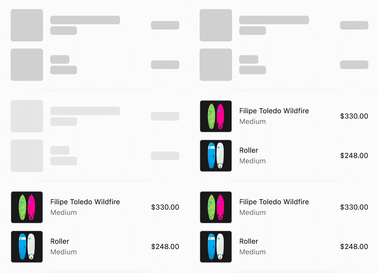
Prevent layout shifts during loading
React
import {
  reactExtension,
  View,
  BlockStack,
  InlineLayout,
  SkeletonImage,
  Image,
  Icon,
  SkeletonText,
  Text,
} from '@shopify/ui-extensions-react/checkout';

export default reactExtension(
  'purchase.checkout.block.render',
  () => <LoadingStateSkeletons />,
);

export const ProductThumbnail = ({
  source = 'https://yourawesomeimage.com',
}) => (
  <View
    minBlockSize={64}
    cornerRadius="large"
    maxInlineSize={64}
    minInlineSize={64}
    border="base"
  >
    {source ? (
      <Image
        fit="cover"
        aspectRatio={1}
        source={source}
        cornerRadius="large"
      />
    ) : (
      <View maxInlineSize={33}>
        <Icon source="camera" size="fill" />
      </View>
    )}
  </View>
);
export const LoadingStateSkeletons = () => {
  const loading = true;
  const [item1, item2] = [
    {
      title: 'Felipe Toledo WildFire',
      variantTitle: 'Medium',
      price: '$330.00',
    },
    {
      title: 'Roller',
      variantTitle: 'Medium',
      price: '$248.00',
    },
  ];
  const itemInfo = ({title, variantTitle}) =>
    loading ? (
      <>
        <SkeletonText>{title}</SkeletonText>
        <SkeletonText>
          {variantTitle}
        </SkeletonText>
      </>
    ) : (
      <>
        <Text emphasis="bold">{title}</Text>
        <Text appearance="subdued">
          {variantTitle}
        </Text>
      </>
    );
  const order = (item) => (
    <InlineLayout
      columns={['auto', 'fill', 'auto']}
      spacing="base"
      blockAlignment="center"
    >
      {loading ? (
        <SkeletonImage
          blockSize={64}
          inlineSize={64}
        />
      ) : (
        <ProductThumbnail />
      )}
      <BlockStack spacing="extraTight">
        {itemInfo(item)}
      </BlockStack>
      {loading ? (
        <SkeletonText>{item.price}</SkeletonText>
      ) : (
        <Text emphasis="bold">{item.price}</Text>
      )}
    </InlineLayout>
  );
  return (
    <View maxInlineSize={400}>
      <BlockStack>
        {order(item1)}
        {order(item2)}
      </BlockStack>
    </View>
  );
};
JavaScript
import {
  extension,
  BlockStack,
  View,
  InlineLayout,
  Image,
  Icon,
  Text,
  SkeletonImage,
  SkeletonText,
} from '@shopify/ui-extensions/checkout';

export default extension(
  'purchase.checkout.block.render',
  (root) => {
    const source = 'https://yourawesomeimage.com';
    const loading = true;
    const [item1, item2] = [
      {
        title: 'Felipe Toledo WildFire',
        variantTitle: 'Medium',
        price: '$330.00',
      },
      {
        title: 'Roller',
        variantTitle: 'Medium',
        price: '$248.00',
      },
    ];
    const thumbnail = root.createComponent(
      View,
      {
        minBlockSize: 64,
        cornerRadius: 'large',
        maxInlineSize: 64,
        minInlineSize: 64,
        border: 'base',
      },
      [
        source
          ? root.createComponent(Image, {
              fit: 'cover',
              aspectRatio: 1,
              source,
              cornerRadius: 'large',
            })
          : root.createComponent(
              View,
              {maxInlineSize: 33},
              [
                root.createComponent(Icon, {
                  source: 'camera',
                  size: 'fill',
                }),
              ],
            ),
      ],
    );
    const itemInfo = ({title, variantTitle}) =>
      root.createComponent(
        BlockStack,
        {
          spacing: 'extraTight',
        },
        [
          loading
            ? (root.createComponent(
                SkeletonText,
                {},
                title,
              ),
              root.createComponent(
                SkeletonText,
                {},
                variantTitle,
              ))
            : (root.createComponent(
                Text,
                {},
                title,
              ),
              root.createComponent(
                Text,
                {},
                variantTitle,
              )),
        ],
      );
    const order = (item) =>
      root.createComponent(
        InlineLayout,
        {
          columns: ['auto', 'fill', 'auto'],
          spacing: 'base',
          blockAlignment: 'center',
        },
        [
          loading
            ? root.createComponent(
                SkeletonImage,
                {
                  blockSize: 64,
                  inlineSize: 64,
                },
              )
            : thumbnail,
          itemInfo(item),
          loading
            ? root.createComponent(
                SkeletonText,
                {},
                item.price,
              )
            : root.createComponent(
                Text,
                {},
                item.price,
              ),
        ],
      );
    const view = root.createComponent(
      View,
      {
        maxInlineSize: 400,
      },
      [
        root.createComponent(BlockStack, {}, [
          order(item1),
          order(item2),
        ]),
      ],
    );
    root.appendChild(view);
  },
);
Anchor to Best practicesBest practices
- Match expected content size: Use
inlineSizeto approximate the width of the final text. - Provide base content when possible: Pass text content inside the component to create a more accurate skeleton shape.
Anchor to LimitationsLimitations
- Only represents inline text. For block-level content placeholders, use SkeletonTextBlock.