Version 2025-07 is the last API version to support React-based UI components. Later versions use Polaris web components, native UI elements with built-in accessibility, better performance, and consistent styling with Shopify's design system. Check out the upgrade guide to upgrade your extension and avoid being blocked from updating your extension after October 1st 2026.
Sheet
collect_buyer_consent capability to be rendered.collect_buyer_consent capability to be rendered.:The Sheet component displays essential information for customers at the bottom of the screen, appearing above other elements. Use it sparingly to avoid distracting customers.
The library automatically applies the WAI-ARIA Dialog pattern to both the activator and the sheet content.
Supported targets
- Customer
Account::Kitchen Sink - customer-account.
footer. render-after - customer-account.
order-index. announcement. render - customer-account.
order-index. block. render - customer-account.
order-status. announcement. render - customer-account.
order-status. block. render - customer-account.
order-status. cart-line-item. render-after - customer-account.
order-status. cart-line-list. render-after - customer-account.
order-status. customer-information. render-after - customer-account.
order-status. fulfillment-details. render-after - customer-account.
order-status. payment-details. render-after - customer-account.
order-status. return-details. render-after - customer-account.
order-status. unfulfilled-items. render-after - customer-account.
order. action. menu-item. render - customer-account.
order. action. render - customer-account.
order. page. render - customer-account.
page. render - customer-account.
profile. addresses. render-after - customer-account.
profile. announcement. render - customer-account.
profile. block. render - customer-account.
profile. company-details. render-after - customer-account.
profile. company-location-addresses. render-after - customer-account.
profile. company-location-payment. render-after - customer-account.
profile. company-location-staff. render-after - customer-account.
profile. payment. render-after
Supported targets
- Customer
Account::Kitchen Sink - customer-account.
footer. render-after - customer-account.
order-index. announcement. render - customer-account.
order-index. block. render - customer-account.
order-status. announcement. render - customer-account.
order-status. block. render - customer-account.
order-status. cart-line-item. render-after - customer-account.
order-status. cart-line-list. render-after - customer-account.
order-status. customer-information. render-after - customer-account.
order-status. fulfillment-details. render-after - customer-account.
order-status. payment-details. render-after - customer-account.
order-status. return-details. render-after - customer-account.
order-status. unfulfilled-items. render-after - customer-account.
order. action. menu-item. render - customer-account.
order. action. render - customer-account.
order. page. render - customer-account.
page. render - customer-account.
profile. addresses. render-after - customer-account.
profile. announcement. render - customer-account.
profile. block. render - customer-account.
profile. company-details. render-after - customer-account.
profile. company-location-addresses. render-after - customer-account.
profile. company-location-payment. render-after - customer-account.
profile. company-location-staff. render-after - customer-account.
profile. payment. render-after
Anchor to Use casesUse cases
- Privacy consent: Collect customer consent for data collection, cookies, or tracking in compliance with privacy regulations.
- Cookie preferences: Let customers manage their cookie preferences with granular controls for different tracking categories.
- Terms acceptance: Present terms of service or policy updates that require customer acknowledgment before proceeding.
- Essential notices: Display critical information that requires customer attention, such as regional compliance notices.
Anchor to PropertiesProperties
Configure the following properties on the Sheet component.
- Anchor to accessibilityLabelaccessibility
Labelaccessibility Label stringstring A label that describes the purpose of the sheet, announced by screen readers. If not set, it will use the value of
heading.- Anchor to defaultOpendefault
Opendefault Open booleanboolean Whether the sheet should be open when it first renders. Use sparingly — only when the user must interact with the sheet before proceeding (for example, a privacy consent prompt). Only takes effect on the initial render.
- Anchor to headingheadingheadingstringstring
A heading rendered at the top of the sheet.
- Anchor to idididstringstring
A unique identifier for the component. Use this to target the component in scripts or stylesheets, or to distinguish it from other instances of the same component.
- Anchor to onHideon
Hideon Hide () => void() => void A callback fired when the sheet is closed.
- Anchor to onShowon
Showon Show () => void() => void A callback fired when the sheet is opened.
- Anchor to primaryActionprimary
Actionprimary Action RemoteFragmentRemoteFragment The primary action to perform, provided as a Button component. Up to two buttons can be rendered.
- Anchor to secondaryActionsecondary
Actionsecondary Action RemoteFragmentRemoteFragment The secondary action to perform, provided as a Button component. Only one button can be rendered.
Anchor to ExamplesExamples
Anchor to Collect consent preferencesCollect consent preferences
Use the sheet to collect customer consent for cookies and tracking. This example displays a consent prompt with accept and decline buttons, and a secondary action that opens preferences.
Collect consent preferences
React
import {
  reactExtension,
  Button,
  Link,
  Sheet,
  TextBlock,
  useApi,
  useCustomerPrivacy,
} from '@shopify/ui-extensions-react/checkout';

export default reactExtension(
  'purchase.checkout.footer.render-after',
  () => <Extension />,
);

function Extension() {
  const {applyTrackingConsentChange, ui} =
    useApi();

  const {shouldShowBanner} = useCustomerPrivacy();

  const sheetId = 'sheet-consent';

  const handleConsentChange = async ({
    analytics,
    marketing,
    preferences,
    saleOfData,
  }) => {
    try {
      const result =
        await applyTrackingConsentChange({
          type: 'changeVisitorConsent',
          analytics,
          marketing,
          preferences,
          saleOfData,
        });

      // Check if operation was successful
      if (result.type === 'success') {
        ui.overlay.close(sheetId);
      } else {
        // Handle failure case here
      }
    } catch (error) {
      // Handle error case here
    }
  };

  return (
    <Sheet
      id={sheetId}
      heading="We value your privacy"
      accessibilityLabel="A sheet that collects privacy consent preferences"
      defaultOpen={shouldShowBanner}
      primaryAction={
        <>
          <Button
            kind="secondary"
            onPress={() =>
              handleConsentChange({
                // values derived from local form state
                analytics: false,
                marketing: false,
                preferences: false,
                saleOfData: false,
              })
            }
          >
            I decline
          </Button>
          <Button
            kind="secondary"
            onPress={() =>
              handleConsentChange({
                analytics: true,
                marketing: true,
                preferences: true,
                saleOfData: true,
              })
            }
          >
            I agree
          </Button>
        </>
      }
      secondaryAction={
        <Button
          kind="plain"
          overlay={
            // Open a settings modal
          }
        >
          Settings
        </Button>
      }
    >
      <TextBlock>
        This website uses cookies to ensure you
        get the best experience on our website.
        <Link>Privacy Policy</Link>
      </TextBlock>
    </Sheet>
  );
}
JS
import {
  extension,
  Sheet,
  Button,
  Link,
  TextBlock,
} from '@shopify/ui-extensions/checkout';

export default extension(
  'purchase.checkout.footer.render-after',
  (
    root,
    {
      applyTrackingConsentChange,
      customerPrivacy,
      ui,
    },
  ) => {
    customerPrivacy.subscribe(
      ({shouldShowBanner}) => {
        const primaryFragment =
          root.createFragment();
        const secondaryFragment =
          root.createFragment();
        const handleConsentChange = async ({
          analytics,
          marketing,
          preferences,
          saleOfData,
        }) => {
          try {
            const result =
              await applyTrackingConsentChange({
                type: 'changeVisitorConsent',
                analytics,
                marketing,
                preferences,
                saleOfData,
              });

            // Check if operation was successful
            if (result) {
              ui.overlay.close(sheetId);
            } else {
              // Handle failure case here
            }
          } catch (error) {
            // Handle error case here
          }
        };

        const declineButton =
          root.createComponent(
            Button,
            {
              kind: 'secondary',
              onPress: () =>
                handleConsentChange({
                  analytics: false,
                  marketing: false,
                  preferences: false,
                  saleOfData: false,
                }),
            },
            'I decline',
          );

        const agreeButton = root.createComponent(
          Button,
          {
            kind: 'secondary',
            onPress: () =>
              handleConsentChange({
                analytics: true,
                marketing: true,
                preferences: true,
                saleOfData: true,
              }),
          },
          'I agree',
        );

        const settingsButton =
          root.createComponent(
            Button,
            {
              kind: 'secondary',
            },
            'Settings',
          );

        primaryFragment.appendChild(
          declineButton,
        );
        primaryFragment.appendChild(agreeButton);
        secondaryFragment.appendChild(
          settingsButton,
        );

        const sheetId = 'sheet-consent';
        const sheet = root.createComponent(
          Sheet,
          {
            id: sheetId,
            heading: 'We value your privacy',
            accessibilityLabel:
              'A sheet that collects privacy consent preferences',
            defaultOpen: shouldShowBanner,
            primaryAction: primaryFragment,
            secondaryAction: secondaryFragment,
          },
        );

        const textBlock = root.createComponent(
          TextBlock,
          null,
          [
            'We and our partners use cookies and other technologies to improve your experience, measure performance, and tailor marketing. Details in our ',
            root.createComponent(
              Link,
              null,
              'Privacy Policy',
            ),
          ],
        );

        sheet.appendChild(textBlock);
        root.appendChild(sheet);
      },
    );
  },
);
Anchor to Link preferences in the descriptionLink preferences in the description
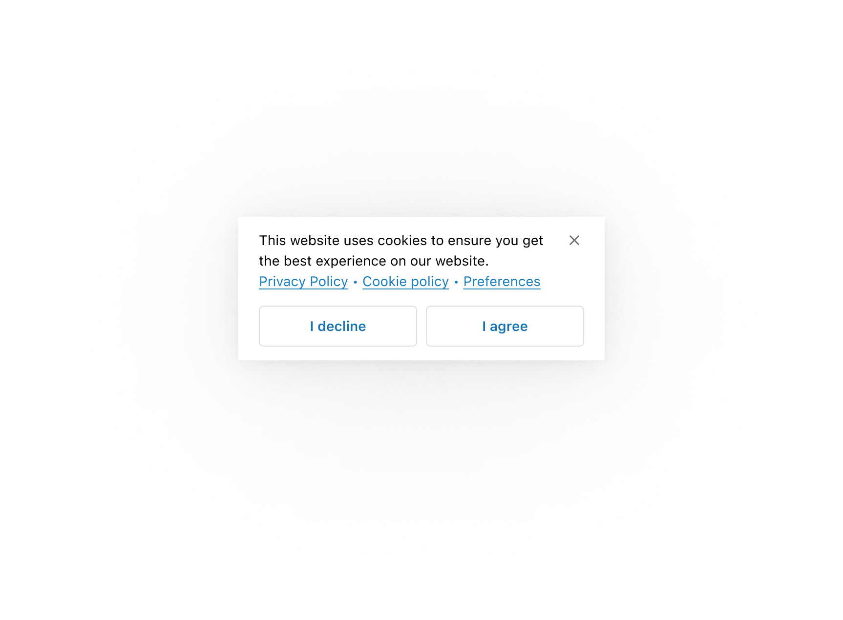
Save space in the action slot by placing secondary actions in the content area. This example shows privacy and cookie policy links alongside a preferences link in the sheet body.
Link preferences in the description
Link preferences in the description
React
import {
  reactExtension,
  Button,
  BlockStack,
  Link,
  Sheet,
  TextBlock,
  useCustomerPrivacy,
} from '@shopify/ui-extensions-react/checkout';

export default reactExtension(
  'purchase.checkout.footer.render-after',
  () => <Extension />,
);

function Extension() {
  const {shouldShowBanner} = useCustomerPrivacy();

  const sheetId = 'sheet-consent';

  return (
    <Sheet
      id={sheetId}
      accessibilityLabel="A sheet that collects privacy consent preferences"
      defaultOpen={shouldShowBanner}
      primaryAction={
        <>
          <Button
            kind="secondary"
            onPress={() => {}}
          >
            I decline
          </Button>
          <Button
            kind="secondary"
            onPress={() => {}}
          >
            I agree
          </Button>
        </>
      }
    >
      <BlockStack spacing="none">
        <TextBlock>
          This website uses cookies to ensure you
          get the best experience on our website.
        </TextBlock>
        <TextBlock>
          <Link>Privacy Policy</Link> ‧{' '}
          <Link>Cookie Policy</Link> ‧{' '}
          <Link
          // overlay: <Modal>Preferences modal...</Modal>,
          >
            Preferences
          </Link>
        </TextBlock>
      </BlockStack>
    </Sheet>
  );
}
JS
import {
  extension,
  Sheet,
  Button,
  Link,
  TextBlock,
  BlockStack,
} from '@shopify/ui-extensions/checkout';

export default extension(
  'purchase.checkout.footer.render-after',
  (root, {customerPrivacy}) => {
    const primaryFragment = root.createFragment();

    const declineButton = root.createComponent(
      Button,
      {
        kind: 'secondary',
        onPress: () => {},
      },
      'I decline',
    );

    const agreeButton = root.createComponent(
      Button,
      {
        kind: 'secondary',
        onPress: () => {},
      },
      'I agree',
    );

    primaryFragment.appendChild(declineButton);
    primaryFragment.appendChild(agreeButton);

    const sheetId = 'sheet-consent';
    const sheet = root.createComponent(Sheet, {
      id: sheetId,
      accessibilityLabel:
        'A sheet that collects privacy consent preferences',
      defaultOpen:
        customerPrivacy.current.shouldShowBanner,
      primaryAction: primaryFragment,
    });

    const textBlock = root.createComponent(
      TextBlock,
      null,
      'This website uses cookies to ensure you get the best experience on our website.',
    );

    const linkBlock = root.createComponent(
      TextBlock,
      null,
      [
        root.createComponent(
          Link,
          null,
          'Privacy Policy',
        ),
        ' ‧ ',
        root.createComponent(
          Link,
          null,
          'Cookie Policy',
        ),
        ' ‧ ',
        root.createComponent(
          Link,
          {
            // overlay: <Modal>Preferences modal...</Modal>,,
          },
          'Preferences',
        ),
      ],
    );

    const blockStack = root.createComponent(
      BlockStack,
      {spacing: 'none'},
      [textBlock, linkBlock],
    );
    sheet.appendChild(blockStack);
    root.appendChild(sheet);
  },
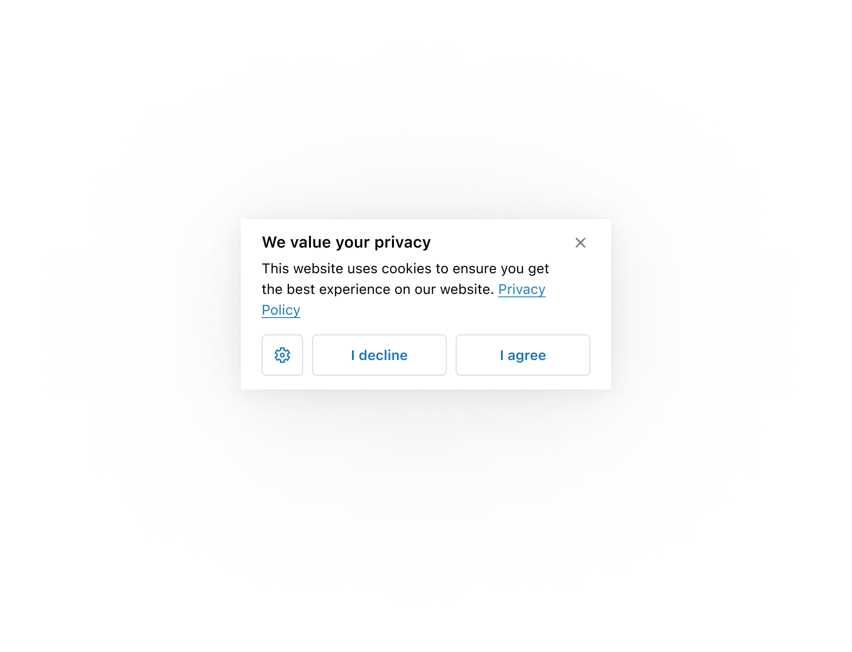
);Use an icon button in the secondary actions area to allow more space for the primary actions.
Use an icon button for preferences
Use an icon button for preferences
React
import {
  reactExtension,
  Button,
  Link,
  Icon,
  Sheet,
  TextBlock,
  useCustomerPrivacy,
} from '@shopify/ui-extensions-react/checkout';

export default reactExtension(
  'purchase.checkout.footer.render-after',
  () => <Extension />,
);

function Extension() {
  const {shouldShowBanner} = useCustomerPrivacy();

  return (
    <Sheet
      accessibilityLabel="A sheet that collects privacy consent preferences"
      heading="We value your privacy"
      defaultOpen={shouldShowBanner}
      primaryAction={
        <>
          <Button
            kind="secondary"
            onPress={() => {}}
          >
            I decline
          </Button>
          <Button
            kind="secondary"
            onPress={() => {}}
          >
            I agree
          </Button>
        </>
      }
      secondaryAction={
        <Button
          kind="secondary"
          onPress={() => {}}
        >
          <Icon source="settings" />
        </Button>
      }
    >
      <TextBlock>
        This website uses cookies to ensure you
        get the best experience on our website.{' '}
        <Link>Privacy Policy</Link>.
      </TextBlock>
    </Sheet>
  );
}
JS
import {
  extension,
  Sheet,
  Button,
  Link,
  TextBlock,
  Icon,
} from '@shopify/ui-extensions/checkout';

export default extension(
  'purchase.checkout.footer.render-after',
  (root, {customerPrivacy}) => {
    const primaryFragment = root.createFragment();
    const secondaryFragment =
      root.createFragment();

    const declineButton = root.createComponent(
      Button,
      {
        kind: 'secondary',
        onPress: () => {},
      },
      'I decline',
    );

    const agreeButton = root.createComponent(
      Button,
      {
        kind: 'secondary',
        onPress: () => {},
      },
      'I agree',
    );

    const preferencesButton =
      root.createComponent(
        Button,
        {
          kind: 'secondary',
        },
        root.createComponent(Icon, {
          source: 'settings',
        }),
      );

    primaryFragment.appendChild(declineButton);
    primaryFragment.appendChild(agreeButton);
    secondaryFragment.appendChild(
      preferencesButton,
    );

    const sheet = root.createComponent(Sheet, {
      accessibilityLabel:
        'A sheet that collects privacy consent preferences',
      defaultOpen:
        customerPrivacy.current.shouldShowBanner,
      primaryAction: primaryFragment,
      secondaryAction: secondaryFragment,
    });

    const textBlock = root.createComponent(
      TextBlock,
      null,
      [
        'This website uses cookies to ensure you get the best experience on our website. ',
        root.createComponent(
          Link,
          null,
          'Privacy Policy',
        ),
      ],
    );

    sheet.appendChild(textBlock);
    root.appendChild(sheet);
  },
);
Anchor to Structure content with layout componentsStructure content with layout components
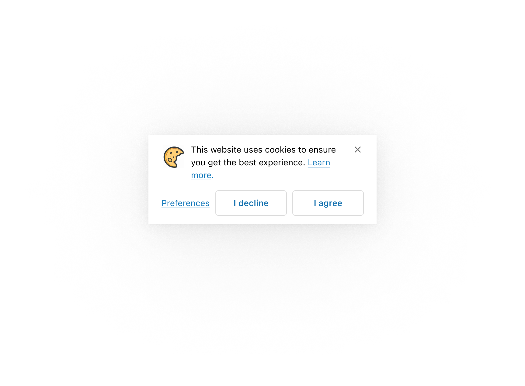
Use layout components in the sheet's content area to structure different types of content in specific ways.
Structure content with layout components
Structure content with layout components
React
import {
  reactExtension,
  Button,
  Link,
  Image,
  InlineLayout,
  Sheet,
  TextBlock,
  useCustomerPrivacy,
} from '@shopify/ui-extensions-react/checkout';

export default reactExtension(
  'purchase.checkout.footer.render-after',
  () => <Extension />,
);

function Extension() {
  const {shouldShowBanner} = useCustomerPrivacy();

  return (
    <Sheet
      accessibilityLabel="A sheet that collects privacy consent preferences"
      defaultOpen={shouldShowBanner}
      primaryAction={
        <>
          <Button
            kind="secondary"
            onPress={() => {}}
          >
            I decline
          </Button>
          <Button
            kind="secondary"
            onPress={() => {}}
          >
            I agree
          </Button>
        </>
      }
      secondaryAction={
        <Button kind="plain" onPress={() => {}}>
          Preferences
        </Button>
      }
    >
      <InlineLayout
        padding="none"
        spacing="small100"
        columns={[38, 'fill']}
      >
        <Image source="https://yourawesomeimage.com" />
        <TextBlock>
          This website uses cookies to ensure you
          get the best experience on our website.{' '}
          <Link>Learn more</Link>.
        </TextBlock>
      </InlineLayout>
    </Sheet>
  );
}
JS
import {
  extension,
  Sheet,
  Button,
  Link,
  TextBlock,
  Image,
  InlineLayout,
} from '@shopify/ui-extensions/checkout';

export default extension(
  'purchase.checkout.footer.render-after',
  (root, {customerPrivacy}) => {
    const primaryFragment = root.createFragment();
    const secondaryFragment =
      root.createFragment();

    const declineButton = root.createComponent(
      Button,
      {
        kind: 'secondary',
        onPress: () => {},
      },
      'I decline',
    );

    const agreeButton = root.createComponent(
      Button,
      {
        kind: 'secondary',
        onPress: () => {},
      },
      'I agree',
    );

    const preferencesButton =
      root.createComponent(
        Button,
        {
          kind: 'plain',
        },
        'Preferences',
      );

    primaryFragment.appendChild(declineButton);
    primaryFragment.appendChild(agreeButton);
    secondaryFragment.appendChild(
      preferencesButton,
    );

    const sheet = root.createComponent(Sheet, {
      accessibilityLabel:
        'A sheet that collects privacy consent preferences',
      defaultOpen:
        customerPrivacy.current.shouldShowBanner,
      primaryAction: primaryFragment,
      secondaryAction: secondaryFragment,
    });

    const textBlock = root.createComponent(
      TextBlock,
      null,
      [
        'This website uses cookies to ensure you get the best experience on our website.',
        root.createComponent(
          Link,
          null,
          'Learn more',
        ),
      ],
    );

    const inlineLayout = root.createComponent(
      InlineLayout,
      {
        padding: 'none',
        spacing: 'small100',
        columns: [38, 'fill'],
      },
      [
        root.createComponent(Image, {
          source: 'https://yourawesomeimage.com',
        }),
        textBlock,
      ],
    );

    sheet.appendChild(inlineLayout);
    root.appendChild(sheet);
  },
);
Anchor to Best practicesBest practices
- Limit to one sheet at a time: Don't stack multiple sheets. If the workflow requires more than one decision, combine them or use a modal for the additional step.
- Reserve for content that requires acknowledgment: Sheets work best when customers need to actively respond before continuing, not for passive informational content.
- Include clear actions: Provide clear primary and secondary actions so customers understand their choices and can respond quickly. The primary section supports up to two buttons, and the secondary section supports one button. Keep button labels brief so they don't wrap to more than one line.
- Keep content concise: Use short content, small text sizes, or remove the header to avoid scrolling. When content exceeds the maximum height, heading and content become scrollable while the actions slot and dismiss button remain fixed.
- Provide an accessibility label: Use
accessibilityLabelwhen the sheet heading alone doesn't fully describe the purpose for screen readers. - Handle all consent outcomes: When implementing consent flows, handle acceptance (cookies load, sheet doesn't re-appear), denial (cookies don't load, sheet doesn't re-appear), and dismissal (cookies don't load, sheet re-appears on refresh).
Anchor to LimitationsLimitations
- The sheet requires configuration of the
collect_buyer_consentcapability to be rendered. Without it, the component won't appear. - Sheets always appear at the bottom of the screen and can't be repositioned. Element positions, padding, spacing, and maximum height are controlled by Shopify.
- The component is intended for consent-related use cases and may not render in other contexts.