Upgrade to Polaris
Version 2025-07 is the last API version to support React-based UI components. Later versions use Polaris web components, native UI elements with built-in accessibility, better performance, and consistent styling with Shopify's design system. Check out the upgrade guide to upgrade your extension and avoid being blocked from updating your extension after October 1st 2026.
Customer
The CustomerAccountAction component displays a modal to complete an order action flow. This component can only be used to populate the order action extension target, which renders as a result of the customer clicking the order action button rendered via the order action menu item extension target.
Support
Targets (25)
Supported targets
- Customer
Account::Kitchen Sink - customer-account.
footer. render-after - customer-account.
order-index. announcement. render - customer-account.
order-index. block. render - customer-account.
order-status. announcement. render - customer-account.
order-status. block. render - customer-account.
order-status. cart-line-item. render-after - customer-account.
order-status. cart-line-list. render-after - customer-account.
order-status. customer-information. render-after - customer-account.
order-status. fulfillment-details. render-after - customer-account.
order-status. payment-details. render-after - customer-account.
order-status. return-details. render-after - customer-account.
order-status. unfulfilled-items. render-after - customer-account.
order. action. menu-item. render - customer-account.
order. action. render - customer-account.
order. page. render - customer-account.
page. render - customer-account.
profile. addresses. render-after - customer-account.
profile. announcement. render - customer-account.
profile. block. render - customer-account.
profile. company-details. render-after - customer-account.
profile. company-location-addresses. render-after - customer-account.
profile. company-location-payment. render-after - customer-account.
profile. company-location-staff. render-after - customer-account.
profile. payment. render-after
Supported targets
- Customer
Account::Kitchen Sink - customer-account.
footer. render-after - customer-account.
order-index. announcement. render - customer-account.
order-index. block. render - customer-account.
order-status. announcement. render - customer-account.
order-status. block. render - customer-account.
order-status. cart-line-item. render-after - customer-account.
order-status. cart-line-list. render-after - customer-account.
order-status. customer-information. render-after - customer-account.
order-status. fulfillment-details. render-after - customer-account.
order-status. payment-details. render-after - customer-account.
order-status. return-details. render-after - customer-account.
order-status. unfulfilled-items. render-after - customer-account.
order. action. menu-item. render - customer-account.
order. action. render - customer-account.
order. page. render - customer-account.
page. render - customer-account.
profile. addresses. render-after - customer-account.
profile. announcement. render - customer-account.
profile. block. render - customer-account.
profile. company-details. render-after - customer-account.
profile. company-location-addresses. render-after - customer-account.
profile. company-location-payment. render-after - customer-account.
profile. company-location-staff. render-after - customer-account.
profile. payment. render-after
Anchor to Use casesUse cases
- Order modifications: Let customers request returns, edit shipping addresses, or cancel orders through a focused modal.
- Confirmation flows: Present confirmation dialogs for destructive actions that require explicit customer consent.
- Quick actions: Collect minimal information from customers to complete a task without leaving the current page.
Anchor to PropertiesProperties
Configure the following properties on the CustomerAccountAction component.
- Anchor to titletitletitlestringstringrequiredrequired
Sets the title of the Action container.
- Anchor to primaryActionprimary
Actionprimary Action RemoteFragmentRemoteFragment Sets the Primary action button of the container. This component must be a button component.
- Anchor to secondaryActionsecondary
Actionsecondary Action RemoteFragmentRemoteFragment Sets the Secondary action button of the container. This component must be a button component.
Configure the following properties on the primary action button.
- stringstring
A label used for buyers using assistive technologies. When set, any
childrensupplied to this component will not be announced to screen reader users.- ButtonAccessibilityRoleButtonAccessibilityRoleDefault: 'button'Default: 'button'
The role of the button that will be rendered.
button: renders a regular button.submit: renders a button that submits a form.- booleanbooleanDefault: falseDefault: false
Disables the button, disallowing any interaction.
- booleanbooleanDefault: falseDefault: false
Replaces content with a loading indicator.
- stringstring
Accessible label for the loading indicator when user prefers reduced motion. This value is only used if
loadingis true.- () => void() => void
Callback that is run when the button is pressed.
ButtonAccessibilityRole
The accessibility role for button-like components. - `button`: A generic button that triggers an action. - `submit`: A button that submits a form.
'button' | 'submit'Configure the following properties on the secondary action button.
- stringstring
A label used for buyers using assistive technologies. When set, any
childrensupplied to this component will not be announced to screen reader users.- booleanbooleanDefault: falseDefault: false
Disables the button, disallowing any interaction.
- booleanbooleanDefault: falseDefault: false
Replaces content with a loading indicator.
- stringstring
Accessible label for the loading indicator when user prefers reduced motion. This value is only used if
loadingis true.- () => void() => void
Callback that is run when the button is pressed.
Anchor to ExamplesExamples
Anchor to Create a basic action modalCreate a basic action modal
Display a modal with a heading, content, and a primary action button. This example shows a CustomerAccountAction with a simple layout for the order action target.Create a basic action modal
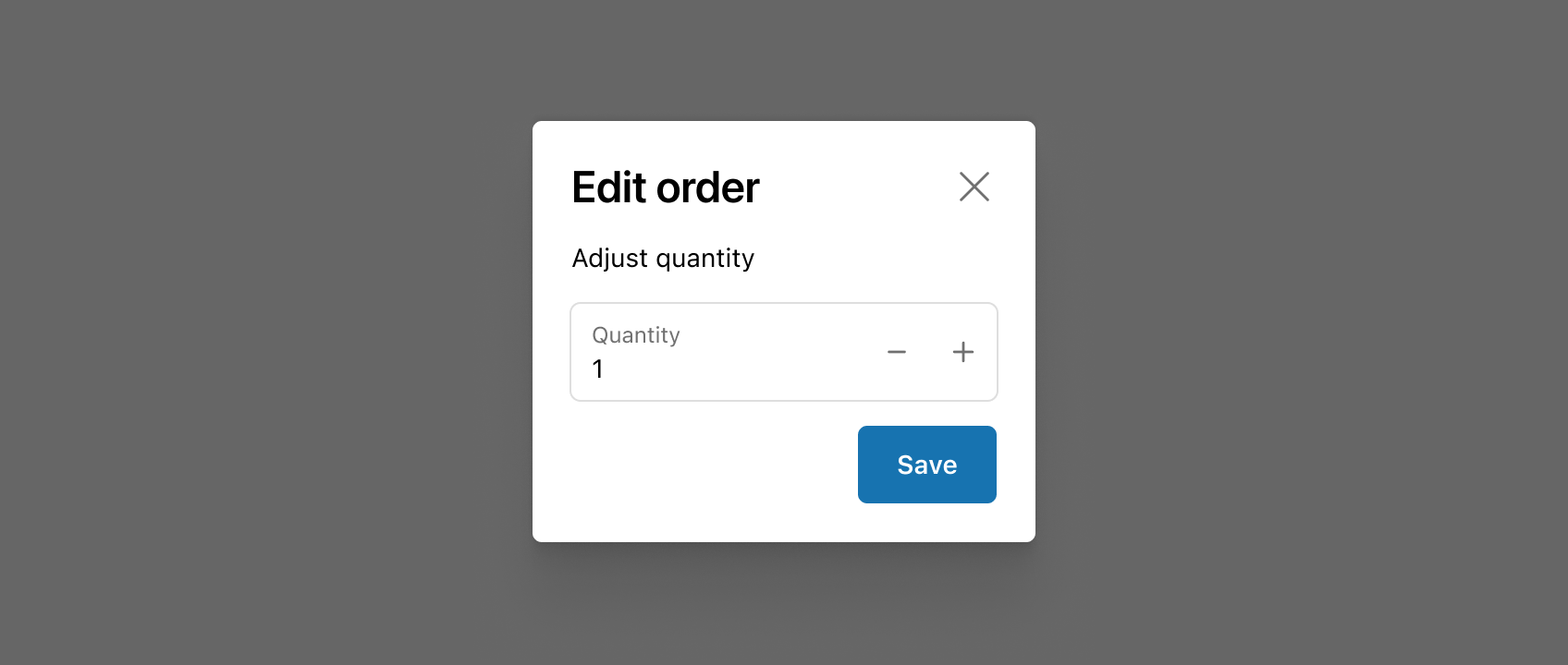
Create a basic action modal
import {
  Button,
  CustomerAccountAction,
  TextBlock,
  reactExtension,
  useApi,
} from '@shopify/ui-extensions-react/customer-account';
import React from 'react';

export default reactExtension('customer-account.order.action.render', () => (
  <App />
));

function App() {
  const api = useApi<'customer-account.order.action.render'>();

  return (
    <CustomerAccountAction
      title="Extension title"
      primaryAction={
        <Button
          onPress={() => {
            api.close();
          }}
        >
          Click to close
        </Button>
      }
    >
      <TextBlock>Extension content</TextBlock>
    </CustomerAccountAction>
  );
}
import {
  Button,
  CustomerAccountAction,
  extension
} from '@shopify/ui-extensions/customer-account';

export default extension(
  'customer-account.order.action.render',
  (root, api) => {
    renderApp(root, api);
  },
)

async function renderApp(root, api) {
  const primaryAction = root.createFragment();
  await primaryAction.append(root.createComponent(Button, {onPress: () => {api.close()}}, 'Click to close'));

  const customerAccountAction = root.createComponent(
    CustomerAccountAction,
    {
      title: 'Extension title',
      primaryAction,
    },
    root.createComponent('TextBlock', {}, 'Extension content')
  );
  root.append(customerAccountAction);
}
React
import {
Button,
CustomerAccountAction,
TextBlock,
reactExtension,
useApi,
} from '@shopify/ui-extensions-react/customer-account';
import React from 'react';
export default reactExtension('customer-account.order.action.render', () => (
<App />
));
function App() {
const api = useApi<'customer-account.order.action.render'>();
return (
<CustomerAccountAction
title="Extension title"
primaryAction={
<Button
onPress={() => {
api.close();
}}
>
Click to close
</Button>
}
>
<TextBlock>Extension content</TextBlock>
</CustomerAccountAction>
);
}JS
import {
Button,
CustomerAccountAction,
extension
} from '@shopify/ui-extensions/customer-account';
export default extension(
'customer-account.order.action.render',
(root, api) => {
renderApp(root, api);
},
)
async function renderApp(root, api) {
const primaryAction = root.createFragment();
await primaryAction.append(root.createComponent(Button, {onPress: () => {api.close()}}, 'Click to close'));
const customerAccountAction = root.createComponent(
CustomerAccountAction,
{
title: 'Extension title',
primaryAction,
},
root.createComponent('TextBlock', {}, 'Extension content')
);
root.append(customerAccountAction);
}Anchor to Show a confirmation dialogShow a confirmation dialog
Present a confirmation dialog for a destructive action. This example shows a CustomerAccountAction with both primary and secondary action buttons for canceling an order.Show a confirmation dialog
import {
  Button,
  CustomerAccountAction,
  TextBlock,
  reactExtension,
  useApi,
} from '@shopify/ui-extensions-react/customer-account';
import React from 'react';

export default reactExtension('customer-account.order.action.render', () => (
  <App />
));

function App() {
  const api = useApi<'customer-account.order.action.render'>();

  return (
    <CustomerAccountAction
      title="Cancel order"
      primaryAction={
        <Button
          onPress={() => {
            api.close();
          }}
        >
          Confirm cancellation
        </Button>
      }
      secondaryAction={
        <Button
          onPress={() => {
            api.close();
          }}
        >
          Go back
        </Button>
      }
    >
      <TextBlock>
        Are you sure you want to cancel this order? This action
        can't be undone.
      </TextBlock>
    </CustomerAccountAction>
  );
}
import {
  Button,
  CustomerAccountAction,
  extension,
} from '@shopify/ui-extensions/customer-account';

export default extension(
  'customer-account.order.action.render',
  (root, api) => {
    renderApp(root, api);
  },
);

async function renderApp(root, api) {
  const primaryAction = root.createFragment();
  await primaryAction.append(
    root.createComponent(
      Button,
      {onPress: () => api.close()},
      'Confirm cancellation',
    ),
  );

  const secondaryAction = root.createFragment();
  await secondaryAction.append(
    root.createComponent(
      Button,
      {onPress: () => api.close()},
      'Go back',
    ),
  );

  const customerAccountAction = root.createComponent(
    CustomerAccountAction,
    {
      title: 'Cancel order',
      primaryAction,
      secondaryAction,
    },
    root.createComponent(
      'TextBlock',
      {},
      "Are you sure you want to cancel this order? This action can't be undone.",
    ),
  );
  root.append(customerAccountAction);
}
React
import {
Button,
CustomerAccountAction,
TextBlock,
reactExtension,
useApi,
} from '@shopify/ui-extensions-react/customer-account';
import React from 'react';
export default reactExtension('customer-account.order.action.render', () => (
<App />
));
function App() {
const api = useApi<'customer-account.order.action.render'>();
return (
<CustomerAccountAction
title="Cancel order"
primaryAction={
<Button
onPress={() => {
api.close();
}}
>
Confirm cancellation
</Button>
}
secondaryAction={
<Button
onPress={() => {
api.close();
}}
>
Go back
</Button>
}
>
<TextBlock>
Are you sure you want to cancel this order? This action
can't be undone.
</TextBlock>
</CustomerAccountAction>
);
}JS
import {
Button,
CustomerAccountAction,
extension,
} from '@shopify/ui-extensions/customer-account';
export default extension(
'customer-account.order.action.render',
(root, api) => {
renderApp(root, api);
},
);
async function renderApp(root, api) {
const primaryAction = root.createFragment();
await primaryAction.append(
root.createComponent(
Button,
{onPress: () => api.close()},
'Confirm cancellation',
),
);
const secondaryAction = root.createFragment();
await secondaryAction.append(
root.createComponent(
Button,
{onPress: () => api.close()},
'Go back',
),
);
const customerAccountAction = root.createComponent(
CustomerAccountAction,
{
title: 'Cancel order',
primaryAction,
secondaryAction,
},
root.createComponent(
'TextBlock',
{},
"Are you sure you want to cancel this order? This action can't be undone.",
),
);
root.append(customerAccountAction);
}Anchor to Submit a return requestSubmit a return request
Collect confirmation from a customer before processing a return. This example shows a CustomerAccountAction modal with a description and primary and secondary actions.Submit a return request
import {
  Button,
  CustomerAccountAction,
  TextBlock,
  reactExtension,
  useApi,
} from '@shopify/ui-extensions-react/customer-account';
import React from 'react';

export default reactExtension('customer-account.order.action.render', () => (
  <App />
));

function App() {
  const api = useApi<'customer-account.order.action.render'>();

  return (
    <CustomerAccountAction
      title="Submit return request"
      primaryAction={
        <Button
          onPress={() => {
            api.close();
          }}
        >
          Submit request
        </Button>
      }
      secondaryAction={
        <Button
          onPress={() => {
            api.close();
          }}
        >
          Cancel
        </Button>
      }
    >
      <TextBlock>
        Your return request will be reviewed within 2 business
        days. You'll receive an email with the return shipping
        label.
      </TextBlock>
    </CustomerAccountAction>
  );
}
import {
  Button,
  CustomerAccountAction,
  extension,
} from '@shopify/ui-extensions/customer-account';

export default extension(
  'customer-account.order.action.render',
  (root, api) => {
    renderApp(root, api);
  },
);

async function renderApp(root, api) {
  const primaryAction = root.createFragment();
  await primaryAction.append(
    root.createComponent(
      Button,
      {onPress: () => api.close()},
      'Submit request',
    ),
  );

  const secondaryAction = root.createFragment();
  await secondaryAction.append(
    root.createComponent(
      Button,
      {onPress: () => api.close()},
      'Cancel',
    ),
  );

  const customerAccountAction = root.createComponent(
    CustomerAccountAction,
    {
      title: 'Submit return request',
      primaryAction,
      secondaryAction,
    },
    root.createComponent(
      'TextBlock',
      {},
      "Your return request will be reviewed within 2 business days. You'll receive an email with the return shipping label.",
    ),
  );
  root.append(customerAccountAction);
}
React
import {
Button,
CustomerAccountAction,
TextBlock,
reactExtension,
useApi,
} from '@shopify/ui-extensions-react/customer-account';
import React from 'react';
export default reactExtension('customer-account.order.action.render', () => (
<App />
));
function App() {
const api = useApi<'customer-account.order.action.render'>();
return (
<CustomerAccountAction
title="Submit return request"
primaryAction={
<Button
onPress={() => {
api.close();
}}
>
Submit request
</Button>
}
secondaryAction={
<Button
onPress={() => {
api.close();
}}
>
Cancel
</Button>
}
>
<TextBlock>
Your return request will be reviewed within 2 business
days. You'll receive an email with the return shipping
label.
</TextBlock>
</CustomerAccountAction>
);
}JS
import {
Button,
CustomerAccountAction,
extension,
} from '@shopify/ui-extensions/customer-account';
export default extension(
'customer-account.order.action.render',
(root, api) => {
renderApp(root, api);
},
);
async function renderApp(root, api) {
const primaryAction = root.createFragment();
await primaryAction.append(
root.createComponent(
Button,
{onPress: () => api.close()},
'Submit request',
),
);
const secondaryAction = root.createFragment();
await secondaryAction.append(
root.createComponent(
Button,
{onPress: () => api.close()},
'Cancel',
),
);
const customerAccountAction = root.createComponent(
CustomerAccountAction,
{
title: 'Submit return request',
primaryAction,
secondaryAction,
},
root.createComponent(
'TextBlock',
{},
"Your return request will be reviewed within 2 business days. You'll receive an email with the return shipping label.",
),
);
root.append(customerAccountAction);
}Anchor to Best practicesBest practices
- Highlight the key decision: Use the component to present essential details and actions needed to confirm or complete an order task.
- Collect only what's necessary: Request the minimum information required to finish the task so the flow stays quick and friction-free.
- Keep forms simple: Use clear labels, intuitive actions, and concise copy so customers know what's required and what happens next.
- Use full-page extensions for complex flows: If the task spans multiple steps or needs extensive input, consider building a full-page extension instead.
Anchor to LimitationsLimitations
- This component can only be used within the
customer-account.order.action.renderextension target. It won't render in other targets. - The modal doesn't support multi-step flows. Each action modal is a single-step interaction.
Was this page helpful?