Version 2025-07 is the last API version to support React-based UI components. Later versions use Polaris web components, native UI elements with built-in accessibility, better performance, and consistent styling with Shopify's design system. Check out the upgrade guide to upgrade your extension and avoid being blocked from updating your extension after October 1st 2026.
Button
The button component triggers actions or events, such as submitting forms, opening dialogs, or navigating to other pages. Use buttons to let users perform specific tasks or initiate interactions throughout the interface.
Supported targets
- Customer
Account::Kitchen Sink - customer-account.
footer. render-after - customer-account.
order-index. announcement. render - customer-account.
order-index. block. render - customer-account.
order-status. announcement. render - customer-account.
order-status. block. render - customer-account.
order-status. cart-line-item. render-after - customer-account.
order-status. cart-line-list. render-after - customer-account.
order-status. customer-information. render-after - customer-account.
order-status. fulfillment-details. render-after - customer-account.
order-status. payment-details. render-after - customer-account.
order-status. return-details. render-after - customer-account.
order-status. unfulfilled-items. render-after - customer-account.
order. action. menu-item. render - customer-account.
order. action. render - customer-account.
order. page. render - customer-account.
page. render - customer-account.
profile. addresses. render-after - customer-account.
profile. announcement. render - customer-account.
profile. block. render - customer-account.
profile. company-details. render-after - customer-account.
profile. company-location-addresses. render-after - customer-account.
profile. company-location-payment. render-after - customer-account.
profile. company-location-staff. render-after - customer-account.
profile. payment. render-after
Supported targets
- Customer
Account::Kitchen Sink - customer-account.
footer. render-after - customer-account.
order-index. announcement. render - customer-account.
order-index. block. render - customer-account.
order-status. announcement. render - customer-account.
order-status. block. render - customer-account.
order-status. cart-line-item. render-after - customer-account.
order-status. cart-line-list. render-after - customer-account.
order-status. customer-information. render-after - customer-account.
order-status. fulfillment-details. render-after - customer-account.
order-status. payment-details. render-after - customer-account.
order-status. return-details. render-after - customer-account.
order-status. unfulfilled-items. render-after - customer-account.
order. action. menu-item. render - customer-account.
order. action. render - customer-account.
order. page. render - customer-account.
page. render - customer-account.
profile. addresses. render-after - customer-account.
profile. announcement. render - customer-account.
profile. block. render - customer-account.
profile. company-details. render-after - customer-account.
profile. company-location-addresses. render-after - customer-account.
profile. company-location-payment. render-after - customer-account.
profile. company-location-staff. render-after - customer-account.
profile. payment. render-after
Anchor to Use casesUse cases
- Primary actions: Let customers take key actions like "Save changes," "Reorder," or "Apply" on their account pages.
- Secondary actions: Provide supporting actions such as "Cancel," "Edit address," or "Track order" alongside a primary action.
- Loading states: Display loading indicators during operations like saving profile changes while preventing duplicate submissions.
- Link-style navigation: Navigate to external pages or resources using a button with the
toprop when a more prominent affordance than an inline link is needed.
Anchor to PropertiesProperties
Configure the following properties on the Button component.
- stringstring
A label used for buyers using assistive technologies. When set, any
childrensupplied to this component will not be announced to screen reader users.- ButtonAccessibilityRoleButtonAccessibilityRoleDefault: 'button'Default: 'button'
The role of the button that will be rendered.
button: renders a regular button.submit: renders a button that submits a form.- 'auto' | 'copy''auto' | 'copy'Default: 'auto' - a default action for the target component.Default: 'auto' - a default action for the target component.
- stringstring
ID of a component that should respond to activations (e.g. clicks) on this pressable.
See
for how to control the behavior of the target.- 'critical' | 'monochrome''critical' | 'monochrome'
Specify the color treatment of the Button.
- booleanbooleanDefault: falseDefault: false
Disables the button, disallowing any interaction.
- stringstring
A unique identifier for the component. Use this to target the component in scripts or stylesheets, or to distinguish it from other instances of the same component.
- InlineAlignmentInlineAlignmentDefault: 'center'Default: 'center'
Specifies the inline alignment of the content.
- 'primary' | 'secondary' | 'plain''primary' | 'secondary' | 'plain'Default: 'primary'Default: 'primary'
The type of button that will be rendered. The visual presentation of the button type is controlled by merchants through the Branding API.
primary: button used for main actions. For example: "Continue to next step".secondary: button used for secondary actions not blocking user progress. For example: "Download Shop app".plain: renders a button that visually looks like a link.- booleanbooleanDefault: falseDefault: false
Replaces content with a loading indicator.
- stringstring
Accessible label for the loading indicator when user prefers reduced motion. This value is only used if
loadingis true.- () => void() => void
Callback that is run when the button is pressed.
- RemoteFragmentRemoteFragment
An overlay component to render when the user interacts with the component.
- stringstring
Destination URL to link to.
- stringstring
The component's identifier whose visibility will be toggled when this component is actioned.
- booleanbooleandeprecateddeprecated
Allows the button to submit a form.
Deprecateduse
insteadDeprecated:use
instead
ButtonAccessibilityRole
The accessibility role for button-like components. - `button`: A generic button that triggers an action. - `submit`: A button that submits a form.
'button' | 'submit'InlineAlignment
Controls how content is aligned along the inline axis (horizontal in standard writing modes). - `'start'`: Aligns content to the inline start of the container. - `'center'`: Centers content along the inline axis. - `'end'`: Aligns content to the inline end of the container.
'start' | 'center' | 'end'Anchor to ExamplesExamples
Create a button that triggers an action when pressed. This example shows a primary button with an
onPress handler.Add primary and secondary buttons
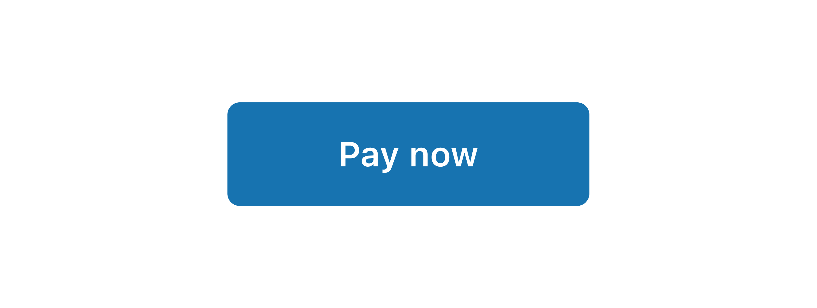
Add primary and secondary buttons
React
import {
  reactExtension,
  Button,
} from '@shopify/ui-extensions-react/customer-account';

export default reactExtension(
  'customer-account.page.render',
  () => <Extension />,
);

function Extension() {
  return (
    <Button
      onPress={() => {
        console.log('onPress event');
      }}
    >
      Pay now
    </Button>
  );
}
JS
import {extension, Button} from '@shopify/ui-extensions/customer-account';

export default extension('customer-account.page.render', (root) => {
  const button = root.createComponent(
    Button,
    {onPress: () => console.log('onPress event')},
    'Pay now',
  );

  root.appendChild(button);
});
Anchor to Show a loading stateShow a loading state
Prevent duplicate submissions by showing a loading indicator while an operation completes. This example displays buttons with the loading prop across primary and secondary variants.Show a loading state
React
import {
  reactExtension,
  Button,
} from '@shopify/ui-extensions-react/customer-account';

export default reactExtension(
  'customer-account.page.render',
  () => <Extension />,
);

function Extension() {
  return (
    <>
      <Button loading kind="primary">
        Saving...
      </Button>
      <Button loading kind="secondary">
        Applying...
      </Button>
    </>
  );
}
JS
import {extension, Button} from '@shopify/ui-extensions/customer-account';

export default extension('customer-account.page.render', (root) => {
  const savingButton = root.createComponent(
    Button,
    {loading: true, kind: 'primary'},
    'Saving...',
  );

  const applyingButton = root.createComponent(
    Button,
    {loading: true, kind: 'secondary'},
    'Applying...',
  );

  root.appendChild(savingButton);
  root.appendChild(applyingButton);
});
Anchor to Open an external pageOpen an external page
Navigate to an external page by using the to prop on a button. This example renders a button that links to an external URL.Open an external page
React
import {
  reactExtension,
  Button,
} from '@shopify/ui-extensions-react/customer-account';

export default reactExtension(
  'customer-account.page.render',
  () => <Extension />,
);

function Extension() {
  return (
    <Button to="https://www.shopify.com">
      Visit our store
    </Button>
  );
}
JS
import {extension, Button} from '@shopify/ui-extensions/customer-account';

export default extension('customer-account.page.render', (root) => {
  const button = root.createComponent(
    Button,
    {to: 'https://www.shopify.com'},
    'Visit our store',
  );

  root.appendChild(button);
});
Anchor to Best practicesBest practices
- Write action-oriented text: Clearly label each button to accurately represent the action. Use strong action verbs at the beginning of button text, such as "Add," "Save," or "Apply."
- Choose appropriate emphasis: Use only one high-emphasis button (primary) per context. Use lower-emphasis buttons for secondary calls to action.
- Use primary buttons for key actions: Reserve primary buttons for the most important action in a given flow, such as "Save" or "Apply." Use secondary buttons for alternatives like "Track your order."
Anchor to LimitationsLimitations
- Buttons don't support custom widths. They size to their content or fill their container based on the layout.
- When
tois set, the button behaves as a link. Press event handlers are ignored.