Version 2025-07 is the last API version to support React-based UI components. Later versions use Polaris web components, native UI elements with built-in accessibility, better performance, and consistent styling with Shopify's design system. Check out the upgrade guide to upgrade your extension and avoid being blocked from updating your extension after October 1st 2026.
Switch
The switch component provides a clear way for customers to toggle settings on and off. Use switch for binary controls that take effect immediately, like enabling features, activating settings, or controlling visibility.
Switches provide instant visual feedback and are ideal for settings that don't require a save action. For selections that require explicit submission, use Checkbox instead.
Supported targets
- Customer
Account::Kitchen Sink - customer-account.
footer. render-after - customer-account.
order-index. announcement. render - customer-account.
order-index. block. render - customer-account.
order-status. announcement. render - customer-account.
order-status. block. render - customer-account.
order-status. cart-line-item. render-after - customer-account.
order-status. cart-line-list. render-after - customer-account.
order-status. customer-information. render-after - customer-account.
order-status. fulfillment-details. render-after - customer-account.
order-status. payment-details. render-after - customer-account.
order-status. return-details. render-after - customer-account.
order-status. unfulfilled-items. render-after - customer-account.
order. action. menu-item. render - customer-account.
order. action. render - customer-account.
order. page. render - customer-account.
page. render - customer-account.
profile. addresses. render-after - customer-account.
profile. announcement. render - customer-account.
profile. block. render - customer-account.
profile. company-details. render-after - customer-account.
profile. company-location-addresses. render-after - customer-account.
profile. company-location-payment. render-after - customer-account.
profile. company-location-staff. render-after - customer-account.
profile. payment. render-after
Supported targets
- Customer
Account::Kitchen Sink - customer-account.
footer. render-after - customer-account.
order-index. announcement. render - customer-account.
order-index. block. render - customer-account.
order-status. announcement. render - customer-account.
order-status. block. render - customer-account.
order-status. cart-line-item. render-after - customer-account.
order-status. cart-line-list. render-after - customer-account.
order-status. customer-information. render-after - customer-account.
order-status. fulfillment-details. render-after - customer-account.
order-status. payment-details. render-after - customer-account.
order-status. return-details. render-after - customer-account.
order-status. unfulfilled-items. render-after - customer-account.
order. action. menu-item. render - customer-account.
order. action. render - customer-account.
order. page. render - customer-account.
page. render - customer-account.
profile. addresses. render-after - customer-account.
profile. announcement. render - customer-account.
profile. block. render - customer-account.
profile. company-details. render-after - customer-account.
profile. company-location-addresses. render-after - customer-account.
profile. company-location-payment. render-after - customer-account.
profile. company-location-staff. render-after - customer-account.
profile. payment. render-after
Anchor to Use casesUse cases
- Feature toggles: Let customers enable or disable optional features instantly.
- Notification preferences: Allow customers to control email or SMS alerts.
- Pre-enabled defaults: Show a setting that's already turned on for convenience.
- Disabled states: Prevent toggling when a prerequisite isn't met.
Anchor to PropertiesProperties
Configure the following properties on the Switch component.
- Anchor to accessibilityLabelaccessibility
Labelaccessibility Label stringstring A label used for users of assistive technologies.
- Anchor to checkedcheckedcheckedbooleanboolean
Whether the switch is active.
- Anchor to disableddisableddisabledbooleanboolean
Whether the switch is disabled, preventing any user interaction.
- Anchor to idididstringstring
A unique identifier for the component. Use this to target the component in scripts or stylesheets, or to distinguish it from other instances of the same component.
- Anchor to labellabellabelstringstring
The text displayed as the switch label, which identifies the purpose of the switch to users.
- Anchor to namenamenamestringstring
An identifier for the field that is unique within the nearest containing
Formcomponent.- Anchor to onChangeon
Changeon Change (value: boolean) => void(value: boolean) => void A callback fired when the switch value changes. This callback is called with a boolean indicating whether the switch should now be active or inactive. This component is controlled, so you must store this value in state and reflect it back in the
checkedorvalueprops.- Anchor to togglestogglestogglesstringstring
The component's identifier whose visibility will be toggled when this component is actioned.
- Anchor to valuevaluevaluebooleanboolean
Whether the switch is selected. This prop is an alias for
checked, and can be useful in form libraries that provide a normalized API for dealing with bothbooleanandstringvalues. If bothvalueandcheckedare set,checkedtakes precedence.
Anchor to ExamplesExamples
Anchor to Toggle a settingToggle a setting
Use switch to let customers turn a setting on or off with a single tap. This example shows a basic switch toggle in its default state.Toggle a setting

Toggle a setting
React
import {
  reactExtension,
  Switch,
} from '@shopify/ui-extensions-react/customer-account';

export default reactExtension(
  'customer-account.page.render',
  () => <Extension />,
);

function Extension() {
  return (
    <Switch accessibilityLabel="my-switch" />
  );
}
JS
import {extension, Switch} from '@shopify/ui-extensions/customer-account';

export default extension('customer-account.page.render', (root) => {
  const baseSwitch = root.createComponent(Switch, {
    accessibilityLabel: 'my-switch',
  });

  root.appendChild(baseSwitch);
});
Anchor to Pair with a custom labelPair with a custom label
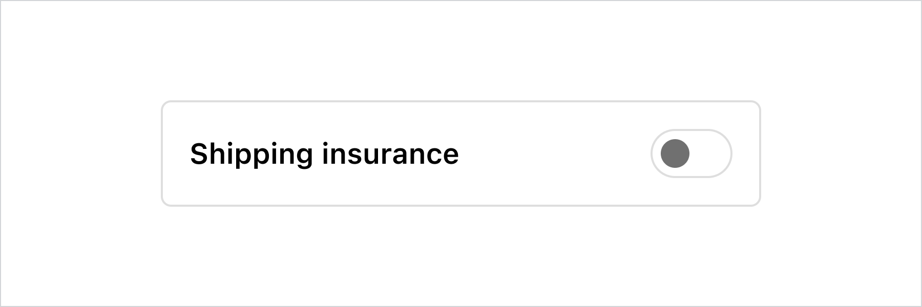
This example demonstrates pairing the switch with a custom label and layout while keeping it accessible to screen readers.
Pair with a custom label
Pair with a custom label
React
import {
  reactExtension,
  InlineLayout,
  Switch,
  Text,
} from '@shopify/ui-extensions-react/checkout';

export default reactExtension(
  'purchase.checkout.footer.render-after',
  () => <Extension />,
);

function Extension() {
  const switchLabel = 'Shipping insurance';
  return (
    <InlineLayout
      padding="base"
      borderRadius="base"
      border="base"
      columns={['fill', 'auto']}
    >
      <Text>{switchLabel}</Text>
      <Switch accessibilityLabel={switchLabel} />
    </InlineLayout>
  );
}
JavaScript
import {
  extension,
  InlineLayout,
  Switch,
  Text,
} from '@shopify/ui-extensions/checkout';

export default extension(
  'purchase.checkout.block.render',
  (root) => {
    const switchLabel = 'Shipping insurance';

    const inlineLayout = root.createComponent(
      InlineLayout,
      {
        padding: 'base',
        borderRadius: 'base',
        border: 'base',
        columns: ['fill', 'auto'],
      },
      [
        root.createComponent(
          Text,
          null,
          switchLabel,
        ),
        root.createComponent(Switch, {
          accessibilityLabel: switchLabel,
        }),
      ],
    );

    root.appendChild(inlineLayout);
  },
);
Anchor to Best practicesBest practices
- Use for immediate effects: Reserve switches for settings that take effect immediately without a save or submit action.
- Write clear labels: Describe the setting being toggled, such as "Order notifications" rather than "Toggle" or "On/Off."
- Use checkbox for deferred actions: If the setting requires form submission to apply, use Checkbox instead.
- Pre-enable thoughtfully: Only use
defaultCheckedfor options that benefit the customer by default.
Anchor to LimitationsLimitations
- No
errororrequiredprops available.