Version 2025-07 is the last API version to support React-based UI components. Later versions use Polaris web components, native UI elements with built-in accessibility, better performance, and consistent styling with Shopify's design system. Check out the upgrade guide to upgrade your extension and avoid being blocked from updating your extension after October 1st 2026.
Banner
Use banners to communicate important messages to customers in a prominent way. Banners support multiple status tones to convey urgency, and can be made dismissible or collapsible depending on the context.
For inline status indicators on individual items, use Badge instead.
Supported targets
- Customer
Account::Kitchen Sink - customer-account.
footer. render-after - customer-account.
order-index. announcement. render - customer-account.
order-index. block. render - customer-account.
order-status. announcement. render - customer-account.
order-status. block. render - customer-account.
order-status. cart-line-item. render-after - customer-account.
order-status. cart-line-list. render-after - customer-account.
order-status. customer-information. render-after - customer-account.
order-status. fulfillment-details. render-after - customer-account.
order-status. payment-details. render-after - customer-account.
order-status. return-details. render-after - customer-account.
order-status. unfulfilled-items. render-after - customer-account.
order. action. menu-item. render - customer-account.
order. action. render - customer-account.
order. page. render - customer-account.
page. render - customer-account.
profile. addresses. render-after - customer-account.
profile. announcement. render - customer-account.
profile. block. render - customer-account.
profile. company-details. render-after - customer-account.
profile. company-location-addresses. render-after - customer-account.
profile. company-location-payment. render-after - customer-account.
profile. company-location-staff. render-after - customer-account.
profile. payment. render-after
Supported targets
- Customer
Account::Kitchen Sink - customer-account.
footer. render-after - customer-account.
order-index. announcement. render - customer-account.
order-index. block. render - customer-account.
order-status. announcement. render - customer-account.
order-status. block. render - customer-account.
order-status. cart-line-item. render-after - customer-account.
order-status. cart-line-list. render-after - customer-account.
order-status. customer-information. render-after - customer-account.
order-status. fulfillment-details. render-after - customer-account.
order-status. payment-details. render-after - customer-account.
order-status. return-details. render-after - customer-account.
order-status. unfulfilled-items. render-after - customer-account.
order. action. menu-item. render - customer-account.
order. action. render - customer-account.
order. page. render - customer-account.
page. render - customer-account.
profile. addresses. render-after - customer-account.
profile. announcement. render - customer-account.
profile. block. render - customer-account.
profile. company-details. render-after - customer-account.
profile. company-location-addresses. render-after - customer-account.
profile. company-location-payment. render-after - customer-account.
profile. company-location-staff. render-after - customer-account.
profile. payment. render-after
Anchor to Use casesUse cases
- Payment errors: Alert customers to payment failures or verification issues that require immediate action.
- Order updates: Inform customers about changes to their orders, such as shipping delays or item substitutions.
- Subscription reminders: Warn customers about upcoming renewals, expiring payment methods, or plan changes.
- Success confirmations: Confirm that an action like updating an address or redeeming a reward completed successfully.
Anchor to PropertiesProperties
Configure the following properties on the Banner component.
- booleanbooleanDefault: falseDefault: false
Whether the banner content can be collapsed and expanded by the user. A collapsible banner conceals child elements initially, allowing the user to expand the banner to reveal them.
- stringstring
A unique identifier for the component. Use this to target the component in scripts or stylesheets, or to distinguish it from other instances of the same component.
- () => void() => void
A callback that fires when the banner is dismissed by the user. This component is controlled, so you must manage the visibility of the banner in state by using the
callback.- StatusStatusDefault: 'info'Default: 'info'
The semantic meaning and color treatment of the banner.
- stringstring
The title text displayed at the top of the banner to summarize the message or alert.
Status
The status communicates the intent or urgency of a message to the user. - `info`: Neutral informational content with no implied urgency. - `success`: Indicates a successful action or positive state. - `warning`: Indicates something that requires attention but isn’t blocking. - `critical`: Indicates a serious problem or error that needs immediate action.
'info' | 'success' | 'warning' | 'critical'Anchor to ExamplesExamples
Anchor to Display a critical errorDisplay a critical error
Use a critical banner to communicate problems that require immediate customer action. This example shows a payment verification error with a concise, actionable message.
Display a critical error
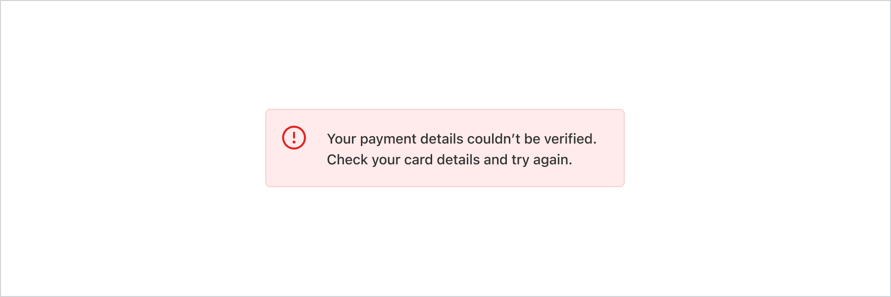
Display a critical error
React
import {
  reactExtension,
  Banner,
} from '@shopify/ui-extensions-react/customer-account';

export default reactExtension(
  'customer-account.page.render',
  () => <Extension />,
);

function Extension() {
  return (
    <Banner
      status="critical"
      title="Your payment details couldn’t be verified. Check your card details and try again."
    />
  );
}
JS
import {extension, Banner} from '@shopify/ui-extensions/customer-account';

export default extension('customer-account.page.render', (root) => {
  const banner = root.createComponent(Banner, {
    status: 'critical',
    title:
      'Your payment details couldn’t be verified. Check your card details and try again.',
  });

  root.appendChild(banner);
});Let customers dismiss informational banners after reading them. This example uses onDismiss to remove the banner when the close button is pressed. The Banner component is controlled, so you must manage visibility in state.
Show a dismissible info banner
React
import {useState} from 'react';
import {
  reactExtension,
  Banner,
} from '@shopify/ui-extensions-react/customer-account';

export default reactExtension(
  'customer-account.page.render',
  () => <Extension />,
);

function Extension() {
  const [visible, setVisible] = useState(true);

  if (!visible) {
    return null;
  }

  return (
    <Banner
      status="info"
      title="Your next subscription order ships on March 15."
      onDismiss={() => setVisible(false)}
    />
  );
}
JS
import {extension, Banner} from '@shopify/ui-extensions/customer-account';

export default extension('customer-account.page.render', (root) => {
  const banner = root.createComponent(Banner, {
    status: 'info',
    title: 'Your next subscription order ships on March 15.',
    onDismiss: () => {
      root.removeChild(banner);
    },
  });

  root.appendChild(banner);
});
Anchor to Present a collapsible warningPresent a collapsible warning
Use a collapsible banner to show a warning title with additional details hidden by default. This example warns about an expiring payment method and reveals instructions when expanded.
Present a collapsible warning
React
import {
  reactExtension,
  Banner,
  Text,
} from '@shopify/ui-extensions-react/customer-account';

export default reactExtension(
  'customer-account.page.render',
  () => <Extension />,
);

function Extension() {
  return (
    <Banner
      status="warning"
      title="Your subscription payment method expires soon"
      collapsible
    >
      <Text>
        Update your payment method before April 1 to
        avoid interruption to your subscription.
      </Text>
    </Banner>
  );
}
JS
import {
  extension,
  Banner,
  Text,
} from '@shopify/ui-extensions/customer-account';

export default extension('customer-account.page.render', (root) => {
  const banner = root.createComponent(
    Banner,
    {
      status: 'warning',
      title: 'Your subscription payment method expires soon',
      collapsible: true,
    },
    [
      root.createComponent(
        Text,
        undefined,
        'Update your payment method before April 1 to avoid interruption to your subscription.',
      ),
    ],
  );

  root.appendChild(banner);
});
Anchor to Best practicesBest practices
- Use banners sparingly: Too many banners distract customers from the main content. Reserve them for the most important information.
- Place banners contextually: Display banners at the top of a page or section, below the relevant header. If a banner relates to specific content, place it near that content.
- Include a next step when possible: Add a Button component with a clear action so customers know what to do after reading the message.
- Make banners dismissible unless critical: Customers should be able to dismiss informational banners. Keep
criticalbanners persistent until the issue is resolved. - Match status to urgency: Use
infofor general updates,warningfor issues needing attention,successfor confirmations, andcriticalfor problems that block progress.
Anchor to LimitationsLimitations
- The Banner component is controlled. You must manage banner visibility in state using the
onDismisscallback. - Collapsible banners conceal child elements by default. The title is always visible.
- Banners don't have a built-in auto-dismiss timer. You must implement timed dismissal manually if needed.