Upgrade to Polaris
Version 2025-07 is the last API version to support React-based UI components. Later versions use Polaris web components, native UI elements with built-in accessibility, better performance, and consistent styling with Shopify's design system. Check out the upgrade guide to upgrade your extension and avoid being blocked from updating your extension after October 1st 2026.
Page
The Page component is the outer wrapper of a full page, including the page heading, subtitle, and page-level actions. It provides a familiar and consistent style that sets expectations about the purpose of the page.
Page supports primary actions, secondary actions, and breadcrumb navigation to help customers orient themselves and take action. For grouping content within a page, use a Card or BlockStack.
Support
Targets (25)
Supported targets
- Customer
Account::Kitchen Sink - customer-account.
footer. render-after - customer-account.
order-index. announcement. render - customer-account.
order-index. block. render - customer-account.
order-status. announcement. render - customer-account.
order-status. block. render - customer-account.
order-status. cart-line-item. render-after - customer-account.
order-status. cart-line-list. render-after - customer-account.
order-status. customer-information. render-after - customer-account.
order-status. fulfillment-details. render-after - customer-account.
order-status. payment-details. render-after - customer-account.
order-status. return-details. render-after - customer-account.
order-status. unfulfilled-items. render-after - customer-account.
order. action. menu-item. render - customer-account.
order. action. render - customer-account.
order. page. render - customer-account.
page. render - customer-account.
profile. addresses. render-after - customer-account.
profile. announcement. render - customer-account.
profile. block. render - customer-account.
profile. company-details. render-after - customer-account.
profile. company-location-addresses. render-after - customer-account.
profile. company-location-payment. render-after - customer-account.
profile. company-location-staff. render-after - customer-account.
profile. payment. render-after
Supported targets
- Customer
Account::Kitchen Sink - customer-account.
footer. render-after - customer-account.
order-index. announcement. render - customer-account.
order-index. block. render - customer-account.
order-status. announcement. render - customer-account.
order-status. block. render - customer-account.
order-status. cart-line-item. render-after - customer-account.
order-status. cart-line-list. render-after - customer-account.
order-status. customer-information. render-after - customer-account.
order-status. fulfillment-details. render-after - customer-account.
order-status. payment-details. render-after - customer-account.
order-status. return-details. render-after - customer-account.
order-status. unfulfilled-items. render-after - customer-account.
order. action. menu-item. render - customer-account.
order. action. render - customer-account.
order. page. render - customer-account.
page. render - customer-account.
profile. addresses. render-after - customer-account.
profile. announcement. render - customer-account.
profile. block. render - customer-account.
profile. company-details. render-after - customer-account.
profile. company-location-addresses. render-after - customer-account.
profile. company-location-payment. render-after - customer-account.
profile. company-location-staff. render-after - customer-account.
profile. payment. render-after
Anchor to Use casesUse cases
- Order status pages: Display an order heading with confirmation details and actions like "Buy again" or "Cancel order".
- Subscription management: Show subscription details with a primary "Manage subscription" action.
- Custom account pages: Build branded full-page experiences with clear headings and contextual actions.
- Return and exchange flows: Structure multi-step processes with a descriptive heading and relevant actions.
Anchor to PropertiesProperties
Configure the following properties on the Page component.
- Anchor to titletitletitlestringstringrequiredrequired
The title displayed at the top of the page.
- Anchor to loadingloadingloadingbooleanbooleanDefault: falseDefault: false
Whether the page is in a loading state. When
true, the page shows loading indicators for its own UI elements. The page is not responsible for loading indicators on content passed aschildren.- Anchor to primaryActionprimary
Actionprimary Action RemoteFragmentRemoteFragment The primary action slot, rendered as one or more buttons in the primary position of the page. Accepts a
containingButtoncomponents.- Anchor to primaryActionAccessibilityLabelprimary
Action Accessibility Labelprimary Action Accessibility Label stringstringDefault: "More actions"Default: "More actions" A label announced by assistive technologies for the primary action grouping.
- Anchor to primaryActionLabelprimary
Action Labelprimary Action Label stringstringDefault: "More actions"Default: "More actions" A visible label for the primary action grouping. Displayed as the text trigger when actions overflow into a menu.
- Anchor to secondaryActionsecondary
Actionsecondary Action RemoteFragmentRemoteFragment The secondary action slot, rendered as one or more buttons in the secondary position of the page. Accepts a
containingButtoncomponents.- Anchor to subtitlesubtitlesubtitlestringstring
An optional subtitle displayed below the title.
Anchor to Primary actionsPrimary actions
Use the prop to surface the most important actions for the page. Primary action buttons appear prominently in the page header.
- stringstring
A label announced by assistive technologies that describes the button's purpose. When set, the button's visible
childrenare not announced to screen readers.- booleanbooleanDefault: falseDefault: false
Whether the button is disabled. A disabled button is non-interactive and visually de-emphasized.
- booleanbooleanDefault: falseDefault: false
Whether to replace the button content with a loading indicator.
- stringstring
An accessible label for the loading indicator, announced when the user prefers reduced motion. Only used when
loadingistrue.- () => void() => void
A callback fired when the button is pressed.
- RemoteFragmentRemoteFragment
An overlay component rendered when the user interacts with the button, such as a modal or popover.
- stringstring
A destination URL that the button navigates to. When set, the button behaves as a link.
Anchor to Secondary actionsSecondary actions
Use the prop to provide additional actions that support the page's purpose without competing with the primary action. Secondary actions appear alongside the primary action in the page header and are styled with less visual emphasis.
- stringstringrequiredrequired
A label announced by assistive technologies that describes the button's purpose. Required because
childrenpassed to this component are discarded.- () => void() => void
A callback fired when the button is pressed.
- stringstring
A destination URL that the button navigates to. When set, the button behaves as a link.
Anchor to ExamplesExamples
Anchor to Display an order status pageDisplay an order status page
Use Page to structure an order detail view with a heading, subtitle, and action buttons. The primary action appears prominently, while secondary actions are grouped separately.
Display an order status page
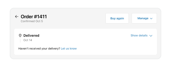
Display an order status page
import {
  Page,
  Button,
  reactExtension,
} from '@shopify/ui-extensions-react/customer-account';
import React from 'react';

export default reactExtension('customer-account.page.render', () => <App />);

function App() {
  return (
    <Page
      title="Order #1411"
      subtitle="Confirmed Oct 5"
      secondaryAction={<Button accessibilityLabel="Button" onPress={() => {}}/>}
      primaryActionLabel="Manage"
      primaryAction={
        <>
          <Button onPress={() => {}}>Buy again</Button>
          <Button onPress={() => {}}>Second action</Button>
          <Button onPress={() => {}}>Third action</Button>
        </>
      }
    >
      Content
    </Page>
  );
}
import {
  Page,
  Button,
  extension
} from '@shopify/ui-extensions/customer-account';

export default extension(
  'customer-account.page.render',
  (root, api) => {
    renderApp(root, api);
  },
)

async function renderApp(root, api) {
  const primaryAction = root.createFragment();
  await primaryAction.append(root.createComponent(Button, {onPress: () => {console.log("primary action 1")}}, 'Buy again primary 1'));
  await primaryAction.append(root.createComponent(Button, {onPress: () => {console.log("primary action 2")}}, 'Buy again primary 2'));
  await primaryAction.append(root.createComponent(Button, {onPress: () => {console.log("primary action 3")}}, 'Buy again primary 3'));

  const secondaryAction = root.createFragment();
  await secondaryAction.append(root.createComponent(Button, {accessibilityLabel: 'Button', onPress: () => {}}))

  const page = root.createComponent(
    Page,
    {
      title: "Order #1411",
      subtitle: "Confirmed Oct 5",
      primaryAction,
      primaryActionLabel: "Manage",
      secondaryAction,
      },
    root.createComponent('View', {}, "Content")
  )
  root.append(page);
}
React
import {
Page,
Button,
reactExtension,
} from '@shopify/ui-extensions-react/customer-account';
import React from 'react';
export default reactExtension('customer-account.page.render', () => <App />);
function App() {
return (
<Page
title="Order #1411"
subtitle="Confirmed Oct 5"
secondaryAction={<Button accessibilityLabel="Button" onPress={() => {}}/>}
primaryActionLabel="Manage"
primaryAction={
<>
<Button onPress={() => {}}>Buy again</Button>
<Button onPress={() => {}}>Second action</Button>
<Button onPress={() => {}}>Third action</Button>
</>
}
>
Content
</Page>
);
}JS
import {
Page,
Button,
extension
} from '@shopify/ui-extensions/customer-account';
export default extension(
'customer-account.page.render',
(root, api) => {
renderApp(root, api);
},
)
async function renderApp(root, api) {
const primaryAction = root.createFragment();
await primaryAction.append(root.createComponent(Button, {onPress: () => {console.log("primary action 1")}}, 'Buy again primary 1'));
await primaryAction.append(root.createComponent(Button, {onPress: () => {console.log("primary action 2")}}, 'Buy again primary 2'));
await primaryAction.append(root.createComponent(Button, {onPress: () => {console.log("primary action 3")}}, 'Buy again primary 3'));
const secondaryAction = root.createFragment();
await secondaryAction.append(root.createComponent(Button, {accessibilityLabel: 'Button', onPress: () => {}}))
const page = root.createComponent(
Page,
{
title: "Order #1411",
subtitle: "Confirmed Oct 5",
primaryAction,
primaryActionLabel: "Manage",
secondaryAction,
},
root.createComponent('View', {}, "Content")
)
root.append(page);
}Anchor to Best practicesBest practices
- Write clear, focused titles: State the main purpose of the page in 1-3 words and use sentence case.
- Use subtitles sparingly: Add a subtitle only when it provides context that's different from the title. Keep it brief.
- Reserve actions for page-level operations: Include buttons only for actions that affect the entire page or flow. Make the main action primary and keep lesser actions secondary.
- Follow UX guidelines for order actions: See UX guidelines for button logic on order pages.
Anchor to LimitationsLimitations
- Page is a full-page wrapper and can only be used at the top level of a page render extension target.
- When multiple primary action buttons are provided, overflow behavior is controlled by
primaryActionLabelandprimaryActionAccessibilityLabel. - Page actions are restricted to button components with specific allowed properties. Other interactive elements aren't supported in action positions.
Was this page helpful?