Version 2025-07 is the last API version to support React-based UI components. Later versions use Polaris web components, native UI elements with built-in accessibility, better performance, and consistent styling with Shopify's design system. Check out the upgrade guide to upgrade your extension and avoid being blocked from updating your extension after October 1st 2026.
Select
The select component lets customers choose one option from a dropdown menu. Use select when presenting four or more choices to keep interfaces uncluttered and scannable, or when space is limited.
Select components support option grouping, placeholder text, help text, and validation states. For more visual selection layouts with radio buttons or checkboxes, use ChoiceList.
Supported targets
- Customer
Account::Kitchen Sink - customer-account.
footer. render-after - customer-account.
order-index. announcement. render - customer-account.
order-index. block. render - customer-account.
order-status. announcement. render - customer-account.
order-status. block. render - customer-account.
order-status. cart-line-item. render-after - customer-account.
order-status. cart-line-list. render-after - customer-account.
order-status. customer-information. render-after - customer-account.
order-status. fulfillment-details. render-after - customer-account.
order-status. payment-details. render-after - customer-account.
order-status. return-details. render-after - customer-account.
order-status. unfulfilled-items. render-after - customer-account.
order. action. menu-item. render - customer-account.
order. action. render - customer-account.
order. page. render - customer-account.
page. render - customer-account.
profile. addresses. render-after - customer-account.
profile. announcement. render - customer-account.
profile. block. render - customer-account.
profile. company-details. render-after - customer-account.
profile. company-location-addresses. render-after - customer-account.
profile. company-location-payment. render-after - customer-account.
profile. company-location-staff. render-after - customer-account.
profile. payment. render-after
Supported targets
- Customer
Account::Kitchen Sink - customer-account.
footer. render-after - customer-account.
order-index. announcement. render - customer-account.
order-index. block. render - customer-account.
order-status. announcement. render - customer-account.
order-status. block. render - customer-account.
order-status. cart-line-item. render-after - customer-account.
order-status. cart-line-list. render-after - customer-account.
order-status. customer-information. render-after - customer-account.
order-status. fulfillment-details. render-after - customer-account.
order-status. payment-details. render-after - customer-account.
order-status. return-details. render-after - customer-account.
order-status. unfulfilled-items. render-after - customer-account.
order. action. menu-item. render - customer-account.
order. action. render - customer-account.
order. page. render - customer-account.
page. render - customer-account.
profile. addresses. render-after - customer-account.
profile. announcement. render - customer-account.
profile. block. render - customer-account.
profile. company-details. render-after - customer-account.
profile. company-location-addresses. render-after - customer-account.
profile. company-location-payment. render-after - customer-account.
profile. company-location-staff. render-after - customer-account.
profile. payment. render-after
Anchor to Use casesUse cases
- Country selection: Let customers pick a country from a long dropdown list.
- Placeholder prompts: Guide customers with default placeholder text before they choose.
- Disabled dropdowns: Prevent selection when a prerequisite field isn't complete.
- Compact option lists: Save space compared to radio buttons or choice lists.
Anchor to PropertiesProperties
Configure the following properties on the Select component.
- Anchor to labellabellabelstringstringrequiredrequired
The text displayed as the field label, which identifies the purpose of the field to users.
- Anchor to optionsoptionsoptionsSelectOptionProps[]SelectOptionProps[]requiredrequired
The options a user can select from.
- Anchor to autocompleteautocompleteautocompleteAutocomplete | booleanAutocomplete | boolean
A hint as to the intended content of the field.
When set to
true, this property indicates that the field should support autofill, but you do not have any more semantic information on the intended contents.When set to
false, you are indicating that this field contains sensitive information, or contents that are never saved, like one-time codes. Note that it is impossible to prevent autocomplete in some browsers, so do not depend on its absence.Alternatively, you can provide an
Autocompleteobject, which describes the specific data you would like to be entered into this field during autocomplete.- Anchor to disableddisableddisabledbooleanboolean
Whether the select is disabled, preventing any user interaction.
- Anchor to errorerrorerrorstringstring
An error message displayed below the field to indicate validation problems. When set, the field is styled with error indicators.
- Anchor to idididstringstring
A unique identifier for the field. When no
idis set, a globally unique value will be used instead.- Anchor to namenamenamestringstring
An identifier for the field that is unique within the nearest containing
Formcomponent.- Anchor to onBluron
Bluron Blur () => void() => void A callback fired when the select loses focus.
- Anchor to onChangeon
Changeon Change (value: string) => void(value: string) => void A callback fired when the select value changes. This callback is called with the string
valueof the selectedoption. This component is controlled, so you must store this value in state and reflect it back in thevalueprop of the select.- Anchor to onFocuson
Focuson Focus () => void() => void A callback fired when the select receives focus.
- Anchor to placeholderplaceholderplaceholderstringstring
The placeholder text displayed in the field when it's empty, providing a hint about the expected input format or value.
- Anchor to readonlyreadonlyreadonlybooleanboolean
Whether the select is read-only and can't be edited. Read-only selects remain focusable and their content is announced by screen readers.
- Anchor to requiredrequiredrequiredbooleanboolean
Whether the field needs a value. This requirement adds semantic value to the field, but it will not cause an error to appear automatically. If you want to present an error when this field is empty, you can do so with the
errorprop.- Anchor to valuevaluevaluestringstring
The active option for the select. This should match to one of the
valueproperties in theoptionsprop. When not set, the value will default to an empty string, which will show theplaceholdertext as the "selected value".
Autocomplete
A descriptor for selecting the data a field would like to receive during autocomplete. This attribute is modeled off of a limited set of the autocomplete values supported in browsers.
- field
The type of data that should be inserted into a field supporting autocomplete.
AutocompleteField - group
The contact information “group” the autocomplete data should be sourced from.
AutocompleteGroup
AutocompleteField
'name' | 'honorific-prefix' | 'given-name' | 'additional-name' | 'family-name' | 'honorific-suffix' | 'nickname' | 'username' | 'new-password' | 'current-password' | 'one-time-code' | 'organization-title' | 'organization' | 'street-address' | 'address-line1' | 'address-line2' | 'address-line3' | 'address-level4' | 'address-level3' | 'address-level2' | 'address-level1' | 'country' | 'country-name' | 'postal-code' | 'credit-card-name' | 'credit-card-given-name' | 'credit-card-additional-name' | 'credit-card-family-name' | 'credit-card-number' | 'credit-card-expiry' | 'credit-card-expiry-month' | 'credit-card-expiry-year' | 'credit-card-security-code' | 'credit-card-type' | 'transaction-currency' | 'transaction-amount' | 'language' | 'birthday' | 'birthday-day' | 'birthday-month' | 'birthday-year' | 'sex' | 'url' | 'photo' | 'telephone' | 'telephone-country-code' | 'telephone-national' | 'telephone-area-code' | 'telephone-local' | 'telephone-local-prefix' | 'telephone-local-suffix' | 'telephone-extension' | 'email' | 'instant-message' | 'home telephone' | 'home telephone-country-code' | 'home telephone-national' | 'home telephone-area-code' | 'home telephone-local' | 'home telephone-local-prefix' | 'home telephone-local-suffix' | 'home telephone-extension' | 'home email' | 'home instant-message' | 'work telephone' | 'work telephone-country-code' | 'work telephone-national' | 'work telephone-area-code' | 'work telephone-local' | 'work telephone-local-prefix' | 'work telephone-local-suffix' | 'work telephone-extension' | 'work email' | 'work instant-message' | 'mobile telephone' | 'mobile telephone-country-code' | 'mobile telephone-national' | 'mobile telephone-area-code' | 'mobile telephone-local' | 'mobile telephone-local-prefix' | 'mobile telephone-local-suffix' | 'mobile telephone-extension' | 'mobile email' | 'mobile instant-message' | 'fax telephone' | 'fax telephone-country-code' | 'fax telephone-national' | 'fax telephone-area-code' | 'fax telephone-local' | 'fax telephone-local-prefix' | 'fax telephone-local-suffix' | 'fax telephone-extension' | 'fax email' | 'fax instant-message' | 'pager telephone' | 'pager telephone-country-code' | 'pager telephone-national' | 'pager telephone-area-code' | 'pager telephone-local' | 'pager telephone-local-prefix' | 'pager telephone-local-suffix' | 'pager telephone-extension' | 'pager email' | 'pager instant-message'AutocompleteGroup
'shipping' | 'billing'SelectOptionProps
Selects let users choose one option from an options menu. Consider select when you have 4 or more options, to avoid cluttering the interface.
- disabled
Whether the option is disabled, preventing selection.
boolean - label
The user-facing label for this option.
string - value
The value that will be passed to the select’s `onChange` callback when this option is selected.
string
Anchor to ExamplesExamples
Anchor to Select a countrySelect a country
Use select to let customers pick one option from a dropdown menu. This example shows a country selection dropdown.Select a country

Select a country
React
import {
  reactExtension,
  Select,
} from '@shopify/ui-extensions-react/customer-account';

export default reactExtension(
  'customer-account.page.render',
  () => <Extension />,
);

function Extension() {
  return (
    <Select
      label="Country"
      value="2"
      options={[
        {
          value: '1',
          label: 'Australia',
        },
        {
          value: '2',
          label: 'Canada',
        },
        {
          value: '3',
          label: 'France',
        },
        {
          value: '4',
          label: 'Japan',
        },
        {
          value: '5',
          label: 'Nigeria',
        },
        {
          value: '6',
          label: 'United States',
        },
      ]}
    />
  );
}
JS
import {extension, Select} from '@shopify/ui-extensions/customer-account';

export default extension('customer-account.page.render', (root) => {
  const select = root.createComponent(Select, {
    label: 'Country',
    value: '2',
    options: [
      {
        value: '1',
        label: 'Australia',
      },
      {
        value: '2',
        label: 'Canada',
      },
      {
        value: '3',
        label: 'France',
      },
      {
        value: '4',
        label: 'Japan',
      },
      {
        value: '5',
        label: 'Nigeria',
      },
      {
        value: '6',
        label: 'United States',
      },
    ],
  });

  root.appendChild(select);
});
Anchor to Display a long list of time choicesDisplay a long list of time choices
The select component is a great choice for displaying a long list of time choices, as it helps conserve valuable space. If the number of options is less than or equal to 5, consider using the choice list component. This lets customers see all options immediately without clicking into the select.
Display a long list of time choices
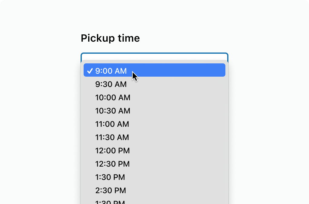
Display a long list of time choices
React
import {
  reactExtension,
  Select,
} from '@shopify/ui-extensions-react/customer-account';

export default reactExtension(
  'customer-account.page.render',
  () => <Extension />,
);

function Extension() {
  return (
    <Select
      label="Pickup time"
      value="1"
      options={[
        {
          value: '1',
          label: '9:00 AM',
        },
        {
          value: '2',
          label: '9:30 AM',
        },
        {
          value: '3',
          label: '10:00 AM',
        },
        {
          value: '4',
          label: '10:30 AM',
        },
        {
          value: '5',
          label: '11:00 AM',
        },
        {
          value: '6',
          label: '11:30 AM',
        },
      ]}
    />
  );
}
JS
import {extension, Select} from '@shopify/ui-extensions/customer-account';

export default extension('customer-account.page.render', (root) => {
  const select = root.createComponent(Select, {
    label: 'Pickup time',
    value: '1',
    options: [
      {
        value: '1',
        label: '9:00 AM',
      },
      {
        value: '2',
        label: '9:30 AM',
      },
      {
        value: '3',
        label: '10:00 AM',
      },
      {
        value: '4',
        label: '10:30 AM',
      },
      {
        value: '5',
        label: '11:00 AM',
      },
      {
        value: '6',
        label: '11:30 AM',
      },
    ],
  });

  root.appendChild(select);
});
Anchor to Best practicesBest practices
- Use for four or more options: For fewer choices, use ChoiceList with radio buttons for better visibility.
- Add placeholder text: Set
placeholderto guide customers when no option is selected, such as "Choose a country." - Pre-select common choices: Use
defaultSelectedon the most common option to reduce the number of interactions for most customers.
Anchor to LimitationsLimitations
- No multi-select support.
- No built-in search or filter.