Version 2025-07 is the last API version to support React-based UI components. Later versions use Polaris web components, native UI elements with built-in accessibility, better performance, and consistent styling with Shopify's design system. Check out the upgrade guide to upgrade your extension and avoid being blocked from updating your extension after October 1st 2026.
Text
The text block component renders a block of text that occupies the full width available, similar to a paragraph. Use text block for multi-line content like descriptions, policies, or explanatory copy.
For inline text styling within a sentence, use Text.
Supported targets
- Customer
Account::Kitchen Sink - customer-account.
footer. render-after - customer-account.
order-index. announcement. render - customer-account.
order-index. block. render - customer-account.
order-status. announcement. render - customer-account.
order-status. block. render - customer-account.
order-status. cart-line-item. render-after - customer-account.
order-status. cart-line-list. render-after - customer-account.
order-status. customer-information. render-after - customer-account.
order-status. fulfillment-details. render-after - customer-account.
order-status. payment-details. render-after - customer-account.
order-status. return-details. render-after - customer-account.
order-status. unfulfilled-items. render-after - customer-account.
order. action. menu-item. render - customer-account.
order. action. render - customer-account.
order. page. render - customer-account.
page. render - customer-account.
profile. addresses. render-after - customer-account.
profile. announcement. render - customer-account.
profile. block. render - customer-account.
profile. company-details. render-after - customer-account.
profile. company-location-addresses. render-after - customer-account.
profile. company-location-payment. render-after - customer-account.
profile. company-location-staff. render-after - customer-account.
profile. payment. render-after
Supported targets
- Customer
Account::Kitchen Sink - customer-account.
footer. render-after - customer-account.
order-index. announcement. render - customer-account.
order-index. block. render - customer-account.
order-status. announcement. render - customer-account.
order-status. block. render - customer-account.
order-status. cart-line-item. render-after - customer-account.
order-status. cart-line-list. render-after - customer-account.
order-status. customer-information. render-after - customer-account.
order-status. fulfillment-details. render-after - customer-account.
order-status. payment-details. render-after - customer-account.
order-status. return-details. render-after - customer-account.
order-status. unfulfilled-items. render-after - customer-account.
order. action. menu-item. render - customer-account.
order. action. render - customer-account.
order. page. render - customer-account.
page. render - customer-account.
profile. addresses. render-after - customer-account.
profile. announcement. render - customer-account.
profile. block. render - customer-account.
profile. company-details. render-after - customer-account.
profile. company-location-addresses. render-after - customer-account.
profile. company-location-payment. render-after - customer-account.
profile. company-location-staff. render-after - customer-account.
profile. payment. render-after
Anchor to Use casesUse cases
- Product descriptions: Display detailed product or service information.
- Policy text: Present return policies, terms, or legal content.
- Explanatory copy: Provide context or instructions for customers.
- Account information: Show account details or profile descriptions.
Anchor to PropertiesProperties
Configure the following properties on the TextBlock component.
- Anchor to appearanceappearanceappearance'subdued' | 'accent' | 'decorative' | 'info' | 'success' | 'warning' | 'critical''subdued' | 'accent' | 'decorative' | 'info' | 'success' | 'warning' | 'critical'
Changes the visual appearance
- Anchor to emphasisemphasisemphasisEmphasisEmphasis
Use to emphasize a word or a group of words.
- Anchor to idididstringstring
A unique identifier for the component. Use this to target the component in scripts or stylesheets, or to distinguish it from other instances of the same component.
- Anchor to inlineAlignmentinline
Alignmentinline Alignment InlineAlignmentInlineAlignment Align text along the main axis.
- Anchor to sizesizesizeTextSizeTextSize
Size of the text
Emphasis
Use to emphasize a word or a group of words.
'italic' | 'bold'InlineAlignment
Controls how content is aligned along the inline axis (horizontal in standard writing modes). - `'start'`: Aligns content to the inline start of the container. - `'center'`: Centers content along the inline axis. - `'end'`: Aligns content to the inline end of the container.
'start' | 'center' | 'end'TextSize
A keyword that maps to a predefined text size from the design system. Includes all standard `Size` values plus `medium`, which sits between `base` and `large`.
Extract<Size, 'extraSmall' | 'small' | 'base' | 'large' | 'extraLarge'> | 'medium'Size
A keyword that maps to a predefined size from the design system's size scale. Components use a subset of these values depending on which sizes they support. - `extraSmall`: The smallest available size. - `small`: A compact size, smaller than the default. - `base`: The default size, appropriate for most contexts. - `large`: A larger size for increased visual prominence. - `extraLarge`: The largest available keyword size. - `fill`: Stretches to fill the available space in the container.
'extraSmall' | 'small' | 'base' | 'large' | 'extraLarge' | 'fill'Anchor to ExamplesExamples
Anchor to Display a block of textDisplay a block of text
Render a full-width block of text content. This example displays a text block component as a paragraph.Display a block of text
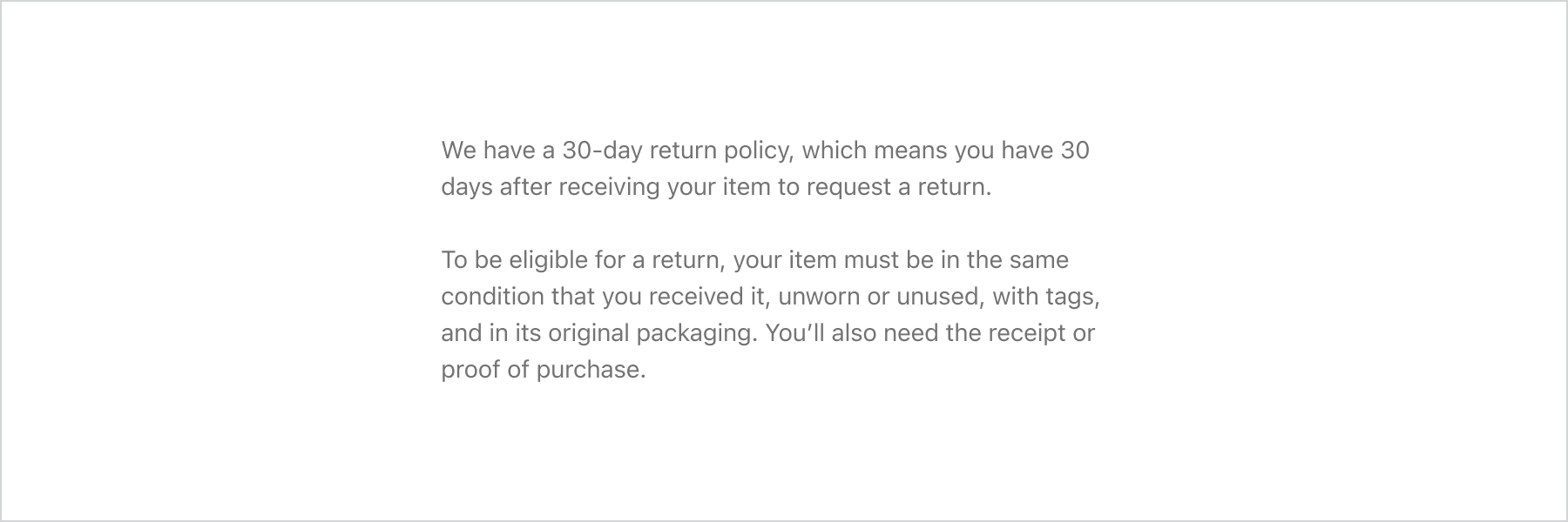
Display a block of text
React
import {
  reactExtension,
  TextBlock,
  BlockStack,
} from '@shopify/ui-extensions-react/customer-account';

export default reactExtension(
  'customer-account.page.render',
  () => <Extension />,
);

function Extension() {
  return (
    <BlockStack>
      <TextBlock>
        We have a 30-day return policy, which
        means you have 30 days after receiving
        your item to request a return.
      </TextBlock>
      <TextBlock>
        To be eligible for a return, your item
        must be in the same condition that you
        received it, unworn or unused, with tags,
        and in its original packaging. You’ll also
        need the receipt or proof of purchase.
      </TextBlock>
    </BlockStack>
  );
}
JS
import {
  extension,
  TextBlock,
  BlockStack,
} from '@shopify/ui-extensions/customer-account';

export default extension('customer-account.page.render', (root) => {
  const textBlock = root.createComponent(BlockStack, undefined, [
    root.createComponent(
      TextBlock,
      undefined,
      'We have a 30-day return policy, which means you have 30 days after receiving your item to request a return.',
    ),
    root.createComponent(
      TextBlock,
      undefined,
      'To be eligible for a return, your item must be in the same condition that you received it, unworn or unused, with tags, and in its original packaging. You’ll also need the receipt or proof of purchase.',
    ),
  ]);

  root.appendChild(textBlock);
});
Anchor to Best practicesBest practices
- Keep paragraphs focused: Limit each text block to a single idea for scannability.
- Use appropriate size: Match the text size to the content hierarchy.
- Use Text for inline styling: For emphasizing words within a text block, nest Text components inside.