Version 2025-07 is the last API version to support React-based UI components. Later versions use Polaris web components, native UI elements with built-in accessibility, better performance, and consistent styling with Shopify's design system. Check out the upgrade guide to upgrade your extension and avoid being blocked from updating your extension after October 1st 2026.
Clipboard
The ClipboardItem component copies text to the user's clipboard when triggered by another component. Use ClipboardItem alongside Button, Pressable, or Link to let users copy discount codes, order numbers, or referral links.
ClipboardItem is a non-rendering component. It connects to a trigger element through the activateTarget property on the trigger component.
Supported targets
- Customer
Account::Kitchen Sink - customer-account.
footer. render-after - customer-account.
order-index. announcement. render - customer-account.
order-index. block. render - customer-account.
order-status. announcement. render - customer-account.
order-status. block. render - customer-account.
order-status. cart-line-item. render-after - customer-account.
order-status. cart-line-list. render-after - customer-account.
order-status. customer-information. render-after - customer-account.
order-status. fulfillment-details. render-after - customer-account.
order-status. payment-details. render-after - customer-account.
order-status. return-details. render-after - customer-account.
order-status. unfulfilled-items. render-after - customer-account.
order. action. menu-item. render - customer-account.
order. action. render - customer-account.
order. page. render - customer-account.
page. render - customer-account.
profile. addresses. render-after - customer-account.
profile. announcement. render - customer-account.
profile. block. render - customer-account.
profile. company-details. render-after - customer-account.
profile. company-location-addresses. render-after - customer-account.
profile. company-location-payment. render-after - customer-account.
profile. company-location-staff. render-after - customer-account.
profile. payment. render-after
Supported targets
- Customer
Account::Kitchen Sink - customer-account.
footer. render-after - customer-account.
order-index. announcement. render - customer-account.
order-index. block. render - customer-account.
order-status. announcement. render - customer-account.
order-status. block. render - customer-account.
order-status. cart-line-item. render-after - customer-account.
order-status. cart-line-list. render-after - customer-account.
order-status. customer-information. render-after - customer-account.
order-status. fulfillment-details. render-after - customer-account.
order-status. payment-details. render-after - customer-account.
order-status. return-details. render-after - customer-account.
order-status. unfulfilled-items. render-after - customer-account.
order. action. menu-item. render - customer-account.
order. action. render - customer-account.
order. page. render - customer-account.
page. render - customer-account.
profile. addresses. render-after - customer-account.
profile. announcement. render - customer-account.
profile. block. render - customer-account.
profile. company-details. render-after - customer-account.
profile. company-location-addresses. render-after - customer-account.
profile. company-location-payment. render-after - customer-account.
profile. company-location-staff. render-after - customer-account.
profile. payment. render-after
Anchor to Use casesUse cases
- Discount codes: Let customers copy a promotion code to use on their next purchase.
- Order confirmation numbers: Provide a quick-copy action for order or tracking IDs on the Order status page.
- Referral codes: Let customers copy and share a referral code with friends.
Anchor to PropertiesProperties
Configure the following properties on the ClipboardItem component.
- Anchor to idididstringstring
A unique identifier for the component. Use this to target the component in scripts or stylesheets, or to distinguish it from other instances of the same component.
- Anchor to onCopyon
Copyon Copy () => void() => void Callback run when the copy to clipboard succeeds.
- Anchor to onCopyErroron
Copy Erroron Copy Error () => void() => void Callback run when the copy to clipboard fails.
- Anchor to texttexttextstringstringDefault: ''Default: ''
Plain text to be written to the clipboard.
Anchor to ExamplesExamples
Anchor to Copy text to the clipboardCopy text to the clipboard
Copy text to the clipboard when a trigger component is activated. This example shows a ClipboardItem connected to a Button through the activateTarget property.Copy text to the clipboard
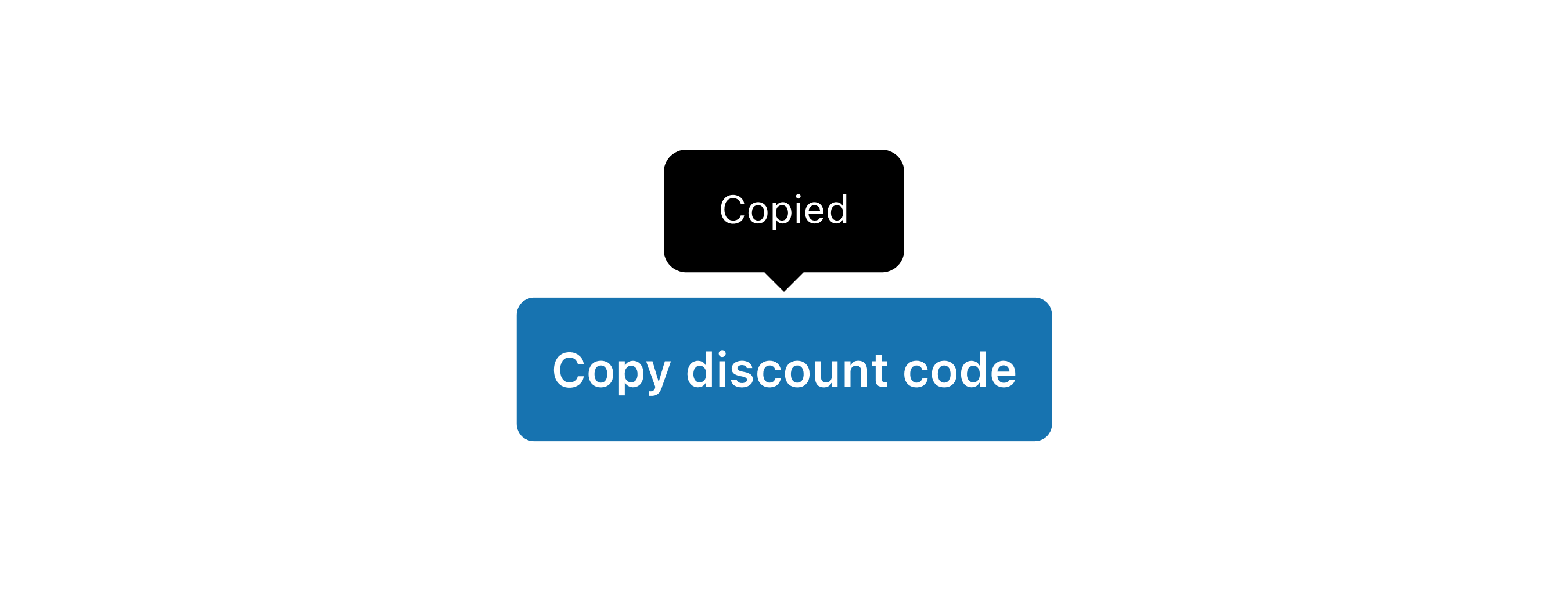
Copy text to the clipboard
React
import {
  reactExtension,
  Button,
  ClipboardItem,
} from '@shopify/ui-extensions-react/customer-account';

export default reactExtension(
  'customer-account.page.render',
  () => <Extension />,
);

function Extension() {
  return (
    <>
      <Button
        activateTarget="discount-code"
        activateAction="copy"
      >
        Copy discount code
      </Button>
      <ClipboardItem
        text="SAVE 25"
        id="discount-code"
      />
    </>
  );
}
JS
import {
  extension,
  ClipboardItem,
  Button,
} from '@shopify/ui-extensions/customer-account';

export default extension('customer-account.page.render', (root) => {
  const button = root.createComponent(
    Button,
    {
      activateTarget: 'discount-code',
    },
    'Copy discount code',
  );
  const clipboardItem = root.createComponent(ClipboardItem, {
    text: 'SAVE 25',
    id: 'discount-code',
  });
  root.appendChild(button);
  root.appendChild(clipboardItem);
});
Anchor to Copy the content of a QR codeCopy the content of a QR code
Provide an alternative way for customers to access QR code content. This example pairs a ClipboardItem with a QR code so customers can copy the URL instead of scanning.Copy the content of a QR code

Copy the content of a QR code
React
import {
  reactExtension,
  BlockStack,
  Button,
  ClipboardItem,
  QRCode,
} from '@shopify/ui-extensions-react/checkout';

export default reactExtension(
  'purchase.checkout.block.render',
  () => <Extension />,
);

function Extension() {
  const bitcoinAddress =
    '14qViLJfdGaP4EeHnDyJbEGQysnCpwk3gd';

  return (
    <BlockStack maxInlineSize={200}>
      <QRCode
        size="fill"
        content={`bitcoin:${bitcoinAddress}`}
      />
      <Button activateTarget="bitcoin-address">
        Copy Bitcoin address
      </Button>
      <ClipboardItem
        text={bitcoinAddress}
        id="bitcoin-address"
      />
    </BlockStack>
  );
}
JS
import {
  extension,
  BlockStack,
  Button,
  ClipboardItem,
  QRCode,
} from '@shopify/ui-extensions/checkout';

export default extension(
  'purchase.checkout.block.render',
  (root) => {
    const bitcoinAddress =
      '14qViLJfdGaP4EeHnDyJbEGQysnCpwk3gd';
    const qrCodeContent = `bitcoin:${bitcoinAddress}`;

    const qrCode = root.createComponent(QRCode, {
      content: qrCodeContent,
      size: 'fill',
    });

    const clipboardItem = root.createComponent(
      ClipboardItem,
      {
        text: bitcoinAddress,
        id: 'bitcoin-address',
      },
    );

    const button = root.createComponent(
      Button,
      {
        activateTarget: 'bitcoin-address',
      },
      'Copy Bitcoin address',
    );

    const blockStack = root.createComponent(
      BlockStack,
      {
        maxInlineSize: 200,
      },
    );

    blockStack.appendChild(qrCode);
    blockStack.appendChild(button);
    blockStack.appendChild(clipboardItem);

    root.appendChild(blockStack);
  },
);
Anchor to Swap an icon after copyingSwap an icon after copying
Provide visual feedback by swapping an icon to a checkmark after the text is copied. This example uses the onCopy callback to toggle the icon state.Swap an icon after copying

Swap an icon after copying
React
import {useState} from 'react';
import {
  reactExtension,
  Button,
  ClipboardItem,
  Icon,
  InlineStack,
  Text,
} from '@shopify/ui-extensions-react/checkout';

import type {IconProps} from '@shopify/ui-extensions/checkout';

export default reactExtension(
  'purchase.checkout.block.render',
  () => <Extension />,
);

function Extension() {
  const [iconSource, setIconSource] =
    useState<IconProps['source']>('clipboard');

  return (
    <>
      <Button activateTarget="sample-id">
        <InlineStack>
          <Text>Copy to clipboard</Text>
          <Icon
            source={iconSource}
            appearance="monochrome"
          />
        </InlineStack>
      </Button>
      <ClipboardItem
        text="This text will be copied to the clipboard"
        id="sample-id"
        onCopy={() => {
          setIconSource('success');
          setTimeout(() => {
            setIconSource('clipboard');
          }, 2500);
        }}
        onCopyError={() => {
          setIconSource('error');
          setTimeout(() => {
            setIconSource('clipboard');
          }, 2500);
        }}
      />
    </>
  );
}
JS
import {
  extension,
  Button,
  ClipboardItem,
  Icon,
  InlineStack,
  Text,
} from '@shopify/ui-extensions/checkout';

export default extension(
  'purchase.checkout.block.render',
  (root) => {
    const button = root.createComponent(Button, {
      activateTarget: 'sample-id',
    });

    const inlineStack = root.createComponent(
      InlineStack,
      {},
    );

    const text = root.createComponent(
      Text,
      {},
      'Copy to clipboard',
    );

    const icon = root.createComponent(Icon, {
      source: 'clipboard',
      appearance: 'monochrome',
    });

    const clipboardItem = root.createComponent(
      ClipboardItem,
      {
        text: 'This text will be copied to the clipboard',
        id: 'sample-id',
        onCopy: () => {
          icon.updateProps({source: 'success'});
          setTimeout(() => {
            icon.updateProps({
              source: 'clipboard',
            });
          }, 2500);
        },
        onCopyError: () => {
          icon.updateProps({source: 'error'});
          setTimeout(() => {
            icon.updateProps({
              source: 'clipboard',
            });
          }, 2500);
        },
      },
    );

    button.appendChild(inlineStack);
    inlineStack.appendChild(text);
    inlineStack.appendChild(icon);
    root.appendChild(button);
    root.appendChild(clipboardItem);
  },
);
Anchor to Best practicesBest practices
- Use descriptive trigger text: Label the trigger with what's being copied, such as "Copy discount code" rather than just "Copy."
- Display the value being copied: Show the text content visually alongside the copy trigger so users know what they're copying.
- Provide copy feedback: Use the
onCopycallback to provide visual feedback, such as swapping an icon or showing a confirmation message. - Keep text values short: Clipboard items work best with concise values like codes, IDs, and short URLs rather than long paragraphs.
Anchor to LimitationsLimitations
- ClipboardItem doesn't render any visible UI. It must be paired with a visible trigger component such as
Button,Pressable, orLink. - The
textproperty only accepts plain strings. Rich text, HTML, and binary content aren't supported.