Version 2025-07 is the last API version to support React-based UI components. Later versions use Polaris web components, native UI elements with built-in accessibility, better performance, and consistent styling with Shopify's design system. Check out the upgrade guide to upgrade your extension and avoid being blocked from updating your extension after October 1st 2026.
Image
The ImageGroup component displays up to four images in a grid or stacked layout. Use ImageGroup to showcase collections of related images, such as products in a wishlist or subscription.
When there are more than four images, the component indicates how many additional images aren't displayed, giving customers a clear sense of the full collection size. The variant property controls whether images display in a grid or inline-stack layout.
Supported targets
- Customer
Account::Kitchen Sink - customer-account.
footer. render-after - customer-account.
order-index. announcement. render - customer-account.
order-index. block. render - customer-account.
order-status. announcement. render - customer-account.
order-status. block. render - customer-account.
order-status. cart-line-item. render-after - customer-account.
order-status. cart-line-list. render-after - customer-account.
order-status. customer-information. render-after - customer-account.
order-status. fulfillment-details. render-after - customer-account.
order-status. payment-details. render-after - customer-account.
order-status. return-details. render-after - customer-account.
order-status. unfulfilled-items. render-after - customer-account.
order. action. menu-item. render - customer-account.
order. action. render - customer-account.
order. page. render - customer-account.
page. render - customer-account.
profile. addresses. render-after - customer-account.
profile. announcement. render - customer-account.
profile. block. render - customer-account.
profile. company-details. render-after - customer-account.
profile. company-location-addresses. render-after - customer-account.
profile. company-location-payment. render-after - customer-account.
profile. company-location-staff. render-after - customer-account.
profile. payment. render-after
Supported targets
- Customer
Account::Kitchen Sink - customer-account.
footer. render-after - customer-account.
order-index. announcement. render - customer-account.
order-index. block. render - customer-account.
order-status. announcement. render - customer-account.
order-status. block. render - customer-account.
order-status. cart-line-item. render-after - customer-account.
order-status. cart-line-list. render-after - customer-account.
order-status. customer-information. render-after - customer-account.
order-status. fulfillment-details. render-after - customer-account.
order-status. payment-details. render-after - customer-account.
order-status. return-details. render-after - customer-account.
order-status. unfulfilled-items. render-after - customer-account.
order. action. menu-item. render - customer-account.
order. action. render - customer-account.
order. page. render - customer-account.
page. render - customer-account.
profile. addresses. render-after - customer-account.
profile. announcement. render - customer-account.
profile. block. render - customer-account.
profile. company-details. render-after - customer-account.
profile. company-location-addresses. render-after - customer-account.
profile. company-location-payment. render-after - customer-account.
profile. company-location-staff. render-after - customer-account.
profile. payment. render-after
Anchor to Use casesUse cases
- Order summaries: Display product images from a recent order in a compact visual group.
- Wishlists and collections: Show a preview of saved items with a count of additional products.
- Subscription overviews: Present the products included in a recurring subscription.
- Visual previews: Provide a quick visual snapshot of related items without taking up significant space.
Anchor to PropertiesProperties
Configure the following properties on the ImageGroup component.
- Anchor to accessibilityLabelaccessibility
Labelaccessibility Label stringstring A label that describes the purpose or contents of the image group. When set, it will be announced to users using assistive technologies and will provide them with more context.
- Anchor to loadingloadingloadingbooleanbooleanDefault: falseDefault: false
The loading state of the image group. When
true, the image group displays a loading indicator in place of images.- Anchor to totalItemstotal
Itemstotal Items numbernumber The total number of items that could be displayed in the image group. Used to calculate and display the remaining count when all available image slots have been filled (for example, "+3 more").
- Anchor to variantvariantvariant'grid' | 'inline-stack''grid' | 'inline-stack'Default: 'grid'Default: 'grid'
The layout arrangement for the images within the group.
grid: Displays images in a grid layout, filling available rows and columns.inline-stack: Displays images in a horizontal stack, arranged inline from start to end.
Anchor to ExamplesExamples
Anchor to Display an image groupDisplay an image group
Show a collection of related images in a compact layout. This example displays three product images in the default grid arrangement.
Display an image group
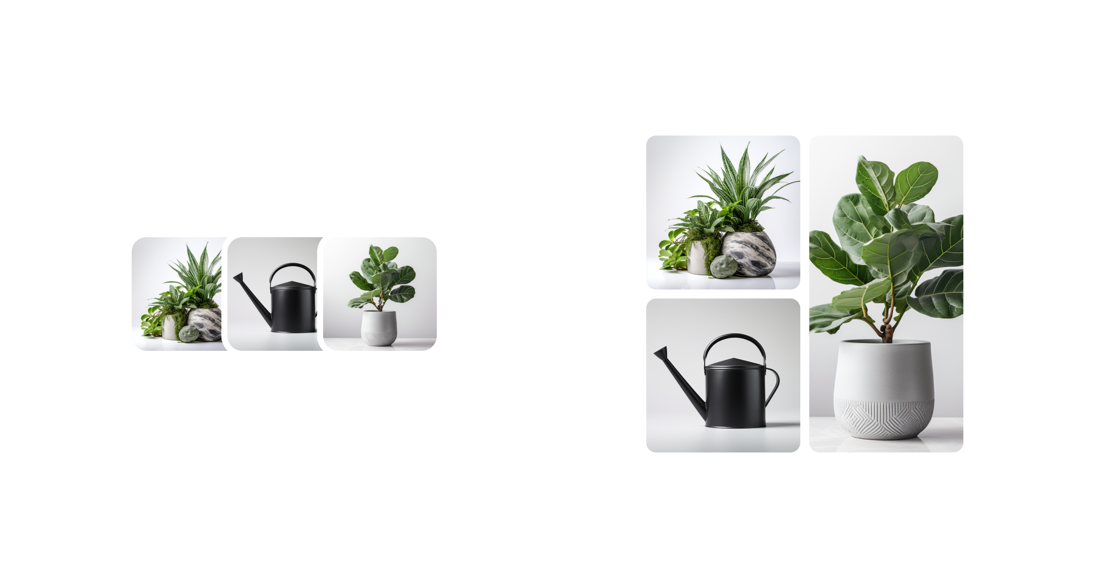
Display an image group
React
import {
  Image,
  ImageGroup,
  View,
  reactExtension,
} from '@shopify/ui-extensions-react/customer-account';
import React from 'react';

export default reactExtension('customer-account.page.render', () => <App />);

function App() {
  return (
    <View maxInlineSize={300}>
      <ImageGroup>
        <Image source="../assets/flower.jpg" />
        <Image source="../assets/flower.jpg" />
        <Image source="../assets/flower.jpg" />
      </ImageGroup>
    </View>
  );
}
JS
import {
  Image,
  ImageGroup,
  View,
  extension,
} from '@shopify/ui-extensions/customer-account';

export default extension(
  'customer-account.page.render',
  (root, api) => {
    renderApp(root, api);
  },
)

function renderApp(root, api) {
  const firstImage = root.createComponent(Image, {
    source: "../assets/flower.jpg"
  });

  const secondeImage = root.createComponent(Image, {
    source: "../assets/flower.jpg"
  });

  const thirdImage = root.createComponent(Image, {
    source: "../assets/flower.jpg"
  });

  const imageGroup = root.createComponent(ImageGroup);

  imageGroup.append(firstImage);
  imageGroup.append(secondeImage);
  imageGroup.append(thirdImage);

  const view = root.createComponent(View, {maxInlineSize: 300});
  view.append(imageGroup);

  root.append(view);
}
Anchor to Display subscription itemsDisplay subscription items
Show subscription items with delivery details. This example places an image group inside a Section alongside the next delivery date and pricing information.
Display subscription items
React
import {
  reactExtension,
  Image,
  ImageGroup,
  Text,
  Heading,
  BlockStack,
  Section,
  View,
} from '@shopify/ui-extensions-react/customer-account';

export default reactExtension(
  'customer-account.page.render',
  () => <Extension />,
);

function Extension() {
  return (
    <View maxInlineSize={300}>
      <Section>
        <Heading>Monthly subscription</Heading>
        <BlockStack spacing="base">
          <ImageGroup>
            <Image
              source="https://cdn.shopify.com/static/sample-product/House-Plant1.png"
              accessibilityDescription="Indoor plant in a gray pot"
            />
            <Image
              source="https://cdn.shopify.com/static/images/polaris/thumbnail-wc_src.jpg"
              accessibilityDescription="White sneakers"
            />
          </ImageGroup>
          <Text>Next delivery: April 15, 2026</Text>
          <Text appearance="subdued">2 items · $45.00/month</Text>
        </BlockStack>
      </Section>
    </View>
  );
}
JS
import {extension, Image, ImageGroup, Text, Heading, BlockStack, Section, View} from '@shopify/ui-extensions/customer-account';

export default extension('customer-account.page.render', (root) => {
  const img1 = root.createComponent(Image, {
    source: 'https://cdn.shopify.com/static/sample-product/House-Plant1.png',
    accessibilityDescription: 'Indoor plant in a gray pot',
  });
  const img2 = root.createComponent(Image, {
    source: 'https://cdn.shopify.com/static/images/polaris/thumbnail-wc_src.jpg',
    accessibilityDescription: 'White sneakers',
  });

  const group = root.createComponent(ImageGroup);
  group.append(img1);
  group.append(img2);

  const delivery = root.createComponent(Text, {}, 'Next delivery: April 15, 2026');
  const price = root.createComponent(Text, {appearance: 'subdued'}, '2 items · $45.00/month');
  const heading = root.createComponent(Heading, {}, 'Monthly subscription');

  const stack = root.createComponent(BlockStack, {spacing: 'base'});
  stack.append(group);
  stack.append(delivery);
  stack.append(price);

  const section = root.createComponent(Section);
  section.append(heading);
  section.append(stack);

  const view = root.createComponent(View, {maxInlineSize: 300});
  view.append(section);

  root.append(view);
});
Anchor to Best practicesBest practices
- Write concise alt text for each image: Describe what's important about each image so all customers can understand the content, even when using assistive technologies.
- Optimize performance: Compress images and use modern formats like WebP. Consider lazy loading to reduce initial load times, especially when displaying multiple groups on a page.
- Use consistent image dimensions: Provide images with similar aspect ratios to maintain a clean, uniform grid appearance.
- Preserve visual breathing room: Maintain consistent spacing around the group so images don't feel crowded or overwhelming within the layout.
Anchor to LimitationsLimitations
- The component displays a maximum of four images at a time. Additional images are represented by a count indicator rather than being displayed.
- All images in the group share the same display size. Individual image sizing or aspect ratio overrides aren't supported within the group.
- Use
totalItemsto display a count indicator when the total exceeds the number of images shown.