Version 2025-07 is the last API version to support React-based UI components. Later versions use Polaris web components, native UI elements with built-in accessibility, better performance, and consistent styling with Shopify's design system. Check out the upgrade guide to upgrade your extension and avoid being blocked from updating your extension after October 1st 2026.
UI components
These components are built with remote-ui. For the equivalents used in newer API versions, see web components.
UI components are the building blocks that you use to display data and trigger API functions in checkout UI extensions. These components follow Shopify's design system and render optimized interfaces for workflows in checkout.
Your target determines which components you can use because different locations in checkout have different interface requirements and constraints.
You can't override the CSS for UI components. The checkout UI will always render the merchant's own branding. Checkout UI extensions don't have access to the real checkout DOM and can't render arbitrary HTML. They can only render custom HTML elements provided by Shopify.
You can't override the CSS for UI components. The checkout UI will always render the merchant's own branding. Checkout UI extensions don't have access to the real checkout DOM and can't render arbitrary HTML. They can only render custom HTML elements provided by Shopify.
Anchor to ActionsActions
Actions enable users to perform tasks and navigate through the checkout interface with interactive elements like buttons and links.



Anchor to Feedback and status indicatorsFeedback and status indicators
Feedback and status indicators communicate system states, progress, and important information to users.
Anchor to FormsForms
Forms capture and validate user input with specialized field types optimized for different data collection needs in checkout.

Checkbox
Give buyers a single binary option, such as signing up for marketing or agreeing to terms and conditions.

Choice
Present a single option within a choice list.

Choice
Present multiple options for single or multiple selections.

Consent
Collect the buyer's approval for a given policy.

Consent
Capture phone numbers for text message marketing sign-up, with the value automatically saved during checkout.

Date
Capture date input with a consistent interface for date selection and proper validation.

Date
Enable users to select a single date or a date range using a calendar interface.

Drop
Accept file uploads through drag-and-drop or button activation.

Form
Wrap form controls and enable implicit submission when users press Enter.

Phone
Capture phone number input with built-in formatting and validation.

Select
Enable users to pick one option from a dropdown menu.

Stepper
Capture numeric input with increment and decrement controls.

Switch
Toggle options on or off.

Text
Capture single-line text input.

Toggle
Present a single option inside a ToggleButtonGroup.
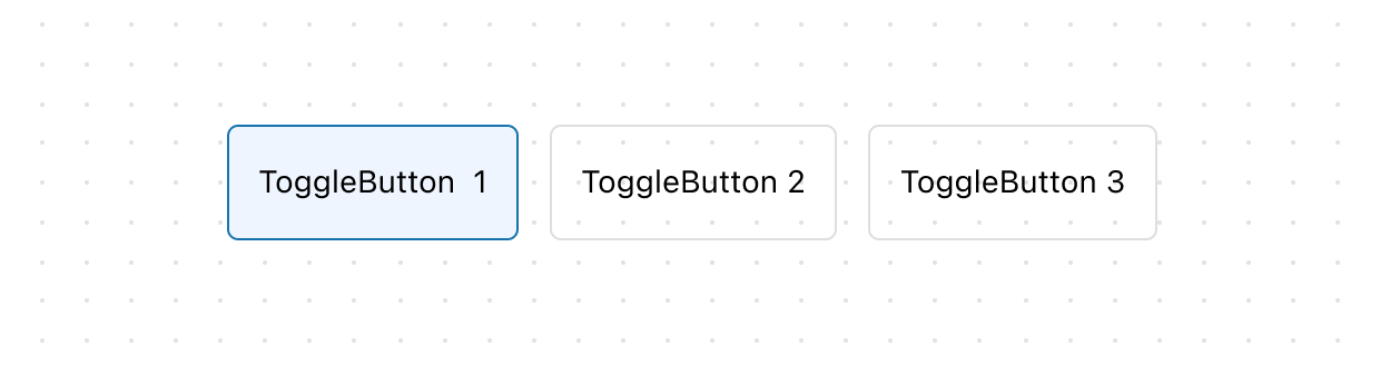
Toggle
Display a group of toggle buttons for selecting options.
Anchor to Layout and structureLayout and structure
Layout and structure components organize content hierarchically and spatially, creating clear visual relationships in checkout interfaces.
Anchor to Media and visualsMedia and visuals
Media and visuals display images, icons, and graphical elements that enhance comprehension and visual communication in checkout.
Anchor to OverlaysOverlays
Overlays present content in floating or layered surfaces that appear above the main interface, useful for focused tasks, contextual information, and supplementary content.

Chat
Display a chat interface for real-time communication.

Modal
Shift focus towards a specific action or set of information before the main flow can proceed.

Popover
Display contextual content in a floating container anchored to a trigger element.

Sheet
Display essential information at the bottom of the screen, appearing above other elements.

Tooltip
Display additional information on hover or focus.
Anchor to Typography and contentTypography and content
Typography and content components present textual information with appropriate hierarchy, emphasis, and styling for clear communication.