Date
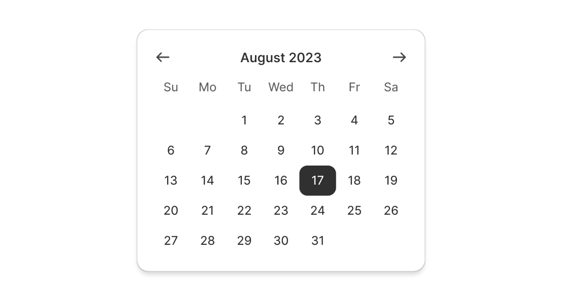
Date pickers let merchants choose dates from a visual calendar that’s consistently applied wherever dates need to be selected across Shopify.
Anchor to datepickerpropsDatePickerProps
- Anchor to defaultYearMonthdefaultYearMonth{year: Year; month: Month} | YearMonthString
Default uncontrolled year and month to display. Ignored when year/month navigation is controlled.
- Anchor to disableddisabledDisabled | Disabled[] | boolean
Disabled dates, days, and/or ranges, or the date picker. Unbound range disables all dates either from
startdate or toenddate.truedisables the date picker.- Anchor to onChangeonChange(selected: T) => void
A callback that is run whenever a date is selected or unselected. This callback is called with a string, an array of strings or a range object representing the selected dates. This component is controlled, so you must store these values in state and reflect it back in the
selectedprops.- Anchor to onYearMonthChangeonYearMonthChange(yearMonth: { year: number; month: number; }) => void
A callback that is run whenever the month is changed. This callback is called with an object indicating the year/month the UI should change to. When year/month navigation is controlled you must store these values in state and reflect it back in the
prop.- Anchor to readOnlyreadOnlyboolean
Whether the date picker is read-only.
- Anchor to selectedselectedT
A date, an array of dates, or a range object with
startand/orendkeys indicating the selected dates. When a range is set, dates between the boundaries will be selected. Passedundefinedorstringallows user to select a single date, an empty array or an array of dates allows selecting multiple dates, an empty object or a Range object allows selecting a range of dates.- Anchor to yearMonthyearMonth{year: Year; month: Month} | YearMonthString
Controlled year and month to display. Use in combination with
. Makes year/month navigation controlled.
Year
numberMonth
Month in 1-12 range
numberYearMonthString
A year/month string using the simplified ISO 8601 format (`YYYY-MM`)
stringDisabled
DateString | Range | DayDateString
A date string using the simplified ISO 8601 format (`YYYY-MM-DD`)
stringRange
- end
Last day (inclusive) of the selected range
DateString - start
First day (inclusive) of the selected range
DateString
export interface Range {
  /**
   * First day (inclusive) of the selected range
   */
  start?: DateString;

  /**
   * Last day (inclusive) of the selected range
   */
  end?: DateString;
}
Day
'Sunday' | 'Monday' | 'Tuesday' | 'Wednesday' | 'Thursday' | 'Friday' | 'Saturday'Add a single-date DatePicker
Examples
Add a single-date DatePicker
React
import React, { useState } from 'react';
import {
  render,
  DatePicker,
  type Selected
} from '@shopify/ui-extensions-react/admin';

render('Playground', () => <App />);

function App() {
  const [selected, setSelected] = useState<Selected>('2023-11-08')
  return (
    <DatePicker selected={selected} onChange={setSelected} />
  );
}
JS
import {extend, DatePicker} from '@shopify/ui-extensions/admin';

extend('Playground', (root) => {
  const datePicker = root.createComponent(
    DatePicker,
    {},
    'DatePicker',
  );

  root.appendChild(datePicker);
});
Preview
Anchor to examplesExamples
Anchor to example-add-a-multi-date-datepickerAdd a multi-date DatePicker
Use this when merchants need to select multiple dates.
Anchor to example-add-a-range-datepickerAdd a range DatePicker
Use this when merchants need to select a range of dates.
Add a multi-date DatePicker
Examples
Add a multi-date DatePicker
Description
Use this when merchants need to select multiple dates.
React
import React from 'react';
import {
  render,
  DatePicker,
  type Selected,
} from '@shopify/ui-extensions-react/admin';


render('Playground', () => <App />);

function App() {
  const [selected, setSelected] = React.useState<Selected>(['2023-11-08']);

  return (
    <DatePicker selected={selected} onChange={setSelected} />
  );
}
JS
import {extend, DatePicker} from '@shopify/ui-extensions/admin';

extend('Playground', (root) => {
  const datePicker = root.createComponent(
    DatePicker,
    { selected: ['2023-11-08'] },
    'DatePicker',
  );

  root.appendChild(datePicker);
});
Add a range DatePicker
Description
Use this when merchants need to select a range of dates.
React
import React from 'react';
import {
  render,
  DatePicker,
  type Selected
} from '@shopify/ui-extensions-react/admin';

render('Playground', () => <App />);

function App() {
  const [selected, setSelected] = React.useState<Selected>({start: '2023-11-08', end: '2023-11-10' });

  return (
    <DatePicker selected={selected} onChange={setSelected} />
  );
}
JS
import {extend, DatePicker} from '@shopify/ui-extensions/admin';

extend('Playground', (root) => {
  const datePicker = root.createComponent(
    DatePicker,
    { selected: {start: '2023-11-08', end: '2023-11-10' } },
    'DatePicker',
  );

  root.appendChild(datePicker);
});