Select
Use this when you want to give users a predefined list of options to choose from.
Anchor to selectpropsSelectProps
Content to use as the field label.
The options a user can select from.
When both options and children Option or are provided,
the options will be merged together, with the options property
taking precedence.
Whether the select can be changed.
Indicate an error to the user. The field will be given a specific stylistic treatment to communicate problems that have to be resolved immediately.
A unique identifier for the field. When no id is set,
a globally unique value will be used instead.
An identifier for the field that is unique within the nearest
containing Form component.
Callback when focus is removed.
A callback that is run whenever the selected option changes. This callback
is called with the string value of the selected option. This component
is controlled,
so you must store this value in state and reflect it back in the value
prop of the select.
Callback when input is focused.
A short hint that describes the expected value of the field.
Whether the field is read-only.
Whether the field needs a value. This requirement adds semantic value
to the field, but it will not cause an error to appear automatically.
If you want to present an error when this field is empty, you can do
so with the error prop.
The active option for the select. This should match to one of the
value properties in the options property or one of the <Option>.
When not set, the value will default to an empty string,
which will show the placeholder text as the "selected value".
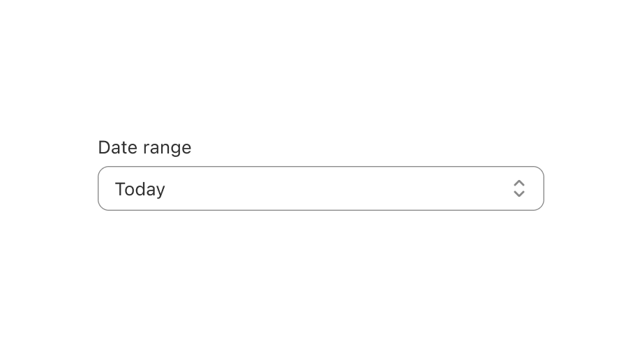
Simple Select example
Preview