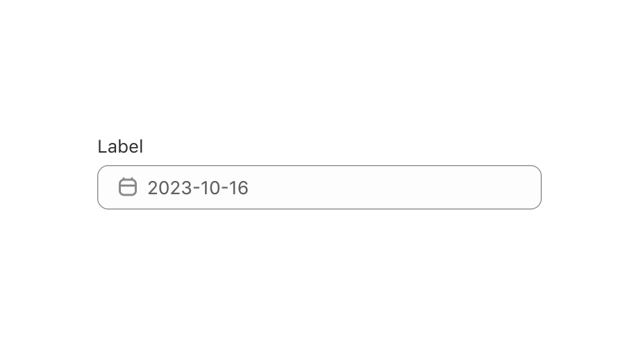
Date
This is a form field that lets users select a date using the DatePicker component.
Anchor to datepickerpropsDatePickerProps
Controlled year and month to display.
Use in combination with .
Makes year/month navigation controlled.
Default uncontrolled year and month to display. Ignored when year/month navigation is controlled.
Disabled dates, days, and/or ranges, or the date picker.
Unbound range disables all dates either from start date or to end date.
true disables the date picker.
Whether the date picker is read-only.
A date, an array of dates, or a range object with start and/or end keys indicating the selected dates.
When a range is set, dates between the boundaries will be selected.
Passed undefined or string allows user to select a single date,
an empty array or an array of dates allows selecting multiple dates,
an empty object or a Range object allows selecting a range of dates.
A callback that is run whenever a date is selected or unselected. This callback
is called with a string, an array of strings or a range object representing the selected dates.
This component is controlled,
so you must store these values in state and reflect it back in the
selected props.
A callback that is run whenever the month is changed. This callback
is called with an object indicating the year/month the UI should change to.
When year/month navigation is controlled you must store these values in state and
reflect it back in the prop.
Add a single-date DateField
Preview
Anchor to examplesExamples
Anchor to example-add-a-multi-date-datefieldAdd a multi-date DateField
Use this when users need to select multiple dates.
Anchor to example-add-a-range-datefieldAdd a range DateField
Use this when users need to select a range of dates.