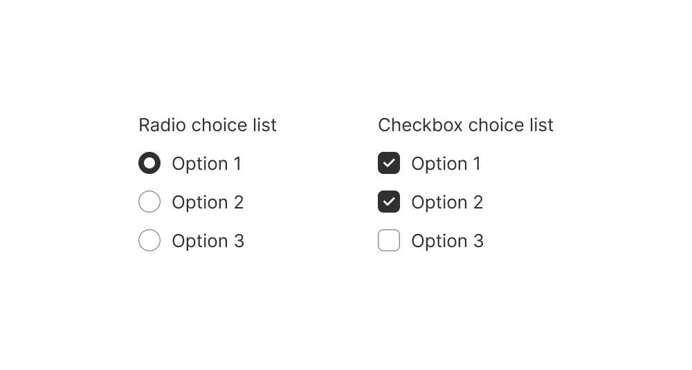
Choice
Use this component if you need to group together a related list of interactive choices as radio buttons or checkboxes.
Anchor to choicelistpropsChoiceListProps
Whether to allow selection of multiple choices
Whether the field can be modified.
Indicate an error to the user. The field will be given a specific stylistic treatment to communicate problems that have to be resolved immediately.
An identifier for the field that is unique within the nearest
containing Form component.
Callback when the user has finished editing a field. Unlike
callbacks you may be familiar with from React component libraries,
this callback is not run on every change to the input. Text fields are
“partially controlled” components, which means that while the user edits the
field, its state is controlled by the component. Once the user has signalled that
they have finished editing the field (typically, by blurring the field),
is called if the input actually changed from the most recent value property. At
that point, you are expected to store this “committed value” in state, and reflect
it in the text field’s value property.
This state management model is important given how UI Extensions are rendered. UI Extension components
run on a separate thread from the UI, so they can’t respond to input synchronously.
A pattern popularized by controlled React components
is to have the component be the source of truth for the input value, and update
the value on every user input. The delay in responding to events from a UI
extension is only a few milliseconds, but attempting to strictly store state with
this delay can cause issues if a user types quickly, or if the user is using a
lower-powered device. Having the UI thread take ownership for “in progress” input,
and only synchronizing when the user is finished with a field, avoids this risk.
It can still sometimes be useful to be notified when the user makes any input in
the field. If you need this capability, you can use the prop. However,
never use that property to create tightly controlled state for the value.
This callback is called with the current value of the field. If the value of a field
is the same as the current value prop provided to the field, the callback
will not be run.
Whether the field is read-only.
A default value to populate for uncontrolled components.
The current value for the field. If omitted, the field will be empty. You should
update this value in response to the callback.
Simple ChoiceList example
Preview